CLASSIC CITIES: Sydney [Quenched]
Moderator: Cartographers
Re: Greater Sydney V2
![]() by Bruceswar on Tue Aug 16, 2011 4:56 am
by Bruceswar on Tue Aug 16, 2011 4:56 am
I think you should  good luck!
Highest Rank: 26 Highest Score: 3480

-

 Bruceswar
- Posts: 9713
- Joined: Sun Dec 23, 2007 12:36 am
- Location: Cow Pastures


Re: Greater Sydney V2
![]() by natty dread on Wed Aug 17, 2011 5:24 pm
by natty dread on Wed Aug 17, 2011 5:24 pm
Why not... Although personally I find Salem much more appealing.

-

natty dread
- Posts: 12877
- Joined: Fri Feb 08, 2008 8:58 pm
- Location: just plain fucked


Re: Greater Sydney V2
![]() by cairnswk on Wed Aug 17, 2011 7:22 pm
by cairnswk on Wed Aug 17, 2011 7:22 pm
Bruceswar wrote:I think you should
natty_dread wrote:Why not... Although personally I find Salem much more appealing.
thanks for the thumbs ups guys.
I think this sydney one will have to wait until Traflagar is moved.

* Pearl Harbour * Waterloo * Forbidden City * Jamaica * Pot Mosbi
-

cairnswk
- Posts: 11510
- Joined: Sat Feb 03, 2007 8:32 pm
- Location: Australia


Re: Greater Sydney V2
![]() by cairnswk on Sun Jan 29, 2012 2:31 am
by cairnswk on Sun Jan 29, 2012 2:31 am
cairnswk wrote:Bruceswar wrote:I think you shouldnatty_dread wrote:Why not... Although personally I find Salem much more appealing.
thanks for the thumbs ups guys.
I think this sydney one will have to wait until Traflagar is moved.
Trafalagar has now been moved...to Beta
...so i will put this forward as the Classic Cities: Sydney offering
* Pearl Harbour * Waterloo * Forbidden City * Jamaica * Pot Mosbi
-
cairnswk
- Posts: 11510
- Joined: Sat Feb 03, 2007 8:32 pm
- Location: Australia
Re: [Vacation - valid untill Feb 2012] - CLASSIC CITIES: Syd
![]() by cairnswk on Sun Jan 29, 2012 3:31 am
by cairnswk on Sun Jan 29, 2012 3:31 am
I feel it woudl be remiss if the Harbour Bridge were not on this title...
Version 4
Version 4
* Pearl Harbour * Waterloo * Forbidden City * Jamaica * Pot Mosbi
-
cairnswk
- Posts: 11510
- Joined: Sat Feb 03, 2007 8:32 pm
- Location: Australia
Re: [Vacation - valid untill Feb 2012] - CLASSIC CITIES: Syd
![]() by thenobodies80 on Sun Jan 29, 2012 6:36 am
by thenobodies80 on Sun Jan 29, 2012 6:36 am
[Moved] back into the Drafting Room. 
Nobodies
Nobodies
-

thenobodies80
- Posts: 5400
- Joined: Wed Sep 05, 2007 4:30 am
- Location: Milan


CLASSIC CITIES: Sydney V04
![]() by cairnswk on Sun Jan 29, 2012 3:02 pm
by cairnswk on Sun Jan 29, 2012 3:02 pm
thenobodies80 wrote:[Moved] back into the Drafting Room.
Nobodies
Thanks tnb80.
* Pearl Harbour * Waterloo * Forbidden City * Jamaica * Pot Mosbi
-
cairnswk
- Posts: 11510
- Joined: Sat Feb 03, 2007 8:32 pm
- Location: Australia
Re: CLASSIC CITIES: Sydney
![]() by Flapcake on Sun Jan 29, 2012 5:10 pm
by Flapcake on Sun Jan 29, 2012 5:10 pm
Is ther any reason that you using the bridge for the city icon, and not the world vide famous opera house by Utzon ?
Nice map btw.
Nice map btw.

-

Flapcake
- Posts: 756
- Joined: Tue Jan 11, 2011 8:22 am
- Location: beyond the unknown


Re: CLASSIC CITIES: Sydney
![]() by cairnswk on Sun Jan 29, 2012 5:15 pm
by cairnswk on Sun Jan 29, 2012 5:15 pm
Flapcake wrote:Is ther any reason that you using the bridge for the city icon, and not the world vide famous opera house by Utzon ?
Nice map btw.
Thanks flapcake,,,yes the Opera House is the icon used on the Sydney Metro map.
* Pearl Harbour * Waterloo * Forbidden City * Jamaica * Pot Mosbi
-
cairnswk
- Posts: 11510
- Joined: Sat Feb 03, 2007 8:32 pm
- Location: Australia
Re: CLASSIC CITIES: Sydney
![]() by Flapcake on Sun Jan 29, 2012 5:17 pm
by Flapcake on Sun Jan 29, 2012 5:17 pm
cairnswk wrote:Flapcake wrote:Is ther any reason that you using the bridge for the city icon, and not the world vide famous opera house by Utzon ?
Nice map btw.
Thanks flapcake,,,yes the Opera House is the icon used on the Sydney Metro map.
Ahh ok
-
Flapcake
- Posts: 756
- Joined: Tue Jan 11, 2011 8:22 am
- Location: beyond the unknown
Re: CLASSIC CITIES: Sydney
![]() by Gillipig on Tue Jan 31, 2012 4:43 am
by Gillipig on Tue Jan 31, 2012 4:43 am
We already have a Sydney metro map so I don't think another Sydney map is what I want to see the most. It's unique in location though because it portraits more of Sydney then the other Sydney map so I'm not saying it shouldn't be allowed to be done, just voicing my opinion that maybe another map like this isn't very interesting when there are so many other beautiful cities that haven't got a map yet. A Paris map would be much more interesting I think!!
AoG for President of the World!!
I promise he will put George W. Bush to shame!
I promise he will put George W. Bush to shame!
-

Gillipig
- Posts: 3565
- Joined: Fri Jan 09, 2009 1:24 pm


Re: CLASSIC CITIES: Sydney
![]() by cairnswk on Tue Jan 31, 2012 6:08 am
by cairnswk on Tue Jan 31, 2012 6:08 am
Gillipig wrote:We already have a Sydney metro map so I don't think another Sydney map is what I want to see the most. It's unique in location though because it portraits more of Sydney then the other Sydney map so I'm not saying it shouldn't be allowed to be done, just voicing my opinion that maybe another map like this isn't very interesting when there are so many other beautiful cities that haven't got a map yet. A Paris map would be much more interesting I think!!
Gillipig, thanks for your comments.
I could say exactly the same thing about all the USA maps and all the Europe maps etc etc.
While this one has similar road style graphics to S Metro, the game is casual, easy and classic, and that's what i would like to portray for Classic City: Sydney, hence why i used this map.
Metro was never meant to be a Classic Sydney map and I have no intention of renaming Metro such.
Yes a Paris map would be probably as interesting depending on the slant, but perhaps other will do that one.
* Pearl Harbour * Waterloo * Forbidden City * Jamaica * Pot Mosbi
-
cairnswk
- Posts: 11510
- Joined: Sat Feb 03, 2007 8:32 pm
- Location: Australia
Re: CLASSIC CITIES: Sydney
![]() by Industrial Helix on Mon Feb 06, 2012 8:41 pm
by Industrial Helix on Mon Feb 06, 2012 8:41 pm
Just a heads up, I'm gonna sticky your maps for now. In my opinion they're looking good and I hope you continue to work on them. But the people in the Main Foundry are a little burdened at the moment.
Sketchblog [Update 07/25/11]: http://indyhelixsketch.blogspot.com/
Living in Japan [Update 07/17/11]: http://mirrorcountryih.blogspot.com/
Russian Revolution map for ConquerClub [07/20/11]: viewtopic.php?f=241&t=116575
Living in Japan [Update 07/17/11]: http://mirrorcountryih.blogspot.com/
Russian Revolution map for ConquerClub [07/20/11]: viewtopic.php?f=241&t=116575
-

Industrial Helix
- Posts: 3462
- Joined: Mon Jul 14, 2008 6:49 pm
- Location: Ohio


Re: CLASSIC CITIES: Sydney
![]() by cairnswk on Mon Feb 06, 2012 9:03 pm
by cairnswk on Mon Feb 06, 2012 9:03 pm
Industrial Helix wrote:Just a heads up, I'm gonna sticky your maps for now. In my opinion they're looking good and I hope you continue to work on them. But the people in the Main Foundry are a little burdened at the moment.
No probs IH, Thanks for the info.
Yes i am working on them - on Perth as I write this.
* Pearl Harbour * Waterloo * Forbidden City * Jamaica * Pot Mosbi
-
cairnswk
- Posts: 11510
- Joined: Sat Feb 03, 2007 8:32 pm
- Location: Australia
Re: CLASSIC CITIES: Sydney [14.2.12] P3-V5 Title Update
![]() by cairnswk on Mon Feb 13, 2012 6:37 pm
by cairnswk on Mon Feb 13, 2012 6:37 pm
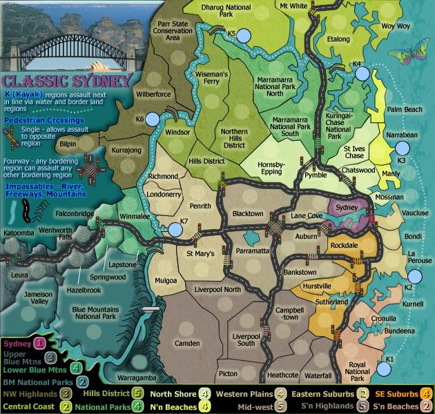
Version 5
Changes made to the title and the mountains.
Changes made to the title and the mountains.
* Pearl Harbour * Waterloo * Forbidden City * Jamaica * Pot Mosbi
-
cairnswk
- Posts: 11510
- Joined: Sat Feb 03, 2007 8:32 pm
- Location: Australia
Re: CLASSIC CITIES: Sydney [14.2.12] P3-V5 Title Update
![]() by koontz1973 on Fri Feb 17, 2012 1:27 am
by koontz1973 on Fri Feb 17, 2012 1:27 am
With the new title, only the opera house looks better. For some reason, the mountains look fuzzy, the bridge looks the right shape but without any detail, it could be drawn by a two year old. Having the opera house larger, it may be out of scale, but now you can see it clearly so works better than before.

-

koontz1973
- Posts: 6960
- Joined: Thu Jan 01, 2009 10:57 am


Re: CLASSIC CITIES: Sydney [14.2.12] P3-V5 Title Update
![]() by chapcrap on Fri Feb 17, 2012 2:17 am
by chapcrap on Fri Feb 17, 2012 2:17 am
I agree that the new title is improved.
Second, it is spelled KAYAK, not KYAK.
I also know that IH brought this up long ago, but it seems a lot of the roads are really unnecessary.
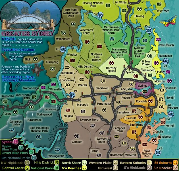
The 4 Parks and Mountains bonuses are very similar in color, it's difficult to tell which one is which from the key. And the names of the regions for Hazelbrook, Springwood, and Lapstone make it difficult to tell where the region is actually at. Maybe it will be easier with the troop numbers, but right now, it looks kind of scrunched up.
What is the reason for making BM National Parks raised? None of the regions look like this and it just looks a little strange by itself.
Second, it is spelled KAYAK, not KYAK.
I also know that IH brought this up long ago, but it seems a lot of the roads are really unnecessary.
The 4 Parks and Mountains bonuses are very similar in color, it's difficult to tell which one is which from the key. And the names of the regions for Hazelbrook, Springwood, and Lapstone make it difficult to tell where the region is actually at. Maybe it will be easier with the troop numbers, but right now, it looks kind of scrunched up.
What is the reason for making BM National Parks raised? None of the regions look like this and it just looks a little strange by itself.
-
chapcrap
- Posts: 9686
- Joined: Sun Feb 03, 2008 12:46 am
- Location: Kansas City


Re: CLASSIC CITIES: Sydney [14.2.12] P3-V5 Title Update
![]() by cairnswk on Fri Feb 17, 2012 3:07 am
by cairnswk on Fri Feb 17, 2012 3:07 am
koontz1973 wrote:With the new title, only the opera house looks better.
good
For some reason, the mountains look fuzzy,
the mountains look fuzzy because that's how they are and why they're called the Blue Mountains. It is created by the eucalyptus oils in the air from the valley floors.
the bridge looks the right shape but without any detail, it could be drawn by a two year old.
Well for that size (small) i don't know if I'd want any more detail because it probably wouldn't show, as for a 2 yo...did somebody infest you with their barberous tongue today
Having the opera house larger, it may be out of scale, but now you can see it clearly so works better than before.
The opera house isn't meant to be large so that size is appropriate as a vista through the bridge.
PS. koontz1973...the software i use for this is Fireworks. It does not allow fine point lines like PS or CD or AI.
1 point lines are the lowest i can achieve. There is quite some detail in the bridge actually, it's simple hidden behind one front layer because this small version doesn't allow it to shwo the larger detail.
Last edited by cairnswk on Fri Feb 17, 2012 3:41 am, edited 1 time in total.
* Pearl Harbour * Waterloo * Forbidden City * Jamaica * Pot Mosbi
-
cairnswk
- Posts: 11510
- Joined: Sat Feb 03, 2007 8:32 pm
- Location: Australia
Re: CLASSIC CITIES: Sydney [14.2.12] P3-V5 Title Update
![]() by cairnswk on Fri Feb 17, 2012 3:10 am
by cairnswk on Fri Feb 17, 2012 3:10 am
* Pearl Harbour * Waterloo * Forbidden City * Jamaica * Pot Mosbi
-
cairnswk
- Posts: 11510
- Joined: Sat Feb 03, 2007 8:32 pm
- Location: Australia
Re: CLASSIC CITIES: Sydney [14.2.12] P3-V5 Title Update
![]() by cairnswk on Fri Feb 17, 2012 3:28 am
by cairnswk on Fri Feb 17, 2012 3:28 am
good to hearchapcrap wrote:I agree that the new title is improved.
Second, it is spelled KAYAK, not KYAK.
I also know that IH brought this up long ago, but it seems a lot of the roads are really unnecessary.
yes i understand, but i wanted to show the main aterial roads around sydney and tie this in with the other Sydney Metro map.
The 4 Parks and Mountains bonuses are very similar in color, it's difficult to tell which one is which from the key.
Sorry, but to me they're miles apart, but i'll see if i can do something to calarify them better.
And the names of the regions for Hazelbrook, Springwood, and Lapstone make it difficult to tell where the region is actually at. Maybe it will be easier with the troop numbers, but right now, it looks kind of scrunched up.
I agree it is scrunched up but then the territory indicator lines are missing from this map
What is the reason for making BM National Parks raised? None of the regions look like this and it just looks a little strange by itself.
Ah, because they are actually mountains that sit behind a 40 mile almost flat plain...that's why they're raised
* Pearl Harbour * Waterloo * Forbidden City * Jamaica * Pot Mosbi
-
cairnswk
- Posts: 11510
- Joined: Sat Feb 03, 2007 8:32 pm
- Location: Australia
Re: CLASSIC CITIES: Sydney [14.2.12] P3-V5 Title Update
![]() by koontz1973 on Fri Feb 17, 2012 1:07 pm
by koontz1973 on Fri Feb 17, 2012 1:07 pm
cairnswk wrote:did somebody infest you with their barberous tongue today
When I wrote what I was, so yes, a bad mood day. Must remember to not post when in a mood.
Sorry for that.
Better mood today and guess what, not much really to complain about GP wise. I love the way you are bringing in the metro map, but it might be nice to see some continuity between the two graphics wise. Same colours, textures, icons and what not. Am I correct in thinking that the metro map is only the Sydney territ on this one? Looking good but I am sure you can see the same defects I can so will not go over them now.
Is there any way you could squeeze the bottom a bit so your bonus legend can fit onto 3 lines? If you can, then it would (again) be nice to see the metro map style brought over.
Two questions for you. What font is the title as I love it? and how did you get that sea detail. Might have to snatch that of you one day.
-
koontz1973
- Posts: 6960
- Joined: Thu Jan 01, 2009 10:57 am
Re: CLASSIC CITIES: Sydney [14.2.12] P3-V5 Title Update
![]() by cairnswk on Fri Feb 17, 2012 2:00 pm
by cairnswk on Fri Feb 17, 2012 2:00 pm
Thanks. That's good.koontz1973 wrote:cairnswk wrote:did somebody infest you with their barberous tongue today
When I wrote what I was, so yes, a bad mood day. Must remember to not post when in a mood.
Sorry for that.
Better mood today....
... I love the way you are bringing in the metro map, but it might be nice to see some continuity between the two graphics wise. Same colours, textures, icons and what not. Am I correct in thinking that the metro map is only the Sydney territ on this one? Looking good but I am sure you can see the same defects I can so will not go over them now.
Is there any way you could squeeze the bottom a bit so your bonus legend can fit onto 3 lines? If you can, then it would (again) be nice to see the metro map style brought over.
A couple of things here...
1. i wanted to keep this map as standard size 630x600 because i don't think it justifies anything bigger, i.e. it is nice and compact.
2. squeezing the territories to fit in another line in the legend would create some very squashed territories and i have to ask for what benefit. Also what would i do with the area under the Blue Mntns Nat. Park? I don't know if this map justifies the same legedn style as Metro....perhaps i can come up with something similar but different colours, we'll see.
3. i think the road element is enough to bring across from the Metro map...i would like this map to have simply classic gameplay and not include the icons that are on the Metro map as part of that gameplay.
4. After all the agitation about maps being same-same in the foundry, would you want the same textures etc brought over?
5. The metro map contains some of the detailed suburbs in the area defined on this map by La Perouse, Hurstville, Parramatta, Lane Cove, Chatswood and Manly. There are 656 suburbs listed here.
6. yes i can see some of the defects, and am working on them
Two questions for you. What font is the title as I love it?
AlgerianD
and how did you get that sea detail. Might have to snatch that of you one day.
This is a texture file in Fireworks called Vein - i have it as 15% as the sea background.
* Pearl Harbour * Waterloo * Forbidden City * Jamaica * Pot Mosbi
-
cairnswk
- Posts: 11510
- Joined: Sat Feb 03, 2007 8:32 pm
- Location: Australia
Re: CLASSIC CITIES: Sydney [14.2.12] P3-V5 Title Update
![]() by chapcrap on Fri Feb 17, 2012 2:09 pm
by chapcrap on Fri Feb 17, 2012 2:09 pm
cairnswk wrote:What is the reason for making BM National Parks raised? None of the regions look like this and it just looks a little strange by itself.
Ah, because they are actually mountains that sit behind a 40 mile almost flat plain...that's why they're raised
Jamison Valley is raised in RL?
I don't know. I'm honestly asking. If you say so, I believe you. I just think it looks a little strange to seemingly have the continent raised about the rest of the map.
-
chapcrap
- Posts: 9686
- Joined: Sun Feb 03, 2008 12:46 am
- Location: Kansas City
Re: CLASSIC CITIES: Sydney [14.2.12] P3-V5 Title Update
![]() by cairnswk on Fri Feb 17, 2012 2:34 pm
by cairnswk on Fri Feb 17, 2012 2:34 pm
chapcrap wrote:...
Jamison Valley is raised in RL?
yes i would say it is raised in RL.
You can read about it here
There is also a video here which will allow you to see Katoomba on top of the Blue Mountains.
While it is a valley in the Blue Mountains, it is certainly elevated above the coastal plain.
3 sisters (in the photo) - 900 metres above sea level.
Valley floor 545 metres to the top
Here it explains that the Jamison Valley is 478 metres above sea level.
I don't know. I'm honestly asking. If you say so, I believe you. I just think it looks a little strange to seemingly have the continent raised about the rest of the map.
I have been up there many times and done various walks around sightseeing etc etc. It is quite cool and rarified air, very different from the coastal plain, and definitely in the mountains.
* Pearl Harbour * Waterloo * Forbidden City * Jamaica * Pot Mosbi
-
cairnswk
- Posts: 11510
- Joined: Sat Feb 03, 2007 8:32 pm
- Location: Australia
Re: CLASSIC CITIES: Sydney [18.2.12] P4-V6 Updates
![]() by cairnswk on Fri Feb 17, 2012 3:29 pm
by cairnswk on Fri Feb 17, 2012 3:29 pm
Version 6.
This addresses a couple of issues.
1. the bridge is more detailed in the title.
2. the colour of the upper blue mntns has been changed slightly
3. the lines indicating the lower blue mntn suburbs are back again.
4. Kyak has been fixed to Kayak
This addresses a couple of issues.
1. the bridge is more detailed in the title.
2. the colour of the upper blue mntns has been changed slightly
3. the lines indicating the lower blue mntn suburbs are back again.
4. Kyak has been fixed to Kayak
* Pearl Harbour * Waterloo * Forbidden City * Jamaica * Pot Mosbi
-
cairnswk
- Posts: 11510
- Joined: Sat Feb 03, 2007 8:32 pm
- Location: Australia
Who is online
Users browsing this forum: No registered users
|
|||||||
| Conquer Club is not associated with RISK online in any way. Copyright © 2006-2024 by Big Wham LLC | |||||||