Conquer Club

1982 [Quenched]

Care to peruse completed maps? Take a stroll through the Atlas.

Moderator: Cartographers

Forum rules
Please read the Community Guidelines before posting.

Re: 1982 [19/11] Latest images Page 1/9

Postby natty dread on Sun Nov 20, 2011 6:24 am

koontz1973 wrote:natty, when I said the colour was light, it was to mean that the colour was lighter than black.


Doesn't matter, the main point you should have taken out of that was this:

    the biggest problem with the border colour is this: in some places it's lighter than the surrounding colours, in some places it's darker than the surrounding colours. This means there's no consistent contrast between the borders & their surroundings. Which also means a glow or shadow won't fix them, since you can't determine if the borders are "light" or "dark" - they're both, depending on location.

    So make it so that they're consistently either clearly darker or lighter from their surroundings, then see if they still need glows or shadows.

koontz1973 wrote:Tried you idea for the Lz's and did not like it one bit.


You probably didn't do it right then... ;)
Image
User avatar
Sergeant 1st Class natty dread
 
Posts: 12877
Joined: Fri Feb 08, 2008 8:58 pm
Location: just plain fucked

Re: 1982 [19/11] Latest images Page 1/9

Postby koontz1973 on Sun Nov 20, 2011 8:52 am

natty_dread wrote:You probably didn't do it right then... ;)


You cheeky sod. ;)
Image
User avatar
Lieutenant koontz1973
 
Posts: 6960
Joined: Thu Jan 01, 2009 10:57 am

Re: 1982 [19/11] Latest images Page 1/9

Postby natty dread on Mon Nov 21, 2011 12:11 pm

Here's what I suggest for the LZ:s

Image
Image
User avatar
Sergeant 1st Class natty dread
 
Posts: 12877
Joined: Fri Feb 08, 2008 8:58 pm
Location: just plain fucked

Re: 1982 [19/11] Latest images Page 1/9

Postby RedBaron0 on Fri Nov 25, 2011 4:32 am

Much has been said on the pixelation here, so I won't beat that dead horse...

The ships look pretty bland and generic, I'd look into something else there, and the planes I'm 'meh' on. The British chopper is awful, while the Argentine one is world better. And the mines have been mentioned...

The playable surface itself is generally pretty good. Add a glow or shadow by the Argentine flags, they are blending into the sea background. Why is there a starburst behind the legend? its kinda distracting.

You do got yourself a decent foundation here, lets build on it!
ImageImage
User avatar
Sergeant 1st Class RedBaron0
 
Posts: 2657
Joined: Sun Aug 19, 2007 12:59 pm
Location: Pennsylvania

Re: 1982 [4/12] Latest images Page 1/9

Postby koontz1973 on Sun Dec 04, 2011 12:54 am

Click image to enlarge.
image


New texture on the land areas.
Played around with the mountains and forests.
Removed the mines.
Redid the land territs.
Played with the ships, aircraft and town icons.
Image
User avatar
Lieutenant koontz1973
 
Posts: 6960
Joined: Thu Jan 01, 2009 10:57 am

Re: 1982 [19/11] Latest images Page 1/9

Postby koontz1973 on Sun Dec 04, 2011 12:59 am

RedBaron0 wrote:Much has been said on the pixelation here, so I won't beat that dead horse...

Thanks you, it is being sorted but point it out incase I miss it.
The ships look pretty bland and generic, I'd look into something else there, and the planes I'm 'meh' on. The British chopper is awful, while the Argentine one is world better. And the mines have been mentioned...

Changed the British chopper. What is 'meh', it gives me nothing. Ships tend to be bland as I do not want to go down the route taken by Ace in Cuban map. Mines are gone.
The playable surface itself is generally pretty good. Add a glow or shadow by the Argentine flags, they are blending into the sea background. Why is there a starburst behind the legend? its kinda distracting.

Added glow. About the legend, can change it but how about you give me an idea on what you would like to see?
You do got yourself a decent foundation here, lets build on it![/quote]
Thanks you.
Image
User avatar
Lieutenant koontz1973
 
Posts: 6960
Joined: Thu Jan 01, 2009 10:57 am

Re: 1982 [19/11] Latest images Page 1/9

Postby koontz1973 on Sun Dec 04, 2011 1:00 am

natty_dread wrote:Here's what I suggest for the LZ:s

Image

Done as this, better than what I had but still not happy with it.
Image
User avatar
Lieutenant koontz1973
 
Posts: 6960
Joined: Thu Jan 01, 2009 10:57 am

Re: 1982 [4/12] Latest images Page 1/10

Postby thehippo8 on Sun Dec 04, 2011 2:10 am

I've been thinking how to approach this one.

I have gone back to this image and compared that to this.

Some good things in the first image not seen here ...

1. The flag of Argentina is light blue, I liked that colour behind the Argentinian planes.
2. I know you were doing what the others asked about more clearly demarking the areas with colours ... problem is I liked your original colours more than these! That's not to say give u7p on different colours, I just don't really like them.
3. I preferred the old borders. Check out the Cyprus map ... that has thicker borders on the outside than the inside.
4. I liked the mines, maybe you can reconsider the awful orange things!
5. The landing zones before were in keeping with the map. I don't feel the boxy things work.
6. As ugly as the old mountains were, I liked them!
7. I preferred the sea having texture.
8. I thought the ships stood out better in the earlier image.

That'll do, just my impressions and no doubt others will disagree. It has been interesting to watch this map develop as I have a similar idea but want to see this come to fruition first!
User avatar
Corporal 1st Class thehippo8
 
Posts: 1025
Joined: Fri Feb 19, 2010 5:32 pm

Re: 1982 [4/12] Latest images Page 1/10

Postby koontz1973 on Sun Dec 04, 2011 2:32 am

thehippo8 wrote:I've been thinking how to approach this one.

I have gone back to this image and compared that to this.

Some good things in the first image not seen here ...

1. The flag of Argentina is light blue, I liked that colour behind the Argentinian planes.
2. I know you were doing what the others asked about more clearly demarking the areas with colours ... problem is I liked your original colours more than these! That's not to say give u7p on different colours, I just don't really like them.
3. I preferred the old borders. Check out the Cyprus map ... that has thicker borders on the outside than the inside.
4. I liked the mines, maybe you can reconsider the awful orange things!
5. The landing zones before were in keeping with the map. I don't feel the boxy things work.
6. As ugly as the old mountains were, I liked them!
7. I preferred the sea having texture.
8. I thought the ships stood out better in the earlier image.

That'll do, just my impressions and no doubt others will disagree. It has been interesting to watch this map develop as I have a similar idea but want to see this come to fruition first!

1. I did too but it seemed that having the different colours helps. I will tone down the colours a tad to try and reach a compromise between the two.
3. The old borders had to go. Sorry. Even I saw the problems with them. Can make them thicker around certain edges (bonus zones)
4. I liked the mines. How do you draw a circle 5 pixels wide with points coming out without it looking like crap. The current solution is temporary. I intend to put the mines back in at a later date.
5. Landing zones will be one of the hardest things to get everyone to agree on. I am still not happy with nattys solution but it is better than my shiny box.
6. The new mountains I like. I understand that the old ones where better for the beginning map, but as this comes along, I am trying to keep the styles merged. The Lz you pointed out would look better on this map now than they did on the previous version.
7. It is still they. Just toned down a tad. Will remove offending layer.
8. I brought the ships more in line to the current planes. Might be nice to go back.

It seems I might of strayed too far in the wrong direction. :( Now that I am back from my trip, can get to work on this. :D
Image
User avatar
Lieutenant koontz1973
 
Posts: 6960
Joined: Thu Jan 01, 2009 10:57 am

Re: 1982 [4/12] Latest images Page 1/10

Postby Flapcake on Sun Dec 04, 2011 4:47 am

koontz1973 wrote:


4. I liked the mines. How do you draw a circle 5 pixels wide with points coming out without it looking like crap. The current solution is temporary. I intend to put the mines back in at a later date.
5. Landing zones will be one of the hardest things to get everyone to agree on. I am still not happy with nattys solution but it is better than my shiny box.


Hi Koontz nice to see you working on it agin,

4. The mines, in my opinion you already had the bedst solution on a previous version, (http://img403.imageshack.us/img403/9461/falklandswarpuzzle.png)
and I think they will work just fine on your new version, they look cool, on a later version had you done some effects so they got a white glow on the top, I did not like, they look their best all-black, so you can clearly see what they imagine.
5. Landing zones, it's just an idea, but how about make it more clear what belongs to England and Argentina, maybe not just with flags and such but with the color red and blue for England and light blue and white for Argentina, but otherwise yes, flags could go behind the troop numbers in the column, just a proposal.

Looking real nice, am excited to see how this turn out :D
User avatar
Private 1st Class Flapcake
 
Posts: 756
Joined: Tue Jan 11, 2011 8:22 am
Location: beyond the unknown

Re: 1982 [4/12] Latest images Page 1/10

Postby thehippo8 on Sun Dec 04, 2011 4:51 am

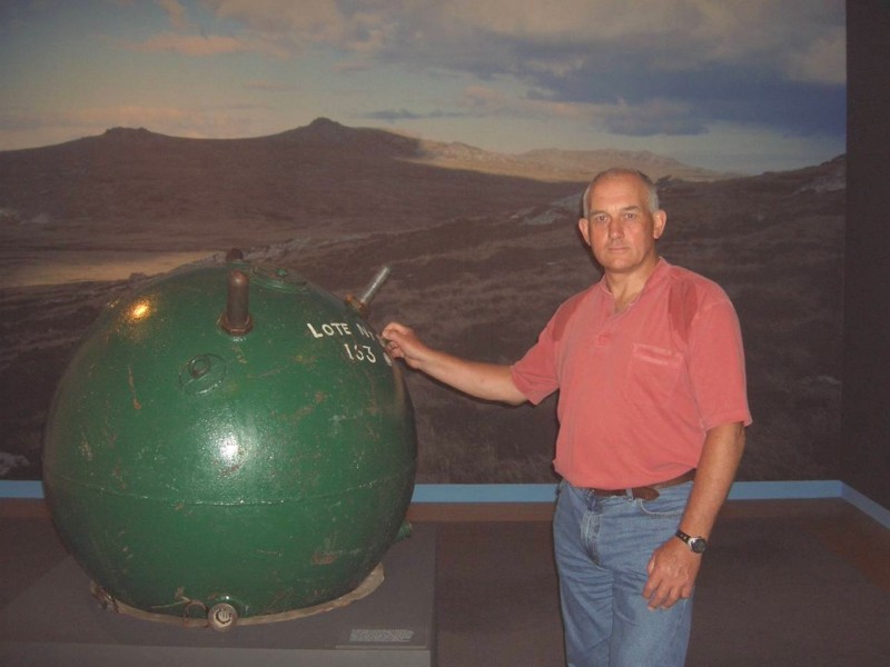
Sounds like you have a fine handle on all that! As for the mines, another way is to draw a part of the mine(s), you know like 500 times it's proper size!? Here's a picture of one ...
Click image to enlarge.
image


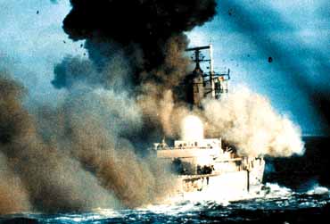
Or maybe the bomb going off

Click image to enlarge.
image


or

Click image to enlarge.
image


or even

Click image to enlarge.
image


and here's some other random pictures:

Click image to enlarge.
image
Click image to enlarge.
image
Click image to enlarge.
image
Click image to enlarge.
image
Click image to enlarge.
image
Click image to enlarge.
image
Click image to enlarge.
image


Happy inspiration!
User avatar
Corporal 1st Class thehippo8
 
Posts: 1025
Joined: Fri Feb 19, 2010 5:32 pm

Re: 1982 [19/11] Latest images Page 1/9

Postby natty dread on Mon Dec 05, 2011 1:08 am

koontz1973 wrote:
natty_dread wrote:Here's what I suggest for the LZ:s

Image

Done as this, better than what I had but still not happy with it.


You forgot to feather the drop shadow
Image
User avatar
Sergeant 1st Class natty dread
 
Posts: 12877
Joined: Fri Feb 08, 2008 8:58 pm
Location: just plain fucked

Re: 1982 [4/12] Latest images Page 1/10

Postby RedBaron0 on Mon Dec 05, 2011 1:41 am

meh=okay, I wouldn't necessarily be opposed to the map moving forward with the jets as is, BUT they could be better. The ships though, genericness alright, but the images you are using... they're terrible. Ok you don't wanna go down the road that Cuba went down, fine. They just look way to clipart for me to fit on this map, the submarine isn't half bad, but the rest forget it.

The starburst is just... odd I understand the need for a background of the legend, but the starburst is just not it. Try different things... deck of a carrier, a radar-screen, something war related that kinda ties the whole thing together, ya'know?

Another thing that pops out at me atm the borders and outlines... very pixelly and jagged, gotta smooth them out.
ImageImage
User avatar
Sergeant 1st Class RedBaron0
 
Posts: 2657
Joined: Sun Aug 19, 2007 12:59 pm
Location: Pennsylvania

Re: 1982 [4/12] Latest images Page 1/10

Postby natty dread on Mon Dec 05, 2011 2:36 am

RedBaron0 wrote:Another thing that pops out at me atm the borders and outlines... very pixelly and jagged, gotta smooth them out.


Yeah, what's with the borders? They were already fixed before... why are they pixelated again :-s
Image
User avatar
Sergeant 1st Class natty dread
 
Posts: 12877
Joined: Fri Feb 08, 2008 8:58 pm
Location: just plain fucked

Re: 1982 [4/12] Latest images Page 1/10

Postby koontz1973 on Sat Dec 17, 2011 12:30 am

Click image to enlarge.
image

New ships
Mines are back
Sorted out pixelation
I like the planes as is, so they stayed as they are.
New background to legend
LZ symbol shadow sorted
Image
User avatar
Lieutenant koontz1973
 
Posts: 6960
Joined: Thu Jan 01, 2009 10:57 am

Re: 1982 [4/12] Latest images Page 1/10

Postby koontz1973 on Sat Dec 17, 2011 9:04 am

Was not happy with aspects of the updated version, so tinkered with it.
Click image to enlarge.
image
Image
User avatar
Lieutenant koontz1973
 
Posts: 6960
Joined: Thu Jan 01, 2009 10:57 am

Re: 1982 [4/12] Latest images Page 1/11

Postby isaiah40 on Sat Dec 17, 2011 10:58 am

The outline and borders are still pixelated really bad. They looked good a couple of versions ago.
Lieutenant isaiah40
 
Posts: 3990
Joined: Mon Aug 27, 2007 7:14 pm

Re: 1982 [4/12] Latest images Page 1/11

Postby natty dread on Sat Dec 17, 2011 11:05 am

Yeah, why don't you revert back to those borders? I don't even get why you changed them again after you managed to get them so good.
Image
User avatar
Sergeant 1st Class natty dread
 
Posts: 12877
Joined: Fri Feb 08, 2008 8:58 pm
Location: just plain fucked

Re: 1982 [4/12] Latest images Page 1/11

Postby koontz1973 on Sat Dec 17, 2011 11:39 am

I did a stupid thing and changed those borders. No idea why as they where good. It was during the redo of the map and for some reason did not copy the procedure. This should put it to bed now. I hope that is.
Click image to enlarge.
image


If there are no objections then, I will make a start on the small map.
Image
User avatar
Lieutenant koontz1973
 
Posts: 6960
Joined: Thu Jan 01, 2009 10:57 am

Re: 1982 [4/12] Latest images Page 1/11

Postby natty dread on Sat Dec 17, 2011 1:02 pm

Um... looks like all you did was blur your current borders?

Why don't you try the method of converting selection to path & stroking the path. This is the best way to get smooth borders, besides drawing them freehand with a tablet.
Image
User avatar
Sergeant 1st Class natty dread
 
Posts: 12877
Joined: Fri Feb 08, 2008 8:58 pm
Location: just plain fucked

Re: 1982 [4/12] Latest images Page 1/11

Postby koontz1973 on Sat Dec 17, 2011 1:14 pm

natty_dread wrote:Um... looks like all you did was blur your current borders?

Why don't you try the method of converting selection to path & stroking the path. This is the best way to get smooth borders, besides drawing them freehand with a tablet.


Thank you natty. Was racking my brains on how I did it before.
Click image to enlarge.
image
Image
User avatar
Lieutenant koontz1973
 
Posts: 6960
Joined: Thu Jan 01, 2009 10:57 am

Re: 1982 [4/12] Latest images Page 1/11

Postby natty dread on Sat Dec 17, 2011 1:17 pm

koontz1973 wrote:Thank you natty. Was racking my brains on how I did it before.


Well why didn't you just look for the post in this thread where I told you of the method the first time?

Anyway, the new borders look pretty smooth. Now the only thing is, the bevel doesn't match them in every place... so now convert the path back to selection, and use that selection to make a new bevel.
Image
User avatar
Sergeant 1st Class natty dread
 
Posts: 12877
Joined: Fri Feb 08, 2008 8:58 pm
Location: just plain fucked

Re: 1982 [4/12] Latest images Page 1/11

Postby koontz1973 on Sat Dec 17, 2011 2:06 pm

Fixed
Click image to enlarge.
image
Image
User avatar
Lieutenant koontz1973
 
Posts: 6960
Joined: Thu Jan 01, 2009 10:57 am

Re: 1982 [4/12] Latest images Page 1/11

Postby Flapcake on Sat Dec 17, 2011 3:58 pm

Hi Koontz, its been a while since I have takin a look at your falkland map, and what a progress its have been through.
I do have some comments,

Tha mines looks realy nice now.
borders/lines super smooth, cool.
color scene, much better with dampened ground colors.
Ships looking nice, but Im not sure about both sides having same ships, would be nice if they dident looked the same.
mountains looks realy good.
Trees, hmm (yes just hmm)
Title, its not so much the burning/flames, I think its the font you using i dont like.

But as I use to say, its my personal opinion, and my conclusion is, overall a damm fine piece of work :)
all for now
Flap
User avatar
Private 1st Class Flapcake
 
Posts: 756
Joined: Tue Jan 11, 2011 8:22 am
Location: beyond the unknown

Re: 1982 [4/12] Latest images Page 1/11

Postby koontz1973 on Sun Dec 18, 2011 12:04 am

Flapcake wrote:Hi Koontz, its been a while since I have takin a look at your falkland map, and what a progress its have been through.
I do have some comments,

Tha mines looks realy nice now.
borders/lines super smooth, cool.
color scene, much better with dampened ground colors.
Ships looking nice, but Im not sure about both sides having same ships, would be nice if they dident looked the same.
mountains looks realy good.
Trees, hmm (yes just hmm)
Title, its not so much the burning/flames, I think its the font you using i dont like.

But as I use to say, its my personal opinion, and my conclusion is, overall a damm fine piece of work :)
all for now
Flap

Nice to see you still looking forward to this Flap.
Mines - thanks, your suggestion to take them back to the original.
borders - should know how to do these by now but it is always they bitch or remembering how.
Ships - thanks, both sides had the same type, in fact, both sides had a sister ship in the conflict. Argentinian forces bought a lot of UK warships as well as American.
Mountains and forests, this is the one thing no one will agree on.
Title, will look at the font.
Image
User avatar
Lieutenant koontz1973
 
Posts: 6960
Joined: Thu Jan 01, 2009 10:57 am

PreviousNext

Return to The Atlas

Who is online

Users browsing this forum: No registered users