
Knights
Moderator: Cartographers
Re: KNIGHTS [4/12] Page 1 & 10. GP stamping time?
![]() by koontz1973 on Sun Dec 04, 2011 12:48 am
by koontz1973 on Sun Dec 04, 2011 12:48 am
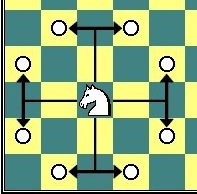
They say that no new is good news but here is the latest image. Just cleaned it up and made the bonus lines look neater. Gave the overall look a polish as well.

-

 koontz1973
- Posts: 6960
- Joined: Thu Jan 01, 2009 10:57 am


Re: KNIGHTS [4/12] Page 1 & 10. GP stamping time?
![]() by thehippo8 on Sun Dec 04, 2011 1:09 am
by thehippo8 on Sun Dec 04, 2011 1:09 am
Yeah, sharp! I was wondering what happened to this ... I wanted to play it before Christmas (wanted to see your Christmas theme!!
-

thehippo8
- Posts: 1025
- Joined: Fri Feb 19, 2010 5:32 pm


Re: KNIGHTS [4/12] Page 1 & 10. GP stamping time?
![]() by koontz1973 on Sun Dec 04, 2011 1:17 am
by koontz1973 on Sun Dec 04, 2011 1:17 am
thehippo8 wrote:Yeah, sharp! I was wondering what happened to this ... I wanted to play it before Christmas (wanted to see your Christmas theme!!
Your one of the bosses now. Pull some strings please
-
koontz1973
- Posts: 6960
- Joined: Thu Jan 01, 2009 10:57 am
Re: KNIGHTS [4/12] Page 1 & 11. GP stamping time?
![]() by thehippo8 on Sun Dec 04, 2011 1:23 am
by thehippo8 on Sun Dec 04, 2011 1:23 am
Still looking for the bell tower!!
-
thehippo8
- Posts: 1025
- Joined: Fri Feb 19, 2010 5:32 pm
Re: KNIGHTS [4/12] Page 1 & 11. GP stamping time?
![]() by koontz1973 on Sun Dec 04, 2011 1:37 am
by koontz1973 on Sun Dec 04, 2011 1:37 am
Look harder. 21 days till xmas.
-
koontz1973
- Posts: 6960
- Joined: Thu Jan 01, 2009 10:57 am
Re: KNIGHTS [4/12] Page 1 & 11. GP stamping time?
![]() by isaiah40 on Sun Dec 04, 2011 1:04 pm
by isaiah40 on Sun Dec 04, 2011 1:04 pm
Sorry for the delay, I will take a look again at this this evening.
-
isaiah40
- Posts: 3990
- Joined: Mon Aug 27, 2007 7:14 pm


Re: KNIGHTS [4/12] Page 1 & 11. GP stamping time?
![]() by koontz1973 on Sun Dec 04, 2011 1:20 pm
by koontz1973 on Sun Dec 04, 2011 1:20 pm
isaiah40 wrote:Sorry for the delay, I will take a look again at this this evening.
No problem. I know you are very busy with that humongous map of yours.
-
koontz1973
- Posts: 6960
- Joined: Thu Jan 01, 2009 10:57 am
Re: KNIGHTS [4/12] Page 1 & 11. GP stamping time?
![]() by isaiah40 on Sun Dec 04, 2011 11:27 pm
by isaiah40 on Sun Dec 04, 2011 11:27 pm
This is looking like a relatively simple map IMHO! The only thing I see is the white lines could be changed to a different color, that is color blind safe of course. I'll have my other cohorts take a look at this as well.
-
isaiah40
- Posts: 3990
- Joined: Mon Aug 27, 2007 7:14 pm
Re: KNIGHTS [4/12] Page 1 & 11. GP stamping time?
![]() by koontz1973 on Sat Dec 10, 2011 1:32 am
by koontz1973 on Sat Dec 10, 2011 1:32 am
isaiah40 wrote:This is looking like a relatively simple map IMHO! The only thing I see is the white lines could be changed to a different color, that is color blind safe of course. I'll have my other cohorts take a look at this as well.
Changed the colour as requested. Ran it through the CB tests to make sure it works and is good to go.

isaiah40, you are right, it may look a simple map, but I think the GP will turn out slightly more differcult than most people think. But if not, a simple map does not equal a bad map.
-
koontz1973
- Posts: 6960
- Joined: Thu Jan 01, 2009 10:57 am
Re: KNIGHTS [10/12] Page 1 & 11. GP stamping?
![]() by gimil on Sat Dec 10, 2011 7:43 am
by gimil on Sat Dec 10, 2011 7:43 am
Hi mate,
As a small suggestion...what do you think of incorporating a knight silhouette in the title? Just to give it a bit more chess flavour. Something I feel is lacking in the current map.
Gimil
As a small suggestion...what do you think of incorporating a knight silhouette in the title? Just to give it a bit more chess flavour. Something I feel is lacking in the current map.
- Click image to enlarge.

Gimil
What do you know about map making, bitch?
Top Score:2403
natty_dread wrote:I was wrong
Top Score:2403
-

gimil
- Posts: 8599
- Joined: Sat Mar 03, 2007 12:42 pm
- Location: United Kingdom (Scotland)


Re: KNIGHTS [10/12] Page 1 & 11. GP stamping?
![]() by koontz1973 on Sat Dec 10, 2011 8:19 am
by koontz1973 on Sat Dec 10, 2011 8:19 am
Had them as bookends to the title in a previous version. No problem with putting them back in.
-
koontz1973
- Posts: 6960
- Joined: Thu Jan 01, 2009 10:57 am
Re: KNIGHTS [10/12] Page 1 & 11. GP stamping?
![]() by isaiah40 on Sun Dec 11, 2011 2:08 pm
by isaiah40 on Sun Dec 11, 2011 2:08 pm
How about doing something like this:
That being said, I move my knight from B1 to capture this at C3!

Congrats!!
That being said, I move my knight from B1 to capture this at C3!
Congrats!!
-
isaiah40
- Posts: 3990
- Joined: Mon Aug 27, 2007 7:14 pm
Re: KNIGHTS [10/12] Page 1 & 11. GP stamping?
![]() by koontz1973 on Sun Dec 11, 2011 2:12 pm
by koontz1973 on Sun Dec 11, 2011 2:12 pm
isaiah40 wrote:How about doing something like this:
That being said, I move my knight from B1 to capture this at C3!
Congrats!!
thanks, with that graphic you posted, do you mean for the small map. Remove the 3 and place the knight there instead? Or make the map overall look like a two tone monster?
-
koontz1973
- Posts: 6960
- Joined: Thu Jan 01, 2009 10:57 am
Re: KNIGHTS [10/12] Page 1 & 11. GP stamping?
![]() by isaiah40 on Sun Dec 11, 2011 2:16 pm
by isaiah40 on Sun Dec 11, 2011 2:16 pm
koontz1973 wrote:Remove the 3 and place the knight there instead?
Sorry! This I'd do.
-
isaiah40
- Posts: 3990
- Joined: Mon Aug 27, 2007 7:14 pm
Re: KNIGHTS [11/12] Page 1 & 11.
![]() by koontz1973 on Sun Dec 11, 2011 5:19 pm
by koontz1973 on Sun Dec 11, 2011 5:19 pm
Now that the GP stamp has arrived, the fun stuff can begin. Hows the new title and icons looking?
Should I go ahead and do the small one?
The icons and title are one of the things that not everyone will agree upon so unless there are any major objections, I see no reason why not keep these ones.

Should I go ahead and do the small one?
The icons and title are one of the things that not everyone will agree upon so unless there are any major objections, I see no reason why not keep these ones.
-
koontz1973
- Posts: 6960
- Joined: Thu Jan 01, 2009 10:57 am
Re: KNIGHTS [11/12] Page 1 & 11.
![]() by natty dread on Mon Dec 12, 2011 12:54 am
by natty dread on Mon Dec 12, 2011 12:54 am
Eh... the left horse has the lighting all wrong.

-

natty dread
- Posts: 12877
- Joined: Fri Feb 08, 2008 8:58 pm
- Location: just plain fucked


Re: KNIGHTS [11/12] Page 1 & 11.
![]() by gimil on Tue Dec 13, 2011 6:44 pm
by gimil on Tue Dec 13, 2011 6:44 pm
Ill be honest mate. I keep look at this hoping that something constructive comes to mind. Unfortunately what I have come up with won't be good.
There is only one aspect of the graphics that work in this map for me...the chess board. The wooden border itself looks great. i really like it. But nothing else about the whole map seems to fit with this key feature. The background is a plain colour..the text is just plain black text and your horses are soft bevely shapes. a far cry from your crisp neat chess board.
My suggestion would be to start from scratch and design the graphics of your map around your lovely wooden board design. Try and get a aesthetic feel for the game of chess.
What do you know about map making, bitch?
Top Score:2403
natty_dread wrote:I was wrong
Top Score:2403
-
gimil
- Posts: 8599
- Joined: Sat Mar 03, 2007 12:42 pm
- Location: United Kingdom (Scotland)
Re: KNIGHTS [11/12] Page 1 & 11.
![]() by natty dread on Tue Dec 13, 2011 7:37 pm
by natty dread on Tue Dec 13, 2011 7:37 pm
I agree with gimil.
How about a giving it some 3d-perspective? Like tilting & rotating the board slightly, then giving it some kind of deep, spacy background...
Also, as a more general advice... tone down on the bevel use. Bevel is nice and all, but when it's overused, it looks horrible. It's best used subtly, kinda like glows.
-
natty dread
- Posts: 12877
- Joined: Fri Feb 08, 2008 8:58 pm
- Location: just plain fucked
Re: KNIGHTS [11/12] Page 1 & 11.
![]() by DiM on Tue Dec 13, 2011 7:49 pm
by DiM on Tue Dec 13, 2011 7:49 pm
a long time ago when i started using cinema4d i made a pretty nice 3d chess board.
something like this: http://www.3dm3.com/portfolio/files/7/8 ... iginal.jpg
but with simple geometric forms instead of high detail pieces and of a much lesser quality.
nevertheless, perhaps it might be a nice idea to head into that direction.
a simple glass board is easy to make even for someone that just downloaded c4d and you can find lots of tutorials for this. then just put some pieces on the side for flavour and that's it.
“In the beginning God said, the four-dimensional divergence of an antisymmetric, second rank tensor equals zero, and there was light, and it was good. And on the seventh day he rested.”- Michio Kaku
-

DiM
- Posts: 10415
- Joined: Wed Feb 14, 2007 6:20 pm
- Location: making maps for scooby snacks


Re: KNIGHTS [11/12] Page 1 & 11.
![]() by koontz1973 on Wed Dec 14, 2011 5:37 am
by koontz1973 on Wed Dec 14, 2011 5:37 am
Sorry for all of tyhe delay with this in getting back to you all. Been super busy with the end of year at school. Sure you all remember putting on plasys and stuff, try doing that with 12 classes of different ages. Bloody nightmare. Friday is the last day for this year so will try to get all things included.
-
koontz1973
- Posts: 6960
- Joined: Thu Jan 01, 2009 10:57 am
Re: KNIGHTS [11/12] Page 1 & 11.
![]() by gimil on Wed Dec 14, 2011 2:13 pm
by gimil on Wed Dec 14, 2011 2:13 pm
koontz1973 wrote:Sorry for all of tyhe delay with this in getting back to you all. Been super busy with the end of year at school. Sure you all remember putting on plasys and stuff, try doing that with 12 classes of different ages. Bloody nightmare. Friday is the last day for this year so will try to get all things included.
I am right there with you mate
What do you know about map making, bitch?
Top Score:2403
natty_dread wrote:I was wrong
Top Score:2403
-
gimil
- Posts: 8599
- Joined: Sat Mar 03, 2007 12:42 pm
- Location: United Kingdom (Scotland)
Re: KNIGHTS [11/12] Page 1 & 11.
![]() by koontz1973 on Sat Dec 17, 2011 4:04 am
by koontz1973 on Sat Dec 17, 2011 4:04 am
Time for an update to this one and it is a big one. Redrew the whole map apart from the boards and even they have been toned down a bit. Went in a different way completely, away from chess and into the realm of medevil knights.
Spacy background? Been hitting to many shrooms there natty. As for the 3D perspective, I take it you mean like poker and Canada. I love the idea but hate it on the maps. The whole illusion is shattered as soon as numbers are fixed onto the board.
For you, you show off. Had a play around but just could not get one I liked. So I stuck with the wood.

natty_dread wrote:How about a giving it some 3d-perspective? Like tilting & rotating the board slightly, then giving it some kind of deep, spacy background...
Spacy background?
DiM wrote:a simple glass board is easy to make
For you, you show off.
-
koontz1973
- Posts: 6960
- Joined: Thu Jan 01, 2009 10:57 am
Re: KNIGHTS [17/12] Page 1 & 12
![]() by natty dread on Sat Dec 17, 2011 5:00 am
by natty dread on Sat Dec 17, 2011 5:00 am
What exactly are those coats of arms? Are they chess related in some way?
Anyway... why such strong bevels on the chess squares? A chess board is flat, so the only bevels should be on the edges of the whole board, not on individual squares... and even that bevel shouldn't be that wide & strong.
So what I suggest: get rid of the individual bevels on the squares. Instead you can try very slight radial gradients on each square, set on soft light mode. Then add a bevel on the entire board, but make it slight, maybe 1-2 pixels wide tops, and feather it a bit. Then add a drop shadow for the board, and you'll be much closer to something that looks like an actual chessboard.
-
natty dread
- Posts: 12877
- Joined: Fri Feb 08, 2008 8:58 pm
- Location: just plain fucked
Re: KNIGHTS [17/12] Page 1 & 12
![]() by koontz1973 on Sat Dec 17, 2011 6:15 am
by koontz1973 on Sat Dec 17, 2011 6:15 am
natty_dread wrote:What exactly are those coats of arms? Are they chess related in some way?
Anyway... why such strong bevels on the chess squares? A chess board is flat, so the only bevels should be on the edges of the whole board, not on individual squares... and even that bevel shouldn't be that wide & strong.
So what I suggest: get rid of the individual bevels on the squares. Instead you can try very slight radial gradients on each square, set on soft light mode. Then add a bevel on the entire board, but make it slight, maybe 1-2 pixels wide tops, and feather it a bit. Then add a drop shadow for the board, and you'll be much closer to something that looks like an actual chessboard.
The coat of arms are really just there for decoration. With gimils note about trying to find a theme for the map, the title of knights brought about the new look.
Changed the look of the board to your suggestion.
Added the knights along the walls.
Changed the background colour so the green bonus line is visible.

-
koontz1973
- Posts: 6960
- Joined: Thu Jan 01, 2009 10:57 am
Re: KNIGHTS [17/12] Page 1 & 12
![]() by natty dread on Sat Dec 17, 2011 6:40 am
by natty dread on Sat Dec 17, 2011 6:40 am
One more thing, the patterns on almost all of the dark or light squares seems to be almost identical. That doesn't look natural. Try finding larger wood patterns, ones you can use for a little variation on the board.
-
natty dread
- Posts: 12877
- Joined: Fri Feb 08, 2008 8:58 pm
- Location: just plain fucked
Who is online
Users browsing this forum: No registered users
|
|||||||
| Conquer Club is not associated with RISK online in any way. Copyright © 2006-2024 by Big Wham LLC | |||||||