Patch Wars [Quenched]
Moderator: Cartographers
Re: Patch Wars [14.Dec.11] - V8 - p1&9
![]() by ender516 on Fri Dec 23, 2011 2:28 am
by ender516 on Fri Dec 23, 2011 2:28 am
Aren't the blue army numbers hard to see on black? I think the pink is just fine.
-

 ender516
- Posts: 4455
- Joined: Wed Dec 17, 2008 6:07 pm
- Location: Waterloo, Ontario


Re: Patch Wars [14.Dec.11] - V8 - p1&9
![]() by cairnswk on Fri Dec 23, 2011 3:03 am
by cairnswk on Fri Dec 23, 2011 3:03 am
ender516 wrote:Aren't the blue army numbers hard to see on black? I think the pink is just fine.
Well, towards the overall colour scheme, which for me is very important, i have to disagree with you ender516

* Pearl Harbour * Waterloo * Forbidden City * Jamaica * Pot Mosbi
-

cairnswk
- Posts: 11510
- Joined: Sat Feb 03, 2007 8:32 pm
- Location: Australia


Re: Patch Wars [14.Dec.11] - V8 - p1&9
![]() by natty dread on Fri Dec 23, 2011 3:27 am
by natty dread on Fri Dec 23, 2011 3:27 am
ender516 wrote:Aren't the blue army numbers hard to see on black?
Yes they are, and as such black should be avoided as army circle colour.

-

natty dread
- Posts: 12877
- Joined: Fri Feb 08, 2008 8:58 pm
- Location: just plain fucked


Re: Patch Wars [14.Dec.11] - V8 - p1&9
![]() by DiM on Fri Dec 23, 2011 10:39 am
by DiM on Fri Dec 23, 2011 10:39 am
here's how it looks now with light pink:
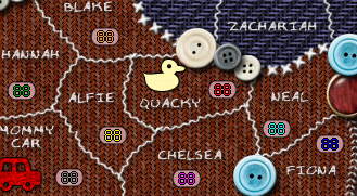
black:
blue:
i'd still go for pink but let's hear what you all think.
black:
blue:
i'd still go for pink but let's hear what you all think.
“In the beginning God said, the four-dimensional divergence of an antisymmetric, second rank tensor equals zero, and there was light, and it was good. And on the seventh day he rested.”- Michio Kaku
-

DiM
- Posts: 10415
- Joined: Wed Feb 14, 2007 6:20 pm
- Location: making maps for scooby snacks


Re: Patch Wars [14.Dec.11] - V8 - p1&9
![]() by isaiah40 on Fri Dec 23, 2011 10:46 am
by isaiah40 on Fri Dec 23, 2011 10:46 am
I believe that the pink works the best.
-
isaiah40
- Posts: 3990
- Joined: Mon Aug 27, 2007 7:14 pm


Re: Patch Wars [14.Dec.11] - V8 - p1&9
![]() by DiM on Fri Dec 23, 2011 10:46 am
by DiM on Fri Dec 23, 2011 10:46 am
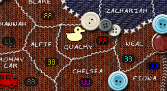
as for the casper pattern i think it's the size of the squares that bothers you. so how about if i decrease their size like so:
now:
half size:
now:
half size:
“In the beginning God said, the four-dimensional divergence of an antisymmetric, second rank tensor equals zero, and there was light, and it was good. And on the seventh day he rested.”- Michio Kaku
-
DiM
- Posts: 10415
- Joined: Wed Feb 14, 2007 6:20 pm
- Location: making maps for scooby snacks
Re: Patch Wars [14.Dec.11] - V8 - p1&9
![]() by koontz1973 on Fri Dec 23, 2011 11:02 am
by koontz1973 on Fri Dec 23, 2011 11:02 am
The black looks nice but the pink works the best. As for the size of pattern, the smaller one looks better as it sits well with the ones around it.

-

koontz1973
- Posts: 6960
- Joined: Thu Jan 01, 2009 10:57 am


Re: Patch Wars [14.Dec.11] - V8 - p1&9
![]() by natty dread on Fri Dec 23, 2011 11:05 am
by natty dread on Fri Dec 23, 2011 11:05 am
The blue could work if it was lighter.
-
natty dread
- Posts: 12877
- Joined: Fri Feb 08, 2008 8:58 pm
- Location: just plain fucked
Re: Patch Wars [14.Dec.11] - V8 - p1&9
![]() by AndyDufresne on Fri Dec 23, 2011 11:36 am
by AndyDufresne on Fri Dec 23, 2011 11:36 am
natty_dread wrote:The blue could work if it was lighter.
It might. But I'm probably quite satisfied with his pink version.
--Andy
-

AndyDufresne
- Posts: 24919
- Joined: Fri Mar 03, 2006 8:22 pm
- Location: A Banana Palm in Zihuatanejo

Re: Patch Wars [14.Dec.11] - V8 - p1&9
![]() by DiM on Fri Dec 23, 2011 12:42 pm
by DiM on Fri Dec 23, 2011 12:42 pm
ok, then pink stays and i'll also implement the reduced squares for the casper patch.
“In the beginning God said, the four-dimensional divergence of an antisymmetric, second rank tensor equals zero, and there was light, and it was good. And on the seventh day he rested.”- Michio Kaku
-
DiM
- Posts: 10415
- Joined: Wed Feb 14, 2007 6:20 pm
- Location: making maps for scooby snacks
Re: Patch Wars [14.Dec.11] - V8 - p1&9
![]() by cairnswk on Fri Dec 23, 2011 4:30 pm
by cairnswk on Fri Dec 23, 2011 4:30 pm
DiM wrote:ok, then pink stays and i'll also implement the reduced squares for the casper patch.
That's a bit fast, eh Dim? Less than 1 day for consideration by others in the foundry?
I know you want pink 'coz you've got a little girl, and Natty did offer that
The blue could work if it was lighter.
Where is the option of light blue that i gave...not considered eh?
The colours that work really well as parts of the overall design are light blue R201 G241 B243

And i'd like to see how the small sqaures work when i see them in the overall design. You obviously don't want to change anything!
* Pearl Harbour * Waterloo * Forbidden City * Jamaica * Pot Mosbi
-
cairnswk
- Posts: 11510
- Joined: Sat Feb 03, 2007 8:32 pm
- Location: Australia
Re: Patch Wars [14.Dec.11] - V8 - p1&9
![]() by DiM on Fri Dec 23, 2011 4:34 pm
by DiM on Fri Dec 23, 2011 4:34 pm
cairnswk wrote:You obviously don't want to change anything!
say what?
i just provided several versions of army boxes so you can't say i haven't tried.
also i tweaked the square pattern and said i will implement that change. so how can you say i don't want to change anything when i already changed something?
it's absurd.
PS: i still think the pink looks better than your light blue because the pink shade i used is more discreet. plus, in my head, it fits better with the theme.
“In the beginning God said, the four-dimensional divergence of an antisymmetric, second rank tensor equals zero, and there was light, and it was good. And on the seventh day he rested.”- Michio Kaku
-
DiM
- Posts: 10415
- Joined: Wed Feb 14, 2007 6:20 pm
- Location: making maps for scooby snacks
Re: Patch Wars [14.Dec.11] - V8 - p1&9
![]() by cairnswk on Fri Dec 23, 2011 4:46 pm
by cairnswk on Fri Dec 23, 2011 4:46 pm
DiM wrote:cairnswk wrote:You obviously don't want to change anything!
say what?
i just provided several versions of army boxes so you can't say i haven't tried.
also i tweaked the square pattern and said i will implement that change. so how can you say i don't want to change anything when i already changed something?
it's absurd.
PS: i still think the pink looks better than your light blue because the pink shade i used is more discreet. plus, in my head, it fits better with the theme.
the reason i said that was because you didn't consider the light blue in the your round of options, you didn't offer another stitch style pattern apart from reducing the checker size, and one day later decided to push your way through by announcing pink as the go with a reduced size same pattern.
Talk about absurd. yes in your head it fits better coz you'ge got a girl.
Dim, you have often credited me with having good colour aesthetic on my maps.
I am trying to get this colour aspect into your head and improve your map, but you're being stubborn. That's why i said it.
But you obviously know everything as being best, so go ahead and do pink. What do i know?!
* Pearl Harbour * Waterloo * Forbidden City * Jamaica * Pot Mosbi
-
cairnswk
- Posts: 11510
- Joined: Sat Feb 03, 2007 8:32 pm
- Location: Australia
Re: Patch Wars [14.Dec.11] - V8 - p1&9
![]() by DiM on Fri Dec 23, 2011 5:00 pm
by DiM on Fri Dec 23, 2011 5:00 pm
i think you're being a bit extreme here. i haven't said i know best and i haven't denied changes.
i've only expressed my opinion and i have provided alternatives and compromises.
i'm sorry that's not good enough for you and you feel the need to snap like that.
it's impossible to please each and every person especially when it comes to such a subjective thing as graphics. you should know that.
you're the only person who complained about the casper patch. i provided a compromise. i think that's good enough.
you wanted different army boxes. i came up with 2 alternatives and you came with a 3rd. i still think the initial pink is the best choice. not all feedback gets implemented, sometimes we just fiddle with choices and come back to the original idea.
“In the beginning God said, the four-dimensional divergence of an antisymmetric, second rank tensor equals zero, and there was light, and it was good. And on the seventh day he rested.”- Michio Kaku
-
DiM
- Posts: 10415
- Joined: Wed Feb 14, 2007 6:20 pm
- Location: making maps for scooby snacks
Re: Patch Wars [14.Dec.11] - V8 - p1&9
![]() by zimmah on Mon Dec 26, 2011 5:38 am
by zimmah on Mon Dec 26, 2011 5:38 am
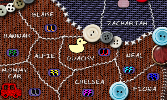
DiM wrote:
that works for me, nice job.
- Click image to enlarge.

-

zimmah
- Posts: 1652
- Joined: Fri Jun 01, 2007 12:43 pm
- Location: VDLL


Re: Patch Wars [14.Dec.11] - V8 - p1&9
![]() by zimmah on Mon Dec 26, 2011 5:40 am
by zimmah on Mon Dec 26, 2011 5:40 am
natty_dread wrote:koontz1973 wrote:a lose thread or two.
Loose.
lool
- Click image to enlarge.
-
zimmah
- Posts: 1652
- Joined: Fri Jun 01, 2007 12:43 pm
- Location: VDLL
Re: Patch Wars [14.Dec.11] - V8 - p1&9
![]() by zimmah on Mon Dec 26, 2011 5:50 am
by zimmah on Mon Dec 26, 2011 5:50 am
cairnswk wrote:DiM wrote:ok, then pink stays and i'll also implement the reduced squares for the casper patch.
That's a bit fast, eh Dim? Less than 1 day for consideration by others in the foundry?
I know you want pink 'coz you've got a little girl, and Natty did offer thatThe blue could work if it was lighter.
Where is the option of light blue that i gave...not considered eh?The colours that work really well as parts of the overall design are light blue R201 G241 B243
And i'd like to see how the small sqaures work when i see them in the overall design. You obviously don't want to change anything!
just because you hate pink doesn't mean pink is bad. it works for visibility and fits the theme. and i think the light blue you used as an example looks out of place and i think cyan may not even be clearly visible on that one.
as for the size of the squares, i slightly prefer the smaller ones but they both look fine to me.
also about DiM not willing to chance anything, i think DiM is among the best mapmakers in this aspect as even when he doesn't like it he's willing to change 95% of his original map idea's if the MAYORITY of the community wants it. yes, he'll give his own opinion too and he can be a little disappointed that his artistic idea's do not get the love he expected, but that's just normal, he spent a lot of times at his maps and ideas and just to get critics about it can be hard, but DiM always tries to make the best maps possible that also are accepted by the community.
and if i made a map i wouldn't change something just because 1 person wants it different while a number of people have said it's fine like it is.
- Click image to enlarge.
-
zimmah
- Posts: 1652
- Joined: Fri Jun 01, 2007 12:43 pm
- Location: VDLL
Re: Patch Wars [14.Dec.11] - V8 - p1&9
![]() by zimmah on Mon Dec 26, 2011 5:51 am
by zimmah on Mon Dec 26, 2011 5:51 am
cairnswk wrote:DiM wrote:cairnswk wrote:You obviously don't want to change anything!
say what?
i just provided several versions of army boxes so you can't say i haven't tried.
also i tweaked the square pattern and said i will implement that change. so how can you say i don't want to change anything when i already changed something?
it's absurd.
PS: i still think the pink looks better than your light blue because the pink shade i used is more discreet. plus, in my head, it fits better with the theme.
the reason i said that was because you didn't consider the light blue in the your round of options, you didn't offer another stitch style pattern apart from reducing the checker size, and one day later decided to push your way through by announcing pink as the go with a reduced size same pattern.
Talk about absurd. yes in your head it fits better coz you'ge got a girl.
Dim, you have often credited me with having good colour aesthetic on my maps.
I am trying to get this colour aspect into your head and improve your map, but you're being stubborn. That's why i said it.
But you obviously know everything as being best, so go ahead and do pink. What do i know?!
dude, pink goes very well with brown.
- Click image to enlarge.
-
zimmah
- Posts: 1652
- Joined: Fri Jun 01, 2007 12:43 pm
- Location: VDLL
Re: Patch Wars [14.Dec.11] - V8 - p1&9
![]() by firsal901 on Mon Dec 26, 2011 6:17 am
by firsal901 on Mon Dec 26, 2011 6:17 am
I think its kinda cluttered. No on this one.
They hate you as much as you hate them
-

firsal901
- Posts: 193
- Joined: Thu Jul 17, 2008 3:33 am
- Location: Laguna, Philippines (Google it)


Re: Patch Wars [14.Dec.11] - V8 - p1&9
![]() by DiM on Mon Dec 26, 2011 12:58 pm
by DiM on Mon Dec 26, 2011 12:58 pm
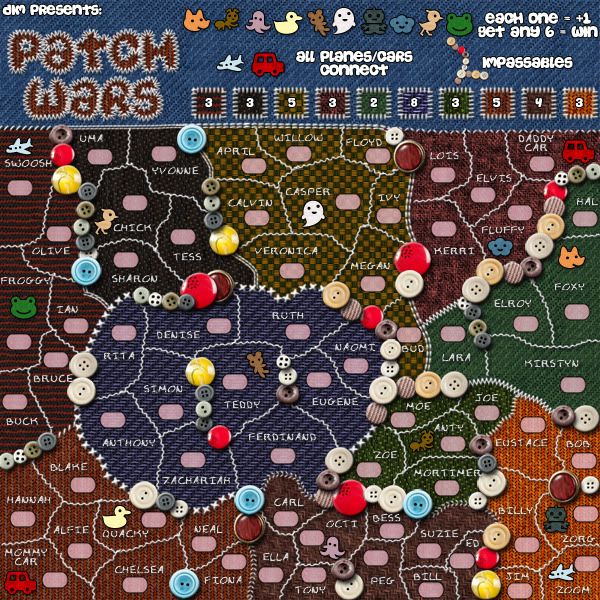
V9:
Large:
Small:
Large:
- Click image to enlarge.
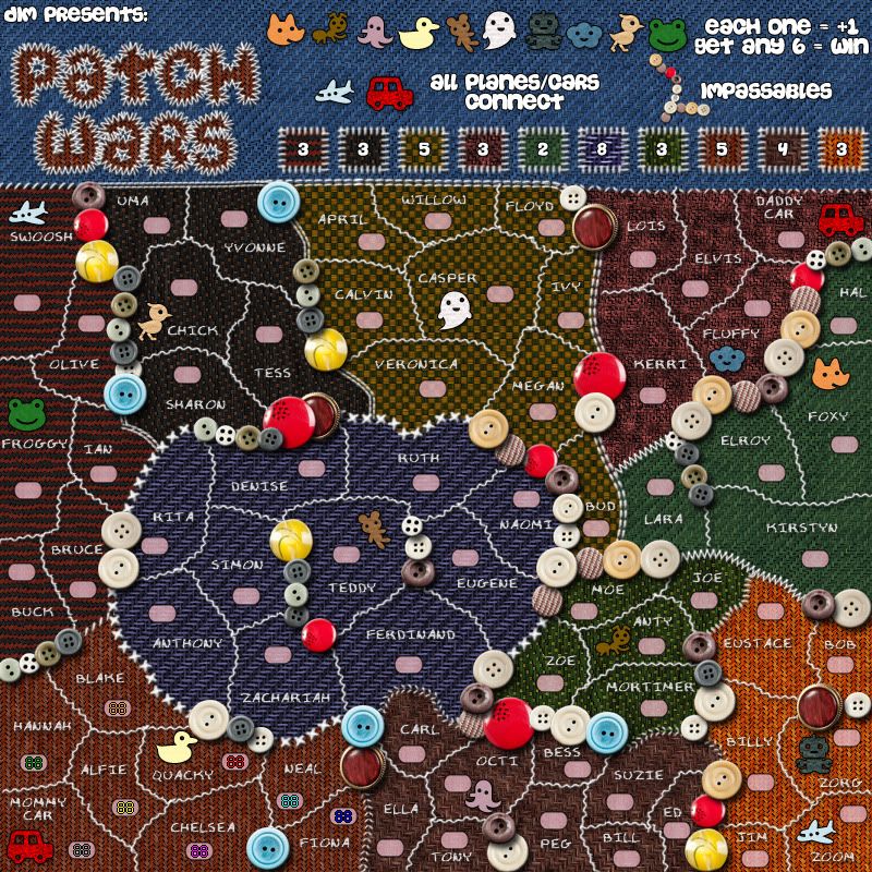
Small:
- Click image to enlarge.
Last edited by DiM on Mon Dec 26, 2011 1:37 pm, edited 2 times in total.
“In the beginning God said, the four-dimensional divergence of an antisymmetric, second rank tensor equals zero, and there was light, and it was good. And on the seventh day he rested.”- Michio Kaku
-
DiM
- Posts: 10415
- Joined: Wed Feb 14, 2007 6:20 pm
- Location: making maps for scooby snacks
Re: Patch Wars [14.Dec.11] - V8 - p1&9
![]() by zimmah on Mon Dec 26, 2011 1:02 pm
by zimmah on Mon Dec 26, 2011 1:02 pm
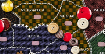
is it an optical illusion or is the color on the casper zone different on the small map?
it appears more yellowish
not that it matters, but it's just weird.
it appears more yellowish
not that it matters, but it's just weird.
- Click image to enlarge.
-
zimmah
- Posts: 1652
- Joined: Fri Jun 01, 2007 12:43 pm
- Location: VDLL
Re: Patch Wars [26.Dec.11] - V9 - p1&12
![]() by DiM on Mon Dec 26, 2011 1:24 pm
by DiM on Mon Dec 26, 2011 1:24 pm
fixed in the image above.
“In the beginning God said, the four-dimensional divergence of an antisymmetric, second rank tensor equals zero, and there was light, and it was good. And on the seventh day he rested.”- Michio Kaku
-
DiM
- Posts: 10415
- Joined: Wed Feb 14, 2007 6:20 pm
- Location: making maps for scooby snacks
Re: Patch Wars [26.Dec.11] - V9 - p1&12
![]() by zimmah on Mon Dec 26, 2011 1:28 pm
by zimmah on Mon Dec 26, 2011 1:28 pm
DiM wrote:fixed in the image above.
oh and just for consistency, the legend icon still shows the old big yellowish squares on both small and large map.
that being said, is it possible to give all of those icons a different stitch, that matches the stitch of the zone border, so that it's even easier to differentiate them?
i'm not sure how it will affect the overall style of the map as i don't want to break it, but especially the legends for quaky and fluffy on the small map (but even a bit on the large map) look very alike, and i believe using different stitches may improve the 'readability' of the legend. just a small suggestion.
oh and also it bothers me a little that all the buttons of the same type and size are exactly in the same position, could you rotate some of them so that they don't look unrealistically perfect? if that makes any sense? i mean like all the white buttons have their holes like so / in exactly the same angle and all the cyan ones are like so -- in the same angle, so why not just rotate them even if it's just 2 or 3 degrees? because i have never seen any perfect stitching like that and if it's supposed to be perfectly aligned then you should align all the buttons to be aligned regardless of color and shape.
Last edited by zimmah on Mon Dec 26, 2011 1:40 pm, edited 1 time in total.
- Click image to enlarge.
-
zimmah
- Posts: 1652
- Joined: Fri Jun 01, 2007 12:43 pm
- Location: VDLL
Re: Patch Wars [26.Dec.11] - V9 - p1&12
![]() by DiM on Mon Dec 26, 2011 1:38 pm
by DiM on Mon Dec 26, 2011 1:38 pm
fixed  see image above.
“In the beginning God said, the four-dimensional divergence of an antisymmetric, second rank tensor equals zero, and there was light, and it was good. And on the seventh day he rested.”- Michio Kaku
-
DiM
- Posts: 10415
- Joined: Wed Feb 14, 2007 6:20 pm
- Location: making maps for scooby snacks
Re: Patch Wars [26.Dec.11] - V9 - p1&12
![]() by zimmah on Mon Dec 26, 2011 1:41 pm
by zimmah on Mon Dec 26, 2011 1:41 pm
DiM wrote:fixed
added some more nitpicking, sorry dim
- Click image to enlarge.
-
zimmah
- Posts: 1652
- Joined: Fri Jun 01, 2007 12:43 pm
- Location: VDLL
Who is online
Users browsing this forum: No registered users
|
|||||||
| Conquer Club is not associated with RISK online in any way. Copyright © 2006-2024 by Big Wham LLC | |||||||