Conquer Club

American Civil War [Quenched]

Care to peruse completed maps? Take a stroll through the Atlas.

Moderator: Cartographers

Forum rules
Please read the Community Guidelines before posting.

Postby cairnswk on Thu Nov 22, 2007 10:20 am

Elijah S wrote:Suzy-
Thanks for your support in this, but the entire thing has left such a bitter taste in my mouth that I think it's best for me to get away from this site for a while, maybe permanently.
I don't even want to make moves in my games at this point. You have my password, if you don't mind?

I've tried to make everyone happy, addressing each issue promptly, sometimes even compromising when I didn't agree.

For several of the foundry members to wait until now to completely pan my work is something I really don't get, but I feel like I've been insulted and humiliated... and for what? -The "honor" of contributing a map to a site I truly enjoyed?

Screw it. I'll save my $25 and get back to some projects I've had on hold.


Elijah S....all i can say to you is .....Welcome to the Foundry Mate.
and you know exactly what i mean by this! You thought i was harsh on you! :wink:
Image
* Pearl Harbour * Waterloo * Forbidden City * Jamaica * Pot Mosbi
User avatar
Private cairnswk
 
Posts: 11510
Joined: Sat Feb 03, 2007 8:32 pm
Location: Australia

Postby yamahafazer on Fri Nov 23, 2007 4:55 am

I think the colours mibi sujested look good.... there much more pleasing to the eye...
Image
User avatar
Private 1st Class yamahafazer
 
Posts: 211
Joined: Fri Aug 24, 2007 9:56 am

Postby Elijah S on Fri Nov 23, 2007 2:38 pm

yamahafazer wrote:I think the colours mibi sujested look good.... there much more pleasing to the eye...


I think so too... I'll mess with it and see what I come up with.
Sergeant 1st Class Elijah S
 
Posts: 672
Joined: Wed May 09, 2007 6:24 pm

Postby Kaplowitz on Sun Nov 25, 2007 2:19 pm

I agree! 8)
Image
User avatar
Private 1st Class Kaplowitz
 
Posts: 3088
Joined: Tue May 01, 2007 5:11 pm

Postby Unit_2 on Sun Nov 25, 2007 2:22 pm

that is a really good idea mibi, try that.
Image
User avatar
Corporal 1st Class Unit_2
 
Posts: 1834
Joined: Sun Jan 14, 2007 12:59 pm
Location: Pennsylvania, U.S.A, North America, Earth, Milky Way, Universe.

Postby Coleman on Mon Nov 26, 2007 2:02 pm

Which border color do you prefer?
    A) The one with all light blue borders. - 50% - [ 15 ]
    B) The one with red, white and blue borders. - 50% - [ 15 ]
Total Votes : 30
User avatar
Sergeant Coleman
 
Posts: 5402
Joined: Tue Jan 02, 2007 10:36 pm
Location: Midwest

Postby Elijah S on Wed Nov 28, 2007 7:37 am

Image
Sergeant 1st Class Elijah S
 
Posts: 672
Joined: Wed May 09, 2007 6:24 pm

Postby gimil on Wed Nov 28, 2007 7:51 am

Magnificent, all i ask it thst you dull te sea texture jsut a little to blend it better.

then quench
What do you know about map making, bitch?

natty_dread wrote:I was wrong


Top Score:2403
User avatar
Corporal 1st Class gimil
 
Posts: 8599
Joined: Sat Mar 03, 2007 12:42 pm
Location: United Kingdom (Scotland)

Postby yeti_c on Wed Nov 28, 2007 8:09 am

Elijah S wrote:Image


Wow - where did that come from?!?!

That looks good - I bet you're actually glad you got some negative comments earlier...

C.
Image
Highest score : 2297
User avatar
Lieutenant yeti_c
 
Posts: 9624
Joined: Thu Jan 04, 2007 9:02 am

Postby reverend_kyle on Wed Nov 28, 2007 11:31 am

Oh man, I guess you can't please everyone, but I liked it so much more before. It just felt historically accurate. From the title with the mixture of the american and confederate flag to the colors of continents being based off of the uniform colors, but oh well if everyone else likes it this way I must be going crazy.
DANCING MUSTARD FOR POOP IN '08!
User avatar
Sergeant reverend_kyle
 
Posts: 9250
Joined: Tue Mar 21, 2006 4:08 pm
Location: 1000 post club

Postby AndrewB on Wed Nov 28, 2007 12:17 pm

Looks a lot better, Elijah.

Some comments:

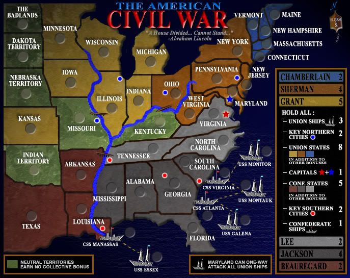
1. Font is a way more readable now, but can we make ships labels to be the same font size as states labels? For that you might need to spread ships a little.
2. Ships icons should not be touching land.
3. It is not clear if CSS Virginia/CSS Atlanta/CSS Manassas connect to mainland at all.
4. You should keep the flags you had before. You can either add them to the title, or maybe even as a watermark background to the states.
5. You should try to get rid of small text size in the legend too. If text does not fit, try to re-phrase it. I.E change "Union States in addition to other bonuses" to "Union States total" or "All Union States". Look into World 2.1 for examples.
6. try to get rid of vertical line, which goes from "Hold All" down to every combination, and push the legend labels to the left.
7. The river border in Missouri has white pixels in it. The river border in Arkansas has black pixels in it. In Ohio it actually has both white and black pixels. It should be consistent along all river banks. I suggest picking black, it looks sharper.
8. Some borders are quite pixelated. For example look into border between Kentucky and Tennessee.
9. Border lines should have same thickness. For example compare border between Minnesota and Iowa and border between New York and Pennsylvania.
10. Beauregard color on map is different color, then Beauregard color in legend.
11. Lee's and Jackson colors are quite close, can you pick another color for one of them?
12. The icon in the top right corner (your coat of arms) is skewed slightly in counter-clockwise direction.
13. Border in Kansas-Nebraska-Missouri corner does not represent the actual border line there. And as results looks quite "blocky", when in reality it is a river border.
14. The line which connects land masses to the water has different sharpness. For example compare left Michigan shoreline to its right shoreline. Same happens around Florida and some other places.
Last edited by AndrewB on Wed Nov 28, 2007 12:38 pm, edited 1 time in total.
Image
User avatar
Lieutenant AndrewB
 
Posts: 1814
Joined: Mon Jun 12, 2006 5:02 pm
Location: Edmonton, Canada, MST

Postby Elijah S on Wed Nov 28, 2007 12:36 pm

If I don't comment after each post it's not that I'm ignoring you... I'm merely waiting for more comments in order to get a consensus of what to address...

Gimil - Thanks! And, the water texture softening is an easy fix.

yedi_c - lol... "no comment"

rev. kyle - I knew this would come up because this map is a departure from the other, but I think this one is far more graphically sound.

andrew b - I printed out your suggestions and will look at each issue.
Sergeant 1st Class Elijah S
 
Posts: 672
Joined: Wed May 09, 2007 6:24 pm

Postby AndrewB on Wed Nov 28, 2007 12:39 pm

Elijah S wrote:
andrew b - I printed out your suggestions and will look at each issue.


Thanks Elijah!

Keep up the great job. I have changed my suggestions couple of time. Please double check that you got all of them ;)
Image
User avatar
Lieutenant AndrewB
 
Posts: 1814
Joined: Mon Jun 12, 2006 5:02 pm
Location: Edmonton, Canada, MST

Postby mibi on Wed Nov 28, 2007 1:03 pm

Elijah S wrote:Image


You just took this map to the next level, nice work.


but uh.. the river is still on the 'previous level'. :wink:
User avatar
Captain mibi
 
Posts: 3350
Joined: Thu Mar 01, 2007 8:19 pm
Location: The Great State of Vermont

Postby Coleman on Wed Nov 28, 2007 1:10 pm

I'm going to agree here about the river, but like kyle I'm a little sad. I don't feel the Union and the Confederate states contrast enough anymore. :(
User avatar
Sergeant Coleman
 
Posts: 5402
Joined: Tue Jan 02, 2007 10:36 pm
Location: Midwest

Postby Elijah S on Wed Nov 28, 2007 1:21 pm

Coleman wrote:I'm going to agree here about the river, but like kyle I'm a little sad. I don't feel the Union and the Confederate states contrast enough anymore. :(


When all of the other things are fixed (or left as they are with explanation)
I'll try to work the other color scheme into it and put it to a poll.

I liked the "blue - gray" of the previous version too, but agreed with mibi's suggestion to go with more of a sepia feel to capture the era.

As for the river, will someone please give me some suggestions or more clear reason why they dislike it?
Sergeant 1st Class Elijah S
 
Posts: 672
Joined: Wed May 09, 2007 6:24 pm

Postby Coleman on Wed Nov 28, 2007 1:28 pm

It contrasts with the ocean too much. In life we all know rivers and oceans aren't the same color but in maps for some reason they look better that way. Or at least the majority feels so.
User avatar
Sergeant Coleman
 
Posts: 5402
Joined: Tue Jan 02, 2007 10:36 pm
Location: Midwest

...

Postby Suzy1 on Wed Nov 28, 2007 2:08 pm

Elijah, this is a Spectacular map. You know that I always liked the other one too. This one has a much sharper appeal. The colors are different, but work for this map beautifully. I loved the flags in the other map as it seems several others did too. You definitely have turned this map around. Genius work. I love it.
Corporal 1st Class Suzy1
 
Posts: 269
Joined: Sat May 12, 2007 3:25 am

Postby spiesr on Wed Nov 28, 2007 2:43 pm

Perhaps you should use the ocean for the river, but slightly lighter as you go up?
User avatar
Captain spiesr
 
Posts: 2809
Joined: Mon May 08, 2006 10:52 am
Location: South Dakota

Postby Coleman on Wed Nov 28, 2007 2:47 pm

spiesr wrote:Perhaps you should use the ocean for the river, but slightly lighter as you go up?
What's funny is the opposite should be what happens but there is a ship where the river would normally empty into the ocean so we can't see that part.
User avatar
Sergeant Coleman
 
Posts: 5402
Joined: Tue Jan 02, 2007 10:36 pm
Location: Midwest

Postby unriggable on Wed Nov 28, 2007 3:40 pm

Move those ships near louisiana a bit to the left so the river can empty into the ocean.
Image
User avatar
Cook unriggable
 
Posts: 8037
Joined: Thu Feb 08, 2007 9:49 pm

Postby yamahafazer on Thu Nov 29, 2007 6:39 am

ABSOLUTLY LOVE this new map... good on ya Elijah.

Just 2 things:

1. the textur in the see ubroply ends.

2. I think all you need to do with the river is use the same colour and textur as the see in it but make it very slightly brighter.. but not much.

Great work Elijah
Image
User avatar
Private 1st Class yamahafazer
 
Posts: 211
Joined: Fri Aug 24, 2007 9:56 am

Postby oaktown on Thu Nov 29, 2007 9:23 am

I miss the blue/grey as well, but this really does look better. Especially the ocean and how it fades to a solid background color. Very nice.

River is indeed ugly. In addition to bringing down the color, what if the land beveled off at the river's edges, just as it does at the shoreline? It would give the sense of a depression, and help give the impression that the bridges really pop out over the rivers.
Image
User avatar
Captain oaktown
 
Posts: 4451
Joined: Sun Dec 03, 2006 9:24 pm
Location: majorcommand

Postby DukeToshiro on Thu Nov 29, 2007 11:30 am

I like the map, but I think Vicksburg should have been a key Southern City.
User avatar
Captain DukeToshiro
 
Posts: 103
Joined: Wed Sep 12, 2007 5:17 pm
Location: Oklahoma

Postby reverend_kyle on Thu Nov 29, 2007 12:45 pm

I was just trying to figure out a way to resolve the Blue/Grey with the sepia feel and I realized...

Why not do both. I noticed your greys are mostly the same, but the blue colors have changed. Is there a way you could bring back the old colors with a sepia tint to it.
DANCING MUSTARD FOR POOP IN '08!
User avatar
Sergeant reverend_kyle
 
Posts: 9250
Joined: Tue Mar 21, 2006 4:08 pm
Location: 1000 post club

PreviousNext

Return to The Atlas

Who is online

Users browsing this forum: No registered users