i prefer the white print - the blueprint idea is fun, but this may prove easier on the eyes.
More arsonists: good.
New colors: good.
Armies x 20: could be good, I think... keep playing with it.
I'm still concerned about the language of "Own a whole colored block." Since to me a block is a single square/rectangle of buildings, perhaps another word for "block" could be found? Neighborhood? Or "Hold all lots of same color"? Parcels?
CC City Mogul [Quenched]
Moderator: Cartographers
![]() by Kaplowitz on Sat Feb 02, 2008 6:13 pm
by Kaplowitz on Sat Feb 02, 2008 6:13 pm
i like the blue better. White hurts my eyes. Maybe a light blue would work best....or a different color all together? light green? i no one uses greenprints...but no one loses their business by rolling dice (damn casinos!)

-

 Kaplowitz
- Posts: 3088
- Joined: Tue May 01, 2007 5:11 pm


![]() by DiM on Sat Feb 02, 2008 6:27 pm
by DiM on Sat Feb 02, 2008 6:27 pm
oaktown wrote:i prefer the white print - the blueprint idea is fun, but this may prove easier on the eyes.
More arsonists: good.
New colors: good.
Armies x 20: could be good, I think... keep playing with it.
I'm still concerned about the language of "Own a whole colored block." Since to me a block is a single square/rectangle of buildings, perhaps another word for "block" could be found? Neighborhood? Or "Hold all lots of same color"? Parcels?
the big armies are good. i don't know the exact odds but surely killing 30 witha 50 is easier than killing 3 with a 5.
as for the coloured block i'm open for suggestions. neighbourhood sounds good.
“In the beginning God said, the four-dimensional divergence of an antisymmetric, second rank tensor equals zero, and there was light, and it was good. And on the seventh day he rested.”- Michio Kaku
-

DiM
- Posts: 10415
- Joined: Wed Feb 14, 2007 6:20 pm
- Location: making maps for scooby snacks


![]() by DiM on Sat Feb 02, 2008 6:28 pm
by DiM on Sat Feb 02, 2008 6:28 pm
Kaplowitz wrote:i like the blue better. White hurts my eyes. Maybe a light blue would work best....or a different color all together? light green? i no one uses greenprints...but no one loses their business by rolling dice (damn casinos!)
i liked blue better but armies and icons are harder to see. especially cyan.
if i put a green print then green armies and icons will be hard to see.
technically white provides the best readability.
“In the beginning God said, the four-dimensional divergence of an antisymmetric, second rank tensor equals zero, and there was light, and it was good. And on the seventh day he rested.”- Michio Kaku
-
DiM
- Posts: 10415
- Joined: Wed Feb 14, 2007 6:20 pm
- Location: making maps for scooby snacks
![]() by gimil on Sat Feb 02, 2008 6:43 pm
by gimil on Sat Feb 02, 2008 6:43 pm
DiM wrote:Kaplowitz wrote:i like the blue better. White hurts my eyes. Maybe a light blue would work best....or a different color all together? light green? i no one uses greenprints...but no one loses their business by rolling dice (damn casinos!)
i liked blue better but armies and icons are harder to see. especially cyan.
if i put a green print then green armies and icons will be hard to see.
technically white provides the best readability.
I know this is a total change of idea, but a blackboard may be an intresting idea for this.
What do you know about map making, bitch?
Top Score:2403
natty_dread wrote:I was wrong
Top Score:2403
-

gimil
- Posts: 8599
- Joined: Sat Mar 03, 2007 12:42 pm
- Location: United Kingdom (Scotland)


![]() by DiM on Sat Feb 02, 2008 6:46 pm
by DiM on Sat Feb 02, 2008 6:46 pm
gimil wrote:DiM wrote:Kaplowitz wrote:i like the blue better. White hurts my eyes. Maybe a light blue would work best....or a different color all together? light green? i no one uses greenprints...but no one loses their business by rolling dice (damn casinos!)
i liked blue better but armies and icons are harder to see. especially cyan.
if i put a green print then green armies and icons will be hard to see.
technically white provides the best readability.
I know this is a total change of idea, but a blackboard may be an intresting idea for this.
no way, black will make everything hard to see (and give me a depressed feeling)
plus, how do you play on a blackboard? do you take it off the wall and put it on the floor?
“In the beginning God said, the four-dimensional divergence of an antisymmetric, second rank tensor equals zero, and there was light, and it was good. And on the seventh day he rested.”- Michio Kaku
-
DiM
- Posts: 10415
- Joined: Wed Feb 14, 2007 6:20 pm
- Location: making maps for scooby snacks
![]() by gimil on Sat Feb 02, 2008 7:09 pm
by gimil on Sat Feb 02, 2008 7:09 pm
DiM wrote:gimil wrote:DiM wrote:Kaplowitz wrote:i like the blue better. White hurts my eyes. Maybe a light blue would work best....or a different color all together? light green? i no one uses greenprints...but no one loses their business by rolling dice (damn casinos!)
i liked blue better but armies and icons are harder to see. especially cyan.
if i put a green print then green armies and icons will be hard to see.
technically white provides the best readability.
I know this is a total change of idea, but a blackboard may be an intresting idea for this.
no way, black will make everything hard to see (and give me a depressed feeling)
plus, how do you play on a blackboard? do you take it off the wall and put it on the floor?
Not all blackboards are wal mounted
What do you know about map making, bitch?
Top Score:2403
natty_dread wrote:I was wrong
Top Score:2403
-
gimil
- Posts: 8599
- Joined: Sat Mar 03, 2007 12:42 pm
- Location: United Kingdom (Scotland)
![]() by Kaplowitz on Sat Feb 02, 2008 7:30 pm
by Kaplowitz on Sat Feb 02, 2008 7:30 pm
DiM wrote:gimil wrote:DiM wrote:Kaplowitz wrote:i like the blue better. White hurts my eyes. Maybe a light blue would work best....or a different color all together? light green? i no one uses greenprints...but no one loses their business by rolling dice (damn casinos!)
i liked blue better but armies and icons are harder to see. especially cyan.
if i put a green print then green armies and icons will be hard to see.
technically white provides the best readability.
I know this is a total change of idea, but a blackboard may be an intresting idea for this.
no way, black will make everything hard to see (and give me a depressed feeling)
plus, how do you play on a blackboard? do you take it off the wall and put it on the floor?
I was thinking a light green. Almost white.
-
Kaplowitz
- Posts: 3088
- Joined: Tue May 01, 2007 5:11 pm
![]() by DiM on Sat Feb 02, 2008 7:41 pm
by DiM on Sat Feb 02, 2008 7:41 pm
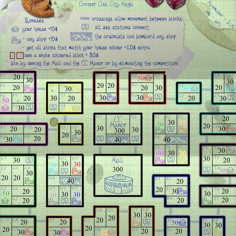
Kaplowitz wrote:
I was thinking a light green. Almost white.
here you go. light green.
“In the beginning God said, the four-dimensional divergence of an antisymmetric, second rank tensor equals zero, and there was light, and it was good. And on the seventh day he rested.”- Michio Kaku
-
DiM
- Posts: 10415
- Joined: Wed Feb 14, 2007 6:20 pm
- Location: making maps for scooby snacks
![]() by Kaplowitz on Sat Feb 02, 2008 7:49 pm
by Kaplowitz on Sat Feb 02, 2008 7:49 pm
I think everything is visible and it doesnt hurt my eyes! but the white border around the yellow font disappears. I htink its better than blue/white. Actually, i think any light color would work pretty well.
-
Kaplowitz
- Posts: 3088
- Joined: Tue May 01, 2007 5:11 pm
![]() by DiM on Sat Feb 02, 2008 7:55 pm
by DiM on Sat Feb 02, 2008 7:55 pm
Kaplowitz wrote:I think everything is visible and it doesnt hurt my eyes! but the white border around the yellow font disappears. I htink its better than blue/white. Actually, i think any light color would work pretty well.
ignore the big numbers. those are the neutral values and the starting armies. they won't be on the map. i just leave them as they are for oaktown to better see how the map plays.
“In the beginning God said, the four-dimensional divergence of an antisymmetric, second rank tensor equals zero, and there was light, and it was good. And on the seventh day he rested.”- Michio Kaku
-
DiM
- Posts: 10415
- Joined: Wed Feb 14, 2007 6:20 pm
- Location: making maps for scooby snacks
![]() by lanyards on Sat Feb 02, 2008 8:48 pm
by lanyards on Sat Feb 02, 2008 8:48 pm
I think the gameplay might be pretty fun, but I don't think all the extra items put on there are really necessary. I don't like the light green, the white was alright and so was the light blue, but not green. The graphics are fine minus the cookie and crumbs, finger prints, stains and smudges. The coffie mug aroung you and Yeti's signatures was fine though, and the folds in the paper look nice too. Looks like a fun map. 
--lanyards
--lanyards

WANT AN ADVANTAGE WHILE WORKING TOWARDS MEDALS?
https://www.conquerclub.com/forum/viewtopic.php?f=529&t=226714
-

lanyards
- Posts: 1378
- Joined: Sat Feb 24, 2007 1:31 am


 2
2


![]() by DiM on Sat Feb 02, 2008 8:53 pm
by DiM on Sat Feb 02, 2008 8:53 pm
fireedud wrote:I think I don't like the shadows of the paper is because they seem to be coming from two differetn sides.
well i have different gradient shadows on the map.
do this. take a piece of paper and measure it's height then do a fold one third from the bottom and 1 third from the top. you should have 2 folds like on the map. now stretch the paper on a table and you'll see the shadows fall like on my image. because of the folds you don't get an uniform shadow.
“In the beginning God said, the four-dimensional divergence of an antisymmetric, second rank tensor equals zero, and there was light, and it was good. And on the seventh day he rested.”- Michio Kaku
-
DiM
- Posts: 10415
- Joined: Wed Feb 14, 2007 6:20 pm
- Location: making maps for scooby snacks
![]() by DiM on Sat Feb 02, 2008 8:54 pm
by DiM on Sat Feb 02, 2008 8:54 pm
Kaplowitz wrote:Maybe you could put a shadow of a hand or something coming out of the top. LIke holding a pencil, or making a move or something.
nah. there's already too much extra stuff on the map.
“In the beginning God said, the four-dimensional divergence of an antisymmetric, second rank tensor equals zero, and there was light, and it was good. And on the seventh day he rested.”- Michio Kaku
-
DiM
- Posts: 10415
- Joined: Wed Feb 14, 2007 6:20 pm
- Location: making maps for scooby snacks
![]() by DiM on Sat Feb 02, 2008 8:57 pm
by DiM on Sat Feb 02, 2008 8:57 pm
lanyards wrote:I think the gameplay might be pretty fun, but I don't think all the extra items put on there are really necessary. I don't like the light green, the white was alright and so was the light blue, but not green. The graphics are fine minus the cookie and crumbs, finger prints, stains and smudges. The coffie mug aroung you and Yeti's signatures was fine though, and the folds in the paper look nice too. Looks like a fun map.
--lanyards
people asked for cookies and fingerprints and stuff to make it look like some kids are playing on their dads blueprint/whiteprint/greenprint.
to be honest i would remove the dice and the cookie and leave the rest.
“In the beginning God said, the four-dimensional divergence of an antisymmetric, second rank tensor equals zero, and there was light, and it was good. And on the seventh day he rested.”- Michio Kaku
-
DiM
- Posts: 10415
- Joined: Wed Feb 14, 2007 6:20 pm
- Location: making maps for scooby snacks
![]() by FreeMan10 on Sat Feb 02, 2008 10:15 pm
by FreeMan10 on Sat Feb 02, 2008 10:15 pm
I really like the green. Easy on the eyes, all the colors seem to be pretty readable (yellow's not very readable on anything light, but this is working OK).
I like the cookies & coffee stains, etc. Makes it look 'real'.
I think this is the most readable version of them all.
I like the cookies & coffee stains, etc. Makes it look 'real'.
I think this is the most readable version of them all.
-

FreeMan10
- Posts: 152
- Joined: Wed Jan 23, 2008 12:48 pm
- Location: On The Road


![]() by oaktown on Sun Feb 03, 2008 5:31 pm
by oaktown on Sun Feb 03, 2008 5:31 pm
alright, i have a gameplay concern related to the big army counts. And maybe I'm missing something, in which case you can set me straight DiM.
In Age of Might, it's become pretty clear that taking your opponents' castle is the way you win. Most spaces are worth 1/3 of an army per turn, while the castles give you a fat bonus. Whoever holds the most castles wins.
This map could have the same problem, only magnified. Let's say I start in B5... I can try hitting b4 or b6, trying to get to some shops or eventually hold an entire block. Of course, it just cost me hal of mystarting 50 armies to take out B6, so even with my +10 house bonus I'm in no position to do much of anything on my second turn.
Meanwhile, my opponent is sitting in P4 collecting armies. Three rounds into the game he sees that I'slogging through huge territories, and knows that I must be thin. So he hits two subways and takes my house. Game over for me.
If your intention is to take the standard game and multiply everything by 20, you need to multiply EVERYTHING by 20. Instead of being worth 1/3 of an army/turn, each and every space should be worth 7/turn. A player shouldn't be penalized for hitting a space like P3, which is going to cost a ton of armies to hit with zero return.
And when you think about it, every territory is real estate - shouldn't I collect rent for owning somebody else's house? When I think of it that way, I think that MY house shouldn't be bring me any income - that's where I live. It's my neighbor's house that should net me some cash each month.
-

oaktown
- Posts: 4451
- Joined: Sun Dec 03, 2006 9:24 pm
- Location: majorcommand


![]() by DiM on Sun Feb 03, 2008 5:49 pm
by DiM on Sun Feb 03, 2008 5:49 pm
oaktown wrote:alright, i have a gameplay concern related to the big army counts. And maybe I'm missing something, in which case you can set me straight DiM.
In Age of Might, it's become pretty clear that taking your opponents' castle is the way you win. Most spaces are worth 1/3 of an army per turn, while the castles give you a fat bonus. Whoever holds the most castles wins.
This map could have the same problem, only magnified. Let's say I start in B5... I can try hitting b4 or b6, trying to get to some shops or eventually hold an entire block. Of course, it just cost me hal of mystarting 50 armies to take out B6, so even with my +10 house bonus I'm in no position to do much of anything on my second turn.
Meanwhile, my opponent is sitting in P4 collecting armies. Three rounds into the game he sees that I'slogging through huge territories, and knows that I must be thin. So he hits two subways and takes my house. Game over for me.
If your intention is to take the standard game and multiply everything by 20, you need to multiply EVERYTHING by 20. Instead of being worth 1/3 of an army/turn, each and every space should be worth 7/turn. A player shouldn't be penalized for hitting a space like P3, which is going to cost a ton of armies to hit with zero return.
And when you think about it, every territory is real estate - shouldn't I collect rent for owning somebody else's house? When I think of it that way, I think that MY house shouldn't be bring me any income - that's where I live. It's my neighbor's house that should net me some cash each month.
i knew i was forgetting something. the terit bonus has to be upped also.
let me think cause i guess i got mixed up in multipliers and when i look at the map i see i made some things 20 times bigger and others just 10 times bigger. grr. edit// and for some just by 5
let's say like this.
house = +2 autodeploy (starts with 2)
shop = +2 (starts with 3)
sub starts with 3
non important terits start with 2
arsonist starts with 5
manor and mall start with 15.
whole block = +3
matching shops = +2
now multiplicating by 20 we get this:
house = +40 autodeploy (starts with 40)
shop = +40 (starts with 60)
sub starts with 60
non important terits start with 40
arsonist starts with 100
manor and mall start with 300.
whole block = +60
matching shops = +40
as for the terit # bonus it will be zero because i like the rent idea. how about each non important terit gives +10 as rent? and it's autodeployable cause you have to go collect it there.
“In the beginning God said, the four-dimensional divergence of an antisymmetric, second rank tensor equals zero, and there was light, and it was good. And on the seventh day he rested.”- Michio Kaku
-
DiM
- Posts: 10415
- Joined: Wed Feb 14, 2007 6:20 pm
- Location: making maps for scooby snacks
![]() by hulmey on Sun Feb 03, 2008 10:03 pm
by hulmey on Sun Feb 03, 2008 10:03 pm
i may seem reall pesimistic but this another map that is going to the bottom of the pile 
But good luck with it anyway!
But good luck with it anyway!
[img]http://img801.imageshack.us/img801/9761/41922610151374166770386.jpg[/mg]
-

hulmey
- Posts: 3742
- Joined: Fri Nov 03, 2006 7:33 am
- Location: Las Vegas


![]() by DiM on Sun Feb 03, 2008 10:06 pm
by DiM on Sun Feb 03, 2008 10:06 pm
hulmey wrote:i may seem reall pesimistic but this another map that is going to the bottom of the pile
But good luck with it anyway!
the bottom of what pile?
so far all my maps have been pretty successful and if i'm not mistaking you've expressed the same opinion about them also and you were wrong every time
“In the beginning God said, the four-dimensional divergence of an antisymmetric, second rank tensor equals zero, and there was light, and it was good. And on the seventh day he rested.”- Michio Kaku
-
DiM
- Posts: 10415
- Joined: Wed Feb 14, 2007 6:20 pm
- Location: making maps for scooby snacks


![]() by hulmey on Sun Feb 03, 2008 11:45 pm
by hulmey on Sun Feb 03, 2008 11:45 pm
DiM wrote:hulmey wrote:i may seem reall pesimistic but this another map that is going to the bottom of the pile
But good luck with it anyway!
the bottom of what pile?
so far all my maps have been pretty successful and if i'm not mistaking you've expressed the same opinion about them also and you were wrong every time
and your quite a cocky fella arent you
[img]http://img801.imageshack.us/img801/9761/41922610151374166770386.jpg[/mg]
-
hulmey
- Posts: 3742
- Joined: Fri Nov 03, 2006 7:33 am
- Location: Las Vegas
Who is online
Users browsing this forum: No registered users
|
|||||||
| Conquer Club is not associated with RISK online in any way. Copyright © 2006-2024 by Big Wham LLC | |||||||