gimil wrote:Pep im assuming this is the large map your currently working on?
Yep.
Moderator: Cartographers
![]() by pepperonibread on Sat Jun 28, 2008 2:22 pm
by pepperonibread on Sat Jun 28, 2008 2:22 pm
gimil wrote:Pep im assuming this is the large map your currently working on?


![]() by MeDeFe on Thu Jul 03, 2008 6:21 am
by MeDeFe on Thu Jul 03, 2008 6:21 am
saxitoxin wrote:Your position is more complex than the federal tax code. As soon as I think I understand it, I find another index of cross-references, exceptions and amendments I have to apply.
Timminz wrote:Yo mama is so classless, she could be a Marxist utopia.


![]() by pepperonibread on Thu Jul 03, 2008 3:39 pm
by pepperonibread on Thu Jul 03, 2008 3:39 pm
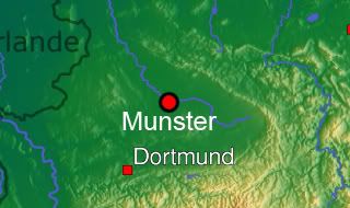
MeDeFe wrote:There are mountains north of Münster? I'll have to go check, I always thought this place was almost as flat as the Netherlands.
![]() by pepperonibread on Fri Jul 04, 2008 9:36 pm
by pepperonibread on Fri Jul 04, 2008 9:36 pm

![]() by edbeard on Fri Jul 04, 2008 10:00 pm
by edbeard on Fri Jul 04, 2008 10:00 pm


![]() by lanyards on Sat Jul 05, 2008 6:12 pm
by lanyards on Sat Jul 05, 2008 6:12 pm


 2
2

![]() by pepperonibread on Sat Jul 05, 2008 8:39 pm
by pepperonibread on Sat Jul 05, 2008 8:39 pm
lanyards wrote:The motto is a little hard to read. I think I like it better with just the symbol without the motto overtop of it. The rest of the map isdelicious.
--lanyards
![]() by ZeakCytho on Sat Jul 05, 2008 8:52 pm
by ZeakCytho on Sat Jul 05, 2008 8:52 pm


![]() by pepperonibread on Sat Jul 05, 2008 8:58 pm
by pepperonibread on Sat Jul 05, 2008 8:58 pm
ZeakCytho wrote:I think the whole crest needs work. It just doesn't have the same elegant feel that the rest of the map has.
Also, considering the significant changes for the better you're making, maybe make your signature the same size as Hoff's?
![]() by AndyDufresne on Sat Jul 05, 2008 9:01 pm
by AndyDufresne on Sat Jul 05, 2008 9:01 pm


![]() by pepperonibread on Sat Jul 05, 2008 9:08 pm
by pepperonibread on Sat Jul 05, 2008 9:08 pm
![]() by bob3603 on Mon Jul 07, 2008 1:47 am
by bob3603 on Mon Jul 07, 2008 1:47 am


![]() by pepperonibread on Mon Jul 07, 2008 3:01 pm
by pepperonibread on Mon Jul 07, 2008 3:01 pm
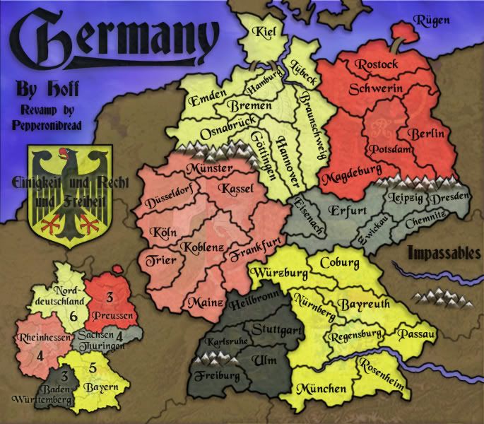
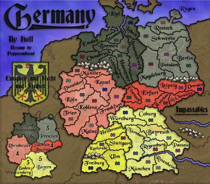
bob3603 wrote:Graphics look good and are much improved over the original (actually I like your "older" new version better than your "newer" new version, but both look good). If you are trying to keep the gameplay the same though there should be a connection between Leipzig and Magdeburg (A very important area in gameplay).
![]() by pepperonibread on Thu Jul 10, 2008 10:30 am
by pepperonibread on Thu Jul 10, 2008 10:30 am

![]() by bob3603 on Thu Jul 10, 2008 1:30 pm
by bob3603 on Thu Jul 10, 2008 1:30 pm
![]() by edbeard on Thu Jul 10, 2008 3:28 pm
by edbeard on Thu Jul 10, 2008 3:28 pm
![]() by yeti_c on Thu Jul 10, 2008 4:39 pm
by yeti_c on Thu Jul 10, 2008 4:39 pm


![]() by MrBenn on Thu Jul 10, 2008 5:42 pm
by MrBenn on Thu Jul 10, 2008 5:42 pm


![]() by Mr. Squirrel on Thu Jul 10, 2008 9:22 pm
by Mr. Squirrel on Thu Jul 10, 2008 9:22 pm

![]() by ZeakCytho on Fri Jul 11, 2008 12:41 am
by ZeakCytho on Fri Jul 11, 2008 12:41 am
![]() by pepperonibread on Fri Jul 11, 2008 12:04 pm
by pepperonibread on Fri Jul 11, 2008 12:04 pm
bob3603 wrote:I like the colors better when you had them intermixed, I think it looks much better.
edbeard wrote:I'd prefer the darker red on the left side so they all match up (or all the dark on the right side. don't matter)
ZeakCytho wrote:I like the new continent color arrangement, but agree with Ed that putting all the bolder colors on one side may look better. On the other hand, it could make the map feel quite imbalanced - give it a try, and if it looks bad we'll tell you
yeti_c wrote:OOC - what does the motto mean?
C.
MrBenn wrote:The colours are really good; a nice homage to the flag which I'm sure will nevertheless be lost on most people
Your mountains are gorgeous... so nice that you could do with a couple more:
* Add one to the left of the Freiburg/Karlsruhe border, or shift the left-most one up a few pixels
* Add a small moutnain to the left of the Munster/Osnabruck range
* Add another to the right of the Dresden/Berlin range
That should help to make it absolutely obvious that those regions don't border
Mr. Squirrel wrote:I always liked the original germany map, but this one is fantastic. This really blew me away when I saw it.
I tried to find something to comment about, but being unaware of German style/geography. I have nothing to nitpick. And even if I did know about germany, there is probably nothing I could find wrong with this map.
![]() by laci_mae on Sat Jul 12, 2008 4:22 pm
by laci_mae on Sat Jul 12, 2008 4:22 pm
edbeard wrote:I'd prefer the darker red on the left side so they all match up (or all the dark on the right side. don't matter)


![]() by iancanton on Tue Jul 15, 2008 8:49 pm
by iancanton on Tue Jul 15, 2008 8:49 pm


![]() by gimil on Wed Jul 16, 2008 9:47 am
by gimil on Wed Jul 16, 2008 9:47 am
natty_dread wrote:I was wrong


![]() by ZeakCytho on Thu Jul 17, 2008 7:05 am
by ZeakCytho on Thu Jul 17, 2008 7:05 am
gimil wrote:Everything looks pretty sharp pep im impressed with your work (as usual). But I dont much like the mountains, there style is a little more Cartoon like that this map demands.
Users browsing this forum: No registered users
|
|||||||
| Conquer Club is not associated with RISK online in any way. Copyright © 2006-2024 by Big Wham LLC | |||||||