Vancouver [Quenched]
Moderator: Cartographers
Re: Vancouver Map
![]() by shakeycat on Mon Feb 02, 2009 4:48 pm
by shakeycat on Mon Feb 02, 2009 4:48 pm
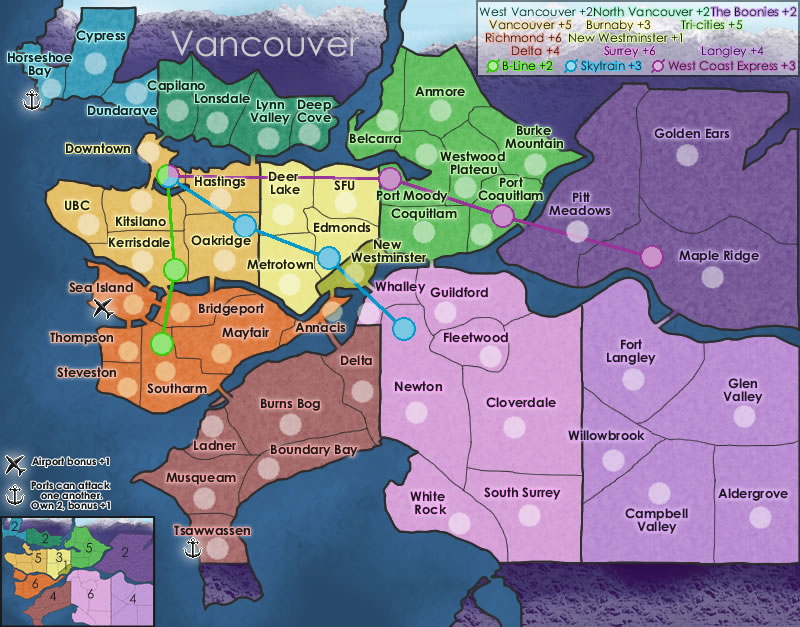
Thank you Raven, Joodoo.
Made some minor tweaks today. Bridges, North Vancouver's bonus, colours of Surrey and Langley a little, and the overall texture. The bridge from Kitsilano to Downtown has been moved, so it would not appear to go into Downtown Station. I hope it is clear that Kitsilano, Hastings, and Downtown are all unique territories.
Made some minor tweaks today. Bridges, North Vancouver's bonus, colours of Surrey and Langley a little, and the overall texture. The bridge from Kitsilano to Downtown has been moved, so it would not appear to go into Downtown Station. I hope it is clear that Kitsilano, Hastings, and Downtown are all unique territories.
- Click image to enlarge.
-

 shakeycat
- Posts: 390
- Joined: Sun Mar 11, 2007 5:13 am
- Location: Vancouver


Re: Vancouver Map [Feb 2]
![]() by Bavarian Raven on Wed Feb 04, 2009 1:21 pm
by Bavarian Raven on Wed Feb 04, 2009 1:21 pm
looking good. one minor thing (doesn't matter really  ) is that below pitt meadows where that large 'bulge' in the river is, is an island.
  but thats just me being too critical...
other wise i like it the way it is
other wise i like it the way it is
-
Bavarian Raven
- Posts: 261
- Joined: Fri Nov 17, 2006 10:52 pm
- Location: Canada, Vancouver


Re: Vancouver Map [Feb 2]
![]() by shakeycat on Wed Feb 04, 2009 2:02 pm
by shakeycat on Wed Feb 04, 2009 2:02 pm
Raven, yes, Barnston Island, isn't it? I took out all the non-playable islands to clean up the map some. Annacis Island is also absent, though its name remains. Perhaps those two islands should go back in?
-
shakeycat
- Posts: 390
- Joined: Sun Mar 11, 2007 5:13 am
- Location: Vancouver
Re: Vancouver Map [Feb 2]
![]() by lzrman on Fri Feb 13, 2009 3:43 pm
by lzrman on Fri Feb 13, 2009 3:43 pm
This map looks really sharp compared to fourth and fifth version! Great Stuff!
-

lzrman
- Posts: 235
- Joined: Wed Aug 20, 2008 3:04 am
- Location: Western Canada

Re: Vancouver Map [Feb 2]
![]() by shakeycat on Fri Feb 13, 2009 3:56 pm
by shakeycat on Fri Feb 13, 2009 3:56 pm
Now that you mention it, Lzrman, it has come along way and I'm glad of it.
-
shakeycat
- Posts: 390
- Joined: Sun Mar 11, 2007 5:13 am
- Location: Vancouver
Re: Vancouver Map [Feb 2]
![]() by Joodoo on Fri Feb 13, 2009 8:18 pm
by Joodoo on Fri Feb 13, 2009 8:18 pm
are the stations separate territories? ex.is there an "Oakridge Station" territory?
TheSaxlad wrote:The Dice suck a lot of the time.
And if they dont suck then they blow.
-

Joodoo
- Posts: 1639
- Joined: Fri Mar 21, 2008 12:19 am
- Location: Greater Toronto, Canada


Re: Vancouver Map [Feb 2]
![]() by shakeycat on Fri Feb 13, 2009 10:09 pm
by shakeycat on Fri Feb 13, 2009 10:09 pm
Yes! Nameless, but they will be called "Oakridge Station", "Port Moody Station", and the like. Oh, I probably have to explain that somewhere, don't I. I thought the white circles would make it clear enough.
-
shakeycat
- Posts: 390
- Joined: Sun Mar 11, 2007 5:13 am
- Location: Vancouver
Re: Vancouver Map [Feb 2]
![]() by Joodoo on Fri Feb 13, 2009 10:39 pm
by Joodoo on Fri Feb 13, 2009 10:39 pm
I guess some more explanation on that would be nice
TheSaxlad wrote:The Dice suck a lot of the time.
And if they dont suck then they blow.
-
Joodoo
- Posts: 1639
- Joined: Fri Mar 21, 2008 12:19 am
- Location: Greater Toronto, Canada
Re: Vancouver Map [Feb 17]
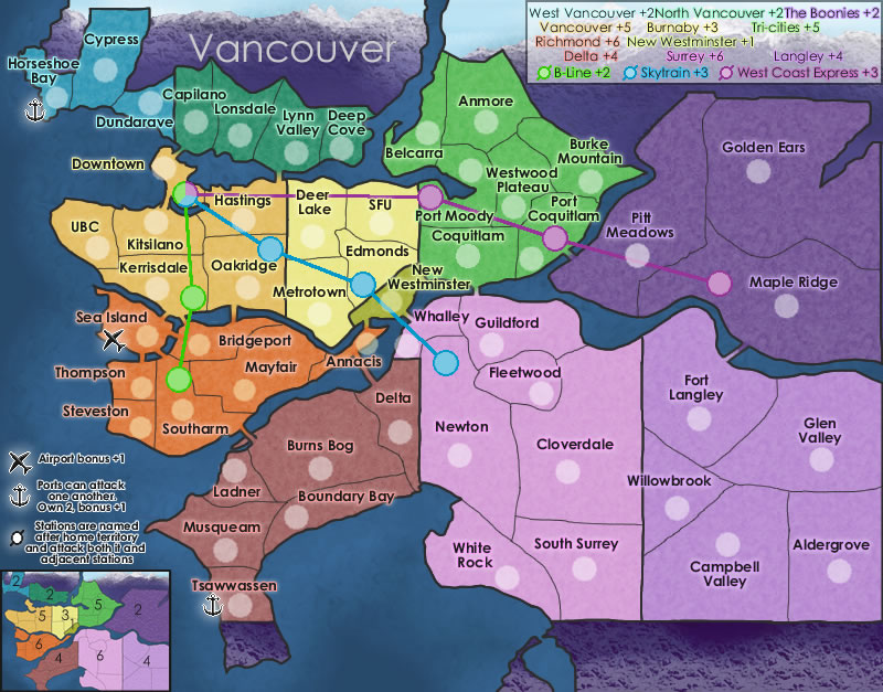
![]() by shakeycat on Tue Feb 17, 2009 3:43 pm
by shakeycat on Tue Feb 17, 2009 3:43 pm
How's this one sound?
- Click image to enlarge.
-
shakeycat
- Posts: 390
- Joined: Sun Mar 11, 2007 5:13 am
- Location: Vancouver
Re: Vancouver Map [Feb 17]
![]() by the.killing.44 on Wed Feb 25, 2009 9:53 pm
by the.killing.44 on Wed Feb 25, 2009 9:53 pm
Here's a thought: how about a +1 autodeploy on Sea Island instead of the airport bonus? It's a very strategic point.
.44
.44
-

the.killing.44
- Posts: 4724
- Joined: Thu Oct 23, 2008 7:43 pm
- Location: now tell me what got two gums and knows how to spit rhymes


Re: Vancouver Map [Feb 17]
![]() by shakeycat on Thu Feb 26, 2009 1:36 pm
by shakeycat on Thu Feb 26, 2009 1:36 pm
With +1 Autodeploy usually comes Starts Neutral, right?
What makes Sea Island a strategic point?
What makes Sea Island a strategic point?
-
shakeycat
- Posts: 390
- Joined: Sun Mar 11, 2007 5:13 am
- Location: Vancouver
Re: Vancouver Map [Feb 17]
![]() by LED ZEPPELINER on Thu Feb 26, 2009 3:58 pm
by LED ZEPPELINER on Thu Feb 26, 2009 3:58 pm
shakeycat wrote:With +1 Autodeploy usually comes Starts Neutral, right?
What makes Sea Island a strategic point?
just the fact that ti borders a lot of territs, is an airport, and a part of a large bonus
-
LED ZEPPELINER
- Posts: 1088
- Joined: Tue Nov 25, 2008 10:09 pm
Re: Vancouver Map [Feb 17]
![]() by LED ZEPPELINER on Fri Feb 27, 2009 7:39 am
by LED ZEPPELINER on Fri Feb 27, 2009 7:39 am
i sort of fell as though the legend is a little cluttered, the minimap is fine, but i was just thinking you could move all of the writing into the bay area by boundry bat and white rock. I think this would give a little more clarity to the Ports becuase at the moment they look as thought they are divided
-
LED ZEPPELINER
- Posts: 1088
- Joined: Tue Nov 25, 2008 10:09 pm
Re: Vancouver Map [Feb 17]
![]() by RjBeals on Fri Feb 27, 2009 8:54 am
by RjBeals on Fri Feb 27, 2009 8:54 am
- Click image to enlarge.
Wow.. a purple map. I like the colors you've chosen. Soft, pastel feel - my style. And lots of bonus regions. This should make for many a good battle.
Here's some of my critiques:
* The territory font you've chosen is okay. It's very plain. That's good, it's better than something that you can't read. But in this case, it looks preschool. I would suggest bringing the point size down just a bit. Maybe try a few other font styles in the same family as the plain san-serif family. And personally, I think the outer glow on those territ names is too bright. Also - your army circles look pixilated. See below.
* Your borders still don't look that good. It looks like it took you about 5 minutes to draw every border on the map. There are jagged places. They are all just black. Are those real region borders? If so are they really that straight? Maybe you could put a little more curve in them, so they don't look like a kids puzzle. Also, if they are not "true" region borders, maybe you could adjust some a bit to allow room for the full territory names and army circles. ?
* The title needs some work. Again, personal taste, but I don't care for the mountain range masked into the non-playing territory lands. I would prefer all the non-play lands be a neutral gray/beige type color, then just have a very nice "Vancouver" title on top. See how you did those beveled mountains in the south part? Maybe have that same type look in the north part also?
* In your mini-map, take out the territory borders. You don't need them. Just keep the main bonus region borders. Like see in your minimap how the dark purple "The Boonies" doesn't have the inner territ borders? Thats how the whole map should be.
* the explanation text above the minimap (Airports, Ports, Stations...) is almost unreadable. The black font with the hard white stroke looks really really bad. You need to redo that somehow. Howabout just white text, with no stroke.
* I would say loose the land bridge style you have, and go for a real bridge graphic. And maybe add some curves to those railway lines. Curve them around the territ names, and army circles. Put some layer efx on them also. Looks like you drew them in Paint as they are now. Very pixilated and straight.
Overall - the map looks fun, and I would love to play it. You just need to work on the visuals. Don't give up. There's plenty of tutorials around here and the web for ideas.

-

RjBeals
- Posts: 2506
- Joined: Mon Nov 20, 2006 5:17 pm
- Location: South Carolina, USA


Re: Vancouver Map [Feb 17]
![]() by bryguy on Fri Feb 27, 2009 9:34 am
by bryguy on Fri Feb 27, 2009 9:34 am
1) The ports, stations, airports, etc, all look pixelated
2) I dont see how RJ can think your army circles are pixilated, they look blurry to me, except for your stations, which obviously look pixelated.
3) Some of the bonuses seem to low.
4) Im not really sold on the borders, especially the big ones that seperate areas, these are especially pixelated IMO
5) The texture on The Boonies is a little to much. Maybe try lowering the opacity a bit?
6) The +1 for New Westminster is hard to read on the mini-map. Also, I think its to low. Maybe instead an autodeploy of +1 or +2?
7) Remove the borders from the mini-map.
 Its a little hard for me to read the wording next to the symbols. Any chance you could up the size of the font by 1?
9) Could you lower the opacity of the texture along the bottom of the map? (its off the gameplay area)
10) I agree with RJ about the territory font.
11) The stations and station connectors are very pixelated. Looks like you drew them using a pencil tool, instead of the paintbrush or ink tool.
12) The white box behind the bonuses in the upper right corner makes it to bright IMO, maybe try a black box instead? (same opacity) That way the bonuses w/ glow would stand out more and be more visible.
13) The bonuses in the box in the upper right (the one just mentioned) seem to be in a jumble, as if you just put things in at random spots. Could you try to arrange it a bit?
Overall I think that this is a good map, keep up the good work
2) I dont see how RJ can think your army circles are pixilated, they look blurry to me, except for your stations, which obviously look pixelated.
3) Some of the bonuses seem to low.
4) Im not really sold on the borders, especially the big ones that seperate areas, these are especially pixelated IMO
5) The texture on The Boonies is a little to much. Maybe try lowering the opacity a bit?
6) The +1 for New Westminster is hard to read on the mini-map. Also, I think its to low. Maybe instead an autodeploy of +1 or +2?
7) Remove the borders from the mini-map.
9) Could you lower the opacity of the texture along the bottom of the map? (its off the gameplay area)
10) I agree with RJ about the territory font.
11) The stations and station connectors are very pixelated. Looks like you drew them using a pencil tool, instead of the paintbrush or ink tool.
12) The white box behind the bonuses in the upper right corner makes it to bright IMO, maybe try a black box instead? (same opacity) That way the bonuses w/ glow would stand out more and be more visible.
13) The bonuses in the box in the upper right (the one just mentioned) seem to be in a jumble, as if you just put things in at random spots. Could you try to arrange it a bit?
Overall I think that this is a good map, keep up the good work
-
bryguy
- Posts: 4381
- Joined: Tue Aug 07, 2007 8:50 am
- Location: Lost in a Jigsaw
Re: Vancouver Map [Feb 17]
![]() by shakeycat on Fri Feb 27, 2009 12:40 pm
by shakeycat on Fri Feb 27, 2009 12:40 pm
Thank you RjBeals and Bryguy, I need feedback like yours!
Bryguy, the upper right box - I wonder, do I even need it? I see I have two bonus sections explaining them, and that's silly. I think I need to name the continents at some point, so maybe I'll find a better way to represent that.
To explain the supposedly jumbled territory names in the upper right box: they correspond with each territory's location on the map.
And the Boonies' purple colour is what makes it appear to have a more opaque texture. The texture is the same opacity as the other territories. Guess I need to fiddle with colours.
I will start working through these issues.
Last edited by shakeycat on Fri Feb 27, 2009 4:05 pm, edited 1 time in total.
-
shakeycat
- Posts: 390
- Joined: Sun Mar 11, 2007 5:13 am
- Location: Vancouver
Re: Vancouver Map [Feb 17]
![]() by sailorseal on Fri Feb 27, 2009 4:01 pm
by sailorseal on Fri Feb 27, 2009 4:01 pm
So here is what I think:
1. The legend is complicated and hard to read/understand so just add that info into the minimap
2. Just say own ports +2 saying that you need 2 is unnecessary because there are only 2
3. The map seems 2D give it some substance, make it pop off the page
4. Make new west minister start neutral because the game will be swayed by whom ever starts with it
5. Divide the boonies further or people will often begin with that bonus
Great Map! Excited to see this in the main foundry
-
sailorseal
- Posts: 2735
- Joined: Sun May 25, 2008 1:49 pm
- Location: conquerclub.com


Re: Vancouver Map [Feb 17]
![]() by thenobodies80 on Fri Feb 27, 2009 6:53 pm
by thenobodies80 on Fri Feb 27, 2009 6:53 pm
In general your map is good.
this is my opinion:
TITLE,FONTS, SYMBOLS & COLORS
Title is simply but good.
Fonts are clear but too bold.
Remove the neon, flash my eyes.
Colors are fantastic don't change them!
Remove the white border on ports and airport symbols
LEGEND & MINIMAP
the minimap is good, i think you have to remove the borders in this small one.
Remove the mountains and sky in minimap.
try to center the bonus numbers in the continents territories in minimap.
Remove the upper right legend is useless, probably you can write the train routes bonuses in the bottom left side of map (there's nothing here!)
the new empty space in right upper could be a good place for title or simply left the mountains visible.
CONTINENTS & TERRITORIES
66 territories is great number for epic battles
i suggest you not to consider the airport and new westiminister like continents.
Why not to give them a +1 autodeploy for each one? All these territories should be neutrals at the start of a game.
Territories borders are complitely wrong, they are unpretty and pixelous.
Army cirlces are pixelous too.
In territories with both train station and armies circles, remove these last one, probably maps could be more clear in some points.
if not,why edmonds hasn't armies circle? I hope you understand what i mean...
Tsawwassen is unpretty with that south border with another color, i supposed you have a valid reason, but you could be less realistic for only a territory.
BONUSES
in my opinion bonuses are:
west vancouver +2
north vancouver +2
the boonies +2
tricities +4
new westminister +1 (autodeploy)
burnaby +3
vancouver +4
richmond +5
delta +3
surrey +5
langley +3
airport +1 (autodeploy)
trains are good
ports should be only a water route, usefull for gameplay, but no +1 bonus in my opinion
------------------------------------------------------------------------------------------------------------
I think you're on the right way.
Nice Start!
-

thenobodies80
- Posts: 5400
- Joined: Wed Sep 05, 2007 4:30 am
- Location: Milan


Re: Vancouver Map [Feb 17]
![]() by shakeycat on Fri Feb 27, 2009 7:06 pm
by shakeycat on Fri Feb 27, 2009 7:06 pm
Thenobodies80-
Tsawwassen, if I understand what you mean, has a purple thing dangling off its south border. That bit of land belongs to the USA, a little place called Point Roberts. Are you saying I should change it somehow?
I can't believe I forgot the army circle on Edmonds! I'll fix that when I re-do the circles to look like RjBeals' ones.
No bonus for ports, I'm cool with that. And Autodeploys sound good, plus the make games interesting. How did you come up with your bonuses?
If you look back to earlier versions of this map, Vancouver and Burnaby had more territories. Do we like it better with less, as it is now, or no?
I'll keep listening over the weekend and work out what I want to do. I'll have something to show for it next week.
-
shakeycat
- Posts: 390
- Joined: Sun Mar 11, 2007 5:13 am
- Location: Vancouver
Re: Vancouver Map [Feb 17]
![]() by thenobodies80 on Fri Feb 27, 2009 7:22 pm
by thenobodies80 on Fri Feb 27, 2009 7:22 pm
shakeycat wrote:Thenobodies80-
Tsawwassen, if I understand what you mean, has a purple thing dangling off its south border. That bit of land belongs to the USA, a little place called Point Roberts. Are you saying I should change it somehow?
I can't believe I forgot the army circle on Edmonds! I'll fix that when I re-do the circles to look like RjBeals' ones.
No bonus for ports, I'm cool with that. And Autodeploys sound good, plus the make games interesting. How did you come up with your bonuses?
If you look back to earlier versions of this map, Vancouver and Burnaby had more territories. Do we like it better with less, as it is now, or no?
I'll keep listening over the weekend and work out what I want to do. I'll have something to show for it next week.
yes i think you should color usa part for tsawassen, no realism but a better look!
Sorry but i have no formula for bonuses, in general is one less than yours.
try to make all better in general ( border and circles graphic first!).
What do you use to do armies circle?
there's some good tools and tips here: MAP MAKING TOOLS
-
thenobodies80
- Posts: 5400
- Joined: Wed Sep 05, 2007 4:30 am
- Location: Milan
Re: Vancouver Map [Feb 17]
![]() by the.killing.44 on Fri Feb 27, 2009 7:49 pm
by the.killing.44 on Fri Feb 27, 2009 7:49 pm
Hey, nicely done on this. I might be repeating some things because of the influx of comments (I wish the whole committee of Reviews was around when Korea was [Adv] comment!).
Firstly, the train lines are very pixelated. Adding some Gaussian blur should do the trick of eliminating this. Or, if that doesn't work (and I encourage you to do this from here on in), take the brush tool with color and settings, etc., click on the beginning of the line and just make a dot. After that, hold shift and click the end of the line, on the beginning of the circle, and that should make a straight and smooth line.
Secondly, I agree with Rj on the fonts. Even if you choose to keep the same style of font (try Myriad Pro or Stone Sans ITC — those are good), I would like to see the font be smaller. And to go along with that, reduce the glow on the key text (and do this if/when you make the typeface smaller), so it doesn't override the text itself.
Since your borders are very straight and such, I encourage you to use the pen tool. Set the brush to be 1-2px, spacing 10%, flow + hardness 100%. From there, take the pen tool and trace over your borders. In "Paths" in the layer window, I advise you to click "New Path" (looks like new layer symbol on the bottom) for each separate layer. Then, after drawing each border, control-click the path in the layer window and hit "Stroke Path…" Select "Mode: brush" and there you have smooth borders.
Like others have said before, the key needs work. The minimap looks great, but there is a problem with the way you organized the text. What I do is make all the text one type layer, align it all one space to the left, and make perfect colums via aligning each name + # with the tab key. Works like a charm. Oh, and don't be afraid to make the key drop further down as you have a ton of space in the Boonies (I think it's that … there are so many similar colors, which I do like though) area with those huge territories.
Lastly, in gameplay, I haven't taken a very hard look but the top left is ridiculously linear. It's literally 1 border for 7 straight territories, save Horshoe bay with the anchor. I'd make Horshoe Bay and Dundarave border each other by making Cypress's border up at the main border, and play around with borders in the emerald green area there.
Nicely done here
.44
-
the.killing.44
- Posts: 4724
- Joined: Thu Oct 23, 2008 7:43 pm
- Location: now tell me what got two gums and knows how to spit rhymes
Re: Vancouver Map [Feb 17]
![]() by the.killing.44 on Fri Feb 27, 2009 11:16 pm
by the.killing.44 on Fri Feb 27, 2009 11:16 pm
And as for the USA land … I'm just thinking aloud via 5-minute 'Shops:
just a thought
.44
- Click image to enlarge.

just a thought
.44
-
the.killing.44
- Posts: 4724
- Joined: Thu Oct 23, 2008 7:43 pm
- Location: now tell me what got two gums and knows how to spit rhymes
Re: Vancouver Map [Feb 17]
![]() by rjz115dude on Sat Feb 28, 2009 12:40 am
by rjz115dude on Sat Feb 28, 2009 12:40 am
I ENJOY this map alot. Looks really good. Well made and all around perfect map that completly meets conquer club's standers in every way. This map def. has a future. Things I would change: The ocean or the sea or w/e looks plain. I think you can amp it up a little bit; make it seem cooler: add more texture to it. And i think it would be less confusing with different colors on the eastern terretories. There all purple
-
rjz115dude
- Posts: 52
- Joined: Sun Dec 07, 2008 7:10 pm
Who is online
Users browsing this forum: No registered users
|
|||||||
| Conquer Club is not associated with RISK online in any way. Copyright © 2006-2024 by Big Wham LLC | |||||||