Hi DubWarrior,
You current image, while solid and crisp, lacks any detail. It is a very plain image at the moment with only flat colours and glows. Can I assume that we will see some more textures and detail later on in production?
I can tell that you are a very able artist. I look forward to seeing how your first map develops.
Cheers,
gimil
Flanders 1302V15[Beta] major changes! P19
Moderator: Cartographers
Re: Flanders 1302
![]() by gimil on Thu Jun 04, 2009 10:47 am
by gimil on Thu Jun 04, 2009 10:47 am
What do you know about map making, bitch?
Top Score:2403
natty_dread wrote:I was wrong
Top Score:2403
-

 gimil
gimil
- Posts: 8599
- Joined: Sat Mar 03, 2007 12:42 pm
- Location: United Kingdom (Scotland)


Re: Flanders 1302
![]() by DubWarrior on Mon Jun 15, 2009 1:53 pm
by DubWarrior on Mon Jun 15, 2009 1:53 pm
I'm sorry to keep you waiting guys, within a few days I've got some time to continu (finals for school are taking some time  )
)
-
DubWarrior
- Posts: 173
- Joined: Sun May 03, 2009 6:09 am
- Location: Belgium


Re: Flanders 1302 Update June 21 - Pg2
![]() by DubWarrior on Sun Jun 21, 2009 3:59 pm
by DubWarrior on Sun Jun 21, 2009 3:59 pm
Hi, Back with some changes.
I tried to change all thing you guys have posted, and thing are going great I think.
So thanks for all feedback, hope you all like it!
Greets
DubWarrior
Large
small
I tried to change all thing you guys have posted, and thing are going great I think.
So thanks for all feedback, hope you all like it!
Greets
DubWarrior
Large
small
-
DubWarrior
- Posts: 173
- Joined: Sun May 03, 2009 6:09 am
- Location: Belgium
Re: Flanders 1302 Update June 21 - Pg2
![]() by eigenvector on Sun Jun 21, 2009 4:53 pm
by eigenvector on Sun Jun 21, 2009 4:53 pm
I like the look of the new map much better. It still leaves something to be desired but it is inchoate in my mind exactly what. Probably the more graphics-minded folks will spell it out for me 
A question: why two of the areas have no capitals? You just didn't want to have too many bonuses or is there an historical reason?
A question: why two of the areas have no capitals? You just didn't want to have too many bonuses or is there an historical reason?
-
eigenvector
- Posts: 95
- Joined: Tue Jul 24, 2007 4:27 am


Re: Flanders 1302 Update June 21 - Pg2
![]() by hecter on Sun Jun 21, 2009 5:41 pm
by hecter on Sun Jun 21, 2009 5:41 pm
Make the borders more visible.
In heaven... Everything is fine, in heaven... Everything is fine, in heaven... Everything is fine... You got your things, and I've got mine.

-

hecter
- Posts: 14632
- Joined: Tue Jan 09, 2007 6:27 pm
- Location: Tying somebody up on the third floor


Re: Flanders 1302 Update June 21 - Pg2
![]() by DubWarrior on Mon Jun 22, 2009 3:43 am
by DubWarrior on Mon Jun 22, 2009 3:43 am
eigenvector wrote:I like the look of the new map much better. It still leaves something to be desired but it is inchoate in my mind exactly what. Probably the more graphics-minded folks will spell it out for me
A question: why two of the areas have no capitals? You just didn't want to have too many bonuses or is there an historical reason?
3 areas have no capitals. In fact, for both reasons: I think there are enough bonuses for a pretty small map, but especially, i would like to make some sort of historical campaign: it's about these capitals where it was all about in 1302...so I consider these cities as something special and rare, worth struggling for...
-
DubWarrior
- Posts: 173
- Joined: Sun May 03, 2009 6:09 am
- Location: Belgium
Re: Flanders 1302 Update June 21 - Pg2
![]() by whitestazn88 on Mon Jun 22, 2009 3:01 pm
by whitestazn88 on Mon Jun 22, 2009 3:01 pm
great update. i like the little backstory, the image in the background kinda gives us an idea of what we're reading about, and the capitals, if they are historically accurate, would also do the trick.
about the image, i think its fine how it is now, although the bridges, rivers and captials seem to have too much of a glow, and are taking my focus away from the map
about the image, i think its fine how it is now, although the bridges, rivers and captials seem to have too much of a glow, and are taking my focus away from the map
-
whitestazn88
- Posts: 3128
- Joined: Mon Feb 05, 2007 2:59 pm
- Location: behind you


Re: Flanders 1302 Update June 21 - Pg2
![]() by eigenvector on Mon Jun 22, 2009 3:06 pm
by eigenvector on Mon Jun 22, 2009 3:06 pm
I actually love the bridges. Btw, why are some decorated with posts? Are these some sort of special crossing points? And what do the icons for the capitals mean?
-
eigenvector
- Posts: 95
- Joined: Tue Jul 24, 2007 4:27 am
Re: Flanders 1302 Update June 21 - Pg2
![]() by DubWarrior on Mon Jun 22, 2009 3:39 pm
by DubWarrior on Mon Jun 22, 2009 3:39 pm
Well, for myself, I'm not that sure about the way the bridges are looking, for now...but I think I leave that up to you, unless I find something better. I think it makes things looks complicated?
No, the bridges have all the same function, some have posts and others haven't...I was looking for some diversity, but maybe that makes things too complicated, also...
The capitals (and its icon) are explained on the left...for adding some historical gameplay, conquering a capitals means a bonus of an additional +1
Anyhow, I'm now working on the borders, and I wait a bit before spending more time working on another bridge...i'll see if someone else would replace them or not.
-
DubWarrior
- Posts: 173
- Joined: Sun May 03, 2009 6:09 am
- Location: Belgium
Re: Flanders 1302 Update June 21 - Pg2
![]() by whitestazn88 on Mon Jun 22, 2009 3:48 pm
by whitestazn88 on Mon Jun 22, 2009 3:48 pm
i meant to say, are the images that you are using as the capitals historically accurate? or are they just a figment of your imagination at this point.
-
whitestazn88
- Posts: 3128
- Joined: Mon Feb 05, 2007 2:59 pm
- Location: behind you
Re: Flanders 1302 Update June 21 - Pg2
![]() by DubWarrior on Mon Jun 22, 2009 4:31 pm
by DubWarrior on Mon Jun 22, 2009 4:31 pm
Yes, they are.
Also the bridges are based on local, historical structures. (it's not that much, I know )
These ones where build in Kortrijk, at the end of the 1300's.

I quickly changed the borders, but to be honest, I don't like it this way:
I got the impression the text becomes illegible now (for example Axel, of Groeninge)...I think i'll keep the borders white, or at least, some sort of pale. But maybe I give them some more weight?
this is the small size:
Also the bridges are based on local, historical structures. (it's not that much, I know
These ones where build in Kortrijk, at the end of the 1300's.
I quickly changed the borders, but to be honest, I don't like it this way:
I got the impression the text becomes illegible now (for example Axel, of Groeninge)...I think i'll keep the borders white, or at least, some sort of pale. But maybe I give them some more weight?
this is the small size:
-
DubWarrior
- Posts: 173
- Joined: Sun May 03, 2009 6:09 am
- Location: Belgium
Re: Flanders 1302 Update June 22 V4 - Pg2
![]() by whitestazn88 on Mon Jun 22, 2009 5:48 pm
by whitestazn88 on Mon Jun 22, 2009 5:48 pm
well i like the borders now a lot more... the text can be moved around relatively easily at this point, and you have a lot of blank space in some of the territs, so you should be fine, and could fudge up some historical borders if only for space's sake.
one thing i'd like to have you look at is the placement of the capitals, they need to be moved into the territory a little better.
examples are in gent, the name needs to be moved down, brugge, the capital should be in the territ, not in damme, kortrijk, and doornik
one thing i'd like to have you look at is the placement of the capitals, they need to be moved into the territory a little better.
examples are in gent, the name needs to be moved down, brugge, the capital should be in the territ, not in damme, kortrijk, and doornik
-
whitestazn88
- Posts: 3128
- Joined: Mon Feb 05, 2007 2:59 pm
- Location: behind you
Re: Flanders 1302 Update June 22 V4 - Pg2
![]() by eigenvector on Mon Jun 22, 2009 6:01 pm
by eigenvector on Mon Jun 22, 2009 6:01 pm
I must be stupid but I still don't get those capital icons. To me they look like mutant cogwheels. 
Some fixes for the story on the shield: it should be "independence", "French", "Flemish".
Keep up the good work!
Some fixes for the story on the shield: it should be "independence", "French", "Flemish".
Keep up the good work!
-
eigenvector
- Posts: 95
- Joined: Tue Jul 24, 2007 4:27 am
Re: Flanders 1302 Update June 21 - Pg2
![]() by TaCktiX on Mon Jun 22, 2009 10:44 pm
by TaCktiX on Mon Jun 22, 2009 10:44 pm
Um...wow? This is a positively enormous improvement from Version 1 to Version 2. Bravo sir, bravo. Keep the good work up based on the feedback you get (which should increase over time, no worries).
Graphics
- The textures technically work, though I don't think the picked grunge texture fits best with the parchment look you're aiming for. Fiddle around with textures to get a paper-looking texture, even a dirty one.
- The parchment border clashes with the rest of the map in places, particularly the middle right and top right. Try to work in the paper more with the rest of the map. Oaktown just finished a paper-like map (Indian Empire), ask him for some tips.
- The capitals look like circus tents. While a 3D symbol is nice, I think the original ivy leaf (or whatever plant that was, not a botanist ) looked better. Perhaps fiddle with the look of the ivy leaf symbol so it changes with continent, or is slightly raised above the map, or what-have-you.
- The assumed borders on the impassables I don't think works with the map, mostly because the impassable outline color differs from the border color. I would suggest changing the border color to match the impassable outline. Try doing a small sample and seeing if that fits better, as right now I have to remind myself that the impassables terminate a country border as well as the normal border lines.
- The bridges work with the map quite well, the different bridge seems out of place. It may be more special in history, but gameplay-wise it seems to note a special element that doesn't exist (i.e., source of confusion).
Gameplay
- The legend is a confusing mess. It would do much better to move the title over (on top of the outline picture on the sea, which adds to flavor quite nicely), and enlarge the minimap to the point that you can stick region names on it, as well as the bonus if at all possible. If not that, try re-adding regions to the map proper. I think that worked, but the way the text was made it hard to read.
- Is it a +1 bonus for a capital or a +1 autodeploy? I would suggest the latter, or have neutral start capitals due to the number of them.
- Continuity-wise, you have different signatures in the small and large. I prefer the large version's signature.
I promised, and I delivered. You got
 .
.
Graphics
- The textures technically work, though I don't think the picked grunge texture fits best with the parchment look you're aiming for. Fiddle around with textures to get a paper-looking texture, even a dirty one.
- The parchment border clashes with the rest of the map in places, particularly the middle right and top right. Try to work in the paper more with the rest of the map. Oaktown just finished a paper-like map (Indian Empire), ask him for some tips.
- The capitals look like circus tents. While a 3D symbol is nice, I think the original ivy leaf (or whatever plant that was, not a botanist
- The assumed borders on the impassables I don't think works with the map, mostly because the impassable outline color differs from the border color. I would suggest changing the border color to match the impassable outline. Try doing a small sample and seeing if that fits better, as right now I have to remind myself that the impassables terminate a country border as well as the normal border lines.
- The bridges work with the map quite well, the different bridge seems out of place. It may be more special in history, but gameplay-wise it seems to note a special element that doesn't exist (i.e., source of confusion).
Gameplay
- The legend is a confusing mess. It would do much better to move the title over (on top of the outline picture on the sea, which adds to flavor quite nicely), and enlarge the minimap to the point that you can stick region names on it, as well as the bonus if at all possible. If not that, try re-adding regions to the map proper. I think that worked, but the way the text was made it hard to read.
- Is it a +1 bonus for a capital or a +1 autodeploy? I would suggest the latter, or have neutral start capitals due to the number of them.
- Continuity-wise, you have different signatures in the small and large. I prefer the large version's signature.
I promised, and I delivered. You got
.-

TaCktiX
- Posts: 2392
- Joined: Mon Dec 17, 2007 8:24 pm
- Location: Rapid City, SD


Re: Flanders 1302 Update June 22 V4 - Pg2
![]() by mattosaurus on Tue Jun 23, 2009 8:06 am
by mattosaurus on Tue Jun 23, 2009 8:06 am
May try making it a more medieval looking map if you want it to be historical from that period. Here's and example. Its kind of messy, but you can get the idea. 
The goal of a map is to be unique, have interesting gameplay and be simple enough to be easy to play without being confusing. On a map this light, army circles aren't necessary. They can take up more space then they're worth.
The goal of a map is to be unique, have interesting gameplay and be simple enough to be easy to play without being confusing. On a map this light, army circles aren't necessary. They can take up more space then they're worth.
Check out my map in the making: Testosterone VS Estrogen
http://www.conquerclub.com/forum/viewtopic.php?f=241&t=85196
http://www.conquerclub.com/forum/viewtopic.php?f=241&t=85196
-
mattosaurus
- Posts: 72
- Joined: Thu Feb 26, 2009 1:38 pm
- Location: Seattle, WA


Re: Flanders 1302 Update June 22 V4 - Pg2
![]() by hecter on Tue Jun 23, 2009 9:41 am
by hecter on Tue Jun 23, 2009 9:41 am
I also really like the new borders. As it was stated, text is easily manipulated.
In heaven... Everything is fine, in heaven... Everything is fine, in heaven... Everything is fine... You got your things, and I've got mine.
-
hecter
- Posts: 14632
- Joined: Tue Jan 09, 2007 6:27 pm
- Location: Tying somebody up on the third floor
Re: Flanders 1302 Update June 22 V4 - Pg2
![]() by oaktown on Sat Jun 27, 2009 2:01 am
by oaktown on Sat Jun 27, 2009 2:01 am
Fantastic looking map for version 2, Dub. I concur with most of tack's concerns, above... especially the legend. In general the look is good, but turn your eye to the mechanics of the map - size of the text (too small on the small map) borders (easier to read now but I agree they don't look as nice) and the legend.
Also, I always appreciate it when a mapmaker makes his/her map only as big as it needs to me. The region you're covering is a fantastic shape for a horizontal CC map that allows everybody to see the entire map and all of the menus and BOB info on one screen, yet you're still close to the max size. I think the map might look tighter and be more practical if you lopped 40 pixels or so off the top of the map and adjusted you legend, title, and picture accordingly.
Keep up the nice work.

-

oaktown
- Posts: 4451
- Joined: Sun Dec 03, 2006 9:24 pm
- Location: majorcommand


Re: Flanders 1302 Update June 22 V4 - Pg2
![]() by captainwalrus on Sat Jun 27, 2009 4:43 pm
by captainwalrus on Sat Jun 27, 2009 4:43 pm
Some cities are a little unclear. Like where is Kortrijk? It appears to be on the little island but the way the name and symbol are placed it is slightly off, making it unclear what it boarders. Can it attack Orchies? Making the symbol a little smaller and the river go further around the symbol would clear that up. Is a bridge necessary between Axel and Hulst? It looks like the river doesn't go althe way in, and it doesn't cut anything else off, so the river seems pointless. Sorry if my feedback is unclear.
~ CaptainWalrus
-

captainwalrus
- Posts: 1018
- Joined: Sun Nov 11, 2007 3:19 pm
- Location: Finnmark
Re: Flanders 1302 Update June 22 V4 - Pg2
![]() by oaktown on Wed Jul 01, 2009 11:06 am
by oaktown on Wed Jul 01, 2009 11:06 am
Hi Dub,
In case folks aren't aware this map has been chosen to be a subject in our first Map Incubator, so hopefully you'll be seeing the same few faces pop in here weekly. As I see there hasn't been much movement since my last visit I'll just say keep up the excellent work!
In case folks aren't aware this map has been chosen to be a subject in our first Map Incubator, so hopefully you'll be seeing the same few faces pop in here weekly. As I see there hasn't been much movement since my last visit I'll just say keep up the excellent work!
-
oaktown
- Posts: 4451
- Joined: Sun Dec 03, 2006 9:24 pm
- Location: majorcommand
Re: Flanders 1302 Update June 22 V4 - Pg2
![]() by lancehoch on Wed Jul 01, 2009 10:37 pm
by lancehoch on Wed Jul 01, 2009 10:37 pm
I am part of that incubator team, so I thought I would give a few comments. Brugge looks like it is actually located in Damme, could you do something a little more like Gent, where the castle is located within the territory even if the name is not? If you are going to have army circles, I think the capitals look better, with the single pixel outline. The name Sint-Armands is a little hard to read, maybe swap the circle and the name or try wrapping the text and split the name at the hyphen.
-
lancehoch
- Posts: 4183
- Joined: Wed Dec 05, 2007 4:13 pm


Re: Flanders 1302 Update June 22 V4 - Pg2
![]() by thenobodies80 on Thu Jul 02, 2009 4:08 pm
by thenobodies80 on Thu Jul 02, 2009 4:08 pm
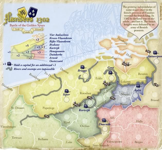
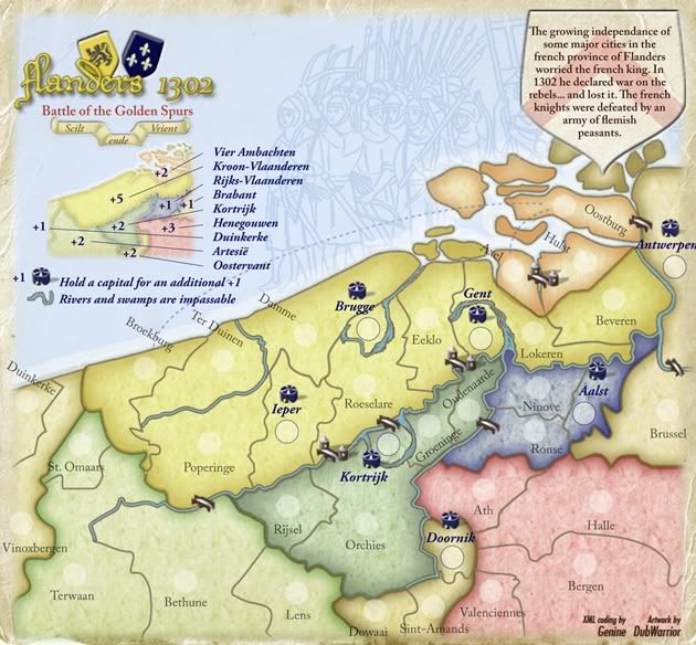
- Click image to enlarge.
Your new draft is good.
In addition to sharing concerns already pointed out up to now, two additional things:
This is your map with Vischeck (simulate colorblind):
- Click image to enlarge.

Vier Ambachten/Brabant isn't so clear
Maybe some corrections on rivers, like in the quick example i did:


-

thenobodies80
- Posts: 5400
- Joined: Wed Sep 05, 2007 4:30 am
- Location: Milan


Re: Flanders 1302 Update June 22 V4 - Pg2
![]() by mibi on Thu Jul 02, 2009 10:55 pm
by mibi on Thu Jul 02, 2009 10:55 pm
This map is hot, keep up the good work.
-

mibi
- Posts: 3350
- Joined: Thu Mar 01, 2007 8:19 pm
- Location: The Great State of Vermont


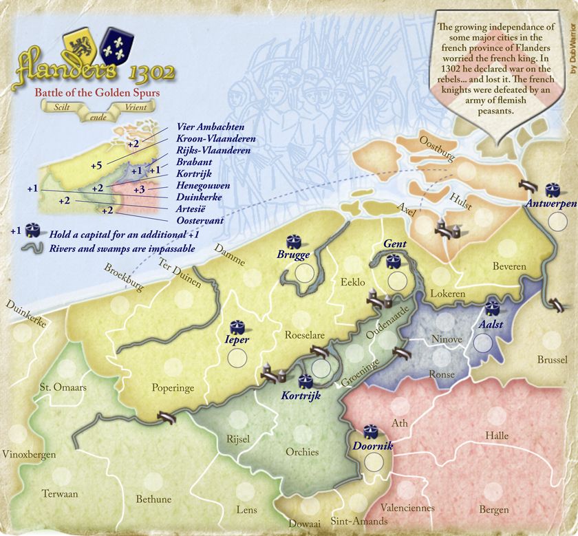
Re: Flanders 1302 Update Juli 3 V4 - Pg1
![]() by DubWarrior on Fri Jul 03, 2009 7:55 am
by DubWarrior on Fri Jul 03, 2009 7:55 am
Hi all,
Back with a Fifth draft.
Most of the changes i've done, is based on your comments.
Here's a quick list of some changes:
-placement of the capitals is now in it's territory
-spellings errors "independence", "French", "Flemish" are fixed.
- soften a bit the grungy background texture
- "capitals look like circus tents"...replaced by a small tower-symbol.
- changed the color of the impassable outline and it's filling.
- one type of bridge, and scaled them a bit.
- enlarged the minimap
- made a horizontal map of it
- the rivers go around the capitals now
- clearing up some river's, coast and bridges (like the one in axel/hulst)
- added a medieval looking border
-added a small drawing for the signature
- changed the position of the title and background information
-changed most colors, and checked it with Vischeck
-changed some borders, so that it becomes clearer which territories are adjacent.
I posted the small size on page one.
DubWarrior
-
DubWarrior
- Posts: 173
- Joined: Sun May 03, 2009 6:09 am
- Location: Belgium
Re: Flanders 1302 Update Juli 3 V4 - Pg1
![]() by lancehoch on Fri Jul 03, 2009 8:55 am
by lancehoch on Fri Jul 03, 2009 8:55 am
Could you make the name Doornik a little darker? The other capitals seem to pop out a little more than that one. Great update though.
-
lancehoch
- Posts: 4183
- Joined: Wed Dec 05, 2007 4:13 pm
Re: Flanders 1302 Update Juli 3 V4 - Pg1
![]() by DubWarrior on Sat Jul 18, 2009 4:22 am
by DubWarrior on Sat Jul 18, 2009 4:22 am
Some more feedback would be appreciated
I've been waiting some time, but nobody is reacting... Anyhow, i've got some time now to make some changes, so shoot your comments plz!
Grtz
DubWarrior
I've been waiting some time, but nobody is reacting... Anyhow, i've got some time now to make some changes, so shoot your comments plz!
Grtz
DubWarrior
-
DubWarrior
- Posts: 173
- Joined: Sun May 03, 2009 6:09 am
- Location: Belgium
Who is online
Users browsing this forum: No registered users
|
|||||||
| Conquer Club is not associated with RISK online in any way. Copyright © 2006-2024 by Big Wham LLC | |||||||