Japan - 日本 - Quenched
Moderator: Cartographers
Re: Japan, Land of the Rising Sun - 10th revision pg7
![]() by Industrial Helix on Sun Jul 19, 2009 2:41 am
by Industrial Helix on Sun Jul 19, 2009 2:41 am
About the uploading... check when you upload that its not shrinking your image automatically. This happened to me using photobucket for a few updates, it tends to blur stuff. Might help with the border lines as well. Otherwise, check the type of file your saving it as, I usually go psd to a jpeg.
Sketchblog [Update 07/25/11]: http://indyhelixsketch.blogspot.com/
Living in Japan [Update 07/17/11]: http://mirrorcountryih.blogspot.com/
Russian Revolution map for ConquerClub [07/20/11]: viewtopic.php?f=241&t=116575
Living in Japan [Update 07/17/11]: http://mirrorcountryih.blogspot.com/
Russian Revolution map for ConquerClub [07/20/11]: viewtopic.php?f=241&t=116575
-

 Industrial Helix
- Posts: 3462
- Joined: Mon Jul 14, 2008 6:49 pm
- Location: Ohio


Re: Japan, Land of the Rising Sun - 10th revision pg7
![]() by RedBaron0 on Sun Jul 19, 2009 3:25 am
by RedBaron0 on Sun Jul 19, 2009 3:25 am
Doesn't look like that's a problem, I export from .xcf (GIMP's version of .psd) to jpeg, and photobucket will resize images greater than 1024x768, which my map is under... I may have to look into imageshack or something and see if it does it there too.


-

RedBaron0
- Posts: 2657
- Joined: Sun Aug 19, 2007 12:59 pm
- Location: Pennsylvania


Re: Japan, Land of the Rising Sun - 10th revision pg7
![]() by RedBaron0 on Mon Jul 20, 2009 1:16 am
by RedBaron0 on Mon Jul 20, 2009 1:16 am
- Click image to enlarge.
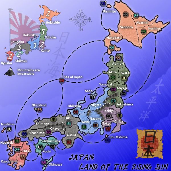
I think I figured out the problem, it was the way the image was being exported and saved as a jpeg. This looks a lot better with the 88's their proper colors. Most of the other stuff seems to be very much the same, maybe a smidgen sharper.
-
RedBaron0
- Posts: 2657
- Joined: Sun Aug 19, 2007 12:59 pm
- Location: Pennsylvania
Re: Japan, Land of the Rising Sun - 10th revision pg7
![]() by ender516 on Mon Jul 20, 2009 12:21 pm
by ender516 on Mon Jul 20, 2009 12:21 pm
The slate grey 88's are hard to read on these army circles, especially in Sapporo, but to a lesser extent in the other locations.
-

ender516
- Posts: 4455
- Joined: Wed Dec 17, 2008 6:07 pm
- Location: Waterloo, Ontario


Re: Japan, Land of the Rising Sun - 10th revision pg7
![]() by Industrial Helix on Mon Jul 20, 2009 12:26 pm
by Industrial Helix on Mon Jul 20, 2009 12:26 pm
ender516 wrote:The slate grey 88's are hard to read on these army circles, especially in Sapporo, but to a lesser extent in the other locations.
Agreed. RedBaron, you might want to consider changing the circles to white; I think it makes all the numbers a lot easier to read.
Sketchblog [Update 07/25/11]: http://indyhelixsketch.blogspot.com/
Living in Japan [Update 07/17/11]: http://mirrorcountryih.blogspot.com/
Russian Revolution map for ConquerClub [07/20/11]: viewtopic.php?f=241&t=116575
Living in Japan [Update 07/17/11]: http://mirrorcountryih.blogspot.com/
Russian Revolution map for ConquerClub [07/20/11]: viewtopic.php?f=241&t=116575
-
Industrial Helix
- Posts: 3462
- Joined: Mon Jul 14, 2008 6:49 pm
- Location: Ohio
Re: Japan, Land of the Rising Sun - 10th revision pg7
![]() by Mr Pink on Mon Jul 20, 2009 6:33 pm
by Mr Pink on Mon Jul 20, 2009 6:33 pm
Is "Land of The Rising Sun" necessary? Seems cheesy to me.
-

Mr Pink
- Posts: 16
- Joined: Mon Oct 08, 2007 1:18 am
Re: Japan, Land of the Rising Sun - 10th revision pg7
![]() by ender516 on Mon Jul 20, 2009 6:53 pm
by ender516 on Mon Jul 20, 2009 6:53 pm
Industrial Helix wrote:ender516 wrote:The slate grey 88's are hard to read on these army circles, especially in Sapporo, but to a lesser extent in the other locations.
Agreed. RedBaron, you might want to consider changing the circles to white; I think it makes all the numbers a lot easier to read.
This is probably the best option, since (I believe) the digits have a fine black line around the coloured portions. So a light background would give the best contrast.
-
ender516
- Posts: 4455
- Joined: Wed Dec 17, 2008 6:07 pm
- Location: Waterloo, Ontario
Re: Japan, Land of the Rising Sun - 11th revision pg8
![]() by RedBaron0 on Tue Jul 21, 2009 4:59 am
by RedBaron0 on Tue Jul 21, 2009 4:59 am
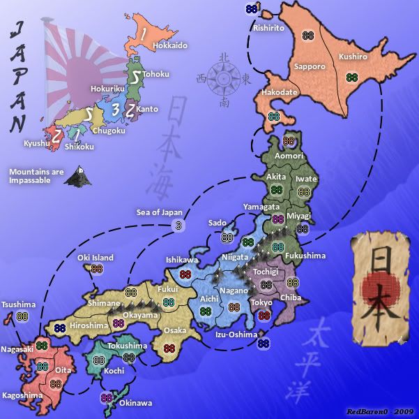
- Click image to enlarge.

Good suggestions from everyone and the update above should address everything.
Gameplay updates:
Sea of Japan now shown as a starting 3 neutral.
Graphical updates:
Internal borders redrawn with paths.
External country outline erased, a white drop shadow replaces the country outline.
Parchment paper lightened.
Title revamped (again
Army circles color changed from grey to white, with a red ring.
My own impression right off the bat is that the circles are to opaque. I'll drop the opacity in the next update.
The red ring around the army circles probably isn't needed, but I thought it was worth trying out. Should I go with this red ring, a black ring, or none at all?
-
RedBaron0
- Posts: 2657
- Joined: Sun Aug 19, 2007 12:59 pm
- Location: Pennsylvania
Re: Japan, Land of the Rising Sun - 11th revision pg8
![]() by whitestazn88 on Wed Jul 22, 2009 2:07 pm
by whitestazn88 on Wed Jul 22, 2009 2:07 pm
hey, whitestazn88 here for the preliminary review. i know i havent been back as often as i would have liked to on this map, but you've made a lot of good progress so far.
i've got only 1 or 2 comments to add though.
- it seems too busy right now. there are too many lines, and the army circles are huge and they're too white, not a big fan, as it is taking away too much from the map, which you're doing a good job with.
- the bonuses seem decent right now, but i think there are too many 2s. think about maybe removing some borders, for example the kushiro border to another continent, and change around some numbers, and i think the gameplay might be a little better
- i do like what you're doing with the space issue of this land mass though, great work
- i also like that you're keeping a fairly traditional japanese theme, as far as i can tell, with lots of characters etc that define what i think of japanese culture
i would say that this can move on, but definitely you need to work on making the map less cluttered, especially in the middle.
-
whitestazn88
- Posts: 3128
- Joined: Mon Feb 05, 2007 2:59 pm
- Location: behind you


Re: Japan, Land of the Rising Sun - 11th revision pg8
![]() by Industrial Helix on Wed Jul 22, 2009 6:06 pm
by Industrial Helix on Wed Jul 22, 2009 6:06 pm
Alright, Preliminary Review time!
Well, I'd say you need to get rid of those red circles and turn down the opacity on the white dots some.
I don't like the glow very much at all. I say go back to the old outline.
The new border divisions do look good though. I think this map is read for its stamp
Well, I'd say you need to get rid of those red circles and turn down the opacity on the white dots some.
I don't like the glow very much at all. I say go back to the old outline.
The new border divisions do look good though. I think this map is read for its stamp
Sketchblog [Update 07/25/11]: http://indyhelixsketch.blogspot.com/
Living in Japan [Update 07/17/11]: http://mirrorcountryih.blogspot.com/
Russian Revolution map for ConquerClub [07/20/11]: viewtopic.php?f=241&t=116575
Living in Japan [Update 07/17/11]: http://mirrorcountryih.blogspot.com/
Russian Revolution map for ConquerClub [07/20/11]: viewtopic.php?f=241&t=116575
-
Industrial Helix
- Posts: 3462
- Joined: Mon Jul 14, 2008 6:49 pm
- Location: Ohio
Re: Japan, Land of the Rising Sun - 10th revision pg7
![]() by danfrank on Wed Jul 22, 2009 6:15 pm
by danfrank on Wed Jul 22, 2009 6:15 pm
Mr Pink wrote:Is "Land of The Rising Sun" necessary? Seems cheesy to me.
This comment should be dismissed .. If land of the rising sun is cheesy to you . Then what would you rather call it?

-
danfrank
- Posts: 611
- Joined: Mon Dec 24, 2007 1:19 am


Re: Japan, Land of the Rising Sun - 11th revision pg8
![]() by RedBaron0 on Fri Jul 24, 2009 1:30 am
by RedBaron0 on Fri Jul 24, 2009 1:30 am
Good feedback guys. I'll hold back my update for a little bit to see if there is anything else from the initial review that needs addressing... if I'm lucky the next update with the reviewers suggestions will lead off in the Main Foundry. 
To prevent clutter I can move the "Sea of Japan" territory closer to the land, it'll keep the lines closer and more in tune with the shape of the map. I think now, that there may be 1 too many connection to the territory. That line a few others will allow adjustments to the bonus values.
The red rings are definitely out, and without them the circles are smaller, and it's easy enough to slide the opacity down on the circles.
I don't necessarily think "Land of the Rising Sun" is cheesy, but I had a nagging thought that the text to create it on the map was a little long and had a bit of a tacked on look. So I took that comment as a reason to transform it into it's current incarnation.
-
RedBaron0
- Posts: 2657
- Joined: Sun Aug 19, 2007 12:59 pm
- Location: Pennsylvania
Re: Japan, Land of the Rising Sun - 11th revision pg8
![]() by dolomite13 on Fri Jul 24, 2009 11:36 pm
by dolomite13 on Fri Jul 24, 2009 11:36 pm
I think everyone already pointed out everything I was going to so i will keep my post simple. Once a few years back when working for an unnamed company someone on the web team used some odd characters from a language in the star wars universe the letters spelled "screw george lucas" I can tell you lucas was not amused... so I feel it is important that you post what the characters on the map are supposed to spell out spell out in your first post so that no-one can complain in the future that you used vulgarity etc...
Great Job =)
==D
Great Job =)
==D
Where Have I Been? ... Testing a prototype board game that I co-designed called Alien Overrun!
-

dolomite13
- Posts: 1379
- Joined: Mon Aug 18, 2008 5:54 pm


Re: Japan, Land of the Rising Sun - 11th revision pg8
![]() by RedBaron0 on Sat Jul 25, 2009 2:51 am
by RedBaron0 on Sat Jul 25, 2009 2:51 am
No problem there, I have most of the translations on the previous page. I just moved it to the first page and added any missing translations.
-
RedBaron0
- Posts: 2657
- Joined: Sun Aug 19, 2007 12:59 pm
- Location: Pennsylvania
Re: Japan, Land of the Rising Sun - 11th revision pg8
![]() by Industrial Helix on Sat Jul 25, 2009 6:33 am
by Industrial Helix on Sat Jul 25, 2009 6:33 am
Yeah, i don't think "land of the rising sun" is cheesy as it is just a tad old fashioned. To me it reminds me of the impressions in America of Japan in before world war II. Like how a movie would describe Japan or something. Anyway, I like the Japanese text in this map... not enough maps have the language of the place their dealing with actually on the map. So good culture points there
Sketchblog [Update 07/25/11]: http://indyhelixsketch.blogspot.com/
Living in Japan [Update 07/17/11]: http://mirrorcountryih.blogspot.com/
Russian Revolution map for ConquerClub [07/20/11]: viewtopic.php?f=241&t=116575
Living in Japan [Update 07/17/11]: http://mirrorcountryih.blogspot.com/
Russian Revolution map for ConquerClub [07/20/11]: viewtopic.php?f=241&t=116575
-
Industrial Helix
- Posts: 3462
- Joined: Mon Jul 14, 2008 6:49 pm
- Location: Ohio
Re: Japan, Land of the Rising Sun - 10th revision pg7
![]() by Mr Pink on Sat Jul 25, 2009 7:52 am
by Mr Pink on Sat Jul 25, 2009 7:52 am
danfrank wrote:Mr Pink wrote:Is "Land of The Rising Sun" necessary? Seems cheesy to me.
This comment should be dismissed .. If land of the rising sun is cheesy to you . Then what would you rather call it?
I'd rather it was called Japan!
Being a resident of Japan and having a Japanese family, it sounds cheesy to me and every one of my Japanese friends I have mentioned it to. No-one in Japan refers to Japan as "The Land of the Rising Sun" these days ---- except maybe the tourist board appealing to foreigners.
Just giving an honest opinion.
Correction: an honest informed opinion, so probably undeserving of outright dismissal.
Anyway, back to the map: looking good . . . .
Best regards.
Mr. P.
-
Mr Pink
- Posts: 16
- Joined: Mon Oct 08, 2007 1:18 am
Re: Japan, Land of the Rising Sun - 11th revision pg8
![]() by RedBaron0 on Sat Jul 25, 2009 10:53 pm
by RedBaron0 on Sat Jul 25, 2009 10:53 pm
Pink has a point, as I research it a little bit more thoroughly, the kanji symbol; 本 has another meaning when it isn't paired with 日 to create 日本 (Nippon) which represents Japan. 本 has an additional meaning of "origin" so the 2 symbols when read separately as a phrase would read, "sun origin" AND if you read it in the traditional Japanese way which is right to left you get "origin sun" It was then very easy for western cultures to jump onto a kind of catch phrase to describe Japan, "land of the rising sun"
So to the community, I charge you with deciding if I should use the subtitle, "Land of the Rising Sun" as a part of the map. And I can use it in several ways, English text, Kanji text(日出ずる国) or the traditional Kanji for Japan(日本)
Personally at this point, I will lean towards the 日本 but I would like hear from the community first for deciding.
-
RedBaron0
- Posts: 2657
- Joined: Sun Aug 19, 2007 12:59 pm
- Location: Pennsylvania
Re: Japan, Land of the Rising Sun - 11th revision pg8
![]() by Mr Pink on Sun Jul 26, 2009 10:34 am
by Mr Pink on Sun Jul 26, 2009 10:34 am
I vote 日本. That's how "Japan" is written in Kanji -- I see no reason to write it otherwise.
-
Mr Pink
- Posts: 16
- Joined: Mon Oct 08, 2007 1:18 am
Re: Japan, Land of the Rising Sun - 11th revision pg8
![]() by Industrial Helix on Sun Jul 26, 2009 12:01 pm
by Industrial Helix on Sun Jul 26, 2009 12:01 pm
Yeah, I'm going to vote for 日本.
And I'm not sure what you're asking regarding "Land of the Rising Sun", but I presume Mr. Pink knows what he's talking about and if no one in Japan would say this then it ought to go. On second thought, apparently the phrase land of the rising sun is a pre-war saying that they did use. The Chinese came up with it in reference to Japan, the seeming origin of the sun. Here's a link to the wikipedia article: http://en.wikipedia.org/wiki/Names_of_Japan
The great oracle Wikipedia also tells me "May your reign last forever" or "Kimi ga Yo" is their national anthem; which might be suitable.
Sketchblog [Update 07/25/11]: http://indyhelixsketch.blogspot.com/
Living in Japan [Update 07/17/11]: http://mirrorcountryih.blogspot.com/
Russian Revolution map for ConquerClub [07/20/11]: viewtopic.php?f=241&t=116575
Living in Japan [Update 07/17/11]: http://mirrorcountryih.blogspot.com/
Russian Revolution map for ConquerClub [07/20/11]: viewtopic.php?f=241&t=116575
-
Industrial Helix
- Posts: 3462
- Joined: Mon Jul 14, 2008 6:49 pm
- Location: Ohio
Re: Japan, Land of the Rising Sun - 11th revision pg8
![]() by ender516 on Sun Jul 26, 2009 12:12 pm
by ender516 on Sun Jul 26, 2009 12:12 pm
Industrial Helix wrote:Yeah, I'm going to vote for 日本.
And I'm not sure what you're asking regarding "Land of the Rising Sun", but I presume Mr. Pink knows what he's talking about and if no one in Japan would say this then it ought to go. On second thought, apparently the phrase land of the rising sun is a pre-war saying that they did use. The Chinese came up with it in reference to Japan, the seeming origin of the sun. Here's a link to the wikipedia article: http://en.wikipedia.org/wiki/Names_of_Japan
The great oracle Wikipedia also tells me "May your reign last forever" or "Kimi ga Yo" is their national anthem; which might be suitable.
I'll second that vote, and the reference to the anthem sounds suitably respectful and current; what do you think, Mr Pink? I'd say your situation gives your opinion a bit more weight than that of the rest of us.
-
ender516
- Posts: 4455
- Joined: Wed Dec 17, 2008 6:07 pm
- Location: Waterloo, Ontario
Re: Japan, Land of the Rising Sun - 11th revision pg8
![]() by thenobodies80 on Mon Jul 27, 2009 6:54 pm
by thenobodies80 on Mon Jul 27, 2009 6:54 pm
RedBaron0 wrote:
- Click image to enlarge.
Army circles color changed from grey to white, with a red ring.
My own impression right off the bat is that the circles are to opaque. I'll drop the opacity in the next update.
The red ring around the army circles probably isn't needed, but I thought it was worth trying out. Should I go with this red ring, a black ring, or none at all?
Not at all...the ring is unnecessary, also reduce opacity could help.
I'm not a big fan of your black thick sea routes, try with something more thin ?
Chugoku and mountains have a similar color, but i can see where impassable are, so it isn't a real problem
I think you missed the Niigata circle.
I think the foundry is around the corner.
Looking forward your next "small" update
thenobodies80
-

thenobodies80
- Posts: 5400
- Joined: Wed Sep 05, 2007 4:30 am
- Location: Milan


Re: [POLL] Japan, Land of the Rising Sun - 12th revision pg9
![]() by RedBaron0 on Tue Jul 28, 2009 2:32 am
by RedBaron0 on Tue Jul 28, 2009 2:32 am
- Click image to enlarge.

Alright with some questions to answer I got an update posted up for y'all.
Graphics:
- red rings out
opacity of army circles lowered
Chugoku color changed to better offset the mountains in the region
Main title repositioned
Minor movement of other objects
Bonus map pushed to the right
a bit more of the flag is visible by the bonus map
"Sea of Japan" territory has been repositioned closer to the country and the connections coming from it have been also repositioned to better jive with the shape of the country.
The map has Japan in kanji, "日本" on top of parchment paper that has been accented with page curls at the corners. I put that version on the map since it leading the votes so far. I have posted versions of each "Land of the Rising Sun" for comparison. That haven't been graphically enhanced as much as the "日本" but I know I'll have to do something to the parchment for the longer kanji version, the paper is really stretched out, so I'd remake the paper around that size for a better look.(if necessary) I'm not as sure about parchment under the English text version. If that be the way to go, I may have to think about doing something a little different there.(if necessary)
I didn't change the connection lines, -yet- The lines are at 2 pixels in width, so 1 pixel will be as wide as the internal borders. So a change there might be best by doing a different type of line, shorter dashes, dots, and/or different colors. I fiddle around with it for the next update, I many just do different lines in different styles for comparisons.
Game Play:
- Bonus values adjusted
1 territory removed from Hokkaido (Abashiri)
connections removed from:
- Sea of Japan to Hakodate
Hiroshima to Kochi
I've eliminated the simpler "2" bonuses to 1's so now there is a good mix of bonus values. I didn't eliminate the connection on the east coast from Fukushima and Kushiro since I eliminated a territory up there and the Sea of Japan to Hakodate connection. I thought this kept a good balance between east and west coast.
-
RedBaron0
- Posts: 2657
- Joined: Sun Aug 19, 2007 12:59 pm
- Location: Pennsylvania
Re: [POLL] Japan, Land of the Rising Sun - 12th revision pg9
![]() by Industrial Helix on Tue Jul 28, 2009 6:21 am
by Industrial Helix on Tue Jul 28, 2009 6:21 am
Looks great, take it to the foundry!
Sketchblog [Update 07/25/11]: http://indyhelixsketch.blogspot.com/
Living in Japan [Update 07/17/11]: http://mirrorcountryih.blogspot.com/
Russian Revolution map for ConquerClub [07/20/11]: viewtopic.php?f=241&t=116575
Living in Japan [Update 07/17/11]: http://mirrorcountryih.blogspot.com/
Russian Revolution map for ConquerClub [07/20/11]: viewtopic.php?f=241&t=116575
-
Industrial Helix
- Posts: 3462
- Joined: Mon Jul 14, 2008 6:49 pm
- Location: Ohio
Re: [POLL] Japan, Land of the Rising Sun - 12th revision pg9
![]() by TaCktiX on Tue Jul 28, 2009 12:27 pm
by TaCktiX on Tue Jul 28, 2009 12:27 pm
I say the Kanji version, and instead of calling it the hackneyed "Japan", why not the more proper "Nippon"? That's A: what the Kanji means, and B: what Japanese people call their country. Appended as the Land of the Rising Sun in English below larger kanji would also look good.
-

TaCktiX
- Posts: 2392
- Joined: Mon Dec 17, 2007 8:24 pm
- Location: Rapid City, SD


Re: [POLL] Japan, Land of the Rising Sun - 12th revision pg9
![]() by RedBaron0 on Wed Jul 29, 2009 3:04 am
by RedBaron0 on Wed Jul 29, 2009 3:04 am
Nippon would be part of the map if the "日本" symbols become part of the map, and it is looking that way at this point. When pronounced, the word is said "ni-hon" or nippon. I'm don't think I'll change the title of the map when the change is already included in the map, unless there is a consensus from the community that Nippon is better than Japan for a title.
-
RedBaron0
- Posts: 2657
- Joined: Sun Aug 19, 2007 12:59 pm
- Location: Pennsylvania
Who is online
Users browsing this forum: No registered users
|
|||||||
| Conquer Club is not associated with RISK online in any way. Copyright © 2006-2024 by Big Wham LLC | |||||||