Conquer Club

Good Morning Woodboro (V7.X) -- Home for the Holidays

Care to peruse completed maps? Take a stroll through the Atlas.

Moderator: Cartographers

Forum rules
Please read the Community Guidelines before posting.

Re: Good Morning Woodboro (V7.2) -- Time to pretty up the town

Postby Evil DIMwit on Mon Mar 08, 2010 10:06 pm

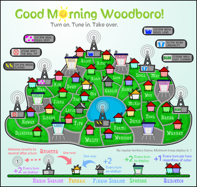
RedBaron0 wrote:I will suggest a couple of white lines in front of your sponsors, so it looks like parking spaces.


Like so?
Click image to enlarge.
image
ImageImage
User avatar
Captain Evil DIMwit
 
Posts: 1616
Joined: Thu Mar 22, 2007 1:47 pm
Location: Philadelphia, NJ

Re: Good Morning Woodboro (V7.2) -- Time to pretty up the town

Postby ender516 on Tue Mar 09, 2010 1:02 am

Glad to see the parking lots painted in at last. You might put extra spots in the A-Mart and Mitch's lots: no business would leave all that asphalt underused.
User avatar
Sergeant 1st Class ender516
 
Posts: 4455
Joined: Wed Dec 17, 2008 6:07 pm
Location: Waterloo, Ontario

Re: Good Morning Woodboro (V7.2) -- Time to pretty up the town

Postby natty dread on Tue Mar 09, 2010 4:41 am

no business would leave all that asphalt underused.


I don't think more lines would look that good... maybe the business guys decided to save money and leave some of the parking spaces unpainted?
Image
User avatar
Sergeant 1st Class natty dread
 
Posts: 12877
Joined: Fri Feb 08, 2008 8:58 pm
Location: just plain fucked

Re: Good Morning Woodboro (V7.2) -- Time to pretty up the town

Postby carlpgoodrich on Tue Mar 09, 2010 6:27 pm

I should preface this with the fact that I know very little about graphic design and am usually a pretty poor judge of what looks good. However, I think lines in front of the sponsors looks a little silly. I know nothing here is to scale, but it seems strange that you would need parking spots so big when the roads are so small.

Also, completely separate question: what is the naming scheme for the stations? Is it "105.3FM WDAL POLKA SPOT"? or just 105.3FM? or just POLKA SPOT? etc.

-carlpgoodrich
Lieutenant carlpgoodrich
 
Posts: 408
Joined: Tue Aug 04, 2009 2:12 pm

Re: Good Morning Woodboro (V7.2) -- Time to pretty up the town

Postby Evil DIMwit on Tue Mar 09, 2010 6:43 pm

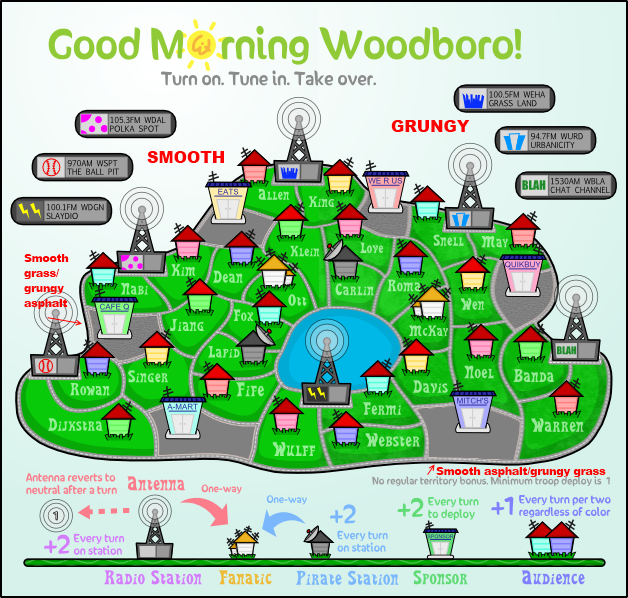
carlpgoodrich wrote:I should preface this with the fact that I know very little about graphic design and am usually a pretty poor judge of what looks good. However, I think lines in front of the sponsors looks a little silly. I know nothing here is to scale, but it seems strange that you would need parking spots so big when the roads are so small.


Y'know, I agree. I don't think they really fit with the rest of the map.


Also, completely separate question: what is the naming scheme for the stations? Is it "105.3FM WDAL POLKA SPOT"? or just 105.3FM? or just POLKA SPOT? etc.


I think it'll just be "Polka Spot Station" and "Polka Spot Antenna." That should be easiest to parse.
ImageImage
User avatar
Captain Evil DIMwit
 
Posts: 1616
Joined: Thu Mar 22, 2007 1:47 pm
Location: Philadelphia, NJ

Re: Good Morning Woodboro (V7.2) -- Time to pretty up the town

Postby MrBenn on Tue Mar 09, 2010 6:48 pm

None of the channels appear to be on Medium Wave :roll: Perhaps you could make the sports channel MW?

As for the parking lots, I'm of the opinion that they're a bit out of place. I'd also like to add that I quite like the simplicity of the pre-grunge versions...
Image
PB: 2661 | He's blue... If he were green he would die | No mod would be stupid enough to do that
User avatar
Lieutenant MrBenn
 
Posts: 6880
Joined: Wed Nov 21, 2007 9:32 am
Location: Off Duty

Re: Good Morning Woodboro (V7.2) -- Time to pretty up the town

Postby the.killing.44 on Tue Mar 09, 2010 6:53 pm

D'ya think you could make the names more legible? And by this I mean upping the opacity, or making them whiter (whichever method of blending you chose).

Also, thanks for putting my last name on there :D
User avatar
Captain the.killing.44
 
Posts: 4724
Joined: Thu Oct 23, 2008 7:43 pm
Location: now tell me what got two gums and knows how to spit rhymes

Re: Good Morning Woodboro (V7.2) -- Time to pretty up the town

Postby carlpgoodrich on Tue Mar 09, 2010 10:16 pm

MrBenn wrote: I'd also like to add that I quite like the simplicity of the pre-grunge versions...


Second. The whole map has a cartoon-ish feel to it, which I really like, and I think the clean cut grass is more in line with this, IMHO. But I am good either way.
Lieutenant carlpgoodrich
 
Posts: 408
Joined: Tue Aug 04, 2009 2:12 pm

Re: Good Morning Woodboro (V7.2) -- Time to pretty up the town

Postby Evil DIMwit on Tue Mar 09, 2010 11:31 pm

I could keep or leave the grunge; maybe I should put up a poll.
ImageImage
User avatar
Captain Evil DIMwit
 
Posts: 1616
Joined: Thu Mar 22, 2007 1:47 pm
Location: Philadelphia, NJ

Re: Good Morning Woodboro (V7.2) -- Time to pretty up the town

Postby RedBaron0 on Wed Mar 10, 2010 12:56 am

MW is the same thing as AM in the States MrBenn, so both the sports station and the chat channel cover that... although my personal recommendation for the frequency of the sports station is 610... but that might not be good for copyright reasons, and is just a personal favorite of mine for sports talk radio - 610 WIP :D King_Herpes is the afternoon drive guy too! :lol: ;)

Image

Personally I like the grunge and the parking lots. You really can go either way with the grungy grass; a poll might be a good idea, but the parking I think really distinguishes the sponsors as stores/businesses; the kind especially that would buy time to advertise on local radio.
ImageImage
User avatar
Sergeant 1st Class RedBaron0
 
Posts: 2657
Joined: Sun Aug 19, 2007 12:59 pm
Location: Pennsylvania

Re: Good Morning Woodboro (V7.??) -- The Grunge Poll

Postby Evil DIMwit on Wed Mar 10, 2010 2:54 am

All right, the poll is up: Smooth or Grungy
Click image to enlarge.
image


the.killing.44 wrote:D'ya think you could make the names more legible? And by this I mean upping the opacity, or making them whiter (whichever method of blending you chose).

I guess I'll take care of that once the grunge thing is settled.

Also, thanks for putting my last name on there :D

Any time, buddy.
ImageImage
User avatar
Captain Evil DIMwit
 
Posts: 1616
Joined: Thu Mar 22, 2007 1:47 pm
Location: Philadelphia, NJ

Re: Good Morning Woodboro (V7.??) -- The Grunge Poll

Postby yeti_c on Wed Mar 10, 2010 4:43 am

Smooth all the way... grunge ruins the whole look of the map.

C.
Image
Highest score : 2297
User avatar
Lieutenant yeti_c
 
Posts: 9624
Joined: Thu Jan 04, 2007 9:02 am

Re: Good Morning Woodboro (V7.??) -- The Grunge Poll

Postby natty dread on Wed Mar 10, 2010 6:05 am

I like grungy. I don't think it ruins anything, it makes the map look less flat, and it's subtle enough not to disturb the visual style.
Image
User avatar
Sergeant 1st Class natty dread
 
Posts: 12877
Joined: Fri Feb 08, 2008 8:58 pm
Location: just plain fucked

Re: Good Morning Woodboro (V7.??) -- The Grunge Poll

Postby ender516 on Wed Mar 10, 2010 12:56 pm

All smooth for me. I can scarcely see the grunge on the asphalt, and I don't think it adds anything to the grass. This is a cartoonish, poster-like map, and flat's where it's at. Plus I would wager that a grunge-less map compresses better and would be smaller and therefore faster to load.
User avatar
Sergeant 1st Class ender516
 
Posts: 4455
Joined: Wed Dec 17, 2008 6:07 pm
Location: Waterloo, Ontario

Re: Good Morning Woodboro (V7.??) -- The Grunge Poll

Postby Evil DIMwit on Sat Mar 13, 2010 12:26 pm

Looks like smoothness is winning. Works for me.
ImageImage
User avatar
Captain Evil DIMwit
 
Posts: 1616
Joined: Thu Mar 22, 2007 1:47 pm
Location: Philadelphia, NJ

Re: Good Morning Woodboro (V7.??) -- The Grunge Poll

Postby MrBenn on Sun Mar 14, 2010 4:05 am

Evil DIMwit wrote:Looks like smoothness is winning. Works for me.
Good ;-)
Image
PB: 2661 | He's blue... If he were green he would die | No mod would be stupid enough to do that
User avatar
Lieutenant MrBenn
 
Posts: 6880
Joined: Wed Nov 21, 2007 9:32 am
Location: Off Duty

Re: Good Morning Woodboro (V7.??) -- The Grunge Poll

Postby Evil DIMwit on Sun Mar 14, 2010 10:28 am

Oh, but the asphalt is a tie now. I might actually have to decide that one.
ImageImage
User avatar
Captain Evil DIMwit
 
Posts: 1616
Joined: Thu Mar 22, 2007 1:47 pm
Location: Philadelphia, NJ

Re: Good Morning Woodboro (V7.??) -- The Grunge Poll

Postby RedBaron0 on Sun Mar 14, 2010 11:58 am

Evil DIMwit wrote:Oh, but the asphalt is a tie now. I might actually have to decide that one.


Choose; but choose wisely... ;)
ImageImage
User avatar
Sergeant 1st Class RedBaron0
 
Posts: 2657
Joined: Sun Aug 19, 2007 12:59 pm
Location: Pennsylvania

Re: Good Morning Woodboro (V7.??) -- The Grunge Poll

Postby yeti_c on Thu Mar 18, 2010 2:19 pm

Double Smooth is ahead now!

C.
Image
Highest score : 2297
User avatar
Lieutenant yeti_c
 
Posts: 9624
Joined: Thu Jan 04, 2007 9:02 am

Re: Good Morning Woodboro (V7.??) -- The Grunge Poll

Postby Evil DIMwit on Thu Mar 18, 2010 6:10 pm

Yep. Though I've been taking another look at the asphalt texture because as it is it seems a bit too plain.
I've also been playing around with more rectangular parking lots but they're not coming out very pretty.
ImageImage
User avatar
Captain Evil DIMwit
 
Posts: 1616
Joined: Thu Mar 22, 2007 1:47 pm
Location: Philadelphia, NJ

Re: Good Morning Woodboro (V7.??) -- The Grunge Poll

Postby Evil DIMwit on Fri Mar 26, 2010 3:11 pm

Well, it's been long enough, and it looks like smooth wins out, so here's a version with the font a bit brighter:

Click image to enlarge.
image

Any other comments before I move on to the large version?


Smooth grass .... 11 .... 39%
Grungy grass .... 3 .... 11%
Other grass (specify) .... 0 .... No votes

Smooth asphalt .... 9 .... 32%
Grungy asphalt .... 5 .... 18%
Other asphalt (specify) .... 0 .... No votes
ImageImage
User avatar
Captain Evil DIMwit
 
Posts: 1616
Joined: Thu Mar 22, 2007 1:47 pm
Location: Philadelphia, NJ

Re: Good Morning Woodboro (V7.4) -- Smooth defeats Grunge

Postby natty dread on Fri Mar 26, 2010 3:28 pm

Could you try a slight drop shadow on the territory names?

Also the sponsor names could still be a bit darker, to make them easier to read.
Image
User avatar
Sergeant 1st Class natty dread
 
Posts: 12877
Joined: Fri Feb 08, 2008 8:58 pm
Location: just plain fucked

Re: Good Morning Woodboro (V7.4) -- Smooth defeats Grunge

Postby Evil DIMwit on Fri Mar 26, 2010 4:32 pm

natty_dread wrote:Could you try a slight drop shadow on the territory names?

The idea with the territory names is that they're sitting on the grass, not floating above it. I'm not sure if that's communicated well...
ImageImage
User avatar
Captain Evil DIMwit
 
Posts: 1616
Joined: Thu Mar 22, 2007 1:47 pm
Location: Philadelphia, NJ

Re: Good Morning Woodboro (V7.4) -- Smooth defeats Grunge

Postby natty dread on Fri Mar 26, 2010 4:41 pm

Well just do a smooth black outline with low opacity. This way it will be barely noticeable but will improve the legibility of the words significantly.
Image
User avatar
Sergeant 1st Class natty dread
 
Posts: 12877
Joined: Fri Feb 08, 2008 8:58 pm
Location: just plain fucked

Re: Good Morning Woodboro (V7.4) -- Smooth defeats Grunge

Postby RedBaron0 on Sat Mar 27, 2010 12:59 am

Looking good Evil. Text looks ok, but I wouldn't mind seeing that light outer glow. Where's the big version? :)
ImageImage
User avatar
Sergeant 1st Class RedBaron0
 
Posts: 2657
Joined: Sun Aug 19, 2007 12:59 pm
Location: Pennsylvania

PreviousNext

Return to The Atlas

Who is online

Users browsing this forum: No registered users