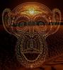
Conquer Club

[Official] Classic Revamp [Quenched]

Care to peruse completed maps? Take a stroll through the Atlas.

Moderator: Cartographers

Forum rules
Please read the Community Guidelines before posting.

Re: [Official] Classic Revamp (V10, page 33, 12/21/09)

Postby Bruceswar on Tue Dec 22, 2009 1:42 am

sully800 wrote:
ender516 wrote:I think the black on the title is just fine, and I think the difference in saturation has to do with the process of running the troop number tests and capturing that image.


Yes. But I also see no real difference in saturation, so either my eyes or bad or different monitors have different views. Probably the latter, which reminds me of the 'black' territories on the Germany revamp where I and many others could read the map text with no problem, yet some people were posting that it looked like black on black and they couldn't read a thing.

Anyway, the version that will be sent to lack will be a jpeg like the first one, so that is probably the kind of saturation we'll be going with. After I use the XML tool to place the army numbers I take a screenshot and then upload that png file for the second pic, so any difference in saturation is based on hosting the image capturing and then hosting in a different format.


Sure as hell hope so ... that version with the numbers is really too bright and hurts my eyes. The first one is nice though sans any numbers.
Highest Rank: 26 Highest Score: 3480
Image
User avatar
Corporal Bruceswar
 
Posts: 9713
Joined: Sun Dec 23, 2007 12:36 am
Location: Cow Pastures

Re: [Official] Classic Revamp (V10, page 33, 12/21/09)

Postby ender516 on Tue Dec 22, 2009 3:17 am

Bruceswar wrote:
sully800 wrote:
ender516 wrote:I think the black on the title is just fine, and I think the difference in saturation has to do with the process of running the troop number tests and capturing that image.


Yes. But I also see no real difference in saturation, so either my eyes or bad or different monitors have different views. Probably the latter, which reminds me of the 'black' territories on the Germany revamp where I and many others could read the map text with no problem, yet some people were posting that it looked like black on black and they couldn't read a thing.

Anyway, the version that will be sent to lack will be a jpeg like the first one, so that is probably the kind of saturation we'll be going with. After I use the XML tool to place the army numbers I take a screenshot and then upload that png file for the second pic, so any difference in saturation is based on hosting the image capturing and then hosting in a different format.


Sure as hell hope so ... that version with the numbers is really too bright and hurts my eyes. The first one is nice though sans any numbers.

That's weird, because on my screen the ones with numbers seem to be darker, especially the ocean. No matter, I like the ones without numbers too.
User avatar
Sergeant 1st Class ender516
 
Posts: 4455
Joined: Wed Dec 17, 2008 6:07 pm
Location: Waterloo, Ontario

Re: [Official] Classic Revamp (V10, page 33, 12/21/09)

Postby sully800 on Tue Dec 22, 2009 10:49 am

edbeard wrote:no thoughts on the idea to make sure all the army circles are the same in terms of brightness/colour?

It doesn't matter what's underneath as there's always going to be army numbers over them


Oh right, I neglected to mention that update. It turns out the previous army circles were not all the same as I had thought. Most notably Europe had a lower opacity than the rest and Africa had a higher opacity so that was contributing to the extra brightness of the African circles. I readjusted all the circles to be the same opacity, and I like the result. Yes the African circles are still brighter since they are on top of lighter colors, but I like them that way because it maintains a constant contrast from the background. If the Europe circles were the same final tone as the African ones they would contrast too much from the darker land. And if the African ones were toned down I think they would blend in with the land too much. In any case the difference in relative brightness is much less notable once the numbers are in place so hopefully the new version is a reasonable compromise.
User avatar
Major sully800
 
Posts: 4978
Joined: Wed Jun 14, 2006 5:45 pm
Location: Bethlehem, Pennsylvania

Re: [Official] Classic Revamp (V10, page 33, 12/21/09)

Postby Robinette on Tue Dec 22, 2009 11:02 am

sully800 wrote:I added notes "To Anchorage" and "To Magadan". It's a tight fit, but I think it's less obtrusive and more helpful than the old note. Let me know if it needs to be tweaked (I think the Magadan on the Large needs to be nudged to the right)

can the font size go down a pt or 2... and thinner too... maybe even in italics, but definetley thinner... yes... thinner


edbeard wrote:no thoughts on the idea to make sure all the army circles are the same in terms of brightness/colour?

It doesn't matter what's underneath as there's always going to be army numbers over them

Yes yes... edbeard is right... please address this if you can...
it's probably better not to remind people about that awful white saucer episode


Incandenza wrote:I want a Classic map revamp for Christmas.
Only a Classic map revamp will dooooo.

Well, okay, I suppose if forced to decide, I'd take a hippopotamus over a classic map revamp. But only barely. :D

Still looking for that special someone, eh incan?
Image
User avatar
Brigadier Robinette
 
Posts: 2944
Joined: Sat Apr 29, 2006 1:32 pm
Location: Northern California

Re: [Official] Classic Revamp (V10, page 33, 12/21/09)

Postby jiminski on Tue Dec 22, 2009 3:35 pm

top man Sully the text on the Anchorage Mag link is much much better now! thanks for your willingness to fine-tune your map.
Image
User avatar
Lieutenant jiminski
 
Posts: 5422
Joined: Tue Feb 20, 2007 3:30 pm
Location: London

Re: [Official] Classic Revamp (V10, page 33, 12/21/09)

Postby gimil on Tue Dec 22, 2009 7:41 pm

Forgive me sully for not wanting to go though this thread to see if there is an answer but...

The images you have with the army numbers on them are much more saturated than the images without. Which colouring will be used in the final image?

For the record I think the saturated image (the ones WITH army counts) is beautiful.
What do you know about map making, bitch?

natty_dread wrote:I was wrong


Top Score:2403
User avatar
Corporal 1st Class gimil
 
Posts: 8599
Joined: Sat Mar 03, 2007 12:42 pm
Location: United Kingdom (Scotland)

Re: [Official] Classic Revamp (V10, page 33, 12/21/09)

Postby MrBenn on Tue Dec 22, 2009 7:50 pm

The difference in saturation between images is actually between the large and the small, not between with/without armies...

Personally I prefer the large, more saturated version; although the army numbers on the small also look less saturated, so I'd put it down to some kind of metaphysical mumbo jumbo...

The "To Anchorage/Magadan" text could probably be in the same font as the title (which looked better without the black stroke), and possibly a bit smaller. If possible, I'd want to keep the text level, rather than curved - but these are only minor niggles.

Let's get this finished soon ;-)
Image
PB: 2661 | He's blue... If he were green he would die | No mod would be stupid enough to do that
User avatar
Lieutenant MrBenn
 
Posts: 6880
Joined: Wed Nov 21, 2007 9:32 am
Location: Off Duty

Re: [Official] Classic Revamp (V10, page 33, 12/21/09)

Postby gimil on Tue Dec 22, 2009 7:54 pm

MrBenn wrote:The difference in saturation between images is actually between the large and the small, not between with/without armies...

Personally I prefer the large, more saturated version; although the army numbers on the small also look less saturated, so I'd put it down to some kind of metaphysical mumbo jumbo...

The "To Anchorage/Magadan" text could probably be in the same font as the title (which looked better without the black stroke), and possibly a bit smaller. If possible, I'd want to keep the text level, rather than curved - but these are only minor niggles.

Let's get this finished soon ;-)


No Benn, it is definitely between those with numbers and those without. Unless you are looking at something other than the images at the bottom of page 33?

sully800 wrote:
Click image to enlarge.
image


Click image to enlarge.
image


Image

Image
What do you know about map making, bitch?

natty_dread wrote:I was wrong


Top Score:2403
User avatar
Corporal 1st Class gimil
 
Posts: 8599
Joined: Sat Mar 03, 2007 12:42 pm
Location: United Kingdom (Scotland)

Re: [Official] Classic Revamp (V10, page 33, 12/21/09)

Postby MrBenn on Tue Dec 22, 2009 7:59 pm

The ones with army numbers seem a little paler, and the colours of the army numbers themselves look a little muted - which would suggest some interference with the metaphysical transponder.

I think there may also be a slight difference between small and large in any case... either way, I prefer the slightly brighter colours, but think the only things that need to be finalised are the title, the "to" text, and any remaining debate about flying saucers army circles...
Image
PB: 2661 | He's blue... If he were green he would die | No mod would be stupid enough to do that
User avatar
Lieutenant MrBenn
 
Posts: 6880
Joined: Wed Nov 21, 2007 9:32 am
Location: Off Duty

Re: [Official] Classic Revamp (V10, page 33, 12/21/09)

Postby jiminski on Tue Dec 22, 2009 8:03 pm

gimil wrote:Forgive me sully for not wanting to go though this thread to see if there is an answer but...

The images you have with the army numbers on them are much more saturated than the images without. Which colouring will be used in the final image?

For the record I think the saturated image (the ones WITH army counts) is beautiful.


i agree completely, as i said before, this change was a revelation.

Ps. i think the Anchorage - Mag link text is good in following the curve of the line as opposed to just being straight. This subtly indicates exactly what it refers to and differentiates it from the territory names whilst maintaining cohesion with the maps tone. In this way it does not, in my opinion, need to be a different font size.
Image
User avatar
Lieutenant jiminski
 
Posts: 5422
Joined: Tue Feb 20, 2007 3:30 pm
Location: London

Re: [Official] Classic Revamp (V10, page 33, 12/21/09)

Postby john9blue on Tue Dec 22, 2009 9:07 pm

I think I don't like the "To xxx" text because it seems shaky. Like, you just cut and paste the letters instead of writing on a path... the base line looks jagged. Unless you did that and Photoshop writes it that way. Maybe if there's a way to give the sides a bit more space, the text could be the same size as the rest and more legible.

And I think most of us like the saturated one better (without numbers, not size related)... did you mean to change it or did it do it automatically? Maybe because of how you saved it?

I'm being crazy picky here because the rest of it is fantastic... ;)
natty_dread wrote:Do ponies have sex?
Army of GOD wrote:the term heterosexual is offensive. I prefer to be called "normal"
(proud member of the Occasionally Wrongly Banned)
User avatar
Captain john9blue
 
Posts: 1268
Joined: Mon Aug 20, 2007 6:18 pm
Location: FlutterChi-town

Re: [Official] Classic Revamp (V10, page 33, 12/21/09)

Postby The Neon Peon on Tue Dec 22, 2009 10:55 pm

I have an idea for the "to _____" that you have right now.

1. Make the lines into arrows (just add a triangle at the end)
2. Get rid of the "To"

That would free up some space, I think.
User avatar
Lieutenant The Neon Peon
 
Posts: 2342
Joined: Sat Jun 14, 2008 12:49 pm

Re: [Official] Classic Revamp (V10, page 33, 12/21/09)

Postby MeanestBossEver on Wed Dec 23, 2009 12:27 am

Arrows/Lines/To/From...I couldn't care less.

When do we get to play?
Major MeanestBossEver
 
Posts: 111
Joined: Thu May 29, 2008 11:00 pm
Location: Behind You...Right Now

Re: [Official] Classic Revamp (V10, page 33, 12/21/09)

Postby sully800 on Wed Dec 23, 2009 12:37 am

The Neon Peon wrote:I have an idea for the "to _____" that you have right now.

1. Make the lines into arrows (just add a triangle at the end)
2. Get rid of the "To"

That would free up some space, I think.


It's not a bad thought, except since I have the "To" on a separate line it's not really taking up space. The large map could be made wider to fit the text better, but the large map doesn't really have a problem right now.

On small map eliminating the "to" would actually make it harder to fit the words in, especially on the Alaska side. I will however experiment with a slightly smaller font and tighter spacing to fit the text in better.

john9blue wrote:I think I don't like the "To xxx" text because it seems shaky. Like, you just cut and paste the letters instead of writing on a path... the base line looks jagged. Unless you did that and Photoshop writes it that way. Maybe if there's a way to give the sides a bit more space, the text could be the same size as the rest and more legible.

And I think most of us like the saturated one better (without numbers, not size related)... did you mean to change it or did it do it automatically? Maybe because of how you saved it?

I'm being crazy picky here because the rest of it is fantastic... ;)


Yeah the shakiness is weird. I rotated the entire string of font at once but it didn't rotate uniformly I guess. I will experiment with typing on the curve itself when I redo the text tomorrow. As for the colors, it's because of different file types (see a few posts up). Both images look the same to me though, and the same as what I've been making in Photoshop, so I'm not really sure what everyone else is seeing.

MeanestBossEver wrote:Arrows/Lines/To/From...I couldn't care less.

When do we get to play?


Should be soon I hope!
User avatar
Major sully800
 
Posts: 4978
Joined: Wed Jun 14, 2006 5:45 pm
Location: Bethlehem, Pennsylvania

Re: [Official] Classic Revamp (V10, page 33, 12/21/09)

Postby Bruceswar on Wed Dec 23, 2009 6:40 am

gimil wrote:Forgive me sully for not wanting to go though this thread to see if there is an answer but...

The images you have with the army numbers on them are much more saturated than the images without. Which colouring will be used in the final image?

For the record I think the saturated image (the ones WITH army counts) is beautiful.


This was what I was saying 3 post up. I have never seen a map do this before... With the number is super saturated while without the numbers it is semi dull(and 10000% better)
Highest Rank: 26 Highest Score: 3480
Image
User avatar
Corporal Bruceswar
 
Posts: 9713
Joined: Sun Dec 23, 2007 12:36 am
Location: Cow Pastures

Re: [Official] Classic Revamp (V10, page 33, 12/21/09)

Postby saaimen on Wed Dec 23, 2009 4:26 pm

No matter how everyone calls it - saturated, dull, ... - I seem to collect that everyone likes the version without numbers better. So do I. Just do what you did there ;)

sully800 wrote:I readjusted all the circles to be the same opacity, and I like the result. Yes the African circles are still brighter since they are on top of lighter colors, but I like them that way because it maintains a constant contrast from the background. If the Europe circles were the same final tone as the African ones they would contrast too much from the darker land. And if the African ones were toned down I think they would blend in with the land too much. In any case the difference in relative brightness is much less notable once the numbers are in place so hopefully the new version is a reasonable compromise.

Agreed. If you close your eyes a bit and look through your eyelashes, the army circles pop out a bit more and they all seem pretty equal to me. Guess the big difference is a bit of an illusion...

Great work, sully800. Let's say, one more week and you're the proud maker of CC's main map? =D>
ImageImage
Winner of "As Easy As 1, 2, 3! - Africa I", "Championship Series: British Isles",
"1v1 Battle to Rule Doodle Earth 2", "Connect 4 (Restarted)" and "Blind Fold Buddy - BeNeLux"
Sergeant 1st Class saaimen
 
Posts: 476
Joined: Thu Nov 29, 2007 10:04 pm

Re: [Official] Classic Revamp (V10, page 33, 12/21/09)

Postby sully800 on Sat Dec 26, 2009 2:49 pm

  • I still wasn't happy with the shaky "To Magadan" type text, and horizontal writing looked bad. Trying it with just arrow heads this time.
  • Made NZ visible
  • Nudged Johannesburg circle inland
  • Adjusted the light source on connections that were previously aligned with it. The line across Australia should be more visible now
  • Moved the globes so they are close to the same height on each map

Image

Click image to enlarge.
image
User avatar
Major sully800
 
Posts: 4978
Joined: Wed Jun 14, 2006 5:45 pm
Location: Bethlehem, Pennsylvania

Re: [Official] Classic Revamp (V11, page 35, 12/26/09)

Postby natty dread on Sat Dec 26, 2009 3:03 pm

Hmm... what if you also added small arrows to the territory names? Like:

<-Anchorage ..... Magadan->

Then it would be idiot-proof... ;)
Image
User avatar
Sergeant 1st Class natty dread
 
Posts: 12877
Joined: Fri Feb 08, 2008 8:58 pm
Location: just plain fucked

Re: [Official] Classic Revamp (V11, page 35, 12/26/09)

Postby the.killing.44 on Sat Dec 26, 2009 3:39 pm

It's actually São Paolo ;)
User avatar
Captain the.killing.44
 
Posts: 4724
Joined: Thu Oct 23, 2008 7:43 pm
Location: now tell me what got two gums and knows how to spit rhymes

Re: [Official] Classic Revamp (V11, page 35, 12/26/09)

Postby sully800 on Sat Dec 26, 2009 3:43 pm

the.killing.44 wrote:It's actually São Paolo ;)


I'm missing the accent, but it's Paulo right? Not Paolo? I am personally not worried about accents but if other people care I can add it in (and any others that may be necessary).
User avatar
Major sully800
 
Posts: 4978
Joined: Wed Jun 14, 2006 5:45 pm
Location: Bethlehem, Pennsylvania

Re: [Official] Classic Revamp (V11, page 35, 12/26/09)

Postby the.killing.44 on Sat Dec 26, 2009 3:48 pm

sully800 wrote:
the.killing.44 wrote:It's actually São Paolo ;)


I'm missing the accent, but it's Paulo right? Not Paolo? I am personally not worried about accents but if other people care I can add it in (and any others that may be necessary).

Yeah, it's Paulo, my typo. I think it's worth it to change it…

I like the arrows by the way.
User avatar
Captain the.killing.44
 
Posts: 4724
Joined: Thu Oct 23, 2008 7:43 pm
Location: now tell me what got two gums and knows how to spit rhymes

Re: [Official] Classic Revamp (V11, page 35, 12/26/09)

Postby ender516 on Sat Dec 26, 2009 4:04 pm

natty_dread wrote:Hmm... what if you also added small arrows to the territory names? Like:

<-Anchorage ..... Magadan->

Then it would be idiot-proof... ;)

It's nearly impossible to make something idiot-proof, because idiots can be so ingenious...
User avatar
Sergeant 1st Class ender516
 
Posts: 4455
Joined: Wed Dec 17, 2008 6:07 pm
Location: Waterloo, Ontario

Re: [Official] Classic Revamp (V11, page 35, 12/26/09)

Postby The Neon Peon on Sat Dec 26, 2009 4:59 pm

natty_dread wrote:Hmm... what if you also added small arrows to the territory names? Like:

<-Anchorage ..... Magadan->

Then it would be idiot-proof... ;)

It's clear enough.
User avatar
Lieutenant The Neon Peon
 
Posts: 2342
Joined: Sat Jun 14, 2008 12:49 pm

Re: [Official] Classic Revamp (V11, page 35, 12/26/09)

Postby skeletonboy on Sat Dec 26, 2009 5:21 pm

Have you got updated maps with numbers?
User avatar
Sergeant skeletonboy
 
Posts: 364
Joined: Wed Oct 24, 2007 8:17 am
Location: With Jesus

Re: [Official] Classic Revamp (V11, page 35, 12/26/09)

Postby sully800 on Sat Dec 26, 2009 5:34 pm

The last update (V10) should be exactly the same in terms of coords except for Johannesburg. Nothing to do with the army circles or other alignment was changed so V10 should be a good reference for now.
User avatar
Major sully800
 
Posts: 4978
Joined: Wed Jun 14, 2006 5:45 pm
Location: Bethlehem, Pennsylvania

PreviousNext

Return to The Atlas

Who is online

Users browsing this forum: No registered users