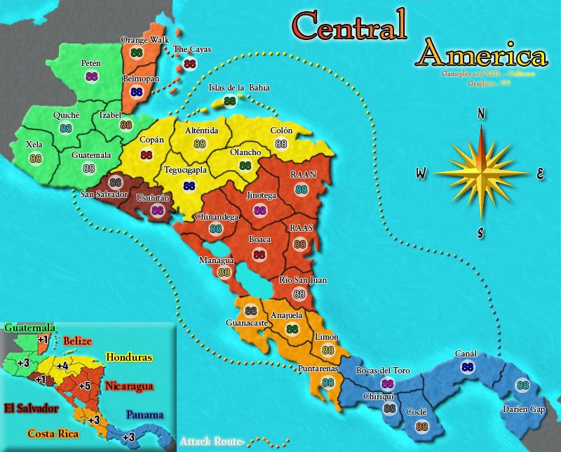
Zela should be Xela
Colon and Tegucigapla should be around the other way
Mangua should be Managua
The last i in Chiriqui should have an acute accent, not a dot
The last a in Canal should have an acute accent above it
Official: Central America Competition - complete!
Moderator: Cartographers
Re: Official: Central America Competition - Rd 1 over
![]() by e_i_pi on Sun Jan 04, 2009 9:21 pm
by e_i_pi on Sun Jan 04, 2009 9:21 pm
-

 e_i_pi
- Posts: 1775
- Joined: Tue Feb 12, 2008 2:19 pm
- Location: Corruption Capital of the world


Re: Official: Central America Competition - Rd 1 over
![]() by oaktown on Sun Jan 04, 2009 11:56 pm
by oaktown on Sun Jan 04, 2009 11:56 pm
-

oaktown
- Posts: 4451
- Joined: Sun Dec 03, 2006 9:24 pm
- Location: majorcommand


Re: Official: Central America Competition - Rd 1 over
![]() by bryguy on Mon Jan 05, 2009 8:56 am
by bryguy on Mon Jan 05, 2009 8:56 am
I don't really like the way that Guatemala is split into two lines with the hyphen in the minimap, and also the font/style of the "Mexico," "Caribbean Sea," "Colombia", and "Pacific Ocean". I deffinately dont like the new compass, what was so bad about the old one? I really liked it 
Title looks awesome tho
Title looks awesome tho
-
bryguy
- Posts: 4381
- Joined: Tue Aug 07, 2007 8:50 am
- Location: Lost in a Jigsaw


Re: Official: Central America Competition - Rd 1 over
![]() by oaktown on Mon Jan 05, 2009 9:23 am
by oaktown on Mon Jan 05, 2009 9:23 am
bryguy wrote:I don't really like the way that Guatemala is split into two lines with the hyphen in the minimap, and also the font/style of the "Mexico," "Caribbean Sea," "Colombia", and "Pacific Ocean". I deffinately dont like the new compass, what was so bad about the old one? I really liked it
I kinda like the new compass, though it seems more washed out than any other element on the image. I'll agree with you somewhat on the font choice - I don't think any one font is bad, but there seem to be a lot of them. The mini-map font is not carried over into the main map any more, making it seem out of place.
My overall feel about many of the maps is that they are too big - this is a small map of a small region, so I don't think it needs to take up 800x800 pixels.
-
oaktown
- Posts: 4451
- Joined: Sun Dec 03, 2006 9:24 pm
- Location: majorcommand
Re: Official: Central America Competition - Rd 1 over
![]() by bryguy on Mon Jan 05, 2009 9:29 am
by bryguy on Mon Jan 05, 2009 9:29 am
oaktown wrote:My overall feel about many of the maps is that they are too big - this is a small map of a small region, so I don't think it needs to take up 800x800 pixels.
Biggest to smallest:
Entry 3: 839x800
Entry 5: 840x772
Entry 2: 800x644
Entry 4: 630x507 Entry 6: 530x507
Entry 1: 628x505
Entry 3 has 1 pixel less height then Entry 5, but 28 pixels more height than Entry 5.
Largest: Entry 3 at 839x800
Smallest: Entry 1 at 628x505
Entry 1 has 2 pixels less than Entry 4 and Entry 6
So half are small, half are large.
Now Im gonna make comments on entries
Entry 1: Needs work... all Im gonna say. Ocean is to dark, numbering thing is distracting, not enough colors, legend needs work, and regions need more distinction.
Entry 2: Very bright. The colors are to similar for my tastes. In the upper left corner, there is a border, why is that? Title is pixely.
Entry 3: Unique. Texture needs lessining, and I can barely read the names. Army circles are to small to fit 2 digits.
Entry 4: Needs to not be an island. All I can think of, cause it is superbly done.
Entry 5: Commented already.
Entry 6: No obvious place for placement of Cayes and Bahla armies. Legend needs to look more natural. Texture needs to be lessened. Needs to not be an island. Text can be hard to see at places.
Thats all I can think of right now
-
bryguy
- Posts: 4381
- Joined: Tue Aug 07, 2007 8:50 am
- Location: Lost in a Jigsaw
Re: Official: Central America Competition - Rd 1 over
![]() by oaktown on Tue Jan 06, 2009 7:44 pm
by oaktown on Tue Jan 06, 2009 7:44 pm
- Click image to enlarge.
Here's another submission that was PM'd to me early with a request for feedback. Attack!
-
oaktown
- Posts: 4451
- Joined: Sun Dec 03, 2006 9:24 pm
- Location: majorcommand
Re: Official: Central America Competition - Rd 1 over
![]() by samuelc812 on Tue Jan 06, 2009 7:57 pm
by samuelc812 on Tue Jan 06, 2009 7:57 pm
I don't think the Green and Blue Continents are really doing anything for the Map, they just don't seem right
-

samuelc812
- Posts: 2215
- Joined: Sun Dec 30, 2007 6:56 am


Re: Official: Central America Competition - Round 2!!
![]() by oaktown on Wed Jan 07, 2009 9:27 pm
by oaktown on Wed Jan 07, 2009 9:27 pm
Round 2 is live - now everybody vote!!
Round 1 results:
Entry #1: 7 votes; 2%
Entry #2: 76 votes; 20%
Entry #3: 60 votes; 16%
Entry #4: 108 votes; 29%
Entry #5: 123 votes; 33%
Round 1 results:
Entry #1: 7 votes; 2%
Entry #2: 76 votes; 20%
Entry #3: 60 votes; 16%
Entry #4: 108 votes; 29%
Entry #5: 123 votes; 33%
-
oaktown
- Posts: 4451
- Joined: Sun Dec 03, 2006 9:24 pm
- Location: majorcommand
Re: Official: Central America Competition - Round 2!!
![]() by the.killing.44 on Wed Jan 07, 2009 9:28 pm
by the.killing.44 on Wed Jan 07, 2009 9:28 pm
First for round two 
Entry 1:
Your title font is called 'Stamp Act' … I have it . However much I like it, I don't this it fits here. Same with your bonus fonts — they seem like something out of Asia/the old Classic which drastically differs from both the Central America location and the style set by your map. The actual map is nice, but the key/text (the colored fonts in the minimap aren't to my liking, the bonus names like I said before, etc.) is a large negative, IMO. Although I do like the overall style of physical map that you give (and your mountains are nice), the map seems just too dark for my liking and especially something like Central America. Also, it's very very hard to differentiate between countries.
Entry 2:
So much different that #1! My second favorite overall, I like the obviousness of the different countries as well as the borders, but the title seems very overshadowed and small. Also, the minimap seems like it would be better just as an inset rather than a beveled box. The readability of the tert names is also an issue — I suggest you scale back on the font outline. Overall, I like the feel — it suits the region very nicely! — and love the compass => 2nd fave!
Entry 3:
Wow wow wow. I really didn't like this one during Round 1 but gosh that is such an amazing redo. Getting rid of the texture on the actual map is a huge plus, and in the background it's just subtle enough to be perfect to the eye. The names are readable, I still am in love with the title — if you couldn't tell already this is far and away my favorite! (By the way, the frame is a very nice touch)
Entry 4:
This will be the small map, so I realize it is just that — small. But the whole thing gives off a very squished feel. The steering wheel colors should have a much bigger difference. I do like the colored texts, although the countries are still hard to make out. I'm not a very big fan of the huge text in the key, but I really like the symbols for each country.
Entry 5:
Third favorite, just missed second favorite … the feel of the map is nice and balanced between subtle colors and the bright Central America-like style. I also really love the minimap and the compass (although the image is a bit weird) — the faded-on-stone look is really appealing. There isn't something specific that I really hate on this map, but it's nowhere near as good as #3. Nice job, though.
Entry 6:
Nice key — that's what jumped out at me first. However, this might not be as good a thing as one would think, as the player should be attracted to the map, first. I would increase the opacity, and even more on the flags of the nations. On the map — the texture is just too much. Like I said to #3 in Round 1, that's what I didn't like about it. As well, the text is a bit hard to read, that is a very large part of the map. Came in 4th in my voting. (P.S. nice compass!)
#3 just blew me away after that update. If it doesn't win … well something's wrong then!
Great Rnd. 2,
.44
Entry 1:
Your title font is called 'Stamp Act' … I have it
Entry 2:
So much different that #1! My second favorite overall, I like the obviousness of the different countries as well as the borders, but the title seems very overshadowed and small. Also, the minimap seems like it would be better just as an inset rather than a beveled box. The readability of the tert names is also an issue — I suggest you scale back on the font outline. Overall, I like the feel — it suits the region very nicely! — and love the compass => 2nd fave!
Entry 3:
Wow wow wow. I really didn't like this one during Round 1 but gosh that is such an amazing redo. Getting rid of the texture on the actual map is a huge plus, and in the background it's just subtle enough to be perfect to the eye. The names are readable, I still am in love with the title — if you couldn't tell already this is far and away my favorite! (By the way, the frame is a very nice touch)
Entry 4:
This will be the small map, so I realize it is just that — small. But the whole thing gives off a very squished feel. The steering wheel colors should have a much bigger difference. I do like the colored texts, although the countries are still hard to make out. I'm not a very big fan of the huge text in the key, but I really like the symbols for each country.
Entry 5:
Third favorite, just missed second favorite … the feel of the map is nice and balanced between subtle colors and the bright Central America-like style. I also really love the minimap and the compass (although the image is a bit weird) — the faded-on-stone look is really appealing. There isn't something specific that I really hate on this map, but it's nowhere near as good as #3. Nice job, though.
Entry 6:
Nice key — that's what jumped out at me first. However, this might not be as good a thing as one would think, as the player should be attracted to the map, first. I would increase the opacity, and even more on the flags of the nations. On the map — the texture is just too much. Like I said to #3 in Round 1, that's what I didn't like about it. As well, the text is a bit hard to read, that is a very large part of the map. Came in 4th in my voting. (P.S. nice compass!)
#3 just blew me away after that update. If it doesn't win … well something's wrong then!
Great Rnd. 2,
.44
Last edited by the.killing.44 on Wed Jan 07, 2009 9:50 pm, edited 1 time in total.
-

the.killing.44
- Posts: 4724
- Joined: Thu Oct 23, 2008 7:43 pm
- Location: now tell me what got two gums and knows how to spit rhymes


Re: Official: Central America Competition - Round 2!!
![]() by bryguy on Wed Jan 07, 2009 9:43 pm
by bryguy on Wed Jan 07, 2009 9:43 pm
oaktown wrote:Entry #4: http://i141.photobucket.com/albums/r76/ ... /map04.jpg[/bigimg]
Entry #5: http://i141.photobucket.com/albums/r76/ ... /map05.png[/bigimg]
uh... oak? lol
1) I think that this entry has been improved greatly from round
2) Love the look
3) This one seems to have imroved in some ways, gotten worse in other. The texture is lightened, thats good. Also, the text is finally readable. The colors have been saturated a bit to much to in my taste.
4) I dont care for this entry at all anymore. Its to crowded. I like the sea symbols thing, but the rest of it is so crowded that its no longer appealing.
5) Comments have been made earlier, and I keep them that way. I also think that the compass and mini-map arent that good anymore. Those and the names of the oceans and surrounding regions are things that I dont like, the rest though is good
6) Have any changes been made here?
-
bryguy
- Posts: 4381
- Joined: Tue Aug 07, 2007 8:50 am
- Location: Lost in a Jigsaw
Re: Official: Central America Competition - Round 2!!
![]() by edbeard on Wed Jan 07, 2009 9:45 pm
by edbeard on Wed Jan 07, 2009 9:45 pm
I'm fairly sure the voting won't reflect this but to me it's not even close.
#3 addressed all it's problems and solved them
It has a unique perspective. It went from the least readable and most busy to one of the most readable and least busy. If it does not win it will be a shame.
the only one's that can compete in uniqueness for me are #1 and #4
#1 made huge strides. partially because it wasn't much the first go around and partially because of the work they put into this. the problem it has is that it needs more of the colours on the map itself to distinguish continents. it seems to be going for a weather map type of theme or something but some of the details are off. well done though
#4 has a great look to it and the style would make for a nice map. problem is it for me it became the most busy and least readable at least of the contenders. some of this can be fixed but one problem is the style itself sets itself up for this. coloured names instead of coloured land will are part of the reason but you cant do much because that's the style of the map. the map is very good but it just doesn't grab me like #3 though if #3 can't win, it should be this one. the mapmaker did him/herself a slight disservice by doing the small map. very good job but 2nd place for me.
the others do not grab me at all. too general and basic. possibly good enough to pass foundry standards but not good enough to win this competition.
why is the poll not the kind that allows changing of votes?
-

edbeard
- Posts: 2501
- Joined: Thu Mar 29, 2007 12:41 am


Re: Official: Central America Competition - Round 2!!
![]() by oaktown on Wed Jan 07, 2009 9:53 pm
by oaktown on Wed Jan 07, 2009 9:53 pm
bryguy wrote:uh... oak? lol
thanks for the catch, bryguy.
I largely agree with the aforementioned comments... map #1 made the most progress, map #3 addressed the readability concerns but may have lost a bit of it's original flare, the others were and have remained very clean. Any of these entries would make solid CC maps.
-
oaktown
- Posts: 4451
- Joined: Sun Dec 03, 2006 9:24 pm
- Location: majorcommand
Re: Official: Central America Competition - Round 2!!
![]() by oaktown on Wed Jan 07, 2009 9:58 pm
by oaktown on Wed Jan 07, 2009 9:58 pm
edbeard wrote:why is the poll not the kind that allows changing of votes?
crap... I'm deleting and re-loading the poll before there are too many votes...
Sincere apologies to the five of you who already voted, and thanks to edbeard for the quick catch.
-
oaktown
- Posts: 4451
- Joined: Sun Dec 03, 2006 9:24 pm
- Location: majorcommand
Re: Official: Central America Competition - Round 2!!
![]() by ZeakCytho on Wed Jan 07, 2009 10:52 pm
by ZeakCytho on Wed Jan 07, 2009 10:52 pm
Awesome entries, everyone. Is there gonna be an announcement on the homepage?
-

ZeakCytho
- Posts: 1251
- Joined: Wed Sep 12, 2007 4:36 pm

Re: Official: Central America Competition - Round 2!!
![]() by the.killing.44 on Wed Jan 07, 2009 11:06 pm
by the.killing.44 on Wed Jan 07, 2009 11:06 pm
I sholud prob post this in the Centerscape comp, but seeing how this will be very active: when has gimil updated the deadline to, if anything?
.44
edited for clarity
and oak that's hilarious!
.44
edited for clarity
and oak that's hilarious!
Last edited by the.killing.44 on Thu Jan 08, 2009 12:41 am, edited 1 time in total.
-
the.killing.44
- Posts: 4724
- Joined: Thu Oct 23, 2008 7:43 pm
- Location: now tell me what got two gums and knows how to spit rhymes
Re: Official: Central America Competition - Round 2!!
![]() by oaktown on Thu Jan 08, 2009 12:32 am
by oaktown on Thu Jan 08, 2009 12:32 am
ZeakCytho wrote:Awesome entries, everyone. Is there gonna be an announcement on the homepage?
already requested it.
meanwhile idiots are walking down my street, smashing windows and burning cars. For whatever reason they skipped mine. Oakland is awesome.
-
oaktown
- Posts: 4451
- Joined: Sun Dec 03, 2006 9:24 pm
- Location: majorcommand
Re: Official: Central America Competition - Round 2!!
![]() by MaleAlphaThree on Thu Jan 08, 2009 8:44 pm
by MaleAlphaThree on Thu Jan 08, 2009 8:44 pm
Yeah, I gotta admit that #3 has gone from horrible eye sore to pretty, damn decent. But it still feels a little cramped in the north and the colors still set me off a bit. It is absolutely unique, however that isn't going to make me vote for it. I wouldn't mind getting that style for another map even.
I just prefer the clear crisp map that #5 delivers. Nothing distracting, and very soft color schemes.
P.S. #1 and #4 are still nasty.
I just prefer the clear crisp map that #5 delivers. Nothing distracting, and very soft color schemes.
P.S. #1 and #4 are still nasty.
-

MaleAlphaThree
- Posts: 35
- Joined: Sun Jun 01, 2008 2:52 pm
- Location: Video games.


Re: Official: Central America Competition - Round 2!!
![]() by e_i_pi on Fri Jan 09, 2009 1:10 pm
by e_i_pi on Fri Jan 09, 2009 1:10 pm
84 votes, 4 comments
-
e_i_pi
- Posts: 1775
- Joined: Tue Feb 12, 2008 2:19 pm
- Location: Corruption Capital of the world
Re: Official: Central America Competition - Round 2!!
![]() by Natewolfman on Fri Jan 09, 2009 1:31 pm
by Natewolfman on Fri Jan 09, 2009 1:31 pm
I dont remember what i voted for last time, but this time I went with 4... here are my thoughts
1) its very well done, in fact it looks almost real... but I dont like that in maps, i dont want them to look real, kinda bugs me
2) my second choice, the colors work very well for the theme and I have very little to say about it, 4 just was a tad better to me
3) 3 is defiantely the most unique, and for that a applaud, I just get the feeling that... playing on that map would give me a headach
4) my choice, yes its all green like #1 but it dosnt look realistic, and I like that about it. Its very well done and i belive the closest to being ready for gameplay
5) kinda bland to me... its alot like #2 without the nice theme colors
6) I liked it alot before this round, but it didnt change... Im also dissapointed at the lack of North/South land since it was such a big issue to some maps in round 1

-

Natewolfman
- Posts: 4599
- Joined: Wed Aug 29, 2007 6:37 pm
- Location: omaha, NE


Re: Official: Central America Competition - Round 2!!
![]() by ZeakCytho on Fri Jan 09, 2009 2:36 pm
by ZeakCytho on Fri Jan 09, 2009 2:36 pm
e_i_pi wrote:84 votes, 4 comments
I know
-
ZeakCytho
- Posts: 1251
- Joined: Wed Sep 12, 2007 4:36 pm
Re: Official: Central America Competition - Round 2!!
![]() by saaimen on Fri Jan 09, 2009 7:10 pm
by saaimen on Fri Jan 09, 2009 7:10 pm
edbeard wrote:#3 addressed all it's problems and solved them
It has a unique perspective. It went from the least readable and most busy to one of the most readable and least busy. If it does not win it will be a shame.
Well ed, on this one, I completely agree


Winner of "As Easy As 1, 2, 3! - Africa I", "Championship Series: British Isles",
"1v1 Battle to Rule Doodle Earth 2", "Connect 4 (Restarted)" and "Blind Fold Buddy - BeNeLux"
-
saaimen
- Posts: 476
- Joined: Thu Nov 29, 2007 10:04 pm

Re: Official: Central America Competition - Round 2!!
![]() by whitestazn88 on Fri Jan 09, 2009 7:25 pm
by whitestazn88 on Fri Jan 09, 2009 7:25 pm
wow, number 3. the mapmaker really took everything people said to heart, it looks better than ever, and with the unique perspective, it has to win!
-
whitestazn88
- Posts: 3128
- Joined: Mon Feb 05, 2007 2:59 pm
- Location: behind you

Re: Official: Central America Competition - Round 2!!
![]() by cairnswk on Fri Jan 09, 2009 9:30 pm
by cairnswk on Fri Jan 09, 2009 9:30 pm
Shame there wasn't size limitation on this...three large maps and 3 small maps....kinda makes a judgement hard when they all aren't the same size.

* Pearl Harbour * Waterloo * Forbidden City * Jamaica * Pot Mosbi
-

cairnswk
- Posts: 11510
- Joined: Sat Feb 03, 2007 8:32 pm
- Location: Australia

Re: Official: Central America Competition - Round 2!!
![]() by e_i_pi on Fri Jan 09, 2009 10:07 pm
by e_i_pi on Fri Jan 09, 2009 10:07 pm
cairnswk wrote:Shame there wasn't size limitation on this...three large maps and 3 small maps....kinda makes a judgement hard when they all aren't the same size.
True cairns. I won't say what size I made, but I do agree that maps all the same size would have been a good idea. The problem I see though is this:
Some people like to start with small and then make the large, others like it the other way around
-
e_i_pi
- Posts: 1775
- Joined: Tue Feb 12, 2008 2:19 pm
- Location: Corruption Capital of the world
Re: Official: Central America Competition - Round 2!!
![]() by ZeakCytho on Fri Jan 09, 2009 10:19 pm
by ZeakCytho on Fri Jan 09, 2009 10:19 pm
It's not too hard to make a scalable one. I made mine at double the large size, so I can scale to large and small very easily. The only difference would be in centering 88s. A size guideline would have been nice to have in the rules, but I think you can compare the maps well enough without it.
-
ZeakCytho
- Posts: 1251
- Joined: Wed Sep 12, 2007 4:36 pm
Who is online
Users browsing this forum: No registered users
|
|||||||
| Conquer Club is not associated with RISK online in any way. Copyright © 2006-2024 by Big Wham LLC | |||||||