The title color. Go back to the same shade a page back. Darker. Please.
Really like the more pronounced back ground!
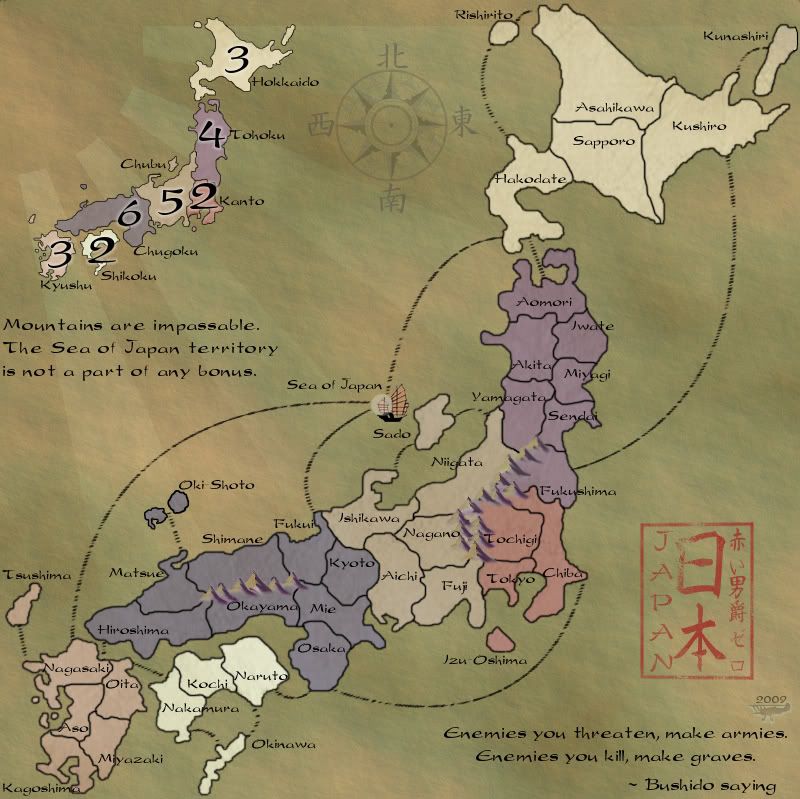
Japan - 日本 - Quenched
Moderator: Cartographers
Re: Japan - 日本 (D, Gp) V11.2 (Upd 12-6)pg38 Working on Graphics
![]() by jefjef on Sun Dec 06, 2009 10:38 am
by jefjef on Sun Dec 06, 2009 10:38 am
This post was made by jefjef who should be on your ignore list.

drunkmonkey wrote:I'm filing a C&A report right now. Its nice because they have a drop-down for "jefjef".
-

 jefjef
- Posts: 6026
- Joined: Mon Feb 23, 2009 8:41 pm
- Location: on my ass


Re: Japan - 日本 (D, Gp) V11.2 (Upd 12-6)pg38 Working on Graphics
![]() by AndyDufresne on Mon Dec 07, 2009 11:40 am
by AndyDufresne on Mon Dec 07, 2009 11:40 am
I'm not sure I like the color of Shikoku...seems strangely like the odd man out color wise.
--Andy
--Andy
-

AndyDufresne
- Posts: 24935
- Joined: Fri Mar 03, 2006 8:22 pm
- Location: A Banana Palm in Zihuatanejo


Re: Japan - 日本 (D, Gp) V11.2 (Upd 12-6)pg38 Working on Graphics
![]() by RedBaron0 on Mon Dec 07, 2009 1:09 pm
by RedBaron0 on Mon Dec 07, 2009 1:09 pm
That color is an easy fix, and I'm working on the the stamp still.(with some help) I actually miss that green that used to be in Chubu... but the color blindness filter kinda nixed it and when I switched the 2 colors it didn't come out the same.


-

RedBaron0
- Posts: 2657
- Joined: Sun Aug 19, 2007 12:59 pm
- Location: Pennsylvania


Re: Japan - 日本 (D, Gp) V11.2 (Upd 12-6)pg38 Working on Graphics
![]() by fumandomuerte on Tue Dec 08, 2009 10:07 pm
by fumandomuerte on Tue Dec 08, 2009 10:07 pm
eer, I don't like the font you're using. Can you try these free type fonts?


You can get them in dafont
You can get them in dafont

-

fumandomuerte
- Posts: 620
- Joined: Sat Dec 29, 2007 1:27 am
- Location: The Cinderella of the Pacific


Re: Japan - 日本 (D, Gp) V11.4 (Upd 12-8)pg38 Working on Graphics
![]() by RedBaron0 on Tue Dec 08, 2009 11:17 pm
by RedBaron0 on Tue Dec 08, 2009 11:17 pm
I'll likely make a push here and see if I can't get into the Forge by the weekend, but I'm content to wait too. killing.44 graciously offered to help me with the title block and here's what he's come up with. I'm pretty beat and will give those fonts a try in the morning.
- Click image to enlarge.
-
RedBaron0
- Posts: 2657
- Joined: Sun Aug 19, 2007 12:59 pm
- Location: Pennsylvania
Re: Japan - 日本 (D, Gp) V11.2 (Upd 12-6)pg38 Working on Graphics
![]() by ender516 on Tue Dec 08, 2009 11:49 pm
by ender516 on Tue Dec 08, 2009 11:49 pm
I prefer the font you have to any of those suggested by fumandomuerte.
-

ender516
- Posts: 4455
- Joined: Wed Dec 17, 2008 6:07 pm
- Location: Waterloo, Ontario


Re: Japan - 日本 (D, Gp) V11.2 (Upd 12-6)pg38 Working on Graphics
![]() by natty dread on Wed Dec 09, 2009 3:37 am
by natty dread on Wed Dec 09, 2009 3:37 am
Love the junk! Definitely a keeper.
You definitely need to change the font though... the o:s and s:s are just too disturbing. If you're going with any of the ones fumandomuerte posted, I suggest the first one.
You definitely need to change the font though... the o:s and s:s are just too disturbing. If you're going with any of the ones fumandomuerte posted, I suggest the first one.

-

natty dread
- Posts: 12877
- Joined: Fri Feb 08, 2008 8:58 pm
- Location: just plain fucked


Re: Japan - 日本 (D, Gp) V11.2 (Upd 12-6)pg38 Working on Graphics
![]() by fumandomuerte on Wed Dec 09, 2009 6:30 am
by fumandomuerte on Wed Dec 09, 2009 6:30 am
natty_dread wrote:Love the junk! Definitely a keeper.
You definitely need to change the font though... the o:s and s:s are just too disturbing
Same concern for me
-
fumandomuerte
- Posts: 620
- Joined: Sat Dec 29, 2007 1:27 am
- Location: The Cinderella of the Pacific
Re: Japan - 日本 (D, Gp) V11.2 (Upd 12-6)pg38 Working on Graphics
![]() by Industrial Helix on Wed Dec 09, 2009 8:36 am
by Industrial Helix on Wed Dec 09, 2009 8:36 am
Might I suggest keeping the font and highlighting the o's and s's and lowering their font size a number or two? I think that should do it. I prefer the current font to the ones suggested.
Sketchblog [Update 07/25/11]: http://indyhelixsketch.blogspot.com/
Living in Japan [Update 07/17/11]: http://mirrorcountryih.blogspot.com/
Russian Revolution map for ConquerClub [07/20/11]: viewtopic.php?f=241&t=116575
Living in Japan [Update 07/17/11]: http://mirrorcountryih.blogspot.com/
Russian Revolution map for ConquerClub [07/20/11]: viewtopic.php?f=241&t=116575
-

Industrial Helix
- Posts: 3462
- Joined: Mon Jul 14, 2008 6:49 pm
- Location: Ohio


Re: Japan - 日本 (D, Gp) V11.2 (Upd 12-6)pg38 Working on Graphics
![]() by ender516 on Wed Dec 09, 2009 10:38 am
by ender516 on Wed Dec 09, 2009 10:38 am
Industrial Helix wrote:Might I suggest keeping the font and highlighting the o's and s's and lowering their font size a number or two? I think that should do it. I prefer the current font to the ones suggested.
Another fix might be to mix bold and normal versions of the text.
-
ender516
- Posts: 4455
- Joined: Wed Dec 17, 2008 6:07 pm
- Location: Waterloo, Ontario
Re: Japan - 日本 (D, Gp) V11.2 (Upd 12-6)pg38 Working on Graphics
![]() by RedBaron0 on Wed Dec 09, 2009 11:50 pm
by RedBaron0 on Wed Dec 09, 2009 11:50 pm
I'm not overly fond of either of the fonts, but I've tried another font I found at dafont, Korean  calligraphy
I know I'll have to reposition some of the layers for better visibility, but this is just to take a look at the font on the map. I tried just changing the size a little for just the "S's" & "O's", didn't really change it.
- Click image to enlarge.
I know I'll have to reposition some of the layers for better visibility, but this is just to take a look at the font on the map. I tried just changing the size a little for just the "S's" & "O's", didn't really change it.
-
RedBaron0
- Posts: 2657
- Joined: Sun Aug 19, 2007 12:59 pm
- Location: Pennsylvania
Re: Japan - 日本 (D, Gp) V11.2 (Upd 12-6)pg38 Working on Graphics
![]() by AndyDufresne on Thu Dec 10, 2009 12:49 am
by AndyDufresne on Thu Dec 10, 2009 12:49 am
I'm fine with the paragraph font, but the territory font is more blah.
--Andy
--Andy
-
AndyDufresne
- Posts: 24935
- Joined: Fri Mar 03, 2006 8:22 pm
- Location: A Banana Palm in Zihuatanejo
Re: Japan - 日本 (D, Gp) V11.2 (Upd 12-6)pg38 Working on Graphics
![]() by natty dread on Thu Dec 10, 2009 1:46 am
by natty dread on Thu Dec 10, 2009 1:46 am
The territory font doesn't look Japanese at all...
it looks korean
But seriously... I'd keep looking with the fonts. The other texts still have the problem of some letters looking like they belong to another font...
Try one of these:
http://www.dafont.com/bonzai.font
http://www.dafont.com/seven-monkey-fury-b.font
it looks korean
But seriously... I'd keep looking with the fonts. The other texts still have the problem of some letters looking like they belong to another font...
Try one of these:
http://www.dafont.com/bonzai.font
http://www.dafont.com/seven-monkey-fury-b.font
-
natty dread
- Posts: 12877
- Joined: Fri Feb 08, 2008 8:58 pm
- Location: just plain fucked
Re: Japan - 日本 (D, Gp) V11.2 (Upd 12-6)pg38 Working on Graphics
![]() by 00iCon on Thu Dec 10, 2009 7:20 am
by 00iCon on Thu Dec 10, 2009 7:20 am
Does anyone else think the boat is a little too close to Sado?
Also any reason for the lowercase letters?
And IMO the verson 114 font is better.
Great job RB0, this has come a really long way. I personally have no preference over the parchment or previous design, though the best has been the one with the dancing Bender and inverted colours
Also any reason for the lowercase letters?
And IMO the verson 114 font is better.
Great job RB0, this has come a really long way. I personally have no preference over the parchment or previous design, though the best has been the one with the dancing Bender and inverted colours
-
00iCon
- Posts: 257
- Joined: Wed Apr 29, 2009 4:42 am
- Location: Sydney NSW

Re: Japan - 日本 (D, Gp) V11.2 (Upd 12-6)pg38 Working on Graphics
![]() by Industrial Helix on Thu Dec 10, 2009 8:40 am
by Industrial Helix on Thu Dec 10, 2009 8:40 am
Not bad. You might want to erase the border where the words go over it to improve clarity, like yamagata for example. Also, the lack of capital letters kind of bugs me.
Sketchblog [Update 07/25/11]: http://indyhelixsketch.blogspot.com/
Living in Japan [Update 07/17/11]: http://mirrorcountryih.blogspot.com/
Russian Revolution map for ConquerClub [07/20/11]: viewtopic.php?f=241&t=116575
Living in Japan [Update 07/17/11]: http://mirrorcountryih.blogspot.com/
Russian Revolution map for ConquerClub [07/20/11]: viewtopic.php?f=241&t=116575
-
Industrial Helix
- Posts: 3462
- Joined: Mon Jul 14, 2008 6:49 pm
- Location: Ohio
Re: Japan - 日本 (D, Gp) V11.2 (Upd 12-6)pg38 Working on Graphics
![]() by RedBaron0 on Thu Dec 10, 2009 12:32 pm
by RedBaron0 on Thu Dec 10, 2009 12:32 pm
That font has no uppercase, even when typing in uppercase the letters still come out lowercase. Looks like I'm looking for another font. I'll try a bunch see where it goes.
I've tried a lot of those Asian fonts from dafont, natty, they just don't come out very clear, either, to loopy/thin or to bold/blocky. I'm looking down a few other avenues.
I'll flip the junk around, erase some of the territory lines... move the circle a little bit perhaps.
I've tried a lot of those Asian fonts from dafont, natty, they just don't come out very clear, either, to loopy/thin or to bold/blocky. I'm looking down a few other avenues.
I'll flip the junk around, erase some of the territory lines... move the circle a little bit perhaps.
-
RedBaron0
- Posts: 2657
- Joined: Sun Aug 19, 2007 12:59 pm
- Location: Pennsylvania
Re: Japan - 日本 (D, Gp) V11.2 (Upd 12-6)pg38 Working on Graphics
![]() by natty dread on Thu Dec 10, 2009 2:15 pm
by natty dread on Thu Dec 10, 2009 2:15 pm
I've tried a lot of those Asian fonts from dafont, natty, they just don't come out very clear, either, to loopy/thin or to bold/blocky.
Do you have anti-aliasing on when you put in the fonts?
-
natty dread
- Posts: 12877
- Joined: Fri Feb 08, 2008 8:58 pm
- Location: just plain fucked
Re: Japan - 日本 (D, Gp) V11.2 (Upd 12-6)pg38 Working on Graphics
![]() by RedBaron0 on Thu Dec 10, 2009 2:42 pm
by RedBaron0 on Thu Dec 10, 2009 2:42 pm
Yeah, and I think some of these same fonts are coming out better with PS than in GIMP that really doesn't have anti-aliasing. Here's the map with a number of different fonts. Each bonus region is a different font, as well as the bonus map. The Sea of Japan is the Korean calligraphy font from before.
Fonts:
Hokkaido: Yoshitoshi - 1001freefonts.com
Tohoku: Bonzai - dafont.com
Kanto: Last Ninja - dafont.com
Chubu: Domo Aregato - 2-free.net/free-fonts
Chugoku: AkashiMF - 1001freefonts.com
Shikoku: Katana - dafont.com
Kyushu: Chow Fun - 1001freefonts.com
Mini-Map: Font Shui - 1001freefonts.com
- Click image to enlarge.

Fonts:
Hokkaido: Yoshitoshi - 1001freefonts.com
Tohoku: Bonzai - dafont.com
Kanto: Last Ninja - dafont.com
Chubu: Domo Aregato - 2-free.net/free-fonts
Chugoku: AkashiMF - 1001freefonts.com
Shikoku: Katana - dafont.com
Kyushu: Chow Fun - 1001freefonts.com
Mini-Map: Font Shui - 1001freefonts.com
-
RedBaron0
- Posts: 2657
- Joined: Sun Aug 19, 2007 12:59 pm
- Location: Pennsylvania
Re: Japan - 日本 (D, Gp) V11.2 (Upd 12-6)pg38 Working on Graphics
![]() by natty dread on Thu Dec 10, 2009 3:01 pm
by natty dread on Thu Dec 10, 2009 3:01 pm
I like the one in Kyushu best. The one in Chubu is nice as well.
-
natty dread
- Posts: 12877
- Joined: Fri Feb 08, 2008 8:58 pm
- Location: just plain fucked
Re: Japan - 日本 (D, Gp) V11.2 (Upd 12-6)pg38 Working on Graphics
![]() by fumandomuerte on Thu Dec 10, 2009 3:39 pm
by fumandomuerte on Thu Dec 10, 2009 3:39 pm
I like the way the Bonzai font looks. I played a bit with it getting results such as:
 .
. .
.
I hope you define your font soon, you have plenty of options
..I hope you define your font soon, you have plenty of options
-
fumandomuerte
- Posts: 620
- Joined: Sat Dec 29, 2007 1:27 am
- Location: The Cinderella of the Pacific
Re: Japan - 日本 (D, Gp) V11.2 (Upd 12-6)pg38 Working on Graphics
![]() by RedBaron0 on Thu Dec 10, 2009 3:55 pm
by RedBaron0 on Thu Dec 10, 2009 3:55 pm
The faster the better...
-
RedBaron0
- Posts: 2657
- Joined: Sun Aug 19, 2007 12:59 pm
- Location: Pennsylvania
Re: Japan - 日本 (D, Gp) V11.2 (Upd 12-6)pg38 Working on Graphics
![]() by porkenbeans on Thu Dec 10, 2009 4:33 pm
by porkenbeans on Thu Dec 10, 2009 4:33 pm
They are all pretty nice except Chugoku and Shikoru. My favorite would have to be Tahoku, followed by Chubu.

-

porkenbeans
- Posts: 2546
- Joined: Mon Sep 10, 2007 4:06 pm


Re: Japan - 日本 (D, Gp) V11.2 (Upd 12-6)pg38 Working on Graphics
![]() by isaiah40 on Thu Dec 10, 2009 5:42 pm
by isaiah40 on Thu Dec 10, 2009 5:42 pm
I like the Chubu font the best 
-
isaiah40
- Posts: 3990
- Joined: Mon Aug 27, 2007 7:14 pm

Re: Japan - 日本 (D, Gp) V11.2 (Upd 12-6)pg38 Working on Graphics
![]() by AndyDufresne on Thu Dec 10, 2009 5:46 pm
by AndyDufresne on Thu Dec 10, 2009 5:46 pm
On an a slightly off topic note, I've heard the Bushido saying before, however I've always heard something else substituted for "kill" -- execute/destroy/etc.
--Andy
--Andy
-
AndyDufresne
- Posts: 24935
- Joined: Fri Mar 03, 2006 8:22 pm
- Location: A Banana Palm in Zihuatanejo
Re: Japan - 日本 (D, Gp) V11.2 (Upd 12-6)pg38 Working on Graphics
![]() by natty dread on Thu Dec 10, 2009 6:01 pm
by natty dread on Thu Dec 10, 2009 6:01 pm
AndyDufresne wrote:On an a slightly off topic note, I've heard the Bushido saying before, however I've always heard something else substituted for "kill" -- execute/destroy/etc.
--Andy
probably just a translation quirk.
The bushido would never disrespect their opponent in such a way as to consider killing them as "destroying" them. Animals get destroyed, or put to rest... Criminals get executed... Honoured opponents get killed.
-
natty dread
- Posts: 12877
- Joined: Fri Feb 08, 2008 8:58 pm
- Location: just plain fucked
Who is online
Users browsing this forum: No registered users
|
|||||||
| Conquer Club is not associated with RISK online in any way. Copyright © 2006-2025 by Big Wham LLC | |||||||