The Third Crusade [Quenched] Revamping
Moderator: Cartographers
Re: The Third Crusade version 18 [D,Gp] Analysing graphics
![]() by RedBaron0 on Fri Sep 18, 2009 11:59 am
by RedBaron0 on Fri Sep 18, 2009 11:59 am
ditto that on the symbol, much better.


-

 RedBaron0
- Posts: 2657
- Joined: Sun Aug 19, 2007 12:59 pm
- Location: Pennsylvania


Re: The Third Crusade version 18 [D,Gp] Analysing graphics
![]() by 00iCon on Sat Sep 19, 2009 4:09 am
by 00iCon on Sat Sep 19, 2009 4:09 am
I think the arrow will help players new to the map.
On a different point, I think the addiditon of manual deployment is going to work great with this map. Will it affect the troops on the starting points?
On a different point, I think the addiditon of manual deployment is going to work great with this map. Will it affect the troops on the starting points?
-
00iCon
- Posts: 257
- Joined: Wed Apr 29, 2009 4:42 am
- Location: Sydney NSW


Re: The Third Crusade version 18 [D,Gp] Analysing graphics
![]() by Kabanellas on Sat Sep 19, 2009 4:12 am
by Kabanellas on Sat Sep 19, 2009 4:12 am
I hope not  ... but that's a good question, though


-
Kabanellas
- Posts: 1482
- Joined: Fri Feb 27, 2009 12:21 pm
- Location: Porto, Portugal


Re: The Third Crusade version 18 [D,Gp] Analysing graphics
![]() by Industrial Helix on Sat Sep 19, 2009 4:41 pm
by Industrial Helix on Sat Sep 19, 2009 4:41 pm
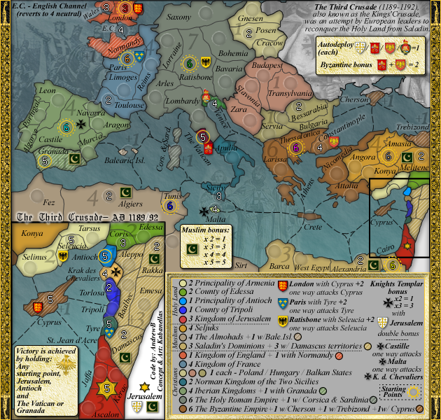
Well, i think the symbol is the way to go. To be honest, all CC players must have a reasonably good knowledge of geography to know that where Jerusalem is so I think it should click right away in any players mind that the gold six pointed star in the Israel area is Jerusalem. I really dont think that the arrow is necessary. The thing I don't get is why the Islamic symbol and the shield are down there as well.
Sketchblog [Update 07/25/11]: http://indyhelixsketch.blogspot.com/
Living in Japan [Update 07/17/11]: http://mirrorcountryih.blogspot.com/
Russian Revolution map for ConquerClub [07/20/11]: viewtopic.php?f=241&t=116575
Living in Japan [Update 07/17/11]: http://mirrorcountryih.blogspot.com/
Russian Revolution map for ConquerClub [07/20/11]: viewtopic.php?f=241&t=116575
-

Industrial Helix
- Posts: 3462
- Joined: Mon Jul 14, 2008 6:49 pm
- Location: Ohio


Re: The Third Crusade version 18 [D,Gp] Analysing graphics
![]() by ender516 on Sat Sep 19, 2009 6:54 pm
by ender516 on Sat Sep 19, 2009 6:54 pm
Industrial Helix wrote:Well, i think the symbol is the way to go. To be honest, all CC players must have a reasonably good knowledge of geography to know that where Jerusalem is so I think it should click right away in any players mind that the gold six pointed star in the Israel area is Jerusalem. I really dont think that the arrow is necessary. The thing I don't get is why the Islamic symbol and the shield are down there as well.
As I read it, the crescent and star indicate that Jerusalem is part of the "Muslim bonus", and the shield indicates that holding Jerusalem doubles the Knights Templar bonus.
-

ender516
- Posts: 4455
- Joined: Wed Dec 17, 2008 6:07 pm
- Location: Waterloo, Ontario


Re: The Third Crusade version 18 [D,Gp] Analysing graphics
![]() by Kabanellas on Sun Sep 20, 2009 5:39 am
by Kabanellas on Sun Sep 20, 2009 5:39 am
yes Helix, Ender is right. Jerusalem has its own Muslim Crescent part of the Muslim bonus, and a Shield that gives 1 autodeployed troop and if combined with the Knights Templar bonus gives extra bonus.
-
Kabanellas
- Posts: 1482
- Joined: Fri Feb 27, 2009 12:21 pm
- Location: Porto, Portugal
Re: The Third Crusade version 18 [D,Gp] Analysing graphics
![]() by 00iCon on Sun Sep 20, 2009 6:17 am
by 00iCon on Sun Sep 20, 2009 6:17 am
It's perfect, what more do we need? Do you want us all to PM the moderators?
-
00iCon
- Posts: 257
- Joined: Wed Apr 29, 2009 4:42 am
- Location: Sydney NSW
Re: The Third Crusade version 18 [D,Gp] Analysing graphics
![]() by Kabanellas on Sun Sep 20, 2009 7:47 am
by Kabanellas on Sun Sep 20, 2009 7:47 am
LOL Icon! great idea, massive support sounds good to me 
the truth is that the graphic aspects of this map were widely and openly debated since the very beginning of its creation, leaving not much stuff to discuss at this point.... I'll just post the (updated) small version tomorrow, and ask for a final opinion on that.
thanks all for the support.
the truth is that the graphic aspects of this map were widely and openly debated since the very beginning of its creation, leaving not much stuff to discuss at this point.... I'll just post the (updated) small version tomorrow, and ask for a final opinion on that.
thanks all for the support.
-
Kabanellas
- Posts: 1482
- Joined: Fri Feb 27, 2009 12:21 pm
- Location: Porto, Portugal
Re: The Third Crusade version 18 [D,Gp] Analysing graphics
![]() by Industrial Helix on Sun Sep 20, 2009 10:24 am
by Industrial Helix on Sun Sep 20, 2009 10:24 am
Ah ahhh... yeah, that makes sense. I had another stupid question that was resolved by reading the rules again. They're complicated, but in a real good way. It's like Battle for Iraq, once you get a good sense of the rules its a fantastic map to play.
I'm racking my brain for another graphical improvement. I've been typing them out and then seeing its not a problem. I think you're really on solid ground as far as the graphics are concerned. They've really looked great from the start. I expect you'll be getting the stamp very soon. Great work!
I'm racking my brain for another graphical improvement. I've been typing them out and then seeing its not a problem. I think you're really on solid ground as far as the graphics are concerned. They've really looked great from the start. I expect you'll be getting the stamp very soon. Great work!
Sketchblog [Update 07/25/11]: http://indyhelixsketch.blogspot.com/
Living in Japan [Update 07/17/11]: http://mirrorcountryih.blogspot.com/
Russian Revolution map for ConquerClub [07/20/11]: viewtopic.php?f=241&t=116575
Living in Japan [Update 07/17/11]: http://mirrorcountryih.blogspot.com/
Russian Revolution map for ConquerClub [07/20/11]: viewtopic.php?f=241&t=116575
-
Industrial Helix
- Posts: 3462
- Joined: Mon Jul 14, 2008 6:49 pm
- Location: Ohio
Re: The Third Crusade version 18 [D,Gp] Analysing graphics
![]() by Evil DIMwit on Sun Sep 20, 2009 11:29 am
by Evil DIMwit on Sun Sep 20, 2009 11:29 am
I actually rather like the arrow. You already have a lot of floating text that doesn't refer to anything so the arrow fits better with the reality of "In lieu of being able to fit this text and these symbols on the little territory, I put them off to the side."
Either way I really hope this map doesn't fall into two months of nitpicking now. The graphics are good to go if you ask me.
Either way I really hope this map doesn't fall into two months of nitpicking now. The graphics are good to go if you ask me.


-

Evil DIMwit
- Posts: 1616
- Joined: Thu Mar 22, 2007 1:47 pm
- Location: Philadelphia, NJ


Re: The Third Crusade version 18 [D,Gp] Analysing graphics
![]() by Kabanellas on Sun Sep 20, 2009 4:12 pm
by Kabanellas on Sun Sep 20, 2009 4:12 pm
Thank you all for you support! Hope the Foundry feels the same way about it
-
Kabanellas
- Posts: 1482
- Joined: Fri Feb 27, 2009 12:21 pm
- Location: Porto, Portugal
Re: The Third Crusade version 18 [D,Gp] Analysing graphics
![]() by ender516 on Mon Sep 21, 2009 12:54 am
by ender516 on Mon Sep 21, 2009 12:54 am
Ever the one to sit on the fence, I would suggest that you could use both the arrow and the symbol. But if you are only going to use one, I think the symbol has a little more class. At first I thought it might make people think that the white area was another territory, which would not be a problem for the arrow, but then I realized that once the troop numbers are on the map, the white area will clearly be out of play.
-
ender516
- Posts: 4455
- Joined: Wed Dec 17, 2008 6:07 pm
- Location: Waterloo, Ontario
Re: The Third Crusade version 18 [D,Gp] Analysing graphics
![]() by Kabanellas on Mon Sep 21, 2009 11:17 am
by Kabanellas on Mon Sep 21, 2009 11:17 am
Small version ready:
I've done a mix of the previous font and the 'book antiqua' in the legend, just in case you find the previous one (in Italic) hard to read.... Which one do you prefer?
I've done a mix of the previous font and the 'book antiqua' in the legend, just in case you find the previous one (in Italic) hard to read.... Which one do you prefer?
- Click image to enlarge.

-
Kabanellas
- Posts: 1482
- Joined: Fri Feb 27, 2009 12:21 pm
- Location: Porto, Portugal
Re: The Third Crusade version 18 [D,Gp] Analysing graphics
![]() by Industrial Helix on Mon Sep 21, 2009 12:27 pm
by Industrial Helix on Mon Sep 21, 2009 12:27 pm
I say stick with the italics, I don't have a problem reading it at all plus it fits in with the rest of the map.
Sketchblog [Update 07/25/11]: http://indyhelixsketch.blogspot.com/
Living in Japan [Update 07/17/11]: http://mirrorcountryih.blogspot.com/
Russian Revolution map for ConquerClub [07/20/11]: viewtopic.php?f=241&t=116575
Living in Japan [Update 07/17/11]: http://mirrorcountryih.blogspot.com/
Russian Revolution map for ConquerClub [07/20/11]: viewtopic.php?f=241&t=116575
-
Industrial Helix
- Posts: 3462
- Joined: Mon Jul 14, 2008 6:49 pm
- Location: Ohio
Re: The Third Crusade version 18 [D,Gp] Analysing graphics
![]() by InsomniaRed on Mon Sep 21, 2009 5:21 pm
by InsomniaRed on Mon Sep 21, 2009 5:21 pm
Industrial Helix wrote:I say stick with the italics, I don't have a problem reading it at all plus it fits in with the rest of the map.
I agree with Helix here, the italics fit better with the map, and they are really not at all hard to read. This map looks great, keep up the amazing work, this really is looking quite handsome
- I will always love you Nick, Forever.

- I will always love you Nick, Forever.
-

InsomniaRed
- Posts: 2246
- Joined: Sun Dec 30, 2007 2:58 am
- Location: In Nick's heart


Re: The Third Crusade version 18 [D,Gp] Analysing graphics
![]() by jefjef on Mon Sep 21, 2009 5:28 pm
by jefjef on Mon Sep 21, 2009 5:28 pm
Great looking map! Love the use of shields.
Perhaps incorperate the Muslim icons into a shield also.
Perhaps incorperate the Muslim icons into a shield also.
-

jefjef
- Posts: 6026
- Joined: Mon Feb 23, 2009 8:41 pm
- Location: on my ass


Re: The Third Crusade version 18 [D,Gp] Analysing graphics
![]() by Kabanellas on Mon Sep 21, 2009 6:04 pm
by Kabanellas on Mon Sep 21, 2009 6:04 pm
thanks guys I'll just wait for Andrew's opinion on the small legend ... but I'd keep the italics.
as for the shield in the Muslim Bonus, replacing it for a shield has crossed my mind before, but its just feels right having a different shape from the Christians' shields.
as for the shield in the Muslim Bonus, replacing it for a shield has crossed my mind before, but its just feels right having a different shape from the Christians' shields.
-
Kabanellas
- Posts: 1482
- Joined: Fri Feb 27, 2009 12:21 pm
- Location: Porto, Portugal
Re: The Third Crusade version 18 [D,Gp] Analysing graphics
![]() by whitestazn88 on Mon Sep 21, 2009 6:08 pm
by whitestazn88 on Mon Sep 21, 2009 6:08 pm
granada should not be next to a start point... or it should be a neutral 20 or something like that
ps. sorry i haven't been here in a while, and if that has already been discussed
ps. sorry i haven't been here in a while, and if that has already been discussed
-
whitestazn88
- Posts: 3128
- Joined: Mon Feb 05, 2007 2:59 pm
- Location: behind you

Re: The Third Crusade version 18 [D,Gp] Analysing graphics
![]() by AndrewB on Mon Sep 21, 2009 6:11 pm
by AndrewB on Mon Sep 21, 2009 6:11 pm
Lets just go with Italic. Looks good!

-

AndrewB
- Posts: 1814
- Joined: Mon Jun 12, 2006 5:02 pm
- Location: Edmonton, Canada, MST


Re: The Third Crusade version 18 [D,Gp] Analysing graphics
![]() by Kabanellas on Mon Sep 21, 2009 6:16 pm
by Kabanellas on Mon Sep 21, 2009 6:16 pm
whitestazn88 wrote:granada should not be next to a start point... or it should be a neutral 20 or something like that
ps. sorry i haven't been here in a while, and if that has already been discussed
stazn, there's no problem with that - no one will win the game holding (only) Granada
-
Kabanellas
- Posts: 1482
- Joined: Fri Feb 27, 2009 12:21 pm
- Location: Porto, Portugal
Re: The Third Crusade version 18 [D,Gp] Analysing graphics
![]() by Kabanellas on Tue Sep 22, 2009 5:08 am
by Kabanellas on Tue Sep 22, 2009 5:08 am
Done!!
I think work is pretty much completed. Should we advance for the xml now?
V18 small
I think work is pretty much completed. Should we advance for the xml now?
V18 small
- Click image to enlarge.
-
Kabanellas
- Posts: 1482
- Joined: Fri Feb 27, 2009 12:21 pm
- Location: Porto, Portugal
Re: The Third Crusade version 18 [D,Gp] Analysing graphics
![]() by iancanton on Wed Sep 23, 2009 4:09 pm
by iancanton on Wed Sep 23, 2009 4:09 pm
u still haven't removed the E on the end of ratisbon.
almost every bonus zone is named after the state, not the people. seljuks therefore looks out of place. change it to sultanate of rum?
http://www.historyfiles.co.uk/KingLists ... liaRum.htm
in the legend, u have room to write balearics islands in full.
ian.
almost every bonus zone is named after the state, not the people. seljuks therefore looks out of place. change it to sultanate of rum?
http://www.historyfiles.co.uk/KingLists ... liaRum.htm
in the legend, u have room to write balearics islands in full.
ian.

-

iancanton
- Foundry Foreman

- Posts: 2424
- Joined: Fri Jun 01, 2007 5:40 am
- Location: europe


Re: The Third Crusade version 18 [D,Gp] Analysing graphics
![]() by Kabanellas on Thu Sep 24, 2009 5:39 am
by Kabanellas on Thu Sep 24, 2009 5:39 am
Completely forget about Ratisbon
All done now:
Large version
Small version
All done now:
Large version
- Click image to enlarge.
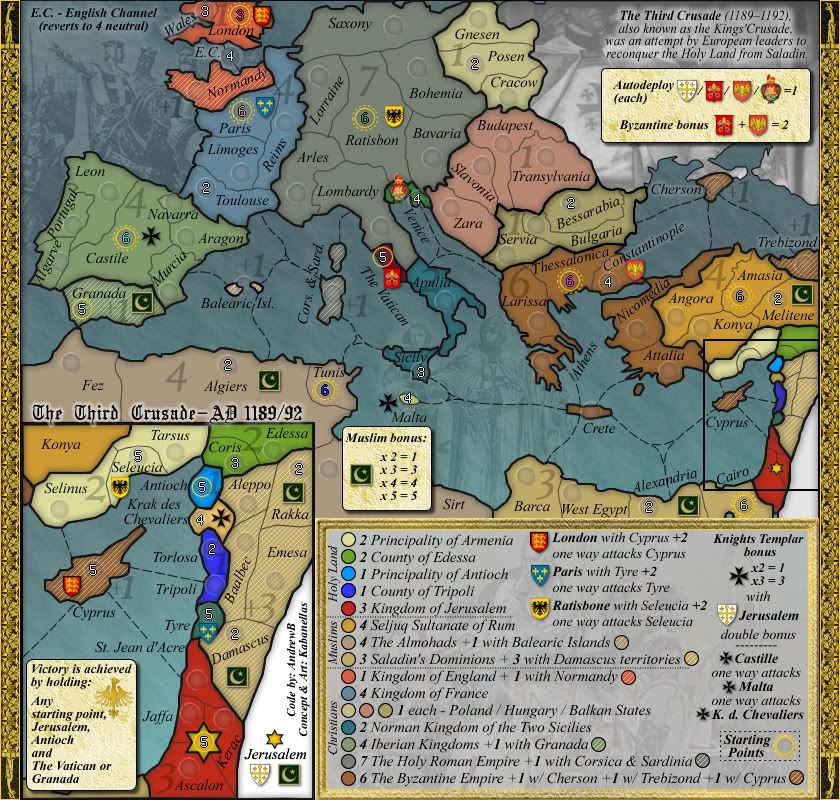
Small version
- Click image to enlarge.

-
Kabanellas
- Posts: 1482
- Joined: Fri Feb 27, 2009 12:21 pm
- Location: Porto, Portugal
Re: The Third Crusade version 18.2 [D,Gp] Analysing graphics
![]() by AndrewB on Sun Sep 27, 2009 3:46 am
by AndrewB on Sun Sep 27, 2009 3:46 am
The first versions of XML are created:
http://bolonniy.com/CC/Third_Crusade_v2.xml
Done:
1. Large map army circles
2. All neighbors are defined
Things to do:
1. Fix small map army circles (they didn't scale down too well at all)
2. Add bonuses
3. Add starting positions and starting neutrals
3. Add objectives
http://bolonniy.com/CC/Third_Crusade_v2.xml
Done:
1. Large map army circles
2. All neighbors are defined
Things to do:
1. Fix small map army circles (they didn't scale down too well at all)
2. Add bonuses
3. Add starting positions and starting neutrals
3. Add objectives
-
AndrewB
- Posts: 1814
- Joined: Mon Jun 12, 2006 5:02 pm
- Location: Edmonton, Canada, MST
Re: The Third Crusade version 18.2 [D,Gp] XML on the making
![]() by haoala on Mon Sep 28, 2009 11:41 am
by haoala on Mon Sep 28, 2009 11:41 am
it gets rather wordy in the legend...are you gonna stick with this font?
Gain the upper hand
-

haoala
- Posts: 295
- Joined: Tue Feb 27, 2007 7:58 am
- Location: Directly opposite the South of Napo

Who is online
Users browsing this forum: No registered users
|
|||||||
| Conquer Club is not associated with RISK online in any way. Copyright © 2006-2024 by Big Wham LLC | |||||||