Riskopoly (Board Game) [Abandoned]
Moderator: Cartographers
![]() by fluffybunnykins on Tue Mar 06, 2007 12:02 pm
by fluffybunnykins on Tue Mar 06, 2007 12:02 pm
looks OK to me 
Superman wears 'Fluffybunnykins' pyjamas
-

 fluffybunnykins
- Posts: 385
- Joined: Tue May 02, 2006 6:43 am
- Location: Liverpool, UK

![]() by Martouf on Tue Mar 06, 2007 1:17 pm
by Martouf on Tue Mar 06, 2007 1:17 pm
I really do like the way this is shaping up. I do like the small map with the Avenues dropped off. At this point there really isn't anything that I would suggest changing. So um yeah...Looks good
OMFG KITTENS! MEW MEW MEW MEW MEW!
-
Martouf
- Posts: 7
- Joined: Mon Jan 22, 2007 4:13 pm
- Location: Where Ever
![]() by johloh on Tue Mar 06, 2007 1:36 pm
by johloh on Tue Mar 06, 2007 1:36 pm
I think the outer edge of the 'game board' needs something. As it is now it has no relief above the table. It should have a very slight shadow or thickness so it appears to be very slightly raised above the wooden table underneath it. ( i know im nitpicking)
also what if the bonus box at the top right corner looked more like a rule book youd get included with a board game? like a paper book creased and folded over to that page?
and what about some game pieces? you could use the risk pieces like the cannon,horse, and army guy or something?
just some ideas....
my new site - http://www.spritestitch.com/ - A video game craft weblog...
-

johloh
- Posts: 472
- Joined: Mon Dec 04, 2006 12:58 pm
- Location: San Francisco


![]() by yeti_c on Tue Mar 06, 2007 2:12 pm
by yeti_c on Tue Mar 06, 2007 2:12 pm
Coleman wrote:yeti_c wrote:What happens if you have Yellow Army on Chance - and Red Army on Chest... you might not be able to see the army amounts... You might have to put a hole in the decks so that they can be visible?
It would probably look like that.
That's Perfect...
C.

Highest score : 2297
-

yeti_c
- Posts: 9624
- Joined: Thu Jan 04, 2007 9:02 am


![]() by Molacole on Tue Mar 06, 2007 2:52 pm
by Molacole on Tue Mar 06, 2007 2:52 pm
the bonuses confuse me.
orange(3)and red(4)are basically identical-
yellow(4) and green(5) are basically identical-
light blue(2) and "light" purple(3) are basically identical-
dark purple(2)...
blue(5) looks easier to hold than red and orange.-
am I missing anything because I'm a little confused
orange(3)and red(4)are basically identical-
yellow(4) and green(5) are basically identical-
light blue(2) and "light" purple(3) are basically identical-
dark purple(2)...
blue(5) looks easier to hold than red and orange.-
am I missing anything because I'm a little confused
-

Molacole
- Posts: 552
- Joined: Fri Jun 23, 2006 8:19 am
- Location: W 2.0 map by ZIM


![]() by Wisse on Tue Mar 06, 2007 3:23 pm
by Wisse on Tue Mar 06, 2007 3:23 pm
Molacole wrote:the bonuses confuse me.
orange(3)and red(4)are basically identical-
yellow(4) and green(5) are basically identical-
light blue(2) and "light" purple(3) are basically identical-
dark purple(2)...
blue(5) looks easier to hold than red and orange.-
am I missing anything because I'm a little confused
yup you are missing something, the bonus is based on the game monopoly and there after every "street" the bonus got higher


-

Wisse
- Posts: 4448
- Joined: Fri Oct 13, 2006 2:59 pm
- Location: The netherlands, gelderland, epe

![]() by EvilOtto on Tue Mar 06, 2007 4:53 pm
by EvilOtto on Tue Mar 06, 2007 4:53 pm
Molacole wrote:the bonuses confuse me.
orange(3)and red(4)are basically identical-
yellow(4) and green(5) are basically identical-
light blue(2) and "light" purple(3) are basically identical-
dark purple(2)...
blue(5) looks easier to hold than red and orange.-
am I missing anything because I'm a little confused
Actually we matched it up to the bonuses pretty well now.
Clockwise from Go:
+2 Purple - 3 ter, 3 borders
+2 Lt. Blue - 4 ters, 3 borders
+3 Pink - 5 terrs, 3 borders
+3 Orange - 5 terrs, 3 borders
+4 Red - 5 terrs, 3 borders (one is a deck)
+4 Yellow - 5 terrs, 3 borders (one is a deck)
+5 Green - 6 terrs, 4 borders
+5 Blue - 6 terrs, 4 borders
But this was also put to a poll and a progressive bonus around the board (regardless of continent difficulty) won 33 to 18.
-

EvilOtto
- Posts: 132
- Joined: Wed Dec 06, 2006 9:39 pm
- Location: San Francisco
![]() by EvilOtto on Tue Mar 06, 2007 5:02 pm
by EvilOtto on Tue Mar 06, 2007 5:02 pm
johloh wrote:I think the outer edge of the 'game board' needs something. As it is now it has no relief above the table. It should have a very slight shadow or thickness so it appears to be very slightly raised above the wooden table underneath it. ( i know im nitpicking)
also what if the bonus box at the top right corner looked more like a rule book youd get included with a board game? like a paper book creased and folded over to that page?
and what about some game pieces? you could use the risk pieces like the cannon,horse, and army guy or something?
just some ideas....
I 'll try a thin shadow on the board. I actually used a scanned Monopoly rule book for the "rules" color/texture... but I agree it doesn't read as well as it could. I'll play with it.
If someone has some copyright free "game pieces" artwork to decorate with, I'd be happy to scatter them around... might be room for a couple on the GO space. But it might look funny if the images aren't just right. I won't use actual Monopoly or Risk pieces without the rights to them.
-
EvilOtto
- Posts: 132
- Joined: Wed Dec 06, 2006 9:39 pm
- Location: San Francisco
![]() by WidowMakers on Tue Mar 06, 2007 10:47 pm
by WidowMakers on Tue Mar 06, 2007 10:47 pm
Wisse wrote:can you make the small one a bit larger i don't like it as it is now (pixely and i can't read the names good)
I agree. The small map needs to be small, but not at a loss of picture quality and readability.

-
WidowMakers
- Posts: 2774
- Joined: Mon Nov 20, 2006 9:25 am
- Location: Detroit, MI


![]() by EvilOtto on Thu Mar 08, 2007 8:49 pm
by EvilOtto on Thu Mar 08, 2007 8:49 pm
So the XML is all done. Here is a new version of the small map:
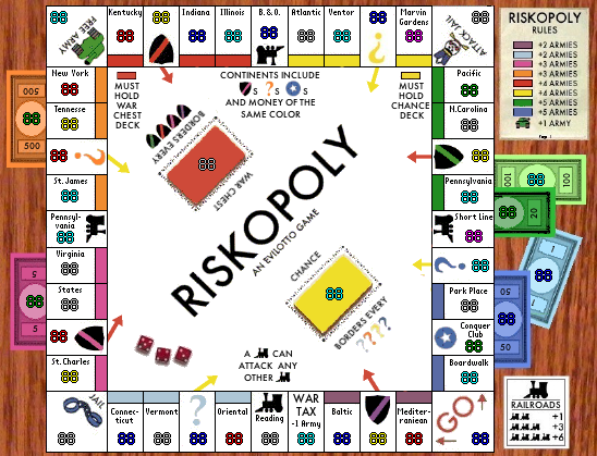
I made the "chest/chance arrows" a bit smaller, and their length reflects the distance from the deck (red chest space and blue chance spaces have very short arrows). Also added text (upper center) explaining that chest, chance, CC and money spaces are part of their continents. Also added a third red die... I'll add a couple white dice somewhere too.
If you think this size is OK for the small map, please say so (I've heard two say it is too small, so I need to know if that is the popular vote). After that I'll post both small and large semi-final maps.
Poll is now up for the name of the map.
-
EvilOtto
- Posts: 132
- Joined: Wed Dec 06, 2006 9:39 pm
- Location: San Francisco


![]() by oaktown on Thu Mar 08, 2007 9:08 pm
by oaktown on Thu Mar 08, 2007 9:08 pm
I've heard folks say that it's not the size of the boat, it's the motion of the ocean, but in this case too small is a bad thing. Perhaps some natural enhancement would restore your confidence in your image.
And I can't believe monopolonquer made it on the poll - thanx for that otto. I almost voted for it just because I could, but then I remembered what happened when people voted for Nader...
And I can't believe monopolonquer made it on the poll - thanx for that otto. I almost voted for it just because I could, but then I remembered what happened when people voted for Nader...

-

oaktown
- Posts: 4451
- Joined: Sun Dec 03, 2006 9:24 pm
- Location: majorcommand


![]() by Molacole on Fri Mar 09, 2007 1:54 am
by Molacole on Fri Mar 09, 2007 1:54 am
EvilOtto wrote:Molacole wrote:the bonuses confuse me.
orange(3)and red(4)are basically identical-
yellow(4) and green(5) are basically identical-
light blue(2) and "light" purple(3) are basically identical-
dark purple(2)...
blue(5) looks easier to hold than red and orange.-
am I missing anything because I'm a little confused
Actually we matched it up to the bonuses pretty well now.
Clockwise from Go:
+2 Purple - 3 ter, 3 borders
+2 Lt. Blue - 4 ters, 3 borders
+3 Pink - 5 terrs, 3 borders
+3 Orange - 5 terrs, 3 borders
+4 Red - 5 terrs, 3 borders (one is a deck)
+4 Yellow - 5 terrs, 3 borders (one is a deck)
+5 Green - 6 terrs, 4 borders
+5 Blue - 6 terrs, 4 borders
But this was also put to a poll and a progressive bonus around the board (regardless of continent difficulty) won 33 to 18.
how does playability take a back seat to theme when our current preference poll shows 59% of the community considers playability the most important thing in a map...
ohhh the irony in that one!
I think you should do another poll for that one because it doesn't make any sense to make a map unbalanced just for the theme. The game to be played on this map is still RISK, not Monopoly... so if I'm not getting hotels or paying for properties I don't want the bonuses to be based on a game that I'm not even playing
-
Molacole
- Posts: 552
- Joined: Fri Jun 23, 2006 8:19 am
- Location: W 2.0 map by ZIM
![]() by yeti_c on Fri Mar 09, 2007 3:17 am
by yeti_c on Fri Mar 09, 2007 3:17 am
Molacole wrote:EvilOtto wrote:Molacole wrote:the bonuses confuse me.
orange(3)and red(4)are basically identical-
yellow(4) and green(5) are basically identical-
light blue(2) and "light" purple(3) are basically identical-
dark purple(2)...
blue(5) looks easier to hold than red and orange.-
am I missing anything because I'm a little confused
Actually we matched it up to the bonuses pretty well now.
Clockwise from Go:
+2 Purple - 3 ter, 3 borders
+2 Lt. Blue - 4 ters, 3 borders
+3 Pink - 5 terrs, 3 borders
+3 Orange - 5 terrs, 3 borders
+4 Red - 5 terrs, 3 borders (one is a deck)
+4 Yellow - 5 terrs, 3 borders (one is a deck)
+5 Green - 6 terrs, 4 borders
+5 Blue - 6 terrs, 4 borders
But this was also put to a poll and a progressive bonus around the board (regardless of continent difficulty) won 33 to 18.
how does playability take a back seat to theme when our current preference poll shows 59% of the community considers playability the most important thing in a map...
ohhh the irony in that one!
I think you should do another poll for that one because it doesn't make any sense to make a map unbalanced just for the theme. The game to be played on this map is still RISK, not Monopoly... so if I'm not getting hotels or paying for properties I don't want the bonuses to be based on a game that I'm not even playing
How exaclty is it unbalanced too? The higher bonus continents have more territories and borders... it works for me.
Highest score : 2297
-
yeti_c
- Posts: 9624
- Joined: Thu Jan 04, 2007 9:02 am

![]() by Enigma on Fri Mar 09, 2007 10:33 am
by Enigma on Fri Mar 09, 2007 10:33 am
ya, agreed, a bit too small. and is there any way to make the army numbers line up around the board, at least on the sides? i think they would look better all aligned than some off center and some not. i realize that unless you move the labels on the top those numbers will have to be unaligned, but the rest could be.
Do you need an excuse to have a war? I mean, who for? Can't you just say "You got lots of cash and land, but I've got a big sword, so divy up right now, chop chop."
Terry Pratchet
Terry Pratchet
-

Enigma
- Posts: 367
- Joined: Mon Jul 03, 2006 10:23 pm
- Location: Classified
![]() by fluffybunnykins on Fri Mar 09, 2007 11:00 am
by fluffybunnykins on Fri Mar 09, 2007 11:00 am
even if continent values aren't mathematically, precisely worked out, it still doesn't necessarily follow that the gameplay will be substandard or unbalanced. If a region has an 'unfairly' high bonus (within reason), that region will probably (hopefully) just attract more attention & competition, right? Wouldn't that justify the higher bonus, anyway? Not that these are unbalanced, but...
Superman wears 'Fluffybunnykins' pyjamas
-
fluffybunnykins
- Posts: 385
- Joined: Tue May 02, 2006 6:43 am
- Location: Liverpool, UK
Return to Melting Pot: Map Ideas
Who is online
Users browsing this forum: No registered users
|
|||||||
| Conquer Club is not associated with RISK online in any way. Copyright © 2006-2024 by Big Wham LLC | |||||||