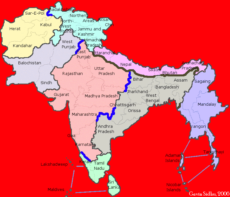
Marvaddin wrote:Excuse me if you dislike my sincerity, but are you really working on this image to make the final version? I hope you arent:
1) the font of the title is simply ridiculous.
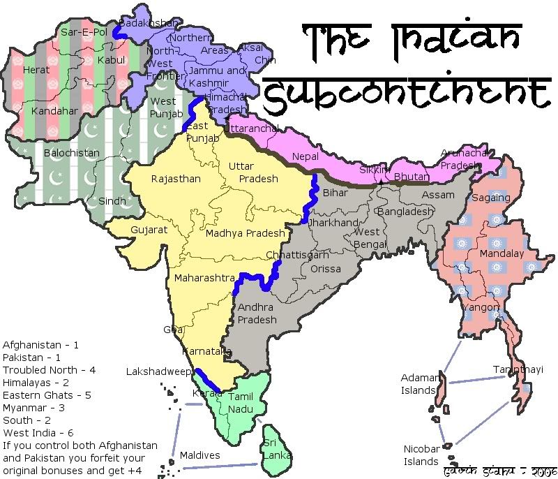
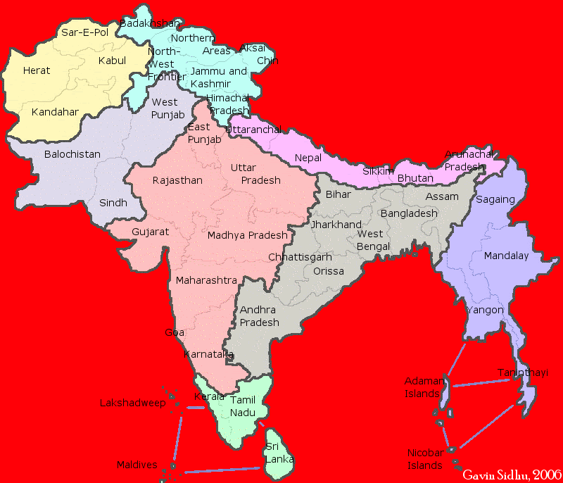
2) the font of the countries names is not good too. And in fact, in many places the names are not readable: Kerala? Sikkim? (Oh, by the way, this country is ridiculously small, you need make it bigger!) Goa? (Same problem) Arunachai Pradesh?
3) The names, make them simple! Why so many "pradesh"? And that W. Bengal, where is the another Bengal?
4) Some countries are so small that they cant have room for names and number of armies, you need re-think them...
5) The patterns, I know there were not easy to do, but they are very poor. It remembers me my version of the Brazil map with patterns... they usually are not good.
6) What type of legend is that one?
So, this map will still need tons of work. Lets dicuss bonuses later, when I have a better idea of the continents.
1) i liked the font in the title (the border of the font is all crummy and i will fix that), its faux sanskrit, meaning fake sansrit (sanskrit is the characters used used in the languages of the area)
2) Do you have a suggestion for a better font? its the default font of GIMP, i'll change it for next update (i may do something like martiovw did and get people to vote). Ill move them around so they dont class with the border.
3) Im using the official names of the states, i dont know what pradesh means or why there are so many of them. West Bengal is a state of india, east bengal later became bangladesh.
4) Ill enlargen some countries
5) Yah i know i have to do something about that.
6) Its a pretend ledgend, i cant make it proper until i have the continent colours right so its just there for reference.
I like your honesty, this is the first real feedback ive had on the map.
I have an idea for the background of the whole map but i just dont know how to do it.


 Children, this is what happens to hockey players, druggies, and Hillary Clinton.