
Bering Strait
Map By: Lanyards
Number of territories: 42
Number of continents: 6
Descriptions of any unique features or areas: Map is split in half by a body of water, and only way to cross is by ports and islands.
Version 7 Large Map:
[bigimg]http://i1331.photobucket.com/albums/w593/lanyards-n/newest_zpsdb25ec62.png[/bigimg]
==============================Original Post==================================
This interest anyone gameplay-wise?
[bigimg]http://i282.photobucket.com/albums/kk273/lanyards/BeringStraightMapFlatV2.jpg[/bigimg]
--lanyards
Bering Strait
Moderator: Cartographers
Forum rules
Please read the Community Guidelines before posting.
Please read the Community Guidelines before posting.
Bering Strait
Last edited by lanyards on Thu Jun 20, 2013 3:28 pm, edited 9 times in total.

WANT AN ADVANTAGE WHILE WORKING TOWARDS MEDALS?
https://www.conquerclub.com/forum/viewt ... 9&t=226714
Re: Bering Straight
yes. Looks kinda cool to
Re: Bering Straight
It is supposed to look somewhat "Arctic".bryguy wrote:yes. Looks kinda cool to
--lanyards
WANT AN ADVANTAGE WHILE WORKING TOWARDS MEDALS?
https://www.conquerclub.com/forum/viewt ... 9&t=226714

Re: Bering Straight
another arctic-themed map would be nice. I love the maps with cool colors.
Where are the dog-paddling polar bears?
Where are the dog-paddling polar bears?
-
Incandenza

- Posts: 4949
- Joined: Thu Oct 19, 2006 5:34 pm
- Gender: Male
- Location: Playing Eschaton with a bucket of old tennis balls
Re: Bering Straight
Maybe throw in a few more islands (more Aleutians and more Pribiloffs) and have a few fewer terits in alaska and siberia and call it the Bering Sea. And watch a few episodes of Deadliest Catch for some flavor. 
THOTA: dingdingdingdingdingdingBOOM
Te Occidere Possunt Sed Te Edere Non Possunt Nefas Est
Te Occidere Possunt Sed Te Edere Non Possunt Nefas Est
Re: Bering Straight
Something like this look good?
[bigimg]http://i282.photobucket.com/albums/kk273/lanyards/BeringStraightMapFlatV3.jpg[/bigimg]
--lanyards
[bigimg]http://i282.photobucket.com/albums/kk273/lanyards/BeringStraightMapFlatV3.jpg[/bigimg]
--lanyards
WANT AN ADVANTAGE WHILE WORKING TOWARDS MEDALS?
https://www.conquerclub.com/forum/viewt ... 9&t=226714


Re: Bering Straight
I agree about more islands. The color scheme in the last one you posted doesn't look very arctic...
Re: Bering Straight
Yea, I agree. The colors don't look good. How should I distinguish the different continents withough making them too colorful?ZeakCytho wrote:I agree about more islands. The color scheme in the last one you posted doesn't look very arctic...
--lanyards
WANT AN ADVANTAGE WHILE WORKING TOWARDS MEDALS?
https://www.conquerclub.com/forum/viewt ... 9&t=226714
Re: Bering Straight
lanyards wrote:Yea, I agree. The colors don't look good. How should I distinguish the different continents withough making them too colorful?ZeakCytho wrote:I agree about more islands. The color scheme in the last one you posted doesn't look very arctic...
--lanyards
maybe do like in new world with the inner glow. but have all the territories one cool color. Just thinking out loud...
Re: Bering Straight
how about different patterns or something? LIke stripes?
Maybe different pictures?
Maybe different pictures?

Re: Bering Straight
I think they could all be different colors, but very cold colors. Blues, whites, etc. Nothing too bright. You could also use a different texture for each continent, maybe? But that really changes the style, and I'm not sure for the better. Play around with it - if it's not visible enough, we'll deal with it then 
Re: Bering Straight
I don't think strips would look too good. Mabye some regional symbols if there are any?Kaplowitz wrote:how about different patterns or something? LIke stripes?
Maybe different pictures?
--lanyards
WANT AN ADVANTAGE WHILE WORKING TOWARDS MEDALS?
https://www.conquerclub.com/forum/viewt ... 9&t=226714
Re: Bering Straight
Yea, I think just using different shades of blue and white would do best. But mabye it would be best to get further along before worrying about graphics.ZeakCytho wrote:I think they could all be different colors, but very cold colors. Blues, whites, etc. Nothing too bright. You could also use a different texture for each continent, maybe? But that really changes the style, and I'm not sure for the better. Play around with it - if it's not visible enough, we'll deal with it then
--lanyards
WANT AN ADVANTAGE WHILE WORKING TOWARDS MEDALS?
https://www.conquerclub.com/forum/viewt ... 9&t=226714

Re: Bering Straight
I posted the idea some time ago in the map ideas thread, and I'm glad to see this map being made. (to the kiddies who'll see this as me taking credit or anything like that, you're all idiots).
well I'm not really sure how you can distinguish the colours more, but I'd like to hear how the separations of continents came about.
It looks like you've split Alaska in two (I'd like to hear if this is based on any reality or just (this looks like a good spot to split it up) and have a Canada continent. I'm not familiar with Russia so I don't really know what happened there.
Furthermore, how did the territory separations come about? Based on counties in Alaska? Purely made up?
I think you've got 40 territories and it wouldn't hurt to try and get the 'classic' 42
Re: Bering Straight
Most of the continental and territory borders are made up, is this a bad thing?edbeard wrote:I posted the idea some time ago in the map ideas thread, and I'm glad to see this map being made. (fyi to the kiddies who'll see this as me taking credit or anything like that. you're all idiots).
well I'm not really sure how you can distinguish the colours more, but I'd like to hear how the separations of continents came about.
It looks like you've split Alaska in two (I'd like to hear if this is based on any reality or just (this looks like a good spot to split it up) and have a Canada continent. I'm not familiar with Russia so I don't really know what happened there.
Furthermore, how did the territory separations come about? Based on counties in Alaska? Purely made up?
I think you've got 40 territories and it wouldn't hurt to try and get the 'classic' 42
But I could probably add an island or 2 to get the 42 territories.
--lanyards
WANT AN ADVANTAGE WHILE WORKING TOWARDS MEDALS?
https://www.conquerclub.com/forum/viewt ... 9&t=226714
Re: Bering Straight
And what are the requirements to get a thread moved to Advance Idea sicky place?
--lanyards
--lanyards
WANT AN ADVANTAGE WHILE WORKING TOWARDS MEDALS?
https://www.conquerclub.com/forum/viewt ... 9&t=226714
Re: Bering Straight
lanyards wrote:And what are the requirements to get a thread moved to Advance Idea sicky place?
--lanyards
just show commitment, post a couple of updates.
Re: Bering Straight
lanyards wrote:And what are the requirements to get a thread moved to Advance Idea sicky place?
--lanyards
slow down tiger. Just keep updating and progressing with the map and it'll happen in time. Everyone wants to get there so putting things in the title like 'time to move?' , 'needs sticky' , are obnoxious and don't help. If you've been at it for a while with a few updates and interest and you haven't been stickied then PM the ideas CA (gimil?) and he'll tell you what you need to do or will sticky it if you're good.
It is 'bad' that you've made up the borders. You should at least try to make it based on reality.
here's an Alaska Counties map you can use as a starting point.
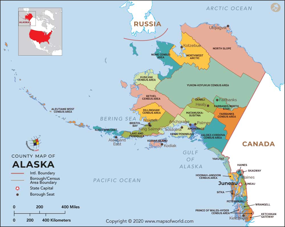
Obviously, some are too big and some are too small. Combine a few where necessary and split some up where necessary. (North / South Bristol Bay or West/East Bethel)
Here's a 'regions' map you can use to split Alaska in two for your continents.

notice how the northern two sections match up with the county lines. Seems like a good idea to me.
I don't want you to just do what I've said here about the Alaskan Borders and counties. I want you to do some research and look at Alaska and Russia maps to find out good ways to split it up based on reality. Obviously, you're making a CC map so gameplay is important but take reality as a start and work outwards from there.
Wikipedia is a good tool and you can learn stuff quickly. Go to the Alaska and Russia pages. Note this map I found.
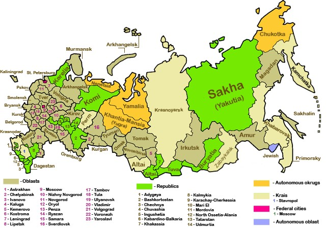
Seems like those northeastern three sections will be on your map. I'll bet you can find pages about those three areas and possibly maps that show how those are split up.
Good luck.
Re: Bering Straight
lanyards wrote:And what are the requirements to get a thread moved to Advance Idea sicky place?
--lanyards
slow down tiger. Just keep updating and progressing with the map and it'll happen in time. Everyone wants to get there so putting things in the title like 'time to move?' , 'needs sticky' , are obnoxious and don't help. If you've been at it for a while with a few updates and interest and you haven't been stickied then PM the ideas CA (gimil?) and he'll tell you what you need to do or will sticky it if you're good.
It is 'bad' that you've made up the borders. You should at least try to make it based on reality.
here's an Alaska Counties map you can use as a starting point.
Obviously, some are too big and some are too small. Combine a few where necessary and split some up where necessary. (North / South Bristol Bay or West/East Bethel)
Here's a 'regions' map you can use to split Alaska in two for your continents.
notice how the northern two sections match up with the county lines. Seems like a good idea to me.
I don't want you to just do what I've said here about the Alaskan Borders and counties. I want you to do some research and look at Alaska and Russia maps to find out good ways to split it up based on reality. Obviously, you're making a CC map so gameplay is important but take reality as a start and work outwards from there.
Wikipedia is a good tool and you can learn stuff quickly. Go to the Alaska and Russia pages. Note this map I found.
Seems like those northeastern three sections will be on your map (and it looks like you might've already split them up that way). I'll bet you can find pages about those three areas and possibly maps that show how those are split up.
Good luck.
Re: Bering Straight
Ok, so I made the territory borders in Alaska geographically correct, and the Continent Border that splits Alaska is not random now. I also added two islands, so now the territory count is up to 42.
Update 1:
[bigimg]http://i282.photobucket.com/albums/kk273/lanyards/BeringStraightMapFlatV5.jpg[/bigimg]
Gameplay?
--lanyards
Update 1:
[bigimg]http://i282.photobucket.com/albums/kk273/lanyards/BeringStraightMapFlatV5.jpg[/bigimg]
Gameplay?
--lanyards
WANT AN ADVANTAGE WHILE WORKING TOWARDS MEDALS?
https://www.conquerclub.com/forum/viewt ... 9&t=226714
Re: Bering Straight (Update 1 - P.2)
What's with the army-circle like objects floating in the ocean? Are there islands there? Or are they just random territories?
Re: Bering Straight (Update 1 - P.2)
Oh, they are islands, but they are too small to be on the map so I made them ports. I'll have a "Hold All Ports" bonus mabye.ZeakCytho wrote:What's with the army-circle like objects floating in the ocean? Are there islands there? Or are they just random territories?
--lanyards
WANT AN ADVANTAGE WHILE WORKING TOWARDS MEDALS?
https://www.conquerclub.com/forum/viewt ... 9&t=226714
-
pepperonibread

- Posts: 954
- Joined: Sun Jan 28, 2007 4:33 pm
- Location: The Former Confederacy
Re: Bering Straight
Hey guys. So you all know, I let lanyards use borders I researched sometime last year. I think he didn't realize that they're all based on real borders. I still have to figure out what those territories were named, though, because I never wrote down their names. I think I've got the Russian half ready, that was pretty easy after Soviet Union. I may have to tweak the Alaska side a bit, but I'll PM lanyards when I've got all the names.
EDIT: Looks like lanyard's already fixed the Alaska side.
EDIT: Looks like lanyard's already fixed the Alaska side.

Re: Bering Straight (Update 1 - P.2)
Here's what I personally would like to see (just my opinion):
- More territories, like close to double. (maybe 72)
- Make more continents in Alaska and Russia, make these sub continents
- Make 2 big continents of Russia and Alaska.
- Make islands part of sub-continents in Alaska in Russia (no special "hold all islands" stuff if they fit geographically. If not, make them neutral territories (no continent)