Bad Speler wrote:Bad Speler wrote:Inside the game, the players' names are underlined in blue. Before this update they were underlined in the players' respective colours. Anyone else see this?
Did everyone just ignore me? ^
mine does that too but i think it is better because it make the names stand out more
also the thing i dislike the most about the update is that the logout is now blue because i see the blue out of the corner of my eye and i think that i have a new pm but that is pretty minor and ill just have to get used to it
great job guys


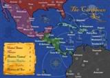 MIDDLE AMERICA MAP