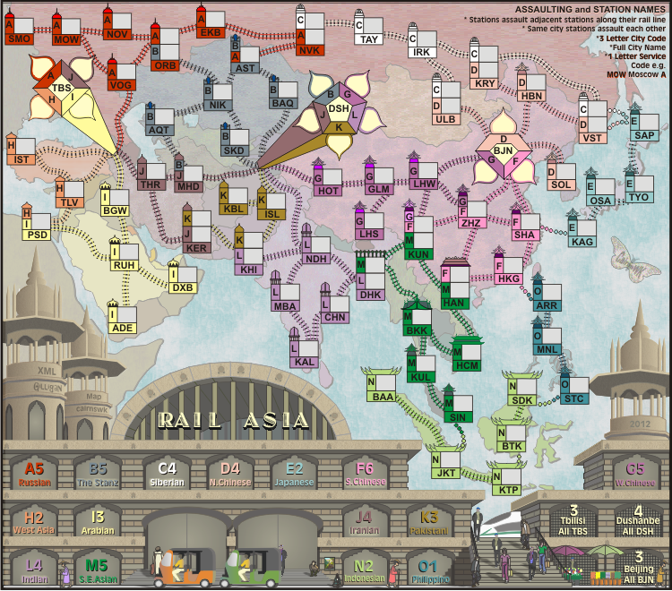
Enjoy!
Moderator: Cartographers


natty dread wrote:...
Enjoy!


DiM wrote:i'd say this has decent graphics ... if we were in 2007
look at rail usa. you went downhill from there and i have no idea why.


cairnswk wrote:DiM wrote:i'd say this has decent graphics ... if we were in 2007
look at rail usa. you went downhill from there and i have no idea why.
To start, i didn't do the graphics on Rail USA. widowmakers did. you yet make another fool of yourself.


DiM wrote:good job managing to come close to widowmakers' graphics from 2007...


DiM wrote:cairnswk wrote:DiM wrote:i'd say this has decent graphics ... if we were in 2007
look at rail usa. you went downhill from there and i have no idea why.
To start, i didn't do the graphics on Rail USA. widowmakers did. you yet make another fool of yourself.
hmm then it's clear why it all went downhill.
good job managing to come close to widowmakers' graphics from 2007... even if you're 5 years later. maybe by next year you'll finally manage to make something better. though it's doubtful since you've already admitted to going for quantity over quality.
but don't worry your pretty little head if you can't manage to improve your graphics, or even the gameplay. the standards are different for you so you'll be cut a slack once again.


thenobodies80 wrote:About the current standard diatribe...please never forget to understand what software people use to develop a map...
thenobodies80 wrote:I'm of the opinion that cairnswk has his own style, we can recognize his maps easily, many of them have a simple graphics,
thenobodies80 wrote:he is a creative person who produces lot of maps,


thenobodies80 wrote:Don't get me wrong, but there's a big difference between saying that if cairnswk decides to use another software instead of illustrator (that is perfect for vectorial art) he can improve/increase his graphics skill and saying that his current maps are shit.
thenobodies80 wrote: About what people consider a fiasco or not, I stopped to trust into people judgement about graphics after seeing the "your favourite map polls" in which a map like North America (that is probably one of the most awful map we have right now on the site) took more votes than other nice and popular maps, like Germany....in few words you'll never know what people can think.....that's why we have a cow and you're drawing a pig (and you shouldn't).
thenobodies80 wrote: As said this map is a cairnswk map and I really don't think it's not par to the current foundry standard, then if you're saying that all his maps looks similar I agree with you and he knows i think in this way.


natty dread wrote:Well Dim, you know I think you make a lot of good points, but to be fair to cairnswk, some of his work is good and some of his maps are actually quite popular. Stalingrad and Waterloo are one of the most popular maps, at least for those who like complex, strategical maps.
natty dread wrote:Also I think some of cairnswk's maps look really nice. It's not that he's not capable of creating good graphics. It's more that no one is really pushing mapmakers to do their best and explore new things anymore... and I do believe this should be remedied, somehow.


DiM wrote:i did not say his maps are shit i just said they are poorer and poorer compared to the foundry standards. basically his skill and technique have only slightly improved from 4-5 years ago and in my opinion they did not keep up with how the foundry should be. if his graphics were considered good in 2007 decent in 2009 i clearly think they are sub-par in 2012.


Gillipig wrote:DiM wrote:i did not say his maps are shit i just said they are poorer and poorer compared to the foundry standards. basically his skill and technique have only slightly improved from 4-5 years ago and in my opinion they did not keep up with how the foundry should be. if his graphics were considered good in 2007 decent in 2009 i clearly think they are sub-par in 2012.
Are you saying that maps like Pot Mosbi and New Zealand aren't up to par for 2012? I think they're two of the best looking maps in the foundry, and they're obviously not sub par maps regardless of how you slice it! Spanish Armada is a fugly map, if all his maps were like that I'd agree with you but that just isn't the case.


thenobodies80 wrote:Personally, the only thing i personally "dislike" is the title...if I look at the map it pops out too much and I'm forced to look at it every 5 seconds. Don't know if this is a good thing while people is playing the map. But maybe it's just me.
thenobodies80 wrote:btw, cairnswk could you please make more visible the connections between BTK-KTP and the one between OSA-TYO?


thenobodies80 wrote:OK, now we're going off topic, back on track


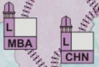
DiM wrote:3. inconsistent lines in almost all of the train stations (army boxes).


isaiah40 wrote:The little black dots are still visible on the title, and I didn't zoom in to see them.


isaiah40 wrote:Okay, title looks good.
Some of the stations still have that blurry line; DHK, CHN, HKG, HAN, BKK, KAL, HCM, KAG, SHA, ZHZ (the "F" needs to come down a couple pixels as well), LHW, SAP, IRK, TAY and AST.
On MHD, the "J" can come down a pixel or two.
Looking at the station bonuses, I'm thinking you might not need the outer glow.


Users browsing this forum: No registered users