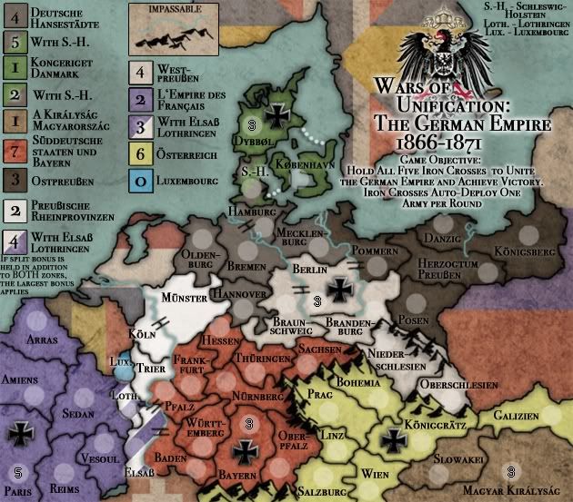
Well, I was originally thinking I would post these once 13 Colonies was done, but the work for that seems to go in small increments and is well on its way. I've had these at this point since May or so and I would like to get some feedback on 'em. Here's a look:
The wars of unification took place in the last half of the 19th century and saw the rise of the united kingdoms of Italy and Germany. France and Austria Hungary stood as the established powers of the region, but after a number of successful wars the balance of power shifted, especially in Germany. These two maps reflect these various wars that took place during this tumultuous time.
It is my intention to develop these together as their graphical style and general gameplay will be similar.
INFO Map Name :: War for German Unification Cartographer :: Industrial Helix Map Type :: Standard, Objective Territories :: 47, 5 neutral starts on Iron Crosses Continents :: 9 Special Features :: shared bonuses, Capture Iron Crosses for victory which start neutral.
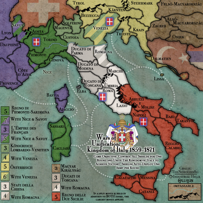
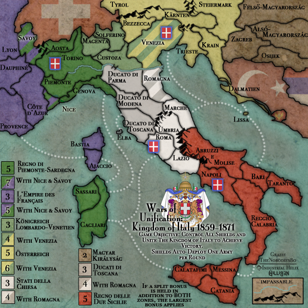
INFO Map Name :: War for Italian Unification Cartographer :: Industrial Helix Map Type :: Standard, Objective Territories :: 46, 4 neutral starts on Shields Continents :: 7 Special Features :: shared bonuses, Capture Shields for victory which start neutral.
Opening thoughts: It's a bit dark and I'm still out on the underlying paper texture, which will likely change. The little brown things are stand ins for a future mountain graphic. It also just occurred to me that I never put bridges over the rivers. All suggestions and feedback is greatly appreciated! Previous Versions :
I had been thinking that unification of Germany would be a good map, and it is I see. You could probably make both a little bigger and it would be clearer.
Last edited by captainwalrus on Thu Oct 22, 2009 2:45 pm, edited 1 time in total.
Cap'n: Well, part of the problem is that the Germany map is pretty wide and there would be nothing of purpose in adding north or south. Though I could stretch it a little to use the available space and give some room in there.
Are you going to try to work on both at once or one then the other? Also, you could probably make 2 separate threads, so you know which one people are giving feedback for. Why are the mountains so opaque? It is hard to tell that they are impassible.
Well, I'm going to try to do the two in tandem, that way the gameplay and graphics stay somewhat similar to each other. How was the USA map pack done? I thought it was all one thread... I might do two threads though just to organize it better. Not sure atm.
The mountains are so transparent, opaque means not see through , because I used a quick star brush to just mark where I thought they ought to go concerning gameplay. I will in the future add in a better graphic.
I like where you going here, Helix. And it could make sense work on both maps together and in the same thread.
Some questions: -Was Danmark part of Bismarckās unified Germany? Didnāt know that -The crosses and shields, do they all stand in capital regions? -Couldnāt they hold any a/d bonus? -Why the dashed border over Romagna and Elsab region?
I like the āfeelingā and look of the maps, for a preliminary approach theyāre great, good work!
The white-colored regions look a little strange since you can't see the army circle. The circles look pretty good everywhere else so maybe you should change the white to something else (or make the circles darker on those regions).
If you have any concrete ideas for the bonus values you should go ahead and plug those in; or if not, take a calculator to the maps.
Kab - - A part of Denmark was incorporated in Bismark's Germany. It was the first war fought over the province of Schleswig-Holstein. Austria and Prussia considered it part of the Zollverine (German Economic union) and the Kingdom of Denmark declared it part of Denmark, Austria and Prussia went to war to take it back.
-The crosses and shields are there to represent the key areas of each respective war for unification. Berlin, obviously the capital. Dybbol was the battle that gave Austria and Prussia victory over Denmark (though its actually in Schleswig Holstein). Bayern (Bavaria) was the final piece of the German empire declared at Paris. Konnigratz was the site of the battle where Prussia defeated Austria for the influence over the German union. Piedmonte was the state that enacted the wars for unification, Rome, obviously the capital taken from the Papal States, Napoli was the capitol of the Kingdom of Two Sicilies and Venetia was the final piece to Italy won after the Franco-Prussian war. So yeah, some are capitols, but the general idea was places of significance in the wars.
-Couldnāt they hold any a/d bonus? ...not sure what you're asking, but I think the answer is that yes, the crosses/shields will have an auto deploy and neutral start... I thought I wrote it on the map but apparently not, oops!
-the dashed borders are the areas of territory that was most contested by the great powers at the time. Alsace was taken from France, Schleswig Holstein taken from Denmark. Savoy was sold to France for help in the wars of Italian Unification, Venetia was taken from Austria (it was a puppet monarchy), Romagna was taken from the Papal States in the early phase of the war before the whole Papal States were swallowed up. Holding the contested area will gain an additional bonus for holding a bonus region.
Evil - I'm hesitent to change the white area in color as each unified state was intended to reflect the national colors, Germany being black, white and red. I think perhaps it might look better with the numbers visible... I'll throw some on next update.
I ran the bonuses through a calc. already just need to post the numbers. Will do next update.
Great to see that you have all historical background covered up here!
And yes, I was thinking on auto-deploy (a/d) bonus. It makes sense to confirm the importance of those key regions with another bonus layer. I like it!
As for the dashed border lines, let me see if I got it right: i.e. In the Italian map, if I hold Lombardo zone bonus, Iāll have an extra bonus for holding Venezia region. On the other hand, to get Osterreich zone bonus its mandatory to hold Venezia. Am I right?
Actually, it can go either way. The idea is that If you hold Austria you get a bonus and if you hold Lombardy you get a bonus, but if you hold one of the two AND Venezia, you get a little more of a bonus than before. Basically, think of War for Iraq or the hatched regions in your 3rd Crusade (thanks for the inspiration btw )
Once you know that the small version will fit, and both of them do, you should work on the larger version, it will be easier to shrink it than it will be to make it larger. also it will be much easier to tell where borders and such are.
captainwalrus wrote:Once you know that the small version will fit, and both of them do, you should work on the larger version, it will be easier to shrink it than it will be to make it larger. also it will be much easier to tell where borders and such are.
Agreed. I'm working on having a basic graphics set up for a large version that way most of the work is done for me when I go for the graphics stamp. Once I get that preliminary large map up, I'll post it here.
So just to update you all, expect an update on these maps sometime around Monday.
-why are the mountain treatment different in the two maps?
- maybe the extra bonus should appear in the legend marked with a box as well, but with a diagonal line dividing it in 2 colours.
-any reason why the colours in the boxes donāt match the one existing in the regions?
-could you make the army circles a little bit more transparent so they donāt get that huge presence over the board (very beautiful by the way, with that pleasant colour grade)
-speaking of colour grade, if you could get a way of differentiating a bit more the neutral gray from the others would work fine. Maybe with a hatch or texture of any kind, maybe the faded flag of the respective neutral country.
-those numbers that appear in the regions with the crosses and the shields are starting neutral troops right, could you use the real numbers?
-the number circles donāt seem to fit that well inside the icons/symbols.... especially in the crosses case. Iād suggest placing the circles near the symbols but not inside them.
-just a personal thing... I prefer the term armies instead of soldier when referring to the bonus.... makes it more realistic. You would not unify Italy with a hand full of soldiers
-why are the mountain treatment different in the two maps? I'm trying to decide which style I like better so I threw both up to see which you people might like best. I'm starting to lean towards the draw mountains but I think I might have to do them again.
- maybe the extra bonus should appear in the legend marked with a box as well, but with a diagonal line dividing it in 2 colours. It's a good idea, I kind of wrote it off because I assumed that numbers over the dash might look too visually confusing. I'll give it a shot and see.
-any reason why the colours in the boxes donāt match the one existing in the regions? Because i didn't turn down the opacity on the boxes, will do
-could you make the army circles a little bit more transparent so they donāt get that huge presence over the board (very beautiful by the way, with that pleasant colour grade) Def. can do
-speaking of colour grade, if you could get a way of differentiating a bit more the neutral gray from the others would work fine. Maybe with a hatch or texture of any kind, maybe the faded flag of the respective neutral country. The hatch texture might work well, I'll give it a shot. I think putting a flag in there might distract too much from the actual map... plus Luxembourg would be a pain.
-those numbers that appear in the regions with the crosses and the shields are starting neutral troops right, could you use the real numbers? Correct. Yeah, I ought to do that... i was just lazy and didn't take the time to do it. Will do this next round though.
-the number circles donāt seem to fit that well inside the icons/symbols.... especially in the crosses case. Iād suggest placing the circles near the symbols but not inside them. Hmm... I rather like it. I moved them from next to the symbol because they were crowding up the territory... I'll turn down the opacity on the dots first, if that doesn't work i'll revert to the next to the icon set up.
-just a personal thing... I prefer the term armies instead of soldier when referring to the bonus.... makes it more realistic. You would not unify Italy with a hand full of soldiers Lol. Yeah, I can do that. Seems to make more sense. Mabe I;ll switch it on my American Colonies map as well.
I like the mountains in the Italian one better. I don't really get the dotted line thing, is it just that those territories are in both bonus regions? Water connections could be a little lighter or smaller, either one.
Alright, got some new versions... I couldn't figure out how to switch to the normal numbers that CC uses... i found the 00s but I can seem to find the actual numbers... any help would be great.
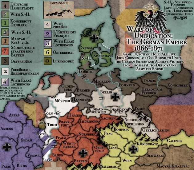
I tried decreasing the opacity on the squares with mixed results. I might switch it up next round. Anyway, here we go:
Industrial Helix wrote:I couldn't figure out how to switch to the normal numbers that CC uses... i found the 00s but I can seem to find the actual numbers... any help would be great.
-The circles in the German map seem to be more transparent... I prefer that option. -I like the flags on the neutral countries (actually I'm trying them in the Napoleonic Europe project ) - just not sure if they should be more faded out or added a bit more of grey in them, so they won't pop out us much. The red from the Ottoman Empire is maybe too close from one used in The Two Sicilies... -making the icons a little smaller could work better, I think
Kab, whoops... turns out one of the problems with working on two maps is that when you make a fix you have to do it to BOTH maps. In this case I forgot to tone down the army circles. Will do.
Shrinking the symbols. Yeah. It needs to be done I think. I originally threw them in as an improve but now that this map is a tad more advanced, I could probably play with it some more.
The thing is with the neutral flags, the background/grunge look is the early stages of a watercolor painting I found in a tutorial, and its darker in spots than it is in others. The reason the Turkey flag is so saturated is because of that. I think I'm going to be completely unable to get an even style for the neutral flags, but desaturated turkey is a definite try for the next update. I'll play with it, see what happens.
You should work on the larger version, as long a you know that the small one works, since it is easier to shrink it that enlarging it.
Instead of the dashed line, perhaps fill the territory with a gradient from one color to the next, or use like stripes of one on a background of another, cause as of now, it is hard to tell what is going down with them. Maybe just get rid of the line all together, that would make it more clear that it is all one territory.
Ok, no one seems to like the idea of the dotted line which means its got to go. The concept is that a territory has a dotted line then it can be used as part of two bonuses. For example, the dotted line on S-H shows that holding the Denmark bonus yields 1 army, if you hold the Denmark bonus AND S-H, then it yields 2 armies, but if you hold North Germany you get 6 Armies, if you hold North Germany AND S-H you get 7 Armies. So the territory of S-H is part of two bonuses and hence it has two territories and a dotted line to act as the bonus region border.
But anyway, I tried to take a page out of Kab's book and do the hatched area, which will then corresspond with a hatched square in the bonus legend. BUT, it looks out of place and a tad strange I think. I had to convert the territory name to White so it would show up. I need some opinions on whether it looks alright or not.
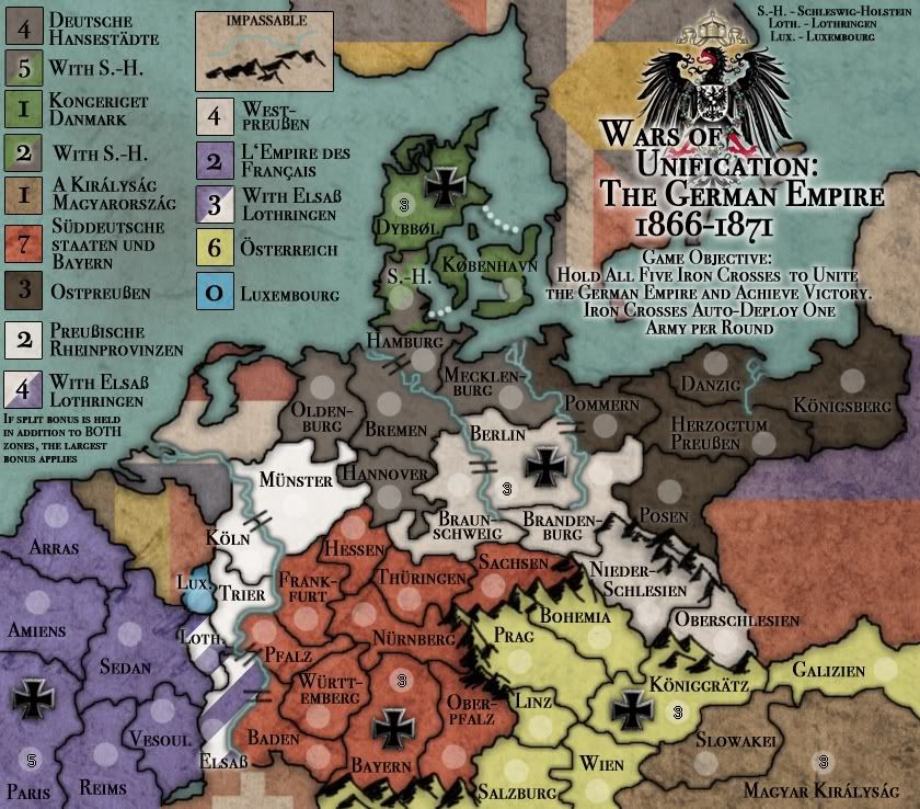
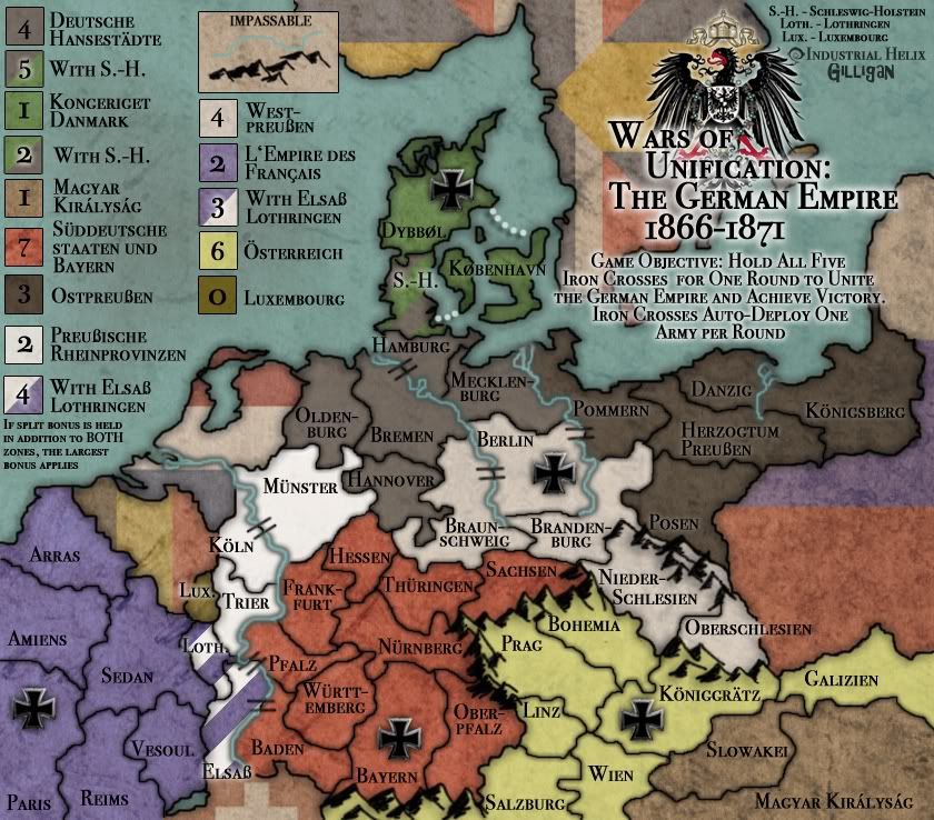
Also, I made large versions of both maps... it was surprisingly uncomplicated. Take a look.