I think a minimap would be better than a real legend for this map. Could you try your hand at it again and see if it comes out well?
I like the current color scheme, but agree that there may be some visibility issues. What do colorblind people think?
Bering Strait
Moderator: Cartographers
111 posts
• Page 3 of 5 • 1, 2, 3, 4, 5
Re: Bering Strait (V4 - P.4)
![]() by ZeakCytho on Sat Jun 28, 2008 11:47 pm
by ZeakCytho on Sat Jun 28, 2008 11:47 pm
-

 ZeakCytho
- Posts: 1251
- Joined: Wed Sep 12, 2007 4:36 pm


Re: Bering Strait (V4 - P.4)
![]() by lanyards on Sat Jun 28, 2008 11:51 pm
by lanyards on Sat Jun 28, 2008 11:51 pm
I am almost positive a mini-map won't work. I couldn't get it to work on the large map, I know it won't work on the small. And about colorblind issues, Oaktown? Ruben?ZeakCytho wrote:I think a minimap would be better than a real legend for this map. Could you try your hand at it again and see if it comes out well?
I like the current color scheme, but agree that there may be some visibility issues. What do colorblind people think?
--lanyards

WANT AN ADVANTAGE WHILE WORKING TOWARDS MEDALS?
https://www.conquerclub.com/forum/viewtopic.php?f=529&t=226714
-

lanyards
- Posts: 1378
- Joined: Sat Feb 24, 2007 1:31 am


 2
2


Re: Bering Strait (V4 - P.4)
![]() by lanyards on Sat Jun 28, 2008 11:52 pm
by lanyards on Sat Jun 28, 2008 11:52 pm
Canada is in America. Right?Joodoo wrote:Yukon is part of Canada, not USA.
Maybe you should make it North American Continents instead of American continents to make it more geographically correct.
--lanyards
WANT AN ADVANTAGE WHILE WORKING TOWARDS MEDALS?
https://www.conquerclub.com/forum/viewtopic.php?f=529&t=226714
-
lanyards
- Posts: 1378
- Joined: Sat Feb 24, 2007 1:31 am
2
Re: Bering Strait (V4 - P.4)
![]() by Joodoo on Sat Jun 28, 2008 11:55 pm
by Joodoo on Sat Jun 28, 2008 11:55 pm
when you say America, I'm thinking that you're talking about the US
-

Joodoo
- Posts: 1639
- Joined: Fri Mar 21, 2008 12:19 am
- Location: Greater Toronto, Canada


Re: Bering Strait (V4 - P.4)
![]() by edbeard on Sun Jun 29, 2008 12:46 am
by edbeard on Sun Jun 29, 2008 12:46 am
one port is missing a name as well.
-

edbeard
- Posts: 2501
- Joined: Thu Mar 29, 2007 12:41 am


Re: Bering Strait (V4 - P.4)
![]() by Ruben Cassar on Sun Jun 29, 2008 9:48 am
by Ruben Cassar on Sun Jun 29, 2008 9:48 am
The colours are indeed too similar. It's very difficult to differentiate between them. You can still keep the icy look by making different shades of white and blue and by using some textures perhaps to help differentiate between a region and another.
I also think a mini map in the lower right corner would be a good idea as it would be of great help to locate the bonuses.
About the sea connections...wouldn't dotted lines be better perhaps?
I also think a mini map in the lower right corner would be a good idea as it would be of great help to locate the bonuses.
About the sea connections...wouldn't dotted lines be better perhaps?


-

Ruben Cassar
- Posts: 2160
- Joined: Thu Nov 16, 2006 6:04 am
- Location: Civitas Invicta, Melita, Evropa


Re: Bering Strait (V4 - P.4)
![]() by lanyards on Sun Jun 29, 2008 9:50 am
by lanyards on Sun Jun 29, 2008 9:50 am
Thanks Ruben, I make the colors more different. And I guess I'll try a mini-map again. Is there a way to make dotted-lines with out have to make each dot by hand?Ruben Cassar wrote:The colours are indeed too similar. It's very difficult to differentiate between them. You can still keep the icy look by making different shades of white and blue and by using some textures perhaps to help differentiate between a region and another.
I also think a mini map in the lower right corner would be a good idea as it would be of great help to locate the bonuses.
About the sea connections...wouldn't dotted lines be better perhaps?
--lanyards
WANT AN ADVANTAGE WHILE WORKING TOWARDS MEDALS?
https://www.conquerclub.com/forum/viewtopic.php?f=529&t=226714
-
lanyards
- Posts: 1378
- Joined: Sat Feb 24, 2007 1:31 am
2
Re: Bering Strait (V4 - P.4)
![]() by Ruben Cassar on Sun Jun 29, 2008 10:21 am
by Ruben Cassar on Sun Jun 29, 2008 10:21 am
lanyards wrote:Thanks Ruben, I make the colors more different. And I guess I'll try a mini-map again. Is there a way to make dotted-lines with out have to make each dot by hand?Ruben Cassar wrote:The colours are indeed too similar. It's very difficult to differentiate between them. You can still keep the icy look by making different shades of white and blue and by using some textures perhaps to help differentiate between a region and another.
I also think a mini map in the lower right corner would be a good idea as it would be of great help to locate the bonuses.
About the sea connections...wouldn't dotted lines be better perhaps?
--lanyards
Yes there is. Are you using photoshop?
If yes, just increase the spacing of the brush.
-
Ruben Cassar
- Posts: 2160
- Joined: Thu Nov 16, 2006 6:04 am
- Location: Civitas Invicta, Melita, Evropa
Re: Bering Strait (V4 - P.4)
![]() by pepperonibread on Sun Jun 29, 2008 10:25 am
by pepperonibread on Sun Jun 29, 2008 10:25 am
Yep, you just need to use the brushes palette. Here's a tutorial that will give you a general idea of how to use it:
http://graphicssoft.about.com/cs/photos ... ebrush.htm
http://graphicssoft.about.com/cs/photos ... ebrush.htm

-

pepperonibread
- Posts: 954
- Joined: Sun Jan 28, 2007 4:33 pm
- Location: The Former Confederacy


Re: Bering Strait (V4 - P.4)
![]() by lanyards on Sun Jun 29, 2008 12:25 pm
by lanyards on Sun Jun 29, 2008 12:25 pm
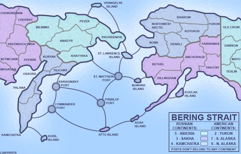
Version 5 Large:
Added port name, added signature, and darken continent colors.
This any better Ruben or Oak or anyone?
--lanyards
- Click image to enlarge.
Added port name, added signature, and darken continent colors.
This any better Ruben or Oak or anyone?
--lanyards
WANT AN ADVANTAGE WHILE WORKING TOWARDS MEDALS?
https://www.conquerclub.com/forum/viewtopic.php?f=529&t=226714
-
lanyards
- Posts: 1378
- Joined: Sat Feb 24, 2007 1:31 am
2
Re: Bering Strait (V5 - P.4)
![]() by pepperonibread on Sun Jun 29, 2008 2:21 pm
by pepperonibread on Sun Jun 29, 2008 2:21 pm
It seems like the islands Nunivak, Adak, Attu, and Kodlak are a different color from their continent (S. Alaska).
-
pepperonibread
- Posts: 954
- Joined: Sun Jan 28, 2007 4:33 pm
- Location: The Former Confederacy
Re: Bering Strait (V5 - P.4)
![]() by lanyards on Sun Jun 29, 2008 2:24 pm
by lanyards on Sun Jun 29, 2008 2:24 pm
Oh, the edges are darkened, I'll remove it for all the islands then. Are the continent colors good now?pepperonibread wrote:It seems like the islands Nunivak, Adak, Attu, and Kodlak are a different color from their continent (S. Alaska).
--lanyards
WANT AN ADVANTAGE WHILE WORKING TOWARDS MEDALS?
https://www.conquerclub.com/forum/viewtopic.php?f=529&t=226714
-
lanyards
- Posts: 1378
- Joined: Sat Feb 24, 2007 1:31 am
2
Re: Bering Strait (V5 - P.4)
![]() by lanyards on Sun Jun 29, 2008 3:05 pm
by lanyards on Sun Jun 29, 2008 3:05 pm
- Click image to enlarge.
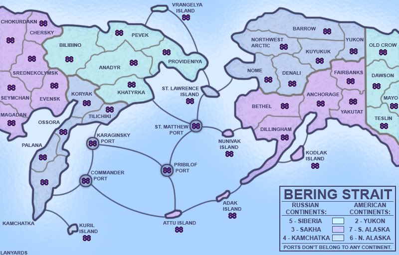
V6: Fixed island color, added coordinates.
--lanyards
WANT AN ADVANTAGE WHILE WORKING TOWARDS MEDALS?
https://www.conquerclub.com/forum/viewtopic.php?f=529&t=226714
-
lanyards
- Posts: 1378
- Joined: Sat Feb 24, 2007 1:31 am
2
Re: Bering Strait (V6 - P.5)
![]() by oaktown on Sun Jun 29, 2008 8:13 pm
by oaktown on Sun Jun 29, 2008 8:13 pm
colorblind issues? yes... southern and northern Alaska look the same, as do the Koryak and Evensk territories. There are more colors you can use and still keep it looking "cool."
In looking at the map, what a "port" is supposed to be isn't clear... why are there ports in the middle of the sea? (The answer might be buried in the thread, but 99% of your players won't have read this.)
In looking at the map, what a "port" is supposed to be isn't clear... why are there ports in the middle of the sea? (The answer might be buried in the thread, but 99% of your players won't have read this.)
-

oaktown
- Posts: 4451
- Joined: Sun Dec 03, 2006 9:24 pm
- Location: majorcommand


Re: Bering Strait (V6 - P.5)
![]() by lanyards on Sun Jun 29, 2008 8:19 pm
by lanyards on Sun Jun 29, 2008 8:19 pm
Ok, I'll change up the colors more to fix the issues. The ports are really islands, but they are too small to be put in correct size, so I just made them like that.oaktown wrote:colorblind issues? yes... southern and northern Alaska look the same, as do the Koryak and Evensk territories. There are more colors you can use and still keep it looking "cool."
In looking at the map, what a "port" is supposed to be isn't clear... why are there ports in the middle of the sea? (The answer might be buried in the thread, but 99% of your players won't have read this.)
--lanyards
WANT AN ADVANTAGE WHILE WORKING TOWARDS MEDALS?
https://www.conquerclub.com/forum/viewtopic.php?f=529&t=226714
-
lanyards
- Posts: 1378
- Joined: Sat Feb 24, 2007 1:31 am
2
Re: Bering Strait (V6 - P.5)
![]() by pepperonibread on Sun Jun 29, 2008 8:38 pm
by pepperonibread on Sun Jun 29, 2008 8:38 pm
Any chance of some type of ocean texture, maybe one that actually reflects the land's surrounding water? Overlaying the water with a depth map could yield some interesting results.
Possibly something like this:

Or you could always go with wikipedia's massive 4000x2000 px elevation map:
http://en.wikipedia.org/wiki/Image:Elevation.jpg
Also, this should be called bering sea, not strait, because the strait is only the small area between Nome and Provideniya.
Possibly something like this:
Or you could always go with wikipedia's massive 4000x2000 px elevation map:
http://en.wikipedia.org/wiki/Image:Elevation.jpg
Also, this should be called bering sea, not strait, because the strait is only the small area between Nome and Provideniya.
-
pepperonibread
- Posts: 954
- Joined: Sun Jan 28, 2007 4:33 pm
- Location: The Former Confederacy
Re: Bering Strait (V6 - P.5)
![]() by gimil on Mon Jun 30, 2008 1:41 pm
by gimil on Mon Jun 30, 2008 1:41 pm
Yes or No.
You may select 1 option
Yes?
18
100%
No?
0
No votes
Total votes : 18
What do you know about map making, bitch?
Top Score:2403
natty_dread wrote:I was wrong
Top Score:2403
-

gimil
- Posts: 8599
- Joined: Sat Mar 03, 2007 12:42 pm
- Location: United Kingdom (Scotland)


Re: Bering Strait (V6 - P.5)
![]() by ZeakCytho on Mon Jun 30, 2008 1:44 pm
by ZeakCytho on Mon Jun 30, 2008 1:44 pm
Has there ever been a map with 100% approval in the ideas stage before?
-
ZeakCytho
- Posts: 1251
- Joined: Wed Sep 12, 2007 4:36 pm
Re: Bering Strait (V6 - P.5)
![]() by gimil on Mon Jun 30, 2008 3:49 pm
by gimil on Mon Jun 30, 2008 3:49 pm
[adv. idea]
What do you know about map making, bitch?
Top Score:2403
natty_dread wrote:I was wrong
Top Score:2403
-
gimil
- Posts: 8599
- Joined: Sat Mar 03, 2007 12:42 pm
- Location: United Kingdom (Scotland)
Re: Bering Strait (V6 - P.5)
![]() by lanyards on Mon Jun 30, 2008 3:53 pm
by lanyards on Mon Jun 30, 2008 3:53 pm
TY TYgimil wrote:[adv. idea]
--lanyards
WANT AN ADVANTAGE WHILE WORKING TOWARDS MEDALS?
https://www.conquerclub.com/forum/viewtopic.php?f=529&t=226714
-
lanyards
- Posts: 1378
- Joined: Sat Feb 24, 2007 1:31 am
2
Re: Bering Strait (V6 - P.5)
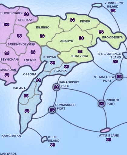
![]() by lanyards on Mon Jun 30, 2008 4:36 pm
by lanyards on Mon Jun 30, 2008 4:36 pm
This any better for colorblindness?
--lanyards
--lanyards
WANT AN ADVANTAGE WHILE WORKING TOWARDS MEDALS?
https://www.conquerclub.com/forum/viewtopic.php?f=529&t=226714
-
lanyards
- Posts: 1378
- Joined: Sat Feb 24, 2007 1:31 am
2
Re: Bering Strait (V6 - P.5)
![]() by Ruben Cassar on Mon Jun 30, 2008 4:39 pm
by Ruben Cassar on Mon Jun 30, 2008 4:39 pm
The other two regions still look a bit too similar for my taste...why not use a slightly darker blue?
Edit: Actually I did not have much of a problem with the one you changed but with the two you did not change!
Edit: Actually I did not have much of a problem with the one you changed but with the two you did not change!
-
Ruben Cassar
- Posts: 2160
- Joined: Thu Nov 16, 2006 6:04 am
- Location: Civitas Invicta, Melita, Evropa
Re: Bering Strait (V6 - P.5)
![]() by Incandenza on Mon Jun 30, 2008 10:32 pm
by Incandenza on Mon Jun 30, 2008 10:32 pm
lanyards wrote:The ports are really islands, but they are too small to be put in correct size, so I just made them like that.
--lanyards
You might be better off just having the islands, especially since St. Lawrence Island looks to be considerably bigger than it is in actuality.
Whether you keep or change the ports, you might want to rename Pribilof and Commander ports, since the other island terits are named after the actual islands, but those two are named after island chains. May I suggest St. Paul and Medny, respectively... (according to wiki, the largest commander island is actually bering island, but that seems to be a pandora's box best left unopened).
EDIT: one thing that might also speak against the port concept is that St. Matthew, strictly speaking, has no port, nor any permanent inhabitants.
THOTA: dingdingdingdingdingdingBOOM
Te Occidere Possunt Sed Te Edere Non Possunt Nefas Est
Te Occidere Possunt Sed Te Edere Non Possunt Nefas Est
-

Incandenza
- Posts: 4949
- Joined: Thu Oct 19, 2006 5:34 pm
- Location: Playing Eschaton with a bucket of old tennis balls


Re: Bering Strait (V6 - P.5)
![]() by MrBenn on Wed Jul 02, 2008 6:38 pm
by MrBenn on Wed Jul 02, 2008 6:38 pm
Lanyards - nice map.
I've only scanned it quickly, and my initial impression is that it's got a similar look to RJ's Charleston... I know the maps have different colour schemes, but there is just something about it... I don't know if it's the font, or the legend placement, or the islands, or all three together, but it generally feels similar... I'm not sure if that's a good thing or not, but I'd take that as a complement
I've only scanned it quickly, and my initial impression is that it's got a similar look to RJ's Charleston... I know the maps have different colour schemes, but there is just something about it... I don't know if it's the font, or the legend placement, or the islands, or all three together, but it generally feels similar... I'm not sure if that's a good thing or not, but I'd take that as a complement

PB: 2661 | He's blue... If he were green he would die | No mod would be stupid enough to do that
-

MrBenn
- Posts: 6880
- Joined: Wed Nov 21, 2007 9:32 am
- Location: Off Duty


Re: Bering Strait (V6 - P.5)
![]() by lanyards on Wed Jul 02, 2008 8:40 pm
by lanyards on Wed Jul 02, 2008 8:40 pm
I never thought it looked like Charleston, but I think it is a good thing if it does.MrBenn wrote:Lanyards - nice map.
I've only scanned it quickly, and my initial impression is that it's got a similar look to RJ's Charleston... I know the maps have different colour schemes, but there is just something about it... I don't know if it's the font, or the legend placement, or the islands, or all three together, but it generally feels similar... I'm not sure if that's a good thing or not, but I'd take that as a complement
Right now, I need to pick out three colors that would be distinguishable to the colorblind, and still look somewhat Arctic (right now, it's blueish colors).
Any ideas?
--lanyards
WANT AN ADVANTAGE WHILE WORKING TOWARDS MEDALS?
https://www.conquerclub.com/forum/viewtopic.php?f=529&t=226714
-
lanyards
- Posts: 1378
- Joined: Sat Feb 24, 2007 1:31 am
2
111 posts
• Page 3 of 5 • 1, 2, 3, 4, 5
Return to Melting Pot: Map Ideas
Who is online
Users browsing this forum: No registered users
|
|||||||
| Conquer Club is not associated with RISK online in any way. Copyright © 2006-2024 by Big Wham LLC | |||||||