Haiti [Quenched]
Moderator: Cartographers
Re: Haiti v13 pg12 [i][gp][gr]
Grats on the sticky Ed... To the Forge soonish.
C.
C.

Highest score : 2297
-

 yeti_c
- Posts: 9624
- Joined: Thu Jan 04, 2007 9:02 am


Re: Haiti v13 pg12 [i][gp][gr]

PB: 2661 | He's blue... If he were green he would die | No mod would be stupid enough to do that
-

 MrBenn
- Posts: 6880
- Joined: Wed Nov 21, 2007 9:32 am
- Location: Off Duty


Re: Haiti v13 pg12 [i][gp][gr]
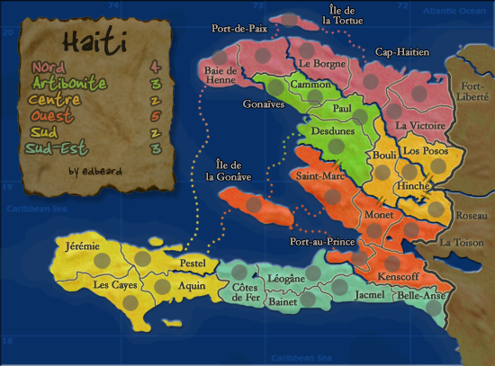
I raised this issue a long time ago but the legend font has nothing to do with Haiti or the rest of the map. You have a map of haiti that kind of looks like a text book, a legend that has an old paper feel to it, and yet the font for the legend is some graphittish handwritten thing. it doesn't make much sense to me, and it also looks bad.
the issue i have had with this map for while is that there is no theme, or perhaps there are too many and they don't mix well.
the legend it self is a very poor use of space, it looks too quick and easy, not much care involved. Another thing that kind of annoys me with this map is that with all the other geography maps out there, there is something that represents that area, whether it be colors, iconography or other touches that add to the 'feel' of a place. But thats not the case here. The map is of the country Haiti but it could just as easily be someplace up, even fictional. There is nothing besides the basic geography that suggest anything Haitian, and given a culture so vibrant, why is there nothing evocative of this.
You have said before that its suppose to look more like a textbook than a Haiti-feeling map. O.k., thats fine, i have no problem with that. But if it is going to look like a textbook or atlas, whats with the very untextbook legend? The bottom line is that this map needs more unity. Of course it can and probably will get quenched in its currant form but that doesn't mean quenching should be the ultimate goal when the map is only at 75% of its potential.
More effort is needed here.
-

 mibi
mibi
- Posts: 3350
- Joined: Thu Mar 01, 2007 8:19 pm
- Location: The Great State of Vermont


Re: Haiti v13 pg12 [i][gp][gr]
I disagree on all accounts. thanks.
-

 edbeard
- Posts: 2501
- Joined: Thu Mar 29, 2007 12:41 am


Re: Haiti v13 pg12 [i][gp][gr]
edbeard wrote:I disagree on all accounts. thanks.
ed, your smugness will not help this map. as you know i rarely comment on the gameplay of other peoples maps, as i figure there are other people with a better handle on it than i. but i know a thing or two about graphics, and the cohesion and execution of a project or product.
you are more than welcome to ignore my valid criticisms, as you have this whole thread, but ultimately the map will suffer and CC will be no better if you continue to slide through with a C+ product. It's not a race or a competition to see who has the most maps. If it was, i'd slap some countries around with color and 30 second legend and call it day, but the more maps there are on CC, the better the maps NEED to be.
Look at the Iceland map, it breathes frigid, cold, clean air. I am not a fan of the Egypt series, but the columns and symbols really put me in the time period. Cairns always excels as added the touched that draw the player into the map. High Seas, same deal, it could be a map across some old sea captains desk. Even maps my members are are not great artists have a style to suit the substance. Madagascar for example, there's no images or icons, but the colors, text show me Africa's east coast. San Marino and basically all the maps coming out feel like they deserve to be there.
I know you have taken Haiti this far, but I have to ask you, why? You have given Haiti no love in terms of design or culture or aesthetics. So why did you feel the need to put in many hours of work for this small country?
-

 mibi
mibi
- Posts: 3350
- Joined: Thu Mar 01, 2007 8:19 pm
- Location: The Great State of Vermont


Re: Haiti v13 pg12 [i][gp][gr]
mibi wrote:ed, your smugness will not help this map. as you know i rarely comment on the gameplay of other peoples maps, as i figure there are other people with a better handle on it than i. but i know a thing or two about graphics, and the cohesion and execution of a project or product.
you are more than welcome to ignore my valid criticisms, as you have this whole thread, but ultimately the map will suffer and CC will be no better if you continue to slide through with a C+ product. It's not a race or a competition to see who has the most maps. If it was, i'd slap some countries around with color and 30 second legend and call it day, but the more maps there are on CC, the better the maps NEED to be.
Look at the Iceland map, it breathes frigid, cold, clean air. I am not a fan of the Egypt series, but the columns and symbols really put me in the time period. Cairns always excels as added the touched that draw the player into the map. High Seas, same deal, it could be a map across some old sea captains desk. Even maps my members are are not great artists have a style to suit the substance. Madagascar for example, there's no images or icons, but the colors, text show me Africa's east coast. San Marino and basically all the maps coming out feel like they deserve to be there.
I know you have taken Haiti this far, but I have to ask you, why? You have given Haiti no love in terms of design or culture or aesthetics. So why did you feel the need to put in many hours of work for this small country?
I'll start off with a bit of niceness. My previous sentence implies there will be a bit of nastiness later because, in fact, there will be. oh well.
I definitely respect your thoughts and opinions on graphics because you do this for a living. ok I guess I didn't have that much niceness. I do disagree with you that my map totally doesn't reflect Haiti because the colours I've used are definitely Haiti.
Now I guess we're on the bad bit of the post. If you don't like reading stuff like that then please stop reading.
I really hate it when people talk out of their ass. I'm not someone who harps on r e s p e c t all the time, but the best way to describe it is that it's quite disrespectful and it doesn't reflect well on the speaker. I'll start with your "smugness" comment. It could mean that you're implying that I feel superior in some way with regard to graphical ability which I think we would all agree is quite laughable (in fact it would lead me to believe you were an idiot which would mean I would feel superior so I guess I would be smug). It would also reflect poorly on your skills of perception. I don't think this is the meaning you were using. I think you were calling me complacent which I find to be quite silly. I've met the standards of the foundry in terms of graphics. It was never my goal to make an astounding looking map so of course I'm going to be satisfied with my map. I would be an idiot to believe my map is a graphical masterpiece. As I've said elsewhere, I'm not here to make great looking maps. I'm here to make maps that are fun to play (which is why I'm not doing graphics on any more maps (if I do any more)). I guess because you're a graphics guy you feel that every map should be excellent and you can't understand why someone would make a map just because it'd be fun to play. I believe I've already said that in this thread as a response to one of your posts yet it apparently didn't sink in with you.
Oh, wait. I have more nice things to say. I really do appreciate your comments because if you didn't care, you wouldn't say anything. I think you're taking a crusade against the slightly above average and trying to get them to be quite good. This is definitely commendable but I don't see anything wrong with a few maps not exceeding the graphical requirements by more than a nose or two.
Let's get back to the bad. Your implication that I'm participating in a race to have the most maps is quite ludicrous. Again I find that you're talking out of your ass. Saying that my map doesn't deserve to be here is quite funny so thanks for that (me being smug!).
I had fun responding to your post and I really do appreciate you taking an interest, but I still have to say that I've met the guidelines (which isn't what you're going on about) and I feel I've got colours that, in a subtle way, reflect 'Haiti'. Yea it's not Circus Maximus in terms of graphic quality (and you're not saying it should be) but I totally disagree that it doesn't fit in with the majority of the other region based maps. I'm satisfied or complacent or smug.
-

 edbeard
- Posts: 2501
- Joined: Thu Mar 29, 2007 12:41 am


Re: Haiti v13 pg12 [i][gp][gr]
edbeard wrote:mibi wrote:ed, your smugness will not help this map. as you know i rarely comment on the gameplay of other peoples maps, as i figure there are other people with a better handle on it than i. but i know a thing or two about graphics, and the cohesion and execution of a project or product.
you are more than welcome to ignore my valid criticisms, as you have this whole thread, but ultimately the map will suffer and CC will be no better if you continue to slide through with a C+ product. It's not a race or a competition to see who has the most maps. If it was, i'd slap some countries around with color and 30 second legend and call it day, but the more maps there are on CC, the better the maps NEED to be.
Look at the Iceland map, it breathes frigid, cold, clean air. I am not a fan of the Egypt series, but the columns and symbols really put me in the time period. Cairns always excels as added the touched that draw the player into the map. High Seas, same deal, it could be a map across some old sea captains desk. Even maps my members are are not great artists have a style to suit the substance. Madagascar for example, there's no images or icons, but the colors, text show me Africa's east coast. San Marino and basically all the maps coming out feel like they deserve to be there.
I know you have taken Haiti this far, but I have to ask you, why? You have given Haiti no love in terms of design or culture or aesthetics. So why did you feel the need to put in many hours of work for this small country?
I'll start off with a bit of niceness. My previous sentence implies there will be a bit of nastiness later because, in fact, there will be. oh well.
I definitely respect your thoughts and opinions on graphics because you do this for a living. ok I guess I didn't have that much niceness. I do disagree with you that my map totally doesn't reflect Haiti because the colours I've used are definitely Haiti.
Now I guess we're on the bad bit of the post. If you don't like reading stuff like that then please stop reading.
I really hate it when people talk out of their ass. I'm not someone who harps on r e s p e c t all the time, but the best way to describe it is that it's quite disrespectful and it doesn't reflect well on the speaker. I'll start with your "smugness" comment. It could mean that you're implying that I feel superior in some way with regard to graphical ability which I think we would all agree is quite laughable (in fact it would lead me to believe you were an idiot which would mean I would feel superior so I guess I would be smug). It would also reflect poorly on your skills of perception. I don't think this is the meaning you were using. I think you were calling me complacent which I find to be quite silly. I've met the standards of the foundry in terms of graphics. It was never my goal to make an astounding looking map so of course I'm going to be satisfied with my map. I would be an idiot to believe my map is a graphical masterpiece. As I've said elsewhere, I'm not here to make great looking maps. I'm here to make maps that are fun to play (which is why I'm not doing graphics on any more maps (if I do any more)). I guess because you're a graphics guy you feel that every map should be excellent and you can't understand why someone would make a map just because it'd be fun to play. I believe I've already said that in this thread as a response to one of your posts yet it apparently didn't sink in with you.
Oh, wait. I have more nice things to say. I really do appreciate your comments because if you didn't care, you wouldn't say anything. I think you're taking a crusade against the slightly above average and trying to get them to be quite good. This is definitely commendable but I don't see anything wrong with a few maps not exceeding the graphical requirements by more than a nose or two.
Let's get back to the bad. Your implication that I'm participating in a race to have the most maps is quite ludicrous. Again I find that you're talking out of your ass. Saying that my map doesn't deserve to be here is quite funny so thanks for that (me being smug!).
I had fun responding to your post and I really do appreciate you taking an interest, but I still have to say that I've met the guidelines (which isn't what you're going on about) and I feel I've got colours that, in a subtle way, reflect 'Haiti'. Yea it's not Circus Maximus in terms of graphic quality (and you're not saying it should be) but I totally disagree that it doesn't fit in with the majority of the other region based maps. I'm satisfied or complacent or smug.
I think you missed point entirely. I could care less about overall graphic quality. Which is why I mentioned t-o-m's Madagascar map which certainly is not gem in the graphics department, but it says 'Madagascar" and I don't mean the title. If you actually understood my previous comments it wasn't about your graphics ability. It was about the purpose and cohesion of the map. You have several 'themes' that do not go together. It doesn't take a graphic guru to fix those.
This is the same situation with Kalp and his Swizz map. He has gone to hell and back trying to find that elusive Swiss flavor. Regardless of whether on he has achieved this (thought I think his latest version is the best yet) this shows dedication on his part to, not just 'pass' but 'nail it'.
You seem rather disinterested in giving this map the flavor it needs. Content that you have already gotten your stamps or fulfilled the requirements.
Let me ask you, what about this map is 'fun to play' since that is your stated goal? It may or may not be fun to play. I guess we won't know until we actually play it. The point is, it doesn't 'look' fun to play. And it doesn't look Haiti either, regardless of your color choices.
It's your map though and I don't feel like challanging someone who seems disinterested, so I'll just watch from the sidelines at this point. I will also save your naive 'nastiness' for some who gives a shit.
Cheers
.
-

 mibi
mibi
- Posts: 3350
- Joined: Thu Mar 01, 2007 8:19 pm
- Location: The Great State of Vermont


Re: Haiti v13 pg12 [i][gp][gr]
edbeard wrote:I disagree on all accounts. thanks.
Wow, that's not the way to handle a big comment that someone has taken time to analyze and write.
I agree with mibi.
-

 t-o-m
t-o-m
- Posts: 2918
- Joined: Sat Mar 22, 2008 2:22 pm


Re: Haiti v4 pg3
RjBeals wrote:Your legend is to plain. Is it possible to dress it up a little? Maybe also add a little Haiti touch to the map? Focus on the artistic influences and maybe deep spirituality of the land (not the extreme poverty). I would still love to see something to do with Zombies on this map. Ever see The Serpent and the Rainbow ???
Well.. I can't say I'm totally in disagreement with mibi. I really said the same thing back on page 4 or 5. You've got yourself a nice looking map ed. Nice, but not fantastic.
As for my taste, it sort of looks like a textbook map - i guess because of the long/lat grid lines. But that's about it. I do like the color choice, although it doesn't scream Haiti to me. It is visually appealing to the eye though. Except I wouldn't have chosen 2 yellows that look really close in shade. You know your game play way better than me, so I can only assume this will be a fun map to play. All except for the Port-de-Paix & Le Borgne border (northern pink area). I'm not sure I like the impassable within the bonus region.
But the legend.. That would be the only part that I would like to see changed. I'm fine with it now, I haven't commented in a while, so I don't expect you to drop everything for my comments. But I think mibi does have a point. He's known for his harsh and abrasive style, but most of the time there's truth to his posts.
You're still the man ed. I hope you don't get frustrated when reading my post.


-

 RjBeals
- Posts: 2506
- Joined: Mon Nov 20, 2006 5:17 pm
- Location: South Carolina, USA


Re: Haiti v13 pg12 [i][gp][gr]
Rj, I can take criticism just fine. I just have a problem with people who run their mouth like mibi did. When they do it to me, I make sure to call them out on it. I won't respond to his latest though since he's missing my point. Also, somewhat relatedly, tom's post gave me a good laugh. thanks.
It hasn't been a "textbook style" map since about version 3. The legend looked like it came from a book. To me, it looked like someone drew borders and put a highlighter to something in their world history book. I went away from that long ago but like you said, the lat/lon lines stayed which I think look good here.
Centre is orange not yellow. It definitely is light though but oftentimes, people use an orange that is too red. It doesn't matter much for clarity here since they both are +2 continents. When you put the colours of Centre and Sud next to each other, the difference is noticeable.
I'm good with the graphics and the legend that I have. thanks though.
I'm glad you brought up the river in Nord. I've been waiting for someone to mention that (I don't think anyone has anyway). Putting a bridge between Le Borgne and Port-de-Paix might open things up. I'm not sure I like taking away Le Borgne as a trap territory. It also lessens laTortue's importance. Maybe it not being mentioned until now is very telling though.
-

 edbeard
- Posts: 2501
- Joined: Thu Mar 29, 2007 12:41 am


Re: Haiti v13 pg12 [i][gp][gr]
Since the continent is contiguous even with the river, I don't really see a need to remove the river. I just don't like non-contiguous continents very much.However, you're much better at seeing the implications of gameplay tweaks than most people here, so I won't object if you do decide to remove it.
I agree with Mibi and Rj that the legend is not as good as it could be. I'm just not a big fan of the font style.
I agree with Mibi and Rj that the legend is not as good as it could be. I'm just not a big fan of the font style.
-

 ZeakCytho
- Posts: 1251
- Joined: Wed Sep 12, 2007 4:36 pm


Re: Haiti v13 pg12 [i][gp][gr]
So the colors represent high-lighter that you would see in a textbook? If so, why not make them a little messier? Like some white showing through the background where the guy didn't high-light well enough. Or some areas that are out of the lines?

-

 RjBeals
- Posts: 2506
- Joined: Mon Nov 20, 2006 5:17 pm
- Location: South Carolina, USA


Re: Haiti v13 pg12 [i][gp][gr]
RjBeals wrote:So the colors represent high-lighter that you would see in a textbook? If so, why not make them a little messier? Like some white showing through the background where the guy didn't high-light well enough. Or some areas that are out of the lines?
I disagree with this - the colors are fine as they are now, to me. Please don't make this a cartoony map like Doodle.
-

 ZeakCytho
- Posts: 1251
- Joined: Wed Sep 12, 2007 4:36 pm


Re: Haiti v13 pg12 [i][gp][gr]
Hey Ed - did you ever fix the bottom of that little island that you cropped by accident?
C.
C.

Highest score : 2297
-

 yeti_c
- Posts: 9624
- Joined: Thu Jan 04, 2007 9:02 am


Re: Haiti v13 pg12 [i][gp][gr]
RjBeals wrote:So the colors represent high-lighter that you would see in a textbook? If so, why not make them a little messier? Like some white showing through the background where the guy didn't high-light well enough. Or some areas that are out of the lines?
edbeard wrote:It hasn't been a "textbook style" map since about version 3.
I'll get on that, yeti. thanks.
-

 edbeard
- Posts: 2501
- Joined: Thu Mar 29, 2007 12:41 am


Re: Haiti v13 pg12 [i][gp][gr]
hmm I did this a few days ago but I guess I forgot to post these up
by "this" I mean yeti's island fix
FF time?
by "this" I mean yeti's island fix
FF time?
-

 edbeard
- Posts: 2501
- Joined: Thu Mar 29, 2007 12:41 am


Re: Haiti v13 pg12 [i][gp][gr]
XML done too. someone willing to host it on a non-expiring place for me?
http://www.sendspace.com/file/tpeb0y
- Code: Select all
 <map>
  <title>Haiti</title>
  <smallwidth>550</smallwidth>
  <smallheight>407</smallheight>
  <largewidth>698</largewidth>
  <largeheight>517</largeheight>
  <filetype>png</filetype>

 <continent>
  <name>Nord</name>
  <bonus>4</bonus>
 <components>
  <territory>Baie de Henne</territory>
  <territory>Port-de-Paix</territory>
  <territory>Ile de la Tortue</territory>
  <territory>Le Borgne</territory>
  <territory>Cap-Haiten</territory>
  <territory>La Victoire</territory>
  <territory>Fort-Liberte</territory>
  </components>
  </continent>

 <continent>
  <name>Artibonite</name>
  <bonus>3</bonus>
 <components>
  <territory>Gonaives</territory>
  <territory>Cammon</territory>
  <territory>Paul</territory>
  <territory>Desdunes</territory>
  </components>
  </continent>

 <continent>
  <name>Centre</name>
  <bonus>2</bonus>
 <components>
  <territory>Bouli</territory>
  <territory>Los Posos</territory>
  <territory>Hinche</territory>
  <territory>Roseau</territory>
  </components>
  </continent>

 <continent>
  <name>Ouest</name>
  <bonus>5</bonus>
 <components>
  <territory>Ile de la Gonave</territory>
  <territory>Saint-Marc</territory>
  <territory>Monet</territory>
  <territory>Port-au-Prince</territory>
  <territory>Kenscoff</territory>
  <territory>La Toison</territory>
  </components>
  </continent>

 <continent>
  <name>Sud</name>
  <bonus>2</bonus>
 <components>
  <territory>Jeremie</territory>
  <territory>Les Cayes</territory>
  <territory>Pestel</territory>
  <territory>Aquin</territory>
  </components>
  </continent>

 <continent>
  <name>Sud-Est</name>
  <bonus>3</bonus>
 <components>
  <territory>Cotes de Fer</territory>
  <territory>Leogane</territory>
  <territory>Bainet</territory>
  <territory>Jacmel</territory>
  <territory>Belle-Anse</territory>
  </components>
  </continent>

 <territory>
  <name>Baie de Henne</name>
<borders>
  <border>Port-de-Paix</border>
  <border>Pestel</border>
</borders>
 <coordinates>
  <smallx>240</smallx>
  <smally>86</smally>
  <largex>304</largex>
  <largey>108</largey>
  </coordinates>
  </territory>

 <territory>
  <name>Port-de-Paix</name>
<borders>
  <border>Baie de Henne</border>
  <border>Ile de la Tortue</border>
  <border>Cammon</border>
  <border>Gonaives</border>
</borders>
 <coordinates>
  <smallx>288</smallx>
  <smally>84</smally>
  <largex>367</largex>
  <largey>102</largey>
  </coordinates>
</territory>

 <territory>
  <name>Ile de la Tortue</name>
 <borders>
  <border>Port-de-Paix</border>
  <border>Cap-Haiten</border>
  </borders>
 <coordinates>
  <smallx>317</smallx>
  <smally>44</smally>
  <largex>404</largex>
  <largey>50</largey>
  </coordinates>
  </territory>

 <territory>
  <name>Le Borgne</name>
 <borders>
  <border>Cap-Haiten</border>
  </borders>
 <coordinates>
  <smallx>337</smallx>
  <smally>78</smally>
  <largex>434</largex>
  <largey>96</largey>
  </coordinates>
  </territory>

 <territory>
  <name>Cap-Haiten</name>
 <borders>
  <border>Le Borgne</border>
  <border>Ile de la Tortue</border>
  <border>Fort-Liberte</border>
  <border>Paul</border>
  <border>La Victoire</border>
  </borders>
 <coordinates>
  <smallx>408</smallx>
  <smally>113</smally>
  <largex>519</largex>
  <largey>139</largey>
  </coordinates>
  </territory>

 <territory>
  <name>Fort-Liberte</name>
 <borders>
  <border>Cap-Haiten</border>
  <border>La Victoire</border>
  </borders>
 <coordinates>
  <smallx>462</smallx>
  <smally>126</smally>
  <largex>587</largex>
  <largey>156</largey>
  </coordinates>
  </territory>


 <territory>
  <name>La Victoire</name>
 <borders>
  <border>Cap-Haiten</border>
  <border>Los Posos</border>
  <border>Fort-Liberte</border>
  </borders>
 <coordinates>
  <smallx>434</smallx>
  <smally>146</smally>
  <largex>555</largex>
  <largey>186</largey>
  </coordinates>
  </territory>

 <territory>
  <name>Gonaives</name>
 <borders>
  <border>Port-de-Paix</border>
  <border>Cammon</border>
  <border>Paul</border>
  </borders>
 <coordinates>
  <smallx>302</smallx>
  <smally>119</smally>
  <largex>385</largex>
  <largey>146</largey>
  </coordinates>
  </territory>

 <territory>
  <name>Cammon</name>
 <borders>
  <border>Port-de-Paix</border>
  <border>Gonaives</border>
  <border>Paul</border>
  </borders>
 <coordinates>
  <smallx>346</smallx>
  <smally>130</smally>
  <largex>440</largex>
  <largey>160</largey>
  </coordinates>
  </territory>

 <territory>
  <name>Paul</name>
 <borders>
  <border>Gonaives</border>
  <border>Cammon</border>
  <border>Cap-Haiten</border>
  <border>Desdunes</border>
  <border>Bouli</border>
  </borders>
 <coordinates>
  <smallx>396</smallx>
  <smally>152</smally>
  <largex>476</largex>
  <largey>178</largey>
  </coordinates>
  </territory>

 <territory>
  <name>Desdunes</name>
 <borders>
  <border>Paul</border>
  <border>Bouli</border>
  <border>Ile de la Gonave</border>
  <border>Saint-Marc</border>
  </borders>
 <coordinates>
  <smallx>369</smallx>
  <smally>185</smally>
  <largex>470</largex>
  <largey>229</largey>
  </coordinates>
  </territory>

 <territory>
  <name>Bouli</name>
 <borders>
  <border>Paul</border>
  <border>Desdunes</border>
  <border>Monet</border>
  <border>Hinche</border>
  </borders>
 <coordinates>
  <smallx>421</smallx>
  <smally>214</smally>
  <largex>535</largex>
  <largey>266</largey>
  </coordinates>
  </territory>

 <territory>
  <name>Los Posos</name>
 <borders>
  <border>Hinche</border>
  <border>La Victoire</border>
  </borders>
 <coordinates>
  <smallx>483</smallx>
  <smally>207</smally>
  <largex>576</largex>
  <largey>230</largey>
  </coordinates>
  </territory>

 <territory>
  <name>Hinche</name>
 <borders>
  <border>Bouli</border>
  <border>Los Posos</border>
  <border>Roseau</border>
  </borders>
 <coordinates>
  <smallx>451</smallx>
  <smally>213</smally>
  <largex>576</largex>
  <largey>269</largey>
  </coordinates>
  </territory>

 <territory>
  <name>Roseau</name>
 <borders>
  <border>Hinche</border>
  </borders>
 <coordinates>
  <smallx>480</smallx>
  <smally>255</smally>
  <largex>606</largex>
  <largey>318</largey>
  </coordinates>
  </territory>

 <territory>
  <name>Ile de la Gonave</name>
 <borders>
  <border>Saint-Marc</border>
  <border>Desdunes</border>
  <border>Port-au-Prince</border>
  <border>Pestel</border>
  </borders>
 <coordinates>
  <smallx>278</smallx>
  <smally>250</smally>
  <largex>354</largex>
  <largey>311</largey>
  </coordinates>
  </territory>

 <territory>
  <name>Saint-Marc</name>
 <borders>
  <border>Ile de la Gonave</border>
  <border>Monet</border>
  <border>Desdunes</border>
  </borders>
 <coordinates>
  <smallx>365</smallx>
  <smally>241</smally>
  <largex>465</largex>
  <largey>299</largey>
  </coordinates>
  </territory>

 <territory>
  <name>Monet</name>
 <borders>
  <border>Saint-Marc</border>
  <border>Bouli</border>
  <border>Port-au-Prince</border>
  <border>Kenscoff</border>
  <border>La Toison</border>
  </borders>
 <coordinates>
  <smallx>411</smallx>
  <smally>279</smally>
  <largex>523</largex>
  <largey>346</largey>
  </coordinates>
  </territory>


 <territory>
  <name>La Toison</name>
 <borders>
  <border>Monet</border>
  <border>Kenscoff</border>
  </borders>
 <coordinates>
  <smallx>453</smallx>
  <smally>278</smally>
  <largex>577</largex>
  <largey>346</largey>
  </coordinates>
  </territory>

 <territory>
  <name>Port-au-Prince</name>
 <borders>
  <border>Monet</border>
  <border>Kenscoff</border>
  <border>Ile de la Gonave</border>
  </borders>
 <coordinates>
  <smallx>395</smallx>
  <smally>308</smally>
  <largex>503</largex>
  <largey>387</largey>
  </coordinates>
  </territory>

 <territory>
  <name>Kenscoff</name>
 <borders>
  <border>Monet</border>
  <border>Port-au-Prince</border>
  <border>Jacmel</border>
  <border>Belle-Anse</border>
  <border>La Toison</border>
  </borders>
 <coordinates>
  <smallx>432</smallx>
  <smally>315</smally>
  <largex>549</largex>
  <largey>395</largey>
  </coordinates>
  </territory>


 <territory>
  <name>Jeremie</name>
 <borders>
  <border>Pestel</border>
  <border>Les Cayes</border>
  </borders>
 <coordinates>
  <smallx>109</smallx>
  <smally>312</smally>
  <largex>140</largex>
  <largey>390</largey>
  </coordinates>
  </territory>

 <territory>
  <name>Les Cayes</name>
 <borders>
  <border>Jeremie</border>
  <border>Pestel</border>
  <border>Aquin</border>
  </borders>
 <coordinates>
  <smallx>141</smallx>
  <smally>359</smally>
  <largex>180</largex>
  <largey>450</largey>
  </coordinates>
  </territory>

 <territory>
  <name>Pestel</name>
 <borders>
  <border>Jeremie</border>
  <border>Les Cayes</border>
  <border>Aquin</border>
  <border>Ile de la Gonave</border>
  <border>Baie de Henne</border>
  </borders>
 <coordinates>
  <smallx>154</smallx>
  <smally>310</smally>
  <largex>197</largex>
  <largey>388</largey>
  </coordinates>
  </territory>

 <territory>
  <name>Aquin</name>
 <borders>
  <border>Pestel</border>
  <border>Les Cayes</border>
  <border>Cotes de Fer</border>
  </borders>
 <coordinates>
  <smallx>177</smallx>
  <smally>341</smally>
  <largex>220</largex>
  <largey>422</largey>
  </coordinates>
  </territory>

 <territory>
  <name>Cotes de Fer</name>
 <borders>
  <border>Aquin</border>
  <border>Leogane</border>
  <border>Bainet</border>
  </borders>
 <coordinates>
  <smallx>262</smallx>
  <smally>325</smally>
  <largex>334</largex>
  <largey>413</largey>
  </coordinates>
  </territory>

 <territory>
  <name>Leogane</name>
 <borders>
  <border>Cotes de Fer</border>
  <border>Bainet</border>
  <border>Jacmel</border>
  </borders>
 <coordinates>
  <smallx>344</smallx>
  <smally>326</smally>
  <largex>438</largex>
  <largey>408</largey>
  </coordinates>
  </territory>

 <territory>
  <name>Bainet</name>
 <borders>
  <border>Cotes de Fer</border>
  <border>Leogane</border>
  <border>Jacmel</border>
  </borders>
 <coordinates>
  <smallx>338</smallx>
  <smally>355</smally>
  <largex>430</largex>
  <largey>445</largey>
  </coordinates>
  </territory>

 <territory>
  <name>Jacmel</name>
 <borders>
  <border>Belle-Anse</border>
  <border>Kenscoff</border>
  <border>Leogane</border>
  <border>Bainet</border>
  </borders>
 <coordinates>
  <smallx>374</smallx>
  <smally>341</smally>
  <largex>475</largex>
  <largey>428</largey>
  </coordinates>
  </territory>

 <territory>
  <name>Belle-Anse</name>
 <borders>
  <border>Jacmel</border>
  <border>Kenscoff</border>
  </borders>
 <coordinates>
  <smallx>478</smallx>
  <smally>364</smally>
  <largex>608</largex>
  <largey>457</largey>
  </coordinates>
  </territory>

  </map>
http://www.sendspace.com/file/tpeb0y
-

 edbeard
- Posts: 2501
- Joined: Thu Mar 29, 2007 12:41 am


Re: Haiti v13 pg12 [i][gp][gr]
foregone wrote:http://h1.ripway.com/foregone/Haiti.xml
thanks!
-

 edbeard
- Posts: 2501
- Joined: Thu Mar 29, 2007 12:41 am


Re: Haiti v13 pg12 [i][gp][gr]
- Final Forge
---The Haiti Map has reached the ‘Final Forge’ Stage. I've revived this thread from the pits of the Foundry Furnace (okay, maybe not) and have examined the contents. Nearly every major concern has been addressed. If there are any other current concerns, please make your voice heard. If after a reasonable amount of time there has not been any objection or protest, the map will be deemed finished with the 'Foundry Brand' of approval and will be submitted for live play. As long as there is still discussion or posts that have yet to be commented on, the map will remain in Final Forge until said discussion has reached the conclusion that the map has reached its final and polished version.
Post questions and concerns if any.

--Andy
-

 AndyDufresne
- Posts: 24935
- Joined: Fri Mar 03, 2006 8:22 pm
- Location: A Banana Palm in Zihuatanejo


Re: Haiti v13 pg12 [Final Forge]
Many thanks Forza.

--Andy

--Andy
-

 AndyDufresne
- Posts: 24935
- Joined: Fri Mar 03, 2006 8:22 pm
- Location: A Banana Palm in Zihuatanejo


Re: Haiti v13 pg12 [Final Forge]
thanks again to forza and another thanks, as always, to Andy
-

 edbeard
- Posts: 2501
- Joined: Thu Mar 29, 2007 12:41 am


Re: Haiti v13 pg12 [Final Forge]
here's the necessary for later
http://i140.photobucket.com/albums/r4/r ... itiv15.png
http://i140.photobucket.com/albums/r4/r ... mallv6.png
http://www.sendspace.com/file/tpeb0y
or (if sendspace expired (thanks forgone))
http://h1.ripway.com/foregone/Haiti.xml
http://i140.photobucket.com/albums/r4/r ... itiv15.png
http://i140.photobucket.com/albums/r4/r ... mallv6.png
http://www.sendspace.com/file/tpeb0y
or (if sendspace expired (thanks forgone))
http://h1.ripway.com/foregone/Haiti.xml
-

 edbeard
- Posts: 2501
- Joined: Thu Mar 29, 2007 12:41 am


Re: Haiti v13 pg12 [Final Forge]
Wow uber quick Forge -> XML time... reckon that's gotta be a new record!!!
C.
C.

Highest score : 2297
-

 yeti_c
- Posts: 9624
- Joined: Thu Jan 04, 2007 9:02 am


Re: Haiti v13 pg12 [Final Forge]
don't tell anyone but my XML was passed by Forza before I was in FF 
-

 edbeard
- Posts: 2501
- Joined: Thu Mar 29, 2007 12:41 am


Who is online
Users browsing this forum: No registered users


