Cairns Metro [Quenched]
Moderator: Cartographers
Re: Cairns Metro V15(P8) [D,Gp]
![]() by gimil on Wed Dec 10, 2008 11:26 am
by gimil on Wed Dec 10, 2008 11:26 am
To be honest cairns the butterfly sig doesn't do it for me next to the title, I believe it would be better fitted somewhere on the rocky patch in the east. Thats just a matter or opinion from me thou rather than a concern.
What do you know about map making, bitch?
Top Score:2403
natty_dread wrote:I was wrong
Top Score:2403
-

 gimil
gimil
- Posts: 8599
- Joined: Sat Mar 03, 2007 12:42 pm
- Location: United Kingdom (Scotland)


Re: Cairns Metro V15(P8) [D,Gp]
![]() by cairnswk on Wed Dec 10, 2008 11:39 am
by cairnswk on Wed Dec 10, 2008 11:39 am
gimil wrote:To be honest cairns the butterfly sig doesn't do it for me next to the title, I believe it would be better fitted somewhere on the rocky patch in the east. Thats just a matter or opinion from me thou rather than a concern.
Yes gimil, i had tried that, and it doesn't do so well over there on that olive colour background.
Much better up top.

* Pearl Harbour * Waterloo * Forbidden City * Jamaica * Pot Mosbi
-

cairnswk
- Posts: 11510
- Joined: Sat Feb 03, 2007 8:32 pm
- Location: Australia


Re: Cairns Metro V15(P8) [D,Gp]
![]() by gimil on Wed Dec 10, 2008 11:42 am
by gimil on Wed Dec 10, 2008 11:42 am
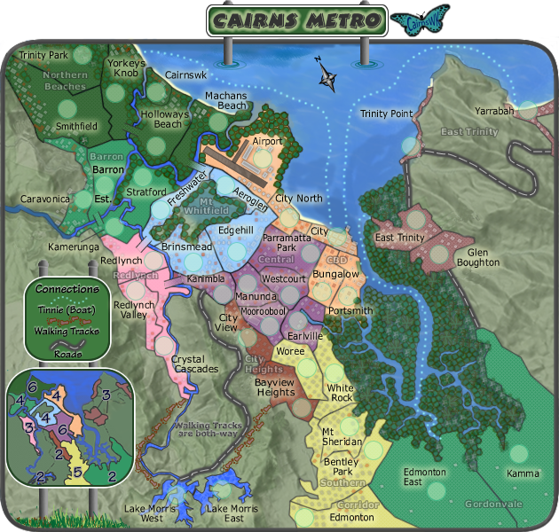
I has also just come to realise that its hard to see how east trinity works. Are they connected by the roads? OR can be all attack each other as it suggests in the minimap?
What do you know about map making, bitch?
Top Score:2403
natty_dread wrote:I was wrong
Top Score:2403
-
gimil
- Posts: 8599
- Joined: Sat Mar 03, 2007 12:42 pm
- Location: United Kingdom (Scotland)
Re: Cairns Metro V15(P8) [D,Gp]
![]() by gimil on Wed Dec 10, 2008 11:43 am
by gimil on Wed Dec 10, 2008 11:43 am
gimil wrote:I has also just come to realise that its hard to see how east trinity works. Are they connected by the roads? OR can be all attack each other as it suggests in the minimap?
Nevermind, I sorted out my own stupidity. But those black lines coming from each terr into the middle on the minimap has the potential to confues others I believe.
What do you know about map making, bitch?
Top Score:2403
natty_dread wrote:I was wrong
Top Score:2403
-
gimil
- Posts: 8599
- Joined: Sat Mar 03, 2007 12:42 pm
- Location: United Kingdom (Scotland)
Re: Cairns Metro V15(P8) [D,Gp]
![]() by Androidz on Wed Dec 10, 2008 11:51 am
by Androidz on Wed Dec 10, 2008 11:51 am
The brige between Hallowsways beach and Yorkey's Knop seem a bit stronger blackness then on the other briges. Pliss dim it a bit.
Also i think Brown Mountion roads will work better on this map then roads. Ofc you can use both but as places in Trinity POint --->Yarroha i think a mountion path is better.
Great map m8=)
Also i think Brown Mountion roads will work better on this map then roads. Ofc you can use both but as places in Trinity POint --->Yarroha i think a mountion path is better.
Great map m8=)

-

Androidz
- Posts: 1046
- Joined: Mon Dec 03, 2007 11:03 am


Re: Cairns Metro V15(P8) [D,Gp]
![]() by whitestazn88 on Thu Dec 11, 2008 7:58 pm
by whitestazn88 on Thu Dec 11, 2008 7:58 pm
put the 3 neutrals back on cairnswk... as we say in the states, you gotta "hold your house down". just a suggestion... although it might make gim take back your gameplay stamp
-
whitestazn88
- Posts: 3128
- Joined: Mon Feb 05, 2007 2:59 pm
- Location: behind you


Re: Cairns Metro V15(P8) [D,Gp]
![]() by cairnswk on Fri Dec 12, 2008 3:06 am
by cairnswk on Fri Dec 12, 2008 3:06 am
Androidz wrote:The brige between Hallowsways beach and Yorkey's Knop seem a bit stronger blackness then on the other briges. Pliss dim it a bit.{/quote]
That i have attended to.Also i think Brown Mountion roads will work better on this map then roads. Ofc you can use both but as places in Trinity POint --->Yarroha i think a mountion path is better.
Great map m8=)
Sorry, but there is no mountain path there, only a road and would rather keep this repesentation and be consistent, also your suggestion would further clog and mini-map legend.
* Pearl Harbour * Waterloo * Forbidden City * Jamaica * Pot Mosbi
-
cairnswk
- Posts: 11510
- Joined: Sat Feb 03, 2007 8:32 pm
- Location: Australia
Re: Cairns Metro V15(P8) [D,Gp]
![]() by cairnswk on Fri Dec 12, 2008 4:30 pm
by cairnswk on Fri Dec 12, 2008 4:30 pm
whitestazn88 wrote:put the 3 neutrals back on cairnswk... as we say in the states, you gotta "hold your house down". just a suggestion... although it might make gim take back your gameplay stamp
Mmmmm. sorry whites...bit pointless really.
* Pearl Harbour * Waterloo * Forbidden City * Jamaica * Pot Mosbi
-
cairnswk
- Posts: 11510
- Joined: Sat Feb 03, 2007 8:32 pm
- Location: Australia
Re: Cairns Metro V16
![]() by cairnswk on Fri Dec 12, 2008 4:42 pm
by cairnswk on Fri Dec 12, 2008 4:42 pm


- Click image to enlarge.

* Pearl Harbour * Waterloo * Forbidden City * Jamaica * Pot Mosbi
-
cairnswk
- Posts: 11510
- Joined: Sat Feb 03, 2007 8:32 pm
- Location: Australia
Re: Cairns Metro V16(P9) [D,Gp] - XML added
![]() by gimil on Wed Dec 17, 2008 12:11 pm
by gimil on Wed Dec 17, 2008 12:11 pm
Merry Christmas Cairns!

What do you know about map making, bitch?
Top Score:2403
natty_dread wrote:I was wrong
Top Score:2403
-
gimil
- Posts: 8599
- Joined: Sat Mar 03, 2007 12:42 pm
- Location: United Kingdom (Scotland)
Re: Cairns Metro V16(P9) [D,Gp] - XML added
![]() by cairnswk on Wed Dec 17, 2008 3:39 pm
by cairnswk on Wed Dec 17, 2008 3:39 pm
gimil wrote:Merry Christmas Cairns!
And to u also Gimil.
* Pearl Harbour * Waterloo * Forbidden City * Jamaica * Pot Mosbi
-
cairnswk
- Posts: 11510
- Joined: Sat Feb 03, 2007 8:32 pm
- Location: Australia
Re: Cairns Metro V16(P9) [D,Gp,Gr] - XML added
![]() by WidowMakers on Mon Dec 22, 2008 12:21 pm
by WidowMakers on Mon Dec 22, 2008 12:21 pm
First off Cairns, I have to agree with everyone else about the detail you put into this map. I love the little buildings and trees. It is something that I don't believe any other map has done to this detail. I also like how the map title is stick out of the map with the water ripples around the poles. VERY COOL.
Just a couple of things I noticed:
Keep up the good work. This map look fantastic.
WM
Just a couple of things I noticed:
- 1) Some of the trees along the airport borders and the forest borders are semi-transparent and you can see the border below. Is there a way to increase opacity to 100% to hide the border?
2) The bonus region names are sort of hard to see. The gray text blends into the map. Maybe make them White text with a black/gray shadow to help them stand out. Or even Color them to match their bonus regions.
3)I like the foot path icons but at first I could not even find them and I think ti is for 2 reasons. First they are that same gray that makes the text hard to see. What if the feet had a more contrasted color to the green hills. And second, maybe make the feet path not so close to the road. By making them parallel, it is harder to see.
Keep up the good work. This map look fantastic.
WM

-
WidowMakers
- Posts: 2774
- Joined: Mon Nov 20, 2006 9:25 am
- Location: Detroit, MI


Re: Cairns Metro V16(P9) [D,Gp,Gr] - XML added
![]() by cairnswk on Wed Dec 24, 2008 10:56 am
by cairnswk on Wed Dec 24, 2008 10:56 am
WidowMakers wrote:First off Cairns, I have to agree with everyone else about the detail you put into this map. I love the little buildings and trees. It is something that I don't believe any other map has done to this detail. I also like how the map title is stick out of the map with the water ripples around the poles. VERY COOL.
Just a couple of things I noticed:1) Some of the trees along the airport borders and the forest borders are semi-transparent and you can see the border below. Is there a way to increase opacity to 100% to hide the border?
2) The bonus region names are sort of hard to see. The gray text blends into the map. Maybe make them White text with a black/gray shadow to help them stand out. Or even Color them to match their bonus regions.
3)I like the foot path icons but at first I could not even find them and I think ti is for 2 reasons. First they are that same gray that makes the text hard to see. What if the feet had a more contrasted color to the green hills. And second, maybe make the feet path not so close to the road. By making them parallel, it is harder to see.
Keep up the good work. This map look fantastic.
WM
i'll see what i can do WM
* Pearl Harbour * Waterloo * Forbidden City * Jamaica * Pot Mosbi
-
cairnswk
- Posts: 11510
- Joined: Sat Feb 03, 2007 8:32 pm
- Location: Australia
Re: Cairns Metro V16
![]() by e_i_pi on Wed Dec 24, 2008 11:55 am
by e_i_pi on Wed Dec 24, 2008 11:55 am
Nitpicking:
Any chance of retracting the bridge from Redlynch to Freshwater a little so that the bridge does not look like a second border between Freshwater and Brinsmead?
Kamerunga text - have you accidently resized that layer? The letters look thinner in it than anywhere else. It may just be an anti-aliasing thing though.
Where Freshwater Creek empties into Barron River, there's a dark border, might look nicer if it wasn't there
Kudos on everything else though. WM has already pointed out the transparency issues with some of the trees, so no need to point that out. Everything about this is fantastic - you've done your home city proud. I'm tempted to start working on Wollongong
-

e_i_pi
- Posts: 1775
- Joined: Tue Feb 12, 2008 2:19 pm
- Location: Corruption Capital of the world


Re: Cairns Metro V17.
![]() by cairnswk on Wed Dec 24, 2008 5:50 pm
by cairnswk on Wed Dec 24, 2008 5:50 pm
WidowMakers wrote:...Just a couple of things I noticed:1) Some of the trees along the airport borders and the forest borders are semi-transparent and you can see the border below. Is there a way to increase opacity to 100% to hide the border?
.....
2) The bonus region names are sort of hard to see. The gray text blends into the map. Maybe make them White text with a black/gray shadow to help them stand out. Or even Color them to match their bonus regions.
3)I like the foot path icons but at first I could not even find them and I think ti is for 2 reasons. First they are that same gray that makes the text hard to see. What if the feet had a more contrasted color to the green hills. And second, maybe make the feet path not so close to the road. By making them parallel, it is harder to see.
WM
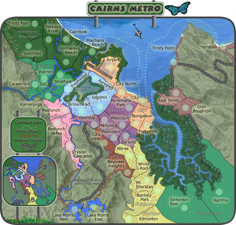
1. the individual vectors for the trees had all been flattened to a bitmap so all i could do was double the bitmap and change the opacity slightly so it didn't stand out too much.
2. White is too stark but inbetween #CCCCCC seems OK
3. Changed their colour completely but not their position.
e_i_pi wrote:Nitpicking:
1. Any chance of retracting the bridge from Redlynch to Freshwater a little so that the bridge does not look like a second border between Freshwater and Brinsmead?
2. Kamerunga text - have you accidently resized that layer? The letters look thinner in it than anywhere else. It may just be an anti-aliasing thing though.
3. Where Freshwater Creek empties into Barron River, there's a dark border, might look nicer if it wasn't there
...
Thanks e_i_pi...
1. Done.
2. It wasn't resized at all, but because of the issue or clarity io change the font to Verdana and re-sized to 11.
3. Done.
* Pearl Harbour * Waterloo * Forbidden City * Jamaica * Pot Mosbi
-
cairnswk
- Posts: 11510
- Joined: Sat Feb 03, 2007 8:32 pm
- Location: Australia
Re: Cairns Metro V17(P10) [D,Gp,Gr] - Tinkering
![]() by cairnswk on Wed Dec 24, 2008 9:15 pm
by cairnswk on Wed Dec 24, 2008 9:15 pm
Version 17.
- Click image to enlarge.
- Click image to enlarge.
Last edited by cairnswk on Sat Dec 27, 2008 10:42 am, edited 1 time in total.
* Pearl Harbour * Waterloo * Forbidden City * Jamaica * Pot Mosbi
-
cairnswk
- Posts: 11510
- Joined: Sat Feb 03, 2007 8:32 pm
- Location: Australia
Re: Cairns Metro V17(P10) [D,Gp,Gr] - Tinkering L & S
![]() by e_i_pi on Wed Dec 24, 2008 11:11 pm
by e_i_pi on Wed Dec 24, 2008 11:11 pm
Nice Xmas present for the CC folk cairns, and a pleasure to behold. Merry Xmas mate
-
e_i_pi
- Posts: 1775
- Joined: Tue Feb 12, 2008 2:19 pm
- Location: Corruption Capital of the world
Re: Cairns Metro V17(P10) [D,Gp,Gr] - Tinkering L & S
![]() by cairnswk on Thu Dec 25, 2008 4:25 pm
by cairnswk on Thu Dec 25, 2008 4:25 pm
e_i_pi wrote:Nice Xmas present for the CC folk cairns, and a pleasure to behold. Merry Xmas mate
Thanks e_i_pi
* Pearl Harbour * Waterloo * Forbidden City * Jamaica * Pot Mosbi
-
cairnswk
- Posts: 11510
- Joined: Sat Feb 03, 2007 8:32 pm
- Location: Australia
Re: Cairns Metro V17.
![]() by WidowMakers on Fri Dec 26, 2008 9:46 pm
by WidowMakers on Fri Dec 26, 2008 9:46 pm
The changes look good. I still think the bonus names could stand out more but they are better than before. I really like the feet now (they stand out much better) and the trees and the border line look much better as well.cairnswk wrote:WidowMakers wrote:...Just a couple of things I noticed:1) Some of the trees along the airport borders and the forest borders are semi-transparent and you can see the border below. Is there a way to increase opacity to 100% to hide the border?
.....
2) The bonus region names are sort of hard to see. The gray text blends into the map. Maybe make them White text with a black/gray shadow to help them stand out. Or even Color them to match their bonus regions.
3)I like the foot path icons but at first I could not even find them and I think ti is for 2 reasons. First they are that same gray that makes the text hard to see. What if the feet had a more contrasted color to the green hills. And second, maybe make the feet path not so close to the road. By making them parallel, it is harder to see.
WM
1. the individual vectors for the trees had all been flattened to a bitmap so all i could do was double the bitmap and change the opacity slightly so it didn't stand out too much.
2. White is too stark but inbetween #CCCCCC seems OK
3. Changed their colour completely but not their position.
Looking good.
WM
-
WidowMakers
- Posts: 2774
- Joined: Mon Nov 20, 2006 9:25 am
- Location: Detroit, MI
Re: Cairns Metro V17(P10) [D,Gp,Gr] - Tinkering L & S
![]() by gimil on Sat Dec 27, 2008 10:38 am
by gimil on Sat Dec 27, 2008 10:38 am
Come on cairns [bigimg] tags.
You just broke my layout
You just broke my layout
What do you know about map making, bitch?
Top Score:2403
natty_dread wrote:I was wrong
Top Score:2403
-
gimil
- Posts: 8599
- Joined: Sat Mar 03, 2007 12:42 pm
- Location: United Kingdom (Scotland)
Re: Cairns Metro V17(P10) [D,Gp,Gr] - Tinkering L & S
![]() by cairnswk on Sat Dec 27, 2008 10:44 am
by cairnswk on Sat Dec 27, 2008 10:44 am
gimil wrote:Come on cairns [bigimg] tags.
You just broke my layout
Try now Gimil. When are you gonna get a decent monitor?
* Pearl Harbour * Waterloo * Forbidden City * Jamaica * Pot Mosbi
-
cairnswk
- Posts: 11510
- Joined: Sat Feb 03, 2007 8:32 pm
- Location: Australia
Re: Cairns Metro V17(P10) [D,Gp,Gr] - Tinkering L & S
![]() by gimil on Sat Dec 27, 2008 11:10 am
by gimil on Sat Dec 27, 2008 11:10 am
cairnswk wrote:gimil wrote:Come on cairns [bigimg] tags.
You just broke my layout
Try now Gimil. When are you gonna get a decent monitor?
Thanks cairns,
I got a res of 1280x800 on a 15 and a half inch screen, unfortunatly bigger images still break my layout.
What do you know about map making, bitch?
Top Score:2403
natty_dread wrote:I was wrong
Top Score:2403
-
gimil
- Posts: 8599
- Joined: Sat Mar 03, 2007 12:42 pm
- Location: United Kingdom (Scotland)
Re: Cairns Metro V17(P10) [D,Gp,Gr] - Tinkering L & S
![]() by cairnswk on Sat Dec 27, 2008 11:26 am
by cairnswk on Sat Dec 27, 2008 11:26 am
gimil wrote:cairnswk wrote:gimil wrote:Come on cairns [bigimg] tags.
You just broke my layout
Try now Gimil. When are you gonna get a decent monitor?
Thanks cairns,
I got a res of 1280x800 on a 15 and a half inch screen, unfortunatly bigger images still break my layout.
You definitely need to upgrade
* Pearl Harbour * Waterloo * Forbidden City * Jamaica * Pot Mosbi
-
cairnswk
- Posts: 11510
- Joined: Sat Feb 03, 2007 8:32 pm
- Location: Australia
Re: Cairns Metro V17(P10) [D,Gp,Gr] - Tinkering L & S
![]() by gimil on Sat Dec 27, 2008 11:28 am
by gimil on Sat Dec 27, 2008 11:28 am
cairnswk wrote:gimil wrote:cairnswk wrote:gimil wrote:Come on cairns [bigimg] tags.
You just broke my layout
Try now Gimil. When are you gonna get a decent monitor?
Thanks cairns,
I got a res of 1280x800 on a 15 and a half inch screen, unfortunatly bigger images still break my layout.
You definitely need to upgrade
Ill let you know when I can hook my laptop up to my 22inch flat screen that santa got me
What do you know about map making, bitch?
Top Score:2403
natty_dread wrote:I was wrong
Top Score:2403
-
gimil
- Posts: 8599
- Joined: Sat Mar 03, 2007 12:42 pm
- Location: United Kingdom (Scotland)
Re: Cairns Metro V17(P10) [D,Gp,Gr]
![]() by cairnswk on Wed Dec 31, 2008 6:57 pm
by cairnswk on Wed Dec 31, 2008 6:57 pm
Version 17. still; just tidied some edges around the frame that were showing smudging from underneath layers.
- Click image to enlarge.
- Click image to enlarge.
* Pearl Harbour * Waterloo * Forbidden City * Jamaica * Pot Mosbi
-
cairnswk
- Posts: 11510
- Joined: Sat Feb 03, 2007 8:32 pm
- Location: Australia
Who is online
Users browsing this forum: No registered users
|
|||||||
| Conquer Club is not associated with RISK online in any way. Copyright © 2006-2024 by Big Wham LLC | |||||||