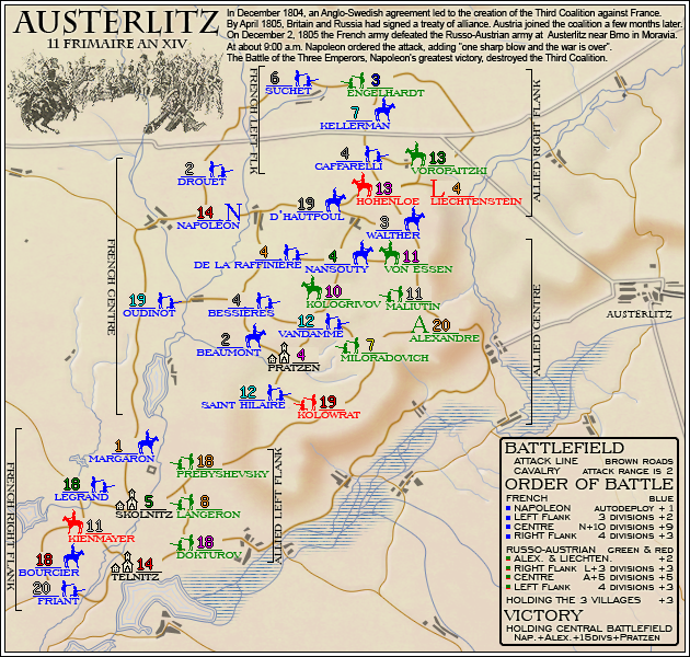
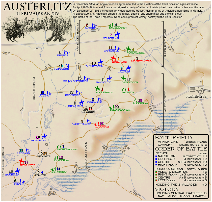
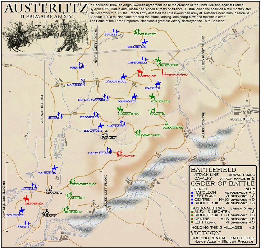
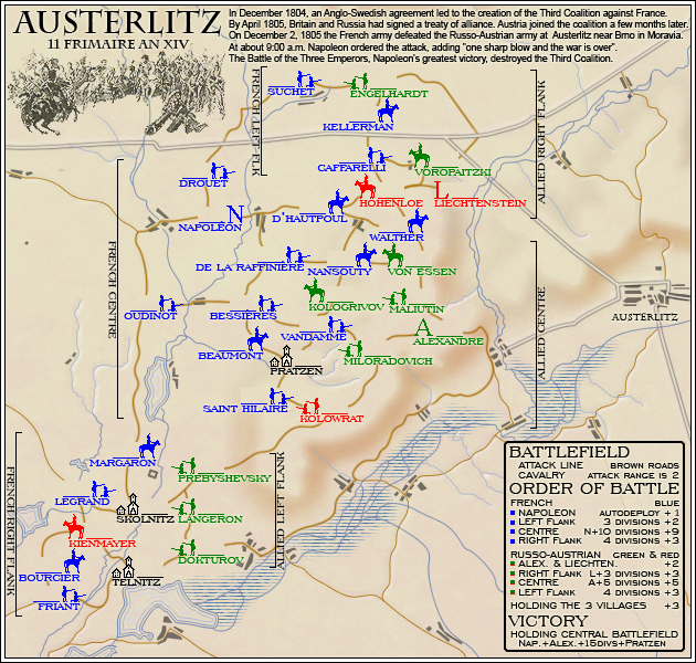
Well I have to say the GFX are very nice on this map. I really like the background, road, cities and how the header and legend blend well.
However, after that the map seems to get very complicated. Not from a GP perspective but from a general "what is going on" perspective.
Here are some things that trouble me:
1) The legend says cavalry get to an attack range of 2. But it does not say what Cavalry are. I would include a small icon to better explain that.
2) The bonus group naming and identification are VERY hard to understand.
3) With Due to how the bonuses and names are laid out and colored, you might have a HUGE issue with colorblind players. Maybe instead of colors only there be ICONS for each side. That way they could more easily be understood. It might also help with the bonus names. Instead of having the brackets and names, what if one group had stars and the legend had star as well. Then colors would not matter. Use different shapes for each group. Squares, triangles, diamonds, circles, two vertical lines. plus sign, etc.
This is not a bad map it has just been overcomplicated IMO.
WM
P.S. French left flank is missing a "A"


