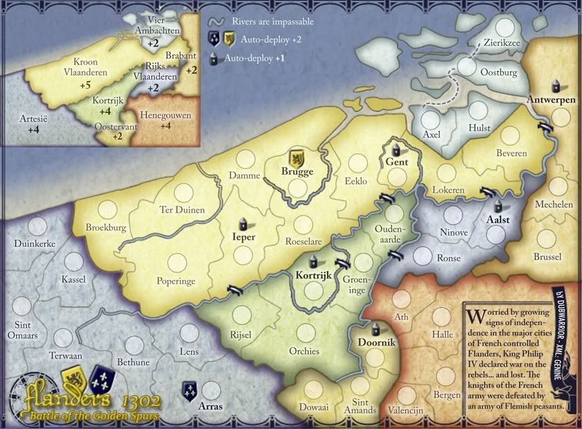
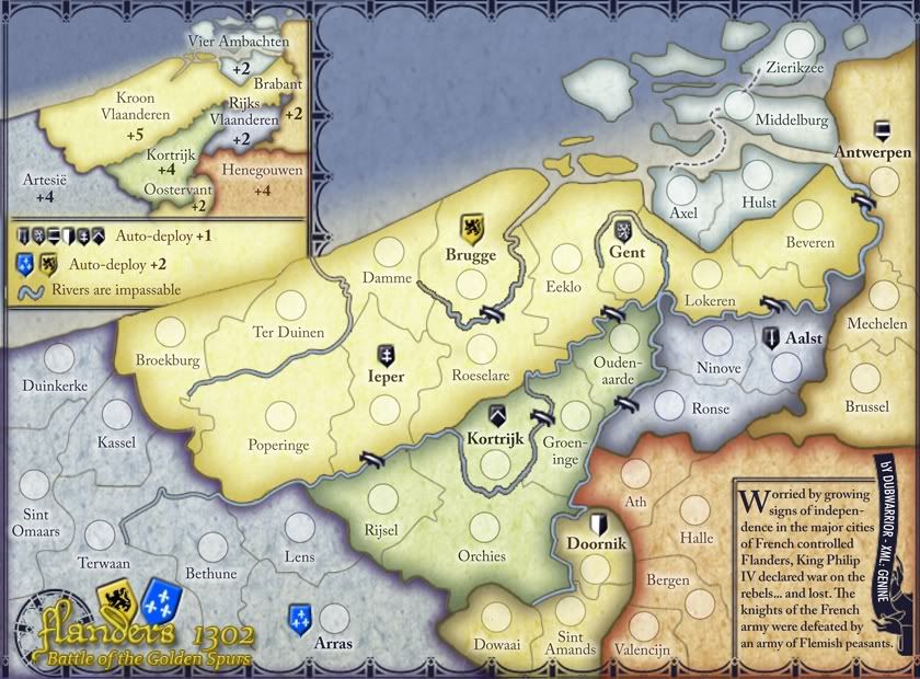
lt_oddball wrote:Artesie (6-2) = 4
Kroon Vlaanderen (10-4) = 6
Henegouwen 4
Kortrijk (5-1)= 4
Brabant (3-1) = 2
Vier Ambachten 2
Rijks Vlaanderen (3-1) = 2
Oostervant (3-1) = 2
(substracted autodeploy goes without saying).
i'm broadly in agreement, except i'd reduce kroon vlaanderen to no more than +5: although this is a difficult bonus, it can be built up gradually by earning +2 and +1 auto-deploys on brugge, ieper and gent.
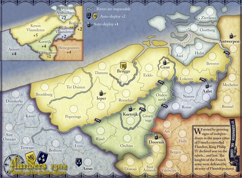
Symmetry wrote:The big sea route could be shorter too. I'd say remove it entirely unless you break up the territories.
DubWarrior wrote:This sea-link was an idea to link 2 'ends' on the map with eachother. If it's impossible for a player to cross the map, some good action can be taken in that way, by using this connection. it's just a very small detail, and can be easily removed from the map.
the long sea route looks completely out of place and distorts the geography a little too much for me. if u do decide to keep it, then make it connect to a ship to slow down the attack a little bit (the ship will not be part of a bonus, but act only as a short cut, like antarctica in
world 2.1).
RedBaron0 wrote:And what about the rebel strongholds? Will they start as neutral?
can u show the number of starting neutral troops on each auto-deploy bonus?
is atrecht the correct flemish name for arras? i presume that we're showing this conflict from a flemish viewpoint.
ian.