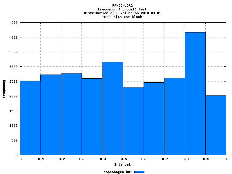
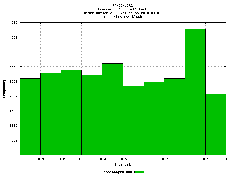
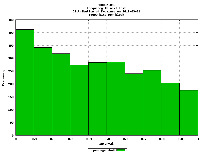
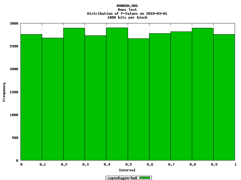
soylentpurple wrote:you still haven't addressed the random.org sample.
Did someone forget to log into their proper account before posting?
Anyway, to address the graphic from random.org. Do you have any idea what the graph represents? I don't, but I suspect that it's not as damning as you seem to think. It's listing intervals, not absolute values. If it's representing the frequency at which the different intervals between values present themselves, then it makes absolute sense that there are much more of the lower values, and fewer of the higher values. Large intervals require a low number, followed by a high one, or the opposite, whereas a low interval will present itself whenever a low number is followed by another low number, or a high followed by a high, or a mid value... and so on. As you can see, you SHOULD be seeing more lower intervals, in a truly random sequence.
Besides all that, do you really think random.org would willingly put up a graph that definitively proved their service was useless?