[Abandoned] Tokyo
Moderator: Cartographers
125 posts
• Page 5 of 5 • 1, 2, 3, 4, 5
Re: Tokyo [17 Oct 2011]
Grats!
Using abbrevations isn't bad, but you might have to use more abbrevations than would be comfortable. In my opinion it might be better to have a few names over borders than having dozens of abbrevations.
Using abbrevations isn't bad, but you might have to use more abbrevations than would be comfortable. In my opinion it might be better to have a few names over borders than having dozens of abbrevations.
-

 mr. CD
- Posts: 1692
- Joined: Fri Aug 22, 2008 12:31 pm
- Location: In a tree


Re: Tokyo [17 Oct 2011]
It's passed a month without an update.
Moving this one into the Recycling Box for a [Vacation] period, if you want to continue with the map, then one of the Foundry Moderators will be able to help put the thread back into the Foundry system, after an update has been made.
Nobodies
Moving this one into the Recycling Box for a [Vacation] period, if you want to continue with the map, then one of the Foundry Moderators will be able to help put the thread back into the Foundry system, after an update has been made.
Nobodies
-

 thenobodies80
- Posts: 5400
- Joined: Wed Sep 05, 2007 4:30 am
- Location: Milan


Re: [Vacation - valid untill May 2012] - Tokyo
RedBaron0, I started work on the small map most recently. It's still in the works.
Current Map Project: Tokyo
-

 shakeycat
- Posts: 390
- Joined: Sun Mar 11, 2007 5:13 am
- Location: Vancouver


Re: [Vacation - valid untill May 2012] - Tokyo
Don't let this map stall too long 

PB: 2661 | He's blue... If he were green he would die | No mod would be stupid enough to do that
-

 MrBenn
- Posts: 6880
- Joined: Wed Nov 21, 2007 9:32 am
- Location: Off Duty


Re: [Vacation - valid untill May 2012] - Tokyo
It's open and being worked on! Hit a bit of a stall with my legend, too much info, too little space.
Current Map Project: Tokyo
-

 shakeycat
- Posts: 390
- Joined: Sun Mar 11, 2007 5:13 am
- Location: Vancouver


Re: [Vacation - valid untill May 2012] - Tokyo
shakeycat wrote:It's open and being worked on! Hit a bit of a stall with my legend, too much info, too little space.
Would an extra 40 pixels in height work?
-
 isaiah40
- Posts: 3990
- Joined: Mon Aug 27, 2007 7:14 pm


Re: [Vacation - valid untill May 2012] - Tokyo
Isaiah, it certainly would. Would this be for just the small version, or the large as well?
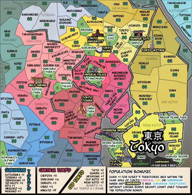
With 40 extra pixels, we'd have something like this:
When I shorten names, do I need to abbreviate the latter parts? (Minami Senju [Railyard], Ochanomizu [University]), .. Ministry OF Defense barely fits but Ministry Defense? :/ bleh. Also, Tokyo N. M. [National Museum]
With 40 extra pixels, we'd have something like this:
When I shorten names, do I need to abbreviate the latter parts? (Minami Senju [Railyard], Ochanomizu [University]), .. Ministry OF Defense barely fits but Ministry Defense? :/ bleh. Also, Tokyo N. M. [National Museum]
Current Map Project: Tokyo
-

 shakeycat
- Posts: 390
- Joined: Sun Mar 11, 2007 5:13 am
- Location: Vancouver


Re: [Vacation - valid untill May 2012] - Tokyo
shakeycat wrote:Isaiah, it certainly would. Would this be for just the small version?
I think it would help for both as it seems a little cramped. Get both the small and large with the extra height, if it isn't any more than 40-50 pixels in height, then we can see about allowing those few. If it is any more then submit your supersize application, and thenobodies80 and I will review it and give you an answer in about 2 days. Before we can approve your application, we will need to see both small and large versions.
-
 isaiah40
- Posts: 3990
- Joined: Mon Aug 27, 2007 7:14 pm


Re: [Vacation - valid untill May 2012] - Tokyo
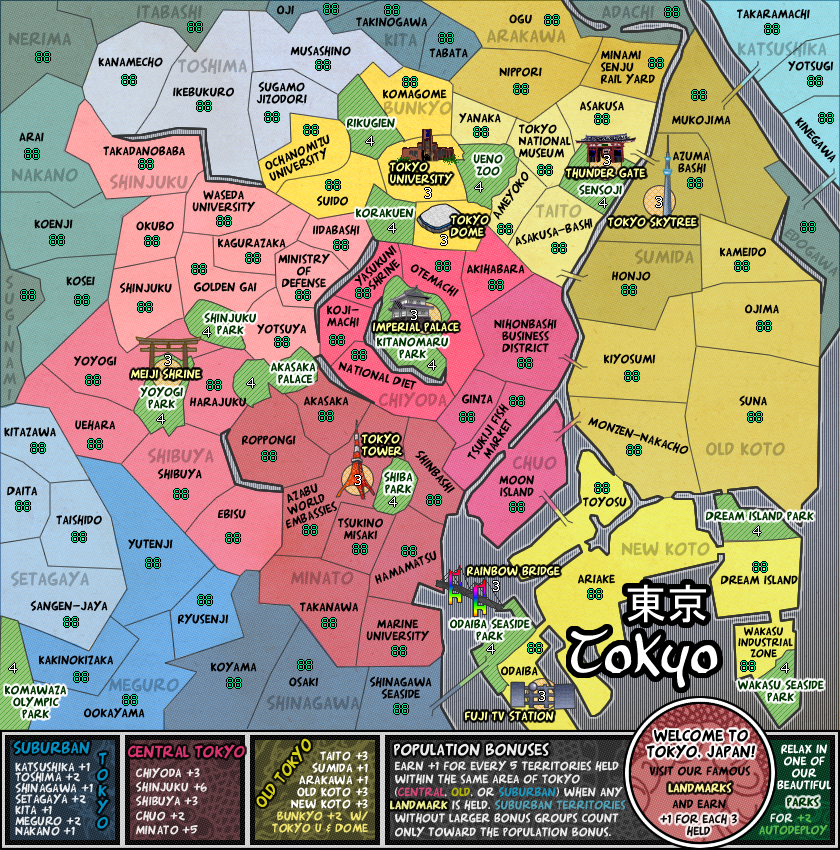
50px will be sufficient. Here is the large version at 840x850,
It's not where I want it to be yet, but getting closer. I like the legend better now, though still need to think through the inclusion of Landmarks/Parks to it.
It's not where I want it to be yet, but getting closer. I like the legend better now, though still need to think through the inclusion of Landmarks/Parks to it.
Current Map Project: Tokyo
-

 shakeycat
- Posts: 390
- Joined: Sun Mar 11, 2007 5:13 am
- Location: Vancouver


Re: [Updated Mar 3] - Tokyo
[Moved] back into the Foundry System. 
Nobodies
Nobodies
-

 thenobodies80
- Posts: 5400
- Joined: Wed Sep 05, 2007 4:30 am
- Location: Milan


Re: [Vacation - valid untill May 2012] - Tokyo
isaiah40 wrote:shakeycat wrote:Isaiah, it certainly would. Would this be for just the small version?
I think it would help for both as it seems a little cramped. Get both the small and large with the extra height, if it isn't any more than 40-50 pixels in height, then we can see about allowing those few. If it is any more then submit your supersize application, and thenobodies80 and I will review it and give you an answer in about 2 days. Before we can approve your application, we will need to see both small and large versions.
Going back and forth trying to figure out what bonus names goes to which is going to be very frustrating. This is going to nee a better system. I know you don't have much room on the bottom for the legend, you have some options and wiggle room, (see above) you will need to explore them to get this up to speed.


-

 RedBaron0
- Posts: 2657
- Joined: Sun Aug 19, 2007 12:59 pm
- Location: Pennsylvania


Re: [Updated Mar 3] - Tokyo
Why have you decided to have a lot of "hard" borders? It looks a little like how the Europeans drew up Africa  .
.
Could you add some water? I think it would make the map clearer.
Could you add some water? I think it would make the map clearer.
AoG for President of the World!!
I promise he will put George W. Bush to shame!
I promise he will put George W. Bush to shame!
-

 Gillipig
- Posts: 3565
- Joined: Fri Jan 09, 2009 1:24 pm


Re: [Updated Mar 3] - Tokyo
Gillipig wrote:Why have you decided to have a lot of "hard" borders? It looks a little like how the Europeans drew up Africa.
Could you add some water? I think it would make the map clearer.
Hard borders, I must've done it at the start to quickly put it together, never changed it. Is it distracting? Would wiggly ones not be too busy?
There is water, it is the vertical stripey area. Techno water.
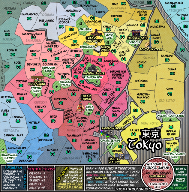
RedBaron, I'm confused. Do you have a solution? I have the region names written on the map as well as the legend. I thought I cleared up the legend a bit, was it not a good use of space?
I would like to move this along, just not sure where to go from here.
Current Map Project: Tokyo
-

 shakeycat
- Posts: 390
- Joined: Sun Mar 11, 2007 5:13 am
- Location: Vancouver


Re: [Updated Mar 3] - Tokyo
I dig the look. gl
Maps Maps Maps!
Take part in this survey and possibly win an upgrade -->
https://docs.google.com/spreadsheet/embeddedform?formkey=dGg4a0VxUzJLb1NGNUFwZHBuOHRFZnc6MQ
Take part in this survey and possibly win an upgrade -->
https://docs.google.com/spreadsheet/embeddedform?formkey=dGg4a0VxUzJLb1NGNUFwZHBuOHRFZnc6MQ
-

 army of nobunaga
- Posts: 1989
- Joined: Sat Oct 13, 2007 10:06 pm
- Location: www.facebook.com/armyofnobu and Houston.


Re: [Updated Mar 3] - Tokyo
Add space and add a mini map. That'd be the easiest thing to do. There just isn't much organization to the names in the legend. I don't see an order that easily allows me to gauge which bonus gives me what and if I should try and take and hold it.
water's ok, I see it as a comic book/manga look addition, which fits.
water's ok, I see it as a comic book/manga look addition, which fits.


-

 RedBaron0
- Posts: 2657
- Joined: Sun Aug 19, 2007 12:59 pm
- Location: Pennsylvania


Re: [Updated Mar 3] - Tokyo
shakeycat wrote:
Hard borders, I must've done it at the start to quickly put it together, never changed it. Is it distracting? Would wiggly ones not be too busy?
There is water, it is the vertical stripey area. Techno water.
RedBaron, I'm confused. Do you have a solution? I have the region names written on the map as well as the legend. I thought I cleared up the legend a bit, was it not a good use of space?
I would like to move this along, just not sure where to go from here.
Soft borders looks more realistic and just nicer in general. Look at the borders of Meguro for example.
What is techno water lol`? Have you tried with real looking water?
AoG for President of the World!!
I promise he will put George W. Bush to shame!
I promise he will put George W. Bush to shame!
-

 Gillipig
- Posts: 3565
- Joined: Fri Jan 09, 2009 1:24 pm


Re: [Updated Mar 3] - Tokyo
RedBaron0,
I chose to simply list the bonuses at the bottom so that it is clear with more than just colour what is "Old", "Suburban", and "Central". I don't think this could be conveyed on a minimap in the same way. Then again, if listing everything on the bottom is not terribly helpful, would it be better to just put the bonuses on the territories themselves, as I already have the faded names there? Yet some barely fit as it is.
Gillipig, real looking water doesn't look half bad. Maybe.
And I can work on softening borders, going with more realistic lines. It's just a lot of busy work for me, and I really don't get the concentrated time to work on such things as I used to.
All in time.
I do appreciate the feedback.
Current Map Project: Tokyo
-

 shakeycat
- Posts: 390
- Joined: Sun Mar 11, 2007 5:13 am
- Location: Vancouver


Re: [Updated Mar 3] - Tokyo
Then you really need to give the bonus listings order then... there needs to be some kind of logical order that can be followed from map to legend.
Example: Katshuka is first on the list of suburban bonuses then Toshima which is in the opposite corner of the map, then Shinagawa which is on the bottom of the map... and so on.
The lists are RANDOM and creates confusion.
Example: Katshuka is first on the list of suburban bonuses then Toshima which is in the opposite corner of the map, then Shinagawa which is on the bottom of the map... and so on.
The lists are RANDOM and creates confusion.


-

 RedBaron0
- Posts: 2657
- Joined: Sun Aug 19, 2007 12:59 pm
- Location: Pennsylvania


Re: [Updated Mar 3] - Tokyo
Seems the progress on this map has stalled. Please contact any CA to return this map to the Main Foundry when an update is made. Please be aware that gameplay standards may be further reviewed upon return to the Main Foundry and may be required to once again pass through gp scrutiny. Should the map be found to be deficient in any way the GP stamp may be removed.
[Moved]
[Moved]


-

 RedBaron0
- Posts: 2657
- Joined: Sun Aug 19, 2007 12:59 pm
- Location: Pennsylvania


Re: [Vacation valid until Nov. 2012] Tokyo
The six months of vacation for this map has expired and this map will now be labeled as [Abandoned]. If the original mapmaker wants to continue this map project that's fine but an update must provided. From this moment anyone else is free to take this project without the original mapmakers permission, but it has to be started from scratch.
-

 nolefan5311
- Posts: 1768
- Joined: Mon Nov 22, 2010 11:51 am
- Location: Florida


125 posts
• Page 5 of 5 • 1, 2, 3, 4, 5
Who is online
Users browsing this forum: No registered users

