chapcrap wrote:Well, I would use a thinner line for the sea routes and make it a line instead of dashes.
a line? OK, i was thinking i would put in docks.
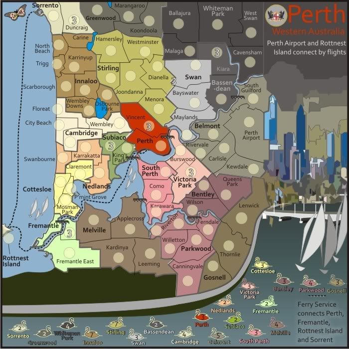
If Perth and Rottnest connect by ferry, why do they need to connect by airport as well? I was looking for a little clarification there.
It's actually Perth Airport that connects with Rottnest Island by air. Perth and Perth airport are several moves away from each other.
This could lead to someone holding Rottnest Island and being strategic by attacking 4 terrtories.
[quote}Does Perth border Sorrento by ferry as well? And Freemantle border Sorrento? That's what the wording says, but the routes do not really show that. They show Perth-->Freemantle-->Rottnest-->Sorrento[/quote]
I've been looking at this obviouslysince being raised...
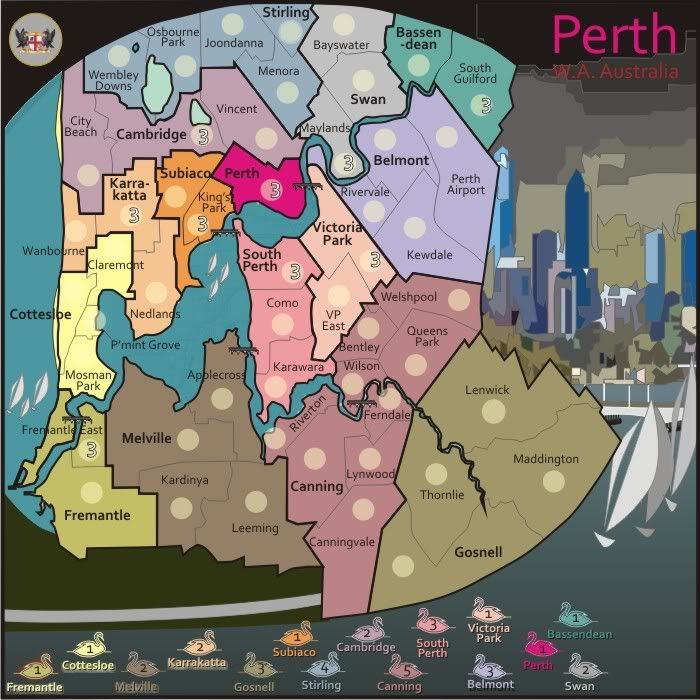
Ferries should connect
* Fremantle with Perth bothways
* Fremantle with Rottnest Is. Both ways
* Sorrento with Rottnest Is. both ways.
I will place this into the next map.