Conquer Club

Three Kingdoms of China - v10.1 [2015-02-01] p15 [Quenched]

Care to peruse completed maps? Take a stroll through the Atlas.

Moderator: Cartographers

Forum rules
Please read the Community Guidelines before posting.

Re: Three Kingdoms of China - v4.2 [2013-02-03] p9

Postby koontz1973 on Tue Feb 05, 2013 1:11 pm

Nice stamp by the way.

Seamus, some of your names in Chinese are wrong I believe. Can you double check these and correct if so, but it also might be nicer to add the full title either way. Might be nice to see capitals and cities go local as well. No need to name them in the legend as you also have the symbols.
čœ€åœ‹ = Kingdom of Shu
ēŽ‹åœ‹č”› = Kingdom of Wei
吳國 = kingdom of Wu
首都 = Capitals
城åø‚ = Cities

Mountain range between Wu and Shu could do with thickening up a bit. It looks way to straight and unnatural. I know the style of the map is not realistic, but try to give them some life.
Title is very plain. Try something like this one but you cannot use this one as it is not free to use.
Lastly for now, the sea route, boring. :P Any chance of seeing something done here? Maybe a couple of junks added going both ways would be a nice addition.
Image
User avatar
Lieutenant koontz1973
 
Posts: 6960
Joined: Thu Jan 01, 2009 10:57 am

Re: Three Kingdoms of China - v4.2 [2013-02-03] p9

Postby Seamus76 on Wed Feb 06, 2013 12:59 am

koontz1973 wrote:Nice stamp by the way.

Seamus, some of your names in Chinese are wrong I believe. Can you double check these and correct if so, but it also might be nicer to add the full title either way. Might be nice to see capitals and cities go local as well. No need to name them in the legend as you also have the symbols.
čœ€åœ‹ = Kingdom of Shu
ēŽ‹åœ‹č”› = Kingdom of Wei
吳國 = kingdom of Wu
首都 = Capitals
城åø‚ = Cities

Mountain range between Wu and Shu could do with thickening up a bit. It looks way to straight and unnatural. I know the style of the map is not realistic, but try to give them some life.
Title is very plain. Try something like this one but you cannot use this one as it is not free to use.
Lastly for now, the sea route, boring. :P Any chance of seeing something done here? Maybe a couple of junks added going both ways would be a nice addition.

Thanks Koontz as always.

If you can please provide any names that you believe to be incorrect, and the correct name that would be great. The names I have are what I believe to be the correct names, and were taken from the original map, which if you go through that thread were pretty much confirmed to gimil, and he was provided maps (which were not attached unfortunately). But again if you have some just let me know.

What do you mean by "Full Title"? Of the tert names? I don't think that's going to work since I have a few that are going to be tight for the small map anyway, plus I'm pretty happy with them being on the more simple side, especially for names that to most players will be a little hard to pronounce to begin with. I think full titles will just confuse people even more.

As for the Capitals and Cities label in the legend going local, that might (small might) be something I would consider, but I'm not initially a fan of that either. Even though there are symbols, and the bonus would be spelled out in English, I think the feel and intensity of the words "Capitals" and "Cities" (as well as the connection to the symbols) would be lost on the map as most players would only ever look at them as the symbols, unless they speak/read Chinese.

I will certainly look at the mountains, now that we're rockin' the Graphics phase \:D/ , but we did go through a few versions of mountains and these were some of the best I could do with the limited skills I have. Plus I like 'em thin if you know what I mean.

The title font took a long time to find, and I'm sorry to push back again, but I like the simplicity (you say plainess) of the title and map. The gameplay yes, but mainly the overall simplicity of the aesthetics and ease on the eye and mind is what I really like, and what I think a lot of players are wanting these days.

To that "simple" point, I'll look for some different Junks for the sea route, but I feel I would then need to use space to explain them, while the dots are understood to be a connection and nothing else. And while there might be open spaces, I would say those are somewhat necessary to keep the clutter down and allow the mind some free areas.

Thanks for the feedback, good stuff to keep me thinking, and you know I appreciate it.
ImageImageImage
User avatar
Sergeant 1st Class Seamus76
 
Posts: 1574
Joined: Fri Feb 25, 2011 5:41 pm
Location: Atlanta, GA

Re: Three Kingdoms of China - v4.2 [2013-02-03] p9

Postby koontz1973 on Wed Feb 06, 2013 1:13 am

Sorry Seamus, must stop typing late at night after a hard day. Never make myself clear.

Region names are all correct as far as I am aware. No need to change. It is the mini map titles. You have Kingdom of Wu and this 吳, when it should really be this: 吳國 Same for the others. Full title is the maps name. Three Kingdoms of China It is a very plain font and could use with jazzing up. That font I posted shows some sort of ink brush text. Very common in China and the orient even today. Understand about the cities and capitals. How about adding the Chinese similar to the mini maps. Just not as big. Mountains are great, and look great. But for some reason, I am not feeling impassable. Even if you doubled up on thickness at places, it would make them a lot better while adding a slight curve to them. With the junks, it was an idea.
Image
User avatar
Lieutenant koontz1973
 
Posts: 6960
Joined: Thu Jan 01, 2009 10:57 am

Re: Three Kingdoms of China - v4.2 [2013-02-03] p9

Postby Dukasaur on Tue Feb 12, 2013 4:01 pm

So graphics is next?

I would like to see the mountain range in the middle gain more life. It looks un-natural going in a perfectly straight line.
ā€œā€ŽLife is a shipwreck, but we must not forget to sing in the lifeboats.ā€
ā€• Voltaire
User avatar
Sergeant 1st Class Dukasaur
Community Coordinator
 
Posts: 27638
Joined: Sat Nov 20, 2010 4:49 pm
Location: Beautiful Niagara
32

Re: Three Kingdoms of China - v4.2 [2013-02-03] p9

Postby cooldeals on Wed Feb 13, 2013 10:09 pm

Great work Seamus!

It's sad the China is so landlocked. One of my favorite parts of the Korea map is the use of the ships to connect by water. I also enjoy the capital bonuses on Korea because they are different than most maps. That said I think it's good to not try to remake the same map and Seamus has done an excellent job of making a map that is fun and a little different than most maps out there. I'm looking forward to playing on it. It looks like many of my concerns on the map have already been addressed like placing a neutral on each of the +1 bonus areas to keep them from giving too much of an early advantage.
User avatar
Colonel cooldeals
 
Posts: 745
Joined: Wed May 30, 2012 9:33 am

Re: Three Kingdoms of China - v4.2 [2013-02-03] p9

Postby RjBeals on Thu Feb 14, 2013 8:59 am

Agree with the "title" comments. It doesn't fit well. Maybe the fact that the map itself is going for the parchment look, with the crease overlay used, and the title has a drop shadow on it. Makes it look like its floating.

Image
Image
User avatar
Private RjBeals
 
Posts: 2506
Joined: Mon Nov 20, 2006 5:17 pm
Location: South Carolina, USA

Re: Three Kingdoms of China - v4.3 [2013-02-14] p9

Postby Seamus76 on Thu Feb 14, 2013 11:10 pm

CURRENT UPDATE INFO - 2013-02-14:
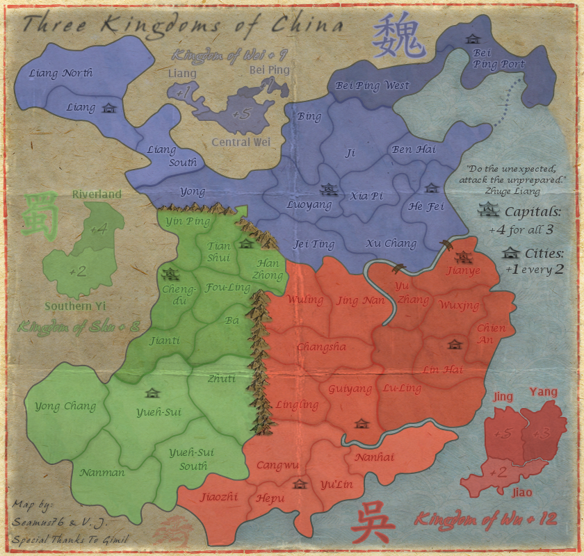
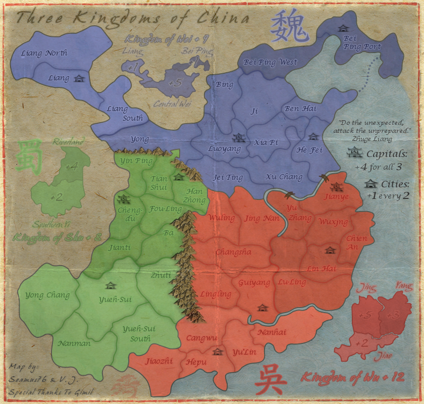
Thanks everyone for the feedback. I'll try to work on the mountains and see if I can give them a little more life. Based on the mountains I currently have please let me know any thoughts or suggestions on helping them. Things I did do are:
- Worked on the title to make it more part of the paper, so that it wasn't floating above the piece.
- Completely redid the creases.

CURRENT MAP VERSION

v4.3 - Large (840x800)
Click image to enlarge.
image
ImageImageImage
User avatar
Sergeant 1st Class Seamus76
 
Posts: 1574
Joined: Fri Feb 25, 2011 5:41 pm
Location: Atlanta, GA

Re: Three Kingdoms of China - v4.3 [2013-02-14] p9

Postby Seamus76 on Mon Feb 18, 2013 8:58 pm

Seamus76 wrote:CURRENT UPDATE INFO - 2013-02-14:
Thanks everyone for the feedback. I'll try to work on the mountains and see if I can give them a little more life. Based on the mountains I currently have please let me know any thoughts or suggestions on helping them. Things I did do are:
- Worked on the title to make it more part of the paper, so that it wasn't floating above the piece.
- Completely redid the creases.

CURRENT MAP VERSION

v4.3 - Large (840x800)
Click image to enlarge.
image


Anyone have some thoughts on this last update?
ImageImageImage
User avatar
Sergeant 1st Class Seamus76
 
Posts: 1574
Joined: Fri Feb 25, 2011 5:41 pm
Location: Atlanta, GA

Re: Three Kingdoms of China - v4.3 [2013-02-14] p9

Postby koontz1973 on Tue Feb 19, 2013 12:31 am

Seamus76 wrote:Anyone have some thoughts on this last update?

The new folds are not as nice as the old ones.
Image
User avatar
Lieutenant koontz1973
 
Posts: 6960
Joined: Thu Jan 01, 2009 10:57 am

Re: Three Kingdoms of China - v4.3 [2013-02-14] p9

Postby RedBaron0 on Tue Feb 19, 2013 10:19 am

I kinda agree about the straight line nature of the main mountain range in the center. Adding some girth (additional mountains) to the range as a whole would likely fix this.
ImageImage
User avatar
Sergeant 1st Class RedBaron0
 
Posts: 2657
Joined: Sun Aug 19, 2007 12:59 pm
Location: Pennsylvania

Re: Three Kingdoms of China - v4.3 [2013-02-14] p9

Postby Seamus76 on Tue Feb 19, 2013 10:50 am

RedBaron0 wrote:I kinda agree about the straight line nature of the main mountain range in the center. Adding some girth (additional mountains) to the range as a whole would likely fix this.

I agree as well.

RB, what is your opinion on the creases?
ImageImageImage
User avatar
Sergeant 1st Class Seamus76
 
Posts: 1574
Joined: Fri Feb 25, 2011 5:41 pm
Location: Atlanta, GA

Re: Three Kingdoms of China - v4.3 [2013-02-14] p9

Postby Oneyed on Tue Feb 19, 2013 11:13 am

why is one way attack from Tian shui to Yong? it is because geography reason or? I do not like it much.
the font of parts of kingdoms does sting my eyes.

Oneyed
User avatar
Private 1st Class Oneyed
 
Posts: 1058
Joined: Sat Dec 10, 2011 12:29 pm

Re: Three Kingdoms of China - v4.3 [2013-02-14] p9

Postby Seamus76 on Tue Feb 19, 2013 12:04 pm

Oneyed wrote:why is one way attack from Tian shui to Yong? it is because geography reason or? I do not like it much.
the font of parts of kingdoms does sting my eyes.

The reason for the one way is to represent the constant, and failed, historical attempts of the south to invade the north. It also adds more gameplay strategy to holding Central Wei.

Which font/text exactly are you referring to? Let me know some examples.

Thanks for the feedback.
ImageImageImage
User avatar
Sergeant 1st Class Seamus76
 
Posts: 1574
Joined: Fri Feb 25, 2011 5:41 pm
Location: Atlanta, GA

Re: Three Kingdoms of China - v4.3 [2013-02-14] p9

Postby Oneyed on Tue Feb 19, 2013 12:09 pm

Seamus76 wrote:The reason for the one way is to represent the constant, and failed, historical attempts of the south to invade the north. It also adds more gameplay strategy to holding Central Wei.


this make sense. then good feature here :)
Seamus76 wrote:Which font/text exactly are you referring to? Let me know some examples.


Bei Ping, Central Wei, Riverland, Jing, Yang, Jiao, Southern Yi, Liang.

Oneyed
User avatar
Private 1st Class Oneyed
 
Posts: 1058
Joined: Sat Dec 10, 2011 12:29 pm

Re: Three Kingdoms of China - v4.3 [2013-02-14] p9

Postby koontz1973 on Tue Feb 19, 2013 12:11 pm

Seamus, your title text looks blurred. Make it sharp like the rest of the text but change the colour to a brown on burn mode. Change the brown as needed so it looks part of the map.

Bei Ping, Central Wei, Riverland, Jing, Yang, Jiao, Southern Yi, Liang.

Agree with Oneyed over these mini map names. The font is out of place.
Image
User avatar
Lieutenant koontz1973
 
Posts: 6960
Joined: Thu Jan 01, 2009 10:57 am

Re: Three Kingdoms of China - v4.3 [2013-02-14] p9

Postby Seamus76 on Tue Feb 19, 2013 12:27 pm

koontz1973 wrote:Seamus, your title text looks blurred. Make it sharp like the rest of the text but change the colour to a brown on burn mode. Change the brown as needed so it looks part of the map.

Bei Ping, Central Wei, Riverland, Jing, Yang, Jiao, Southern Yi, Liang.

Agree with Oneyed over these mini map names. The font is out of place.

Got it. What do you guys think, just keep those names the same font as the mini-map kingdom names?

Edit: It might look better with the same font as the tert names, but I may just have to play around with them and post a couple versions for review.
ImageImageImage
User avatar
Sergeant 1st Class Seamus76
 
Posts: 1574
Joined: Fri Feb 25, 2011 5:41 pm
Location: Atlanta, GA

Re: Three Kingdoms of China - v4.3 [2013-02-14] p9

Postby Seamus76 on Fri Feb 22, 2013 1:25 pm

CURRENT UPDATE INFO - 2013-02-22:
- Redid the Southern mountains, which I think look pretty good, and are no longer just a straight line.
- Redid the mini-map bonus label text fonts, which now match the kingdom font.
- Worked on the title again.

As for the crease I think it actually looks pretty good as well, and much more realistic than the previous lines. Correct me if I'm wrong but I also think it makes it stand out from other maps, as I'm not sure there are any others with such a style of crease. I plan to be going with this version moving forward, but can certainly move tert names around as needed or if people have a problem with any overlaps.

CURRENT MAP VERSION

v5.1 - Large (840x800)
Click image to enlarge.
image
ImageImageImage
User avatar
Sergeant 1st Class Seamus76
 
Posts: 1574
Joined: Fri Feb 25, 2011 5:41 pm
Location: Atlanta, GA

Re: Three Kingdoms of China - v5.1 [2013-02-22] p10

Postby RedBaron0 on Sun Feb 24, 2013 12:02 pm

Creases look fine, in fact it might be a decent idea to add a crease in a corner or 2, for additional realism, but that's up to you. The territory names should be affected by the creases, so if and all possible I'd move the territory names away from the creases so this has little to no affect on their readability.
ImageImage
User avatar
Sergeant 1st Class RedBaron0
 
Posts: 2657
Joined: Sun Aug 19, 2007 12:59 pm
Location: Pennsylvania

Re: Three Kingdoms of China - v5.1 [2013-02-22] p10

Postby Seamus76 on Mon Feb 25, 2013 11:42 am

CURRENT UPDATE INFO - 2013-02-25:
- Moved any tert names that were under a crease. On tert names where I could not move them due to the size of the tert I used a couple of different ways to get it to look more effected by the crease then before, but keeping them still readable.

CURRENT MAP VERSION

v5.1 - Large (840x800)
Click image to enlarge.
image
ImageImageImage
User avatar
Sergeant 1st Class Seamus76
 
Posts: 1574
Joined: Fri Feb 25, 2011 5:41 pm
Location: Atlanta, GA

Re: Three Kingdoms of China - v5.1 [2013-02-22] p10

Postby iancanton on Tue Feb 26, 2013 5:23 pm

i do like the crease effect, which immediately tells us that this is a paper map.

the course of the pearl river, which is one of two readily-recognisable features on the map, at nanhai is wrong. the river actually flows roughly south-east from where guiyang meets lu-ling, cutting nanhai in half; a bridge can be drawn between the two halves of nanhai to keep it as one region. mountains between nanhai and lu-ling form a natural impassable.

ian. :)
Image
User avatar
Brigadier iancanton
Foundry Foreman
Foundry Foreman
 
Posts: 2429
Joined: Fri Jun 01, 2007 5:40 am
Location: europe

Re: Three Kingdoms of China - v5.2 [2013-02-25] p10

Postby RedBaron0 on Tue Feb 26, 2013 5:48 pm

While geographical accuracy is a good thing, it isn't always good for gameplay. I dislike the use of bridges within regions to keep them connected denoting that they are still "connected" it invites confusion.

Impassibles should be placed at the mapmakers discretion based on their judgement of the region, overall gameplay, and aesthetics of the image itself.
ImageImage
User avatar
Sergeant 1st Class RedBaron0
 
Posts: 2657
Joined: Sun Aug 19, 2007 12:59 pm
Location: Pennsylvania

Re: Three Kingdoms of China - v5.1 [2013-02-22] p10

Postby Seamus76 on Fri Mar 01, 2013 11:54 am

Thanks as always ian, your feedback is invaluable, and I absolutely love your consistency. I knew I had seen this before, and I found your original post from 2008 (below) referencing the same thing. At the time I was researching the map I noticed the post and tried to find the original map you referenced but the only maps I found confirmed what gimil had posted, which is, the change would really not effect gameplay, and would require (as pointed out by nolefan) a bridge within a tert which I had already been told to remove from Tribal War - Israel due to only adding confusion. I made the decision to go with gimils original design as it was the best for gameplay and only slightly off from geographical accuracy, which I too think is acceptable for the map. Unless there is a huge motion from the community I would like to keep the river and impassables as they are.

iancanton wrote:i do like the crease effect, which immediately tells us that this is a paper map.

the course of the pearl river, which is one of two readily-recognisable features on the map, at nanhai is wrong. the river actually flows roughly south-east from where guiyang meets lu-ling, cutting nanhai in half; a bridge can be drawn between the two halves of nanhai to keep it as one region. mountains between nanhai and lu-ling form a natural impassable.

ian. :)


RedBaron0 wrote:While geographical accuracy is a good thing, it isn't always good for gameplay. I dislike the use of bridges within regions to keep them connected denoting that they are still "connected" it invites confusion.

Impassibles should be placed at the mapmakers discretion based on their judgement of the region, overall gameplay, and aesthetics of the image itself.


gimil wrote:
iancanton wrote:Re: Post by iancanton on Sun Jul 06, 2008 8:40 am
cangwu and yulin need to be swapped round and the borders of the southern wu continent adjusted. the pearl river runs into the sea to the west of nanhai and does not go any further east. can u replace the eastern part of the river by mountains, as i have done in the mock-up below (thick brown line above nanhai)? i've also opened up an attack route between nanhai and guiyang to eliminate the nanhai dead-end, but i think the dead-end isn't a big issue if u don't like the gap between the mountains and the river.

Image

my main source for the above changes is this map, which shows the position in ad 229, when hepu had been split into two commanderies for a short period.

http://www.anu.edu.au/asianstudies/decr ... _map16.gif

ian. :)


Cheers ian, appreciated as always. Unforuntaly adding the river in your mock up wouldnt change the gameplay. Because I used the pen tool to create my contients it would be alot of work with no gain. Reducing the other river will be a drastic change to gameplay. Im happy to live with this inaccuarcy for the sake of maintaining gameplay.
ImageImageImage
User avatar
Sergeant 1st Class Seamus76
 
Posts: 1574
Joined: Fri Feb 25, 2011 5:41 pm
Location: Atlanta, GA

Re: Three Kingdoms of China - v5.2 [2013-02-25] p10

Postby The Bison King on Mon Mar 04, 2013 12:41 am

I made the decision to go with gimils original design as it was the best for gameplay and only slightly off from geographical accuracy, which I too think is acceptable for the map. Unless there is a huge motion from the community I would like to keep the river and impassables as they are.

I believe that this is a good decision.
User avatar
Sergeant 1st Class The Bison King
 
Posts: 1957
Joined: Thu Aug 27, 2009 5:06 pm
Location: the Mid-Westeros

Re: Three Kingdoms of China - v5.2 [2013-02-25] p10

Postby isaiah40 on Tue Mar 05, 2013 10:01 pm

A few items. First of all this map is really turning out pretty darn good seamus!

1. The bonus amounts on the mini-map for Wu, especially on Yang is very hard to read. Maybe increase the outer glow a tad bit to make it stand out more. The same on Jing.
2. The bonus amount on Bei Ping is also hard to read, move it beside Bei Ping.
3. The Chinese character for Shu is hard to see as well, it needs to be darkened a bit.
4. Kingdom of Wu text is hard to tell exactly what it is. It looks like the "g" is an "s".
5. Kindom of Shu text is hard to read due to the light color you have. My suggestion is to use the same dark color you have for the bonus amounts.
6. I think that you will also need to adjust the kerning of the text for each "the Kingdom of ..." as the letters are very close together which also makes them hard to read. I can read them fine because I've been following the map, but first time players probably will have a hard time reading them.
7. I'm sorry, but those mountains do not go with the rest of the map. They stick out like a sore thumb, so they need to be changed. RjBeals did a quick tutorial on hand drawn mountains, take a look at it and see what you can do.

Well these items should keep you busy for awhile. Looking forward to your next update!
Lieutenant isaiah40
 
Posts: 3990
Joined: Mon Aug 27, 2007 7:14 pm

Re: Three Kingdoms of China - v5.2 [2013-02-25] p10

Postby Seamus76 on Tue Mar 05, 2013 11:22 pm

isaiah40 wrote:A few items. First of all this map is really turning out pretty darn good seamus!

1. The bonus amounts on the mini-map for Wu, especially on Yang is very hard to read. Maybe increase the outer glow a tad bit to make it stand out more. The same on Jing.
2. The bonus amount on Bei Ping is also hard to read, move it beside Bei Ping.
3. The Chinese character for Shu is hard to see as well, it needs to be darkened a bit.
4. Kingdom of Wu text is hard to tell exactly what it is. It looks like the "g" is an "s".
5. Kindom of Shu text is hard to read due to the light color you have. My suggestion is to use the same dark color you have for the bonus amounts.
6. I think that you will also need to adjust the kerning of the text for each "the Kingdom of ..." as the letters are very close together which also makes them hard to read. I can read them fine because I've been following the map, but first time players probably will have a hard time reading them.

Well these items should keep you busy for awhile. Looking forward to your next update!

Ok, nice little check list, give me a couple minutes on these. lol :lol:

7. I'm sorry, but those mountains do not go with the rest of the map. They stick out like a sore thumb, so they need to be changed. RjBeals did a quick tutorial on hand drawn mountains, take a look at it and see what you can do.

Ouch, this one does sting a bit. Of course Rj makes it look extremely easy, but I'm willing to give it another go. The current mountains are the 4th version, and one of those thorns in my side. I thought we had come up with a winner, but I will give it my best shot and see what I can produce.

Thank you for your time and feedback. I really appreciate it.
ImageImageImage
User avatar
Sergeant 1st Class Seamus76
 
Posts: 1574
Joined: Fri Feb 25, 2011 5:41 pm
Location: Atlanta, GA

PreviousNext

Return to The Atlas

Who is online

Users browsing this forum: No registered users