
Squares(abandoned)
Moderator: Cartographers
18 posts
• Page 1 of 1
Squares(abandoned)
![]() by Unit_2 on Sun Feb 25, 2007 2:33 am
by Unit_2 on Sun Feb 25, 2007 2:33 am
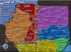
hello again, i made this map off of a kid this map but it was just white so i put some color and other stuff to make it look good, it does to me but you guys are the ones to decide.
Last edited by Unit_2 on Wed Mar 21, 2007 11:11 am, edited 4 times in total.
-

 Unit_2
- Posts: 1834
- Joined: Sun Jan 14, 2007 12:59 pm
- Location: Pennsylvania, U.S.A, North America, Earth, Milky Way, Universe.


![]() by Teya on Sun Feb 25, 2007 3:41 am
by Teya on Sun Feb 25, 2007 3:41 am
For me, this map is too similar to the Periodic table of elements map. http://www.conquerclub.com/forum/viewtopic.php?t=8303&start=0
-

Teya
- Posts: 411
- Joined: Tue Oct 17, 2006 5:25 am
![]() by Enigma on Sun Mar 11, 2007 10:52 pm
by Enigma on Sun Mar 11, 2007 10:52 pm
Unit_2 wrote:hey guys, what do i need to do to make this map look good?
a theme other than "squares"
sorry- no appeal for me.
Do you need an excuse to have a war? I mean, who for? Can't you just say "You got lots of cash and land, but I've got a big sword, so divy up right now, chop chop."
Terry Pratchet
Terry Pratchet
-
Enigma
- Posts: 367
- Joined: Mon Jul 03, 2006 10:23 pm
- Location: Classified


x
![]() by antjo on Fri Mar 16, 2007 11:08 am
by antjo on Fri Mar 16, 2007 11:08 am
i like this map very much
its radical
but you have to make the squares smaller
just big enough for the numbers
so you have like five times more squares and something
and you have to get rid of the cobntinentbonuses
and you only have to use black and white
then it is extreme radical
some people would play it because its crazy
its not a map that the majority likes to play,
but there also have to be maps for the minority
originele maps ? zie
http://www.conquerclub.com/forum/viewtopic.php?t=15500
http://www.conquerclub.com/forum/viewtopic.php?t=15500
-

antjo
- Posts: 262
- Joined: Mon Dec 04, 2006 3:40 pm
![]() by Jarunik on Fri Mar 16, 2007 11:19 am
by Jarunik on Fri Mar 16, 2007 11:19 am
Yes maybe you can swith your theme to chess or something more interesting then just squares.
Chess ... with interesting Attack routes (like playing chess) based on the figures standing on the chess board.
Not just squares ....
Chess ... with interesting Attack routes (like playing chess) based on the figures standing on the chess board.
Not just squares ....
-

Jarunik
- Posts: 7
- Joined: Thu Jan 04, 2007 9:56 am
- Location: Switzerland
![]() by Ruben Cassar on Fri Mar 16, 2007 1:22 pm
by Ruben Cassar on Fri Mar 16, 2007 1:22 pm
Forget about this map and focus on another one. This will never make it...it would be a waste of your time and resources to work on it.


-

Ruben Cassar
- Posts: 2160
- Joined: Thu Nov 16, 2006 6:04 am
- Location: Civitas Invicta, Melita, Evropa


![]() by oaktown on Fri Mar 16, 2007 1:37 pm
by oaktown on Fri Mar 16, 2007 1:37 pm
Jarunik wrote:Yes maybe you can swith your theme to chess or something more interesting then just squares.
Chess ... with interesting Attack routes (like playing chess) based on the figures standing on the chess board.
Not just squares ....
chess has been attempted and abandoned... i still think it's a great idea, but it would take a while to develop a board in which the pieces can attack in a playable fashion.
There have to be other ways to make a map based on squares that would have more appeal. How about a farm with fields in a grid? Then you could call your squares asparagus, broccoli, cauliflower, zuchini - wow, there are a lot of vegetables I don't know how to spell! You could throw in a barn and an alien crop circle.
-

oaktown
- Posts: 4451
- Joined: Sun Dec 03, 2006 9:24 pm
- Location: majorcommand


![]() by oaktown on Sat Mar 17, 2007 10:47 am
by oaktown on Sat Mar 17, 2007 10:47 am
Unit_2 wrote:wow, that a very good idea, would you mind helping gme get the stuff?
I think you need to create the elements, or find somebody who would like to collaborate on this with you.
The basic layout is easy enough, and it might look best with some depth, like the photo below. Then you just need to come up with some non-copyrighted photos or drawings of some veggies (do NOT use the examples below). I think some simple drawings would have more appeal and work better on a map than would photos.


-
oaktown
- Posts: 4451
- Joined: Sun Dec 03, 2006 9:24 pm
- Location: majorcommand
18 posts
• Page 1 of 1
Return to Melting Pot: Map Ideas
Who is online
Users browsing this forum: No registered users
|
|||||||
| Conquer Club is not associated with RISK online in any way. Copyright © 2006-2025 by Big Wham LLC | |||||||