like this

[size=0]in no way do i like the cardinals[/size]
Moderator: Cartographers
![]() by Daring Overlord5 on Sun Jul 01, 2007 1:05 pm
by Daring Overlord5 on Sun Jul 01, 2007 1:05 pm


![]() by thegeneralpublic on Sun Jul 01, 2007 8:16 pm
by thegeneralpublic on Sun Jul 01, 2007 8:16 pm
![]() by reverend_kyle on Mon Jul 02, 2007 3:27 am
by reverend_kyle on Mon Jul 02, 2007 3:27 am


![]() by musicman_379 on Mon Jul 02, 2007 2:40 pm
by musicman_379 on Mon Jul 02, 2007 2:40 pm
thegeneralpublic wrote:Naw, make it the CC logo. We don't want to get into that whole Yankees / Red Sox thing.
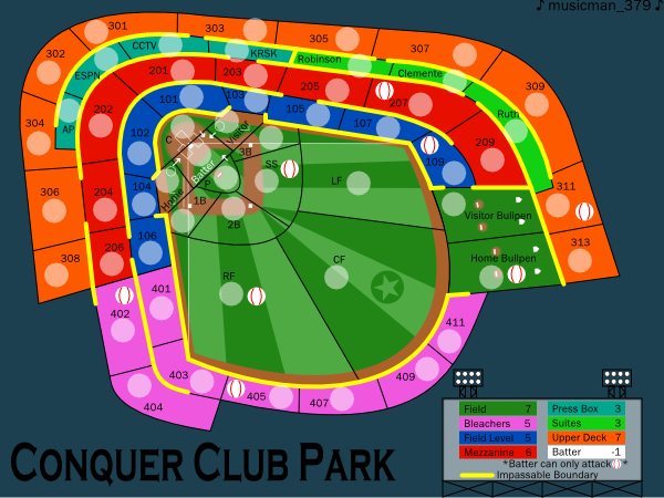
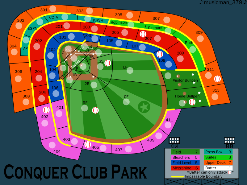
Night Strike wrote:I think the continents would look better if they are blocked (like section A, B, C, etc) instead of rows (100, 200, 300). I'm not sure how that would work, but I think it would make the map better liked.


![]() by musicman_379 on Mon Jul 02, 2007 3:03 pm
by musicman_379 on Mon Jul 02, 2007 3:03 pm
![]() by Night Strike on Mon Jul 02, 2007 7:32 pm
by Night Strike on Mon Jul 02, 2007 7:32 pm


![]() by musicman_379 on Tue Jul 03, 2007 4:28 pm
by musicman_379 on Tue Jul 03, 2007 4:28 pm
Unit_2 wrote:that pic at the top woud look good for the map.
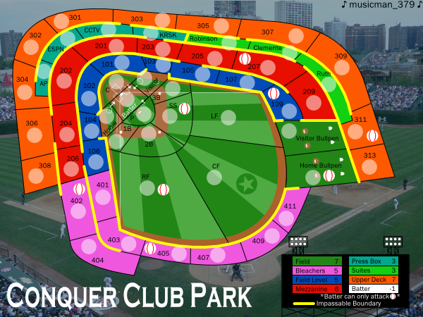
![]() by musicman_379 on Thu Jul 12, 2007 4:10 pm
by musicman_379 on Thu Jul 12, 2007 4:10 pm

![]() by Night Strike on Thu Jul 12, 2007 5:02 pm
by Night Strike on Thu Jul 12, 2007 5:02 pm
![]() by Kaplowitz on Thu Jul 12, 2007 7:42 pm
by Kaplowitz on Thu Jul 12, 2007 7:42 pm
Night Strike wrote:Oh gosh.........don't like it!!! Having your field's orientation going against the orientation of the picture is just terrible!!! It makes the whole thing look like it's out of place.


![]() by thegeneralpublic on Thu Jul 12, 2007 8:51 pm
by thegeneralpublic on Thu Jul 12, 2007 8:51 pm
![]() by ParadiceCity9 on Fri Jul 13, 2007 1:00 pm
by ParadiceCity9 on Fri Jul 13, 2007 1:00 pm


![]() by Keredrex on Fri Jul 13, 2007 2:10 pm
by Keredrex on Fri Jul 13, 2007 2:10 pm
ParadiceCity9 wrote:I think you should change the angle of the field. I mean make it so home plate as at the base of the page and center field is at the top of the page.


![]() by musicman_379 on Fri Jul 13, 2007 5:45 pm
by musicman_379 on Fri Jul 13, 2007 5:45 pm
Kaplowitz wrote:Night Strike wrote:Oh gosh.........don't like it!!! Having your field's orientation going against the orientation of the picture is just terrible!!! It makes the whole thing look like it's out of place.
I think that it looks fine. Acually, maybe it would look better if the outer border was darker.
![]() by Night Strike on Fri Jul 13, 2007 6:09 pm
by Night Strike on Fri Jul 13, 2007 6:09 pm
![]() by gimil on Fri Jul 13, 2007 8:16 pm
by gimil on Fri Jul 13, 2007 8:16 pm
natty_dread wrote:I was wrong


![]() by edbeard on Fri Jul 13, 2007 8:30 pm
by edbeard on Fri Jul 13, 2007 8:30 pm


![]() by AndyDufresne on Fri Jul 13, 2007 10:12 pm
by AndyDufresne on Fri Jul 13, 2007 10:12 pm


![]() by Ronaldinho on Sat Jul 14, 2007 5:48 am
by Ronaldinho on Sat Jul 14, 2007 5:48 am


Return to Melting Pot: Map Ideas
Users browsing this forum: No registered users
|
|||||||
| Conquer Club is not associated with RISK online in any way. Copyright © 2006-2025 by Big Wham LLC | |||||||