Conquer Club

The Citadel [Quenched]

Care to peruse completed maps? Take a stroll through the Atlas.

Moderator: Cartographers

Forum rules
Please read the Community Guidelines before posting.

The Citadel [Quenched]

Postby TaCktiX on Thu Jan 24, 2008 9:02 pm

Territories: 50
Continents: 8


Bonuses:
- 1st Battalion: 4
- 2nd Battalion: 6
- 3rd Battalion: 4
- 4th Battalion: 3
- Support Battalion: 2
- Jenkins Avenue: 4
- Avenue of Remembrance: 4
- Lee Avenue: 5

Unique Features:
- The Parade Deck has 13 adjacent territories, putting it in striking distance of virtually the entire map. It also is a killer neutral, making it only a waypoint to other conquest.

Stamps:
ImageImageImage
ImageImage
Image

Version 24

Updates
- Updated the legend text to have a subtle stroke and drop shadow

Small version (600x461)
Image
Large version (700x538)
Click image to enlarge.
image
Last edited by TaCktiX on Fri Oct 03, 2008 12:21 pm, edited 72 times in total.
User avatar
Corporal 1st Class TaCktiX
 
Posts: 2392
Joined: Mon Dec 17, 2007 8:24 pm
Location: Rapid City, SD

Postby whitestazn88 on Thu Jan 24, 2008 9:06 pm

similar to ccu, especially since its a school. also i dont know if you can directly state that it is a map of that school because of certain rules about maps and shit. it could work tho... it would work for shit like tournaments where one group plays for citadel, the other for ccu and see whos the better university.
Lieutenant whitestazn88
 
Posts: 3128
Joined: Mon Feb 05, 2007 2:59 pm
Location: behind you

Postby InkL0sed on Thu Jan 24, 2008 9:14 pm

Robert Jordan went to the Citadel :!:
User avatar
Lieutenant InkL0sed
 
Posts: 2370
Joined: Sat Jun 23, 2007 4:06 pm
Location: underwater

Postby RjBeals on Thu Jan 24, 2008 9:17 pm

Cool.. I started a Charleston map a while ago, but abandoned it due to lack of interest. Few people on this site know of that beautiful coastal city.

http://www.conquerclub.com/forum/viewtopic.php?t=29013
Image
User avatar
Private RjBeals
 
Posts: 2506
Joined: Mon Nov 20, 2006 5:17 pm
Location: South Carolina, USA

Postby InkL0sed on Thu Jan 24, 2008 9:23 pm

I have been inspired to try my hand at a Wheel of Time map. :D
User avatar
Lieutenant InkL0sed
 
Posts: 2370
Joined: Sat Jun 23, 2007 4:06 pm
Location: underwater

Postby TaCktiX on Sat Jan 26, 2008 8:16 pm

Updated to reflect my current beta status. After I put sidewalks in I'll start doing territories and general beautification of the buildings.
User avatar
Corporal 1st Class TaCktiX
 
Posts: 2392
Joined: Mon Dec 17, 2007 8:24 pm
Location: Rapid City, SD

Postby TaCktiX on Mon Feb 18, 2008 3:20 pm

Wow I need to resize the Version 1 image, but you get the idea. Sorry it took so long to create a beta worth anything, homework was swamping me. And yes, I shamelessly ripped off Google Earth and then put a filter on it.

EDIT: Resized for Large size.
User avatar
Corporal 1st Class TaCktiX
 
Posts: 2392
Joined: Mon Dec 17, 2007 8:24 pm
Location: Rapid City, SD

Postby TaCktiX on Thu Mar 20, 2008 6:53 pm

UPDATE! It's not dead, I swear, I've just been so dang busy with school that I've only this week made substantial progress.
Version 0.8
Image
To Do:
- The remaining black outline buildings
- Army circles
- Attack routes
- Add The Tower (it's in 2nd Battalion)
User avatar
Corporal 1st Class TaCktiX
 
Posts: 2392
Joined: Mon Dec 17, 2007 8:24 pm
Location: Rapid City, SD

Postby grayhawke on Thu Mar 20, 2008 7:15 pm

Like the concept - but not the font :(
'fraid my old eyes have great trouble reading it without employing magnification.

I'd suggest using single letter codes on the map itself with an off-map key - see the Waterloo map for example.
User avatar
Cadet grayhawke
 
Posts: 119
Joined: Sun Sep 30, 2007 8:07 pm

Postby TaCktiX on Thu Mar 20, 2008 7:45 pm

I'm designing the Small version first so I can make sure everything fits. The Large version will be much more readable. If anyone can suggest to me a script-like font I could use for the "big territory" names, let me know.
User avatar
Corporal 1st Class TaCktiX
 
Posts: 2392
Joined: Mon Dec 17, 2007 8:24 pm
Location: Rapid City, SD

Postby TaCktiX on Fri Mar 21, 2008 8:33 pm

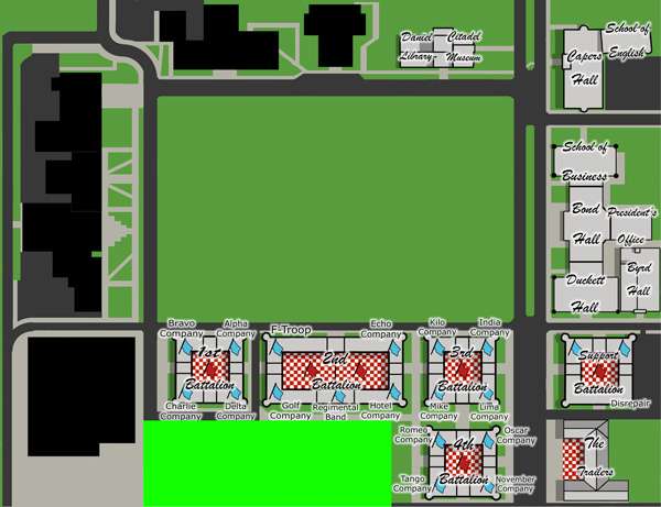
Version 1 is now released. This is the small version, I'll post a Large one later on.

Version 1
Image

Territories: 50
Continents: 8


Tentative Bonuses:
- 1st Battalion: 5
- 2nd Battalion: 7
- 3rd Battalion: 6
- 4th Battalion: 4
- Support Battalion: 3
- Jenkins Avenue: 3
- Avenue of Remembrance: 3
- Lee Avenue: 4

Unique Features:
- The Parade Deck has 12 adjacent territories, putting it in striking distance of virtually the entire map.
- The Tower can bombard anything the Parade Deck can attack.
- Battalion Flags (red) cannot be attacked except by Company Flags (blue).
Last edited by TaCktiX on Sun Mar 23, 2008 12:50 pm, edited 1 time in total.
User avatar
Corporal 1st Class TaCktiX
 
Posts: 2392
Joined: Mon Dec 17, 2007 8:24 pm
Location: Rapid City, SD

Postby Ditocoaf on Fri Mar 21, 2008 9:06 pm

Excellent map; looks fun. Esp. like the large territory in the middle, bordering practically everything; adds some interesting aspects to gameplay. There should be some bonus for holding it, though. If you can grab it and the tower, it should be easier to defend.
Private 1st Class Ditocoaf
 
Posts: 1054
Joined: Wed Feb 27, 2008 9:17 pm
Location: Being eaten by the worms and weird fishes

Postby TaCktiX on Fri Mar 21, 2008 9:18 pm

I suppose I should ask a few map readability questions:

- Is it? If not, what, and where?
- Is it relatively apparent that The Trailers, McAlister Field House, and Locker Rooms have no continent?
- Are the continents well-defined as is?
- Is the size of the Parade Deck obvious enough? The thing connects to 12 territories all over the map.
- Are the special attack features (Tower Bombard, Companies --> Battalions) well-explained?

Ditocoaf wrote:Excellent map; looks fun. Esp. like the large territory in the middle, bordering practically everything; adds some interesting aspects to gameplay. There should be some bonus for holding it, though. If you can grab it and the tower, it should be easier to defend.


I think the position of the Parade Deck is reward enough. If you hold it, you're within striking distance of virtually everybody. Conversely, you can use it to go all the way across the map to strike at someone. The territory will see heavy use as is, and a bonus would be unnecessary.
User avatar
Corporal 1st Class TaCktiX
 
Posts: 2392
Joined: Mon Dec 17, 2007 8:24 pm
Location: Rapid City, SD

Postby TaCktiX on Sun Mar 23, 2008 1:31 pm

I should shoot myself for forgetting to post territory/continent information. D'oh. Please comment now. :D
User avatar
Corporal 1st Class TaCktiX
 
Posts: 2392
Joined: Mon Dec 17, 2007 8:24 pm
Location: Rapid City, SD

Postby yeti_c on Mon Mar 24, 2008 1:52 pm

I can't quite make this one out - it looks very interesting...

Perhaps it's a bit cramped?

C.
Image
Highest score : 2297
User avatar
Lieutenant yeti_c
 
Posts: 9624
Joined: Thu Jan 04, 2007 9:02 am

Postby edbeard on Mon Mar 24, 2008 4:04 pm

My problem with the map at the moment is that none of the bonus areas stick out. Perhaps consider colouring the buildings to help players further distinguish between bonus areas without having to read.


I'm not quite sure how you can show connections between areas without them, but I'd say the red lines are a bit of an eyesore. They jump out too much for my liking. You need them to be different than your regular paths showing the landscape of the area, but I just don't know how to make them clear without sticking out. Maybe you can think of something.


I don't like how those connections move directly into your continent names. It just doesn't look right and might confuse some people.


A further reason for colours distinguishing continents is that the areas in the corners could belong to either avenue. Obviously the lower left could only be in Jenkins, but the upper right could be part of Lee or Remembrance.


What are the names of the checkered 'hall' areas in each Battalion? Doesn't seem to be space for labels but maybe you can mention this in the legend?


Ok I think I figured it out. The checkered areas are battalions and these can only be attacked by the corners eg: Band, Gold, Charlie, Tango etc...


The problem with having it the way you have it is that army numbers are going to cover up those flags so no one will see them. There'll be no way to know what is a company and what is a battalion. Furthermore, at the moment you can't tell which is which because you haven't labeled them specifically.


Maybe you should consider using different shaped army circles for the battalions and a different shape for the companies. Diamond and Square. Or, perhaps something more significant to your experience at the citadel. Just remember that shapes can be more important than colour because of colourblind players.
User avatar
Lieutenant edbeard
 
Posts: 2501
Joined: Thu Mar 29, 2007 12:41 am

Postby TaCktiX on Mon Mar 24, 2008 9:28 pm

Thanks for the laundry list of comments. Let's do this one by one:
edbeard wrote:My problem with the map at the moment is that none of the bonus areas stick out. Perhaps consider colouring the buildings to help players further distinguish between bonus areas without having to read.


I can do that very easily the way I structured the map. Gogo Photoshop layer effects!

edbeard wrote:I'm not quite sure how you can show connections between areas without them, but I'd say the red lines are a bit of an eyesore. They jump out too much for my liking. You need them to be different than your regular paths showing the landscape of the area, but I just don't know how to make them clear without sticking out. Maybe you can think of something.


The thing about the landscape is it near-directly models the physical campus (look up 171 Moultrie St., Charleston, SC 29409 on Google Maps and put up satellite, I dare you). I think the buildings connecting is apparent enough for territories. The major worries I had when I drew those red lines were "how will people know just how big the parade deck is" and "how will people see the doubled attack lines of the battalions?" I'll see if I can mix up a more muted solution that doesn't mess with the landscape much (black dotted lines perhaps?)


edbeard wrote:I don't like how those connections move directly into your continent names. It just doesn't look right and might confuse some people.


I wanted lines to be straight where possible, perhaps I can have dotted lines connect off-center and then hit the Deck. But then how would I communicate cases like School of Business and Duckett Hall, where they're hit by the Parade Deck but don't hit each other?


edbeard wrote:A further reason for colours distinguishing continents is that the areas in the corners could belong to either avenue. Obviously the lower left could only be in Jenkins, but the upper right could be part of Lee or Remembrance.


I guess my experience with the campus interfered here. Capers Hall clearly faces Lee Avenue at ground level. Not so much from above. I'll fix with the previous continent distinguisher of layer effects.

edbeard wrote:What are the names of the checkered 'hall' areas in each Battalion? Doesn't seem to be space for labels but maybe you can mention this in the legend?


Those, my friend, are The Quads. The Large size will not have the problem the Small one does, which is putting text on the Quads. 600 width is just too small to stick those 5 army circles and text. I think I'll mix around the bonus legend so that the Battalion flag is behind the word Battalion and the Company flag is behind the word Companies.

edbeard wrote:The problem with having it the way you have it is that army numbers are going to cover up those flags so no one will see them. There'll be no way to know what is a company and what is a battalion. Furthermore, at the moment you can't tell which is which because you haven't labeled them specifically.

Maybe you should consider using different shaped army circles for the battalions and a different shape for the companies. Diamond and Square. Or, perhaps something more significant to your experience at the citadel. Just remember that shapes can be more important than colour because of colourblind players.


I think I'll edit the army circles a bit for those to be like the flag that's presently underneath. Company Guidon flags are a baby blue with writing, Battalion colors are a bold red with writing. I.E., exactly what you can see underneath the army circles. I'll take the shape idea into consideration for certain, though.

User avatar
Corporal 1st Class TaCktiX
 
Posts: 2392
Joined: Mon Dec 17, 2007 8:24 pm
Location: Rapid City, SD

Postby CatfishJohnson on Mon Mar 24, 2008 9:31 pm

Problem solving ftw
User avatar
Cook CatfishJohnson
 
Posts: 137
Joined: Tue Feb 19, 2008 3:47 pm
Location: Michigan

Postby Unit_2 on Mon Mar 24, 2008 10:38 pm

I like this :D But i hate the text being used, its really hard to read, try changeing it a bit so its readable, Remember, it doesn't have to be fancy, just readable and playable ;)
Image
User avatar
Cook Unit_2
 
Posts: 1834
Joined: Sun Jan 14, 2007 12:59 pm
Location: Pennsylvania, U.S.A, North America, Earth, Milky Way, Universe.

good map

Postby shadowsteel9 on Tue Mar 25, 2008 8:17 am

i would definitely play this map
User avatar
Corporal shadowsteel9
 
Posts: 145
Joined: Sat Feb 16, 2008 6:33 pm
Location: the moment

Postby CatfishJohnson on Tue Mar 25, 2008 10:46 am

unit is that a michigan flag ?
User avatar
Cook CatfishJohnson
 
Posts: 137
Joined: Tue Feb 19, 2008 3:47 pm
Location: Michigan

Postby Unit_2 on Tue Mar 25, 2008 2:36 pm

No Pennsylvania, but if you want the Michigan one you can get it at http://www.3dflags.com
Image
User avatar
Cook Unit_2
 
Posts: 1834
Joined: Sun Jan 14, 2007 12:59 pm
Location: Pennsylvania, U.S.A, North America, Earth, Milky Way, Universe.

Postby TaCktiX on Tue Mar 25, 2008 2:46 pm

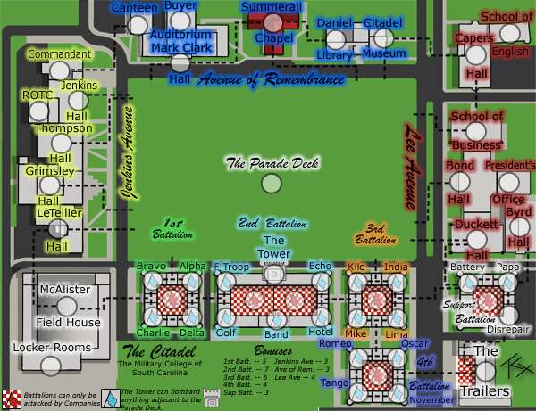
Version 2

Updates:
- Made the Attack lines less obtrusive and less cut-off.
- Changed text colors to correspond to continents.
- Made a few minor resizing changes.
- Edited the heavy use of script font to sans serif readability.
- Tried to Clarify the Battalion/Company difference.

Image
User avatar
Corporal 1st Class TaCktiX
 
Posts: 2392
Joined: Mon Dec 17, 2007 8:24 pm
Location: Rapid City, SD

Postby CatfishJohnson on Tue Mar 25, 2008 2:52 pm

very nice tacktix i like i
User avatar
Cook CatfishJohnson
 
Posts: 137
Joined: Tue Feb 19, 2008 3:47 pm
Location: Michigan

Postby TaCktiX on Tue Mar 25, 2008 3:00 pm

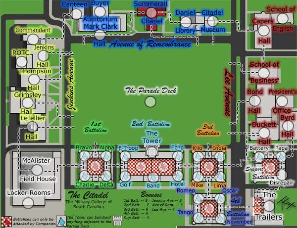
Version 2.1

Updates:
- The attack lines were TOO unobtrusive.

Image
User avatar
Corporal 1st Class TaCktiX
 
Posts: 2392
Joined: Mon Dec 17, 2007 8:24 pm
Location: Rapid City, SD

Next

Return to The Atlas

Who is online

Users browsing this forum: No registered users