

Current Version 16
Gameplay changes for Version 3
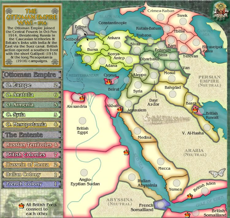
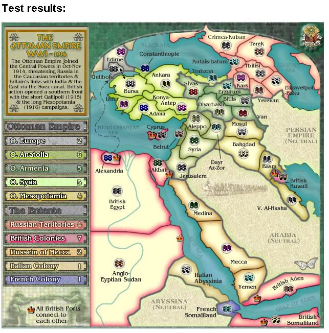
1. The number of territories currently on the map.
41.
Italy 1
France 1
Gr Britain 7
Russian Empire 7
Anatolia 7
O Armenia 5
O Mesopotamia 4
O Syria 5
O Europe 2
Hussein Mecca 3
Total 42
2 are coded as neutral starts - Italy and France
2. The number of continents. (If this makes sense for your map)
10 continents - 5 for each side
I have switched Hussein of Mecca territories to the Allied side after finding out that the Arab Revolt lead by Hussein and Lawrence of Arabia was in part responsible for the defeat and downfall of the Ottoman Empire.
There is a whole history in this diplomacy and why Hussein fought with the Allies.
Version 2
http://i155.photobucket.com/albums/s282 ... n_V02S.jpg
ORIGINAL DRAFT VERSION Time to produce this draft: 13.5 hrs
PRELUDE
Collapse
In 1908 the Young Turk movement, a reformist and strongly nationalist group, with many adherents in the army, forced the restoration of the constitution of 1876, and in 1909 the parliament deposed the sultan and put Muhammad V on the throne. In the two successive Balkan Wars (1912–13), Turkey lost nearly its entire territory in Europe to Bulgaria, Serbia, Greece, and newly independent Albania. The nationalism of the Young Turks, whose leader Enver Pasha gained virtual dictatorial power by a coup in 1913, antagonized the remaining minorities in the empire.
The outbreak of World War I found Turkey lined up with the Central Powers. Although Turkish troops succeeded against the Allies in the Gallipoli campaign (1915), Arabia rose against Turkish rule, and British forces occupied (1917) Baghdad and Jerusalem. In 1918, Turkish resistance collapsed in Asia and Europe. An armistice was concluded in October, and the Ottoman Empire came to an end. The Treaty of Sèvres (see Sèvres, Treaty of) confirmed its dissolution. With the victory of the Turkish nationalists, who had refused to accept the peace terms and overthrew the sultan in 1922, modern Turkey's history began.
Ref: http://www.infoplease.com/ce6/history/A0860176.html
The Ottoman Empire joined the Central Powers in October-November 1914, threatening Russia's Caucasian territories and Britain's communications with India and the East via the Suez canal. British action opened another front in the South with the Gallipoli (1915) and Mesopotamia campaigns. Initially the Turks were successful in repelling enemy incursion.
But in Mesopotamia, after the disastrous Siege of Kut (1915-16), the British reorganized and captured Baghdad in March 1917. Further to the west in Palestine, initial British failures were overcome with Jerusalem being captured in December 1917 and the Egyptian Expeditionary Force going on to break the Ottoman forces at the Battle of Megiddo (September 1918).
Enver Pasha, supreme commander of the Turkish armed forces, was a very ambitious man, with a dream to conquer central Asia. He was not a practical soldier. He launched an offensive with 100,000 troops against the Russians in the Caucasus in December of 1914. Insisting on a frontal attack against Russian positions in the mountains in the heart of winter, Enver lost 86% of his force.
A new Russian commander on the front in the fall of 1915, Grand Duke Nicholas, brought new vigor. A major offensive in 1916 drove the Turks out of much of present-day Armenia, and tragically provided a context for the deportation and massacre of the Armenian population in eastern Anatolia. With control of part of the southern Black Sea coast, Nicholas pushed forward the construction of railway lines to bring up supplies.
Ref: http://www.germannotes.com/hist_ww1_proceedings.shtml
Baghdad Railway
Baghdad Railway, railroad of international importance linking Europe with Asia Minor and the Middle East. The line runs from Istanbul, Turkey, to Basra, Iraq; it connected what were distant regions of the Ottoman Empire. The railroad was initially financed chiefly by German capital; its Anatolian sections were completed in 1896. The ambitious project was then formed to extend the railroad to Baghdad, and a company, again backed chiefly by German capital, was organized for the purpose. Immediate protests were made to Turkey by France, Russia, and, particularly, Great Britain, which saw in the projected line a direct threat to its empire in India. Operations were held up for several years by these international representations and by engineering difficulties, but in 1911 work was resumed. By playing on imperialistic rivalries, the construction of the railroad was a factor in bringing about World War I. By the end of the war only a stretch between Mosul and Samarra remained to be completed on the main line, which Syria and Iraq later undertook and finished.
http://www.infoplease.com/ce6/history/A0805737.html
Why?
This is a prelude to the Gallipoli map in a WW1 series. The other map i plan doing is WW1 Africa.
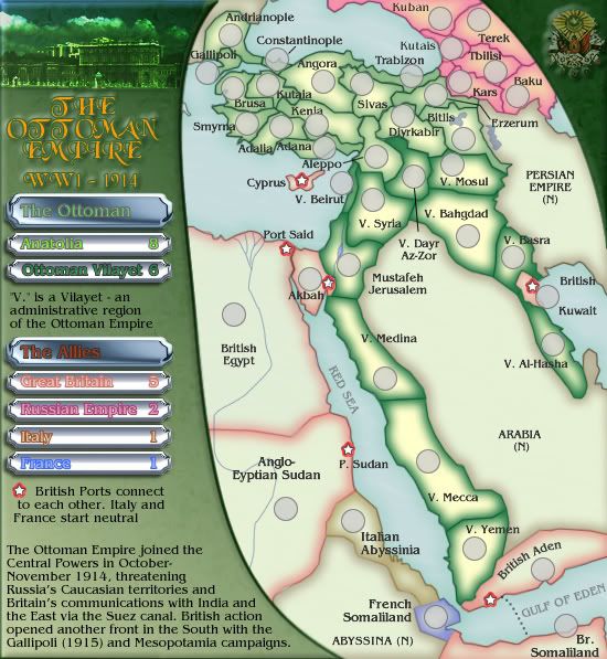
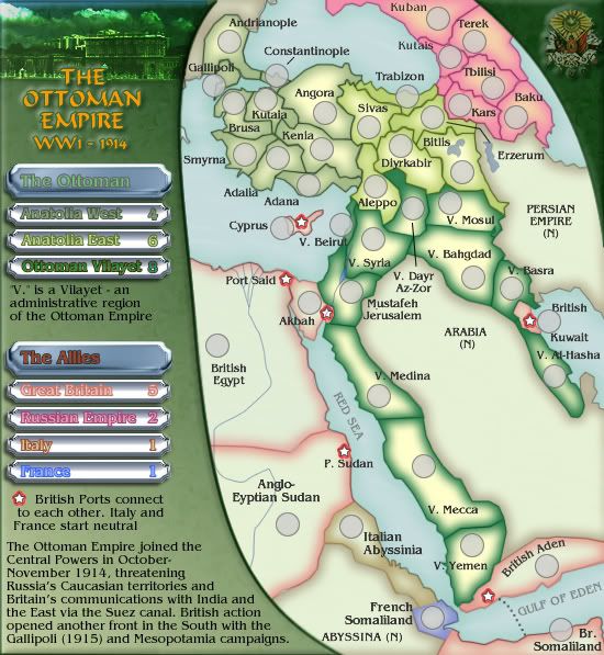
1. The number of territories currently on the map.
41.
Italy 1
France 1
Gr Britain 7
Russian Empire 6
Turkey 16
Vilayet's 10
2 are coded as neutral starts - Italy and France
2. The number of continents. (If this makes sense for your map)
6 continents - possibly more if called for and the Ottoman Empire can be further broken down into administrative regions.
3. Descriptions of any unique features or areas.
Classic gameplay with the only twist on play is that the English ports connect to each other.


