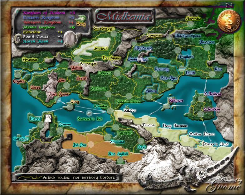
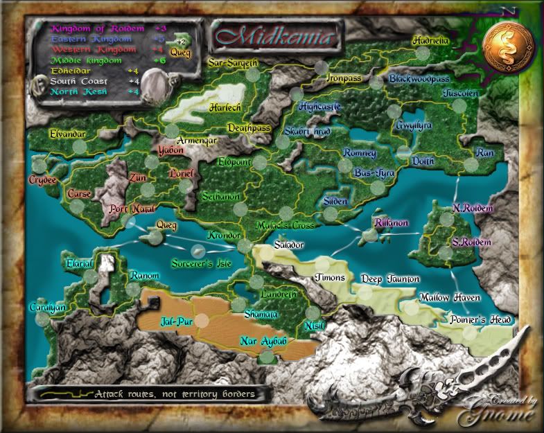
DiM wrote:edit// why does crydee have 2 different glows? the first half is pink and the second is red
same problem for Riibinon. first half is red and second is magenta.
I changed the glows again, they should be consistent now
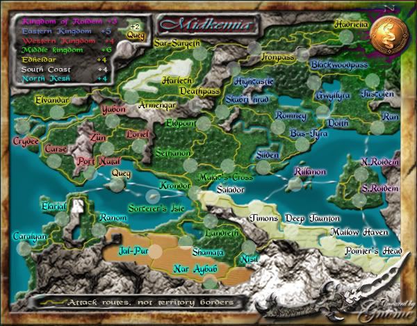
DiM wrote:also I'm having a lot of trouble reading the text on the map. it's very small. either make it a bit bigger or increase the size of the maps. you have plenty of spare pixels till you reach the limit.
Well I don't know when the rules got changed but I've never seen a rule telling that I could go over 800px for large and over 600px for small?
Big map

Small map