Conquer Club

Bamboo Jack (Thai POW Railway) [Quenched]

Care to peruse completed maps? Take a stroll through the Atlas.

Moderator: Cartographers

Forum rules
Please read the Community Guidelines before posting.

Postby Gozar on Fri Sep 14, 2007 8:05 pm

It took me a little while to figure out the Railway station business, but it is clear and easy to follow now that I understand.

This map is quite eye catching. Nice colours, and the way it appears to be made of flames is very sharp.

Can't wait to play on this one.

:)
Image
User avatar
Lieutenant Gozar
 
Posts: 2534
Joined: Wed Jan 31, 2007 3:15 pm
Location: Nova Scotia (G1)

Postby oaktown on Sat Sep 15, 2007 2:57 pm

The only graphic element I don't care for on this map is the photo down the right side. Everything else is hand-drawn using a similar style and color palette, so the photo seems out of place. If you were to sketch the image in the same style as the rest of the map and then drop it in the background it would have a unifying effect on the entire map.

This map has been bumped by the PGD, mapmaker advocates who believe that maps should always be at the top of the Foundry forums.
Image
User avatar
Captain oaktown
 
Posts: 4451
Joined: Sun Dec 03, 2006 9:24 pm
Location: majorcommand

Postby cairnswk on Sat Sep 15, 2007 3:53 pm

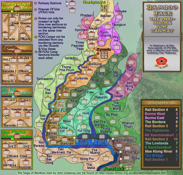
oaktown wrote:The only graphic element I don't care for on this map is the photo down the right side. Everything else is hand-drawn using a similar style and color palette, so the photo seems out of place. If you were to sketch the image in the same style as the rest of the map and then drop it in the background it would have a unifying effect on the entire map.

This map has been bumped by the PGD, mapmaker advocates who believe that maps should always be at the top of the Foundry forums.


i understand oaktown,,,i'll give it a go and see if it looks OK.
Image
* Pearl Harbour * Waterloo * Forbidden City * Jamaica * Pot Mosbi
User avatar
Private cairnswk
 
Posts: 11510
Joined: Sat Feb 03, 2007 8:32 pm
Location: Australia

Postby cairnswk on Tue Sep 18, 2007 5:18 am

POLL RESULTS

There is some negative reaction to this map because it deals with war, POWs and death. Should this map continue development?
Yes - I am here to play Conquer Club and that in itself is attack and conquer; this is simply another map strategy for the game based on history and does not offend me.
77% [ 55 ]
No - this is not a good subject for a map; it reminds me too much of the consequences of attack and conquer.
22% [ 16 ]

Total Votes : 71
Image
* Pearl Harbour * Waterloo * Forbidden City * Jamaica * Pot Mosbi
User avatar
Private cairnswk
 
Posts: 11510
Joined: Sat Feb 03, 2007 8:32 pm
Location: Australia

V16 Small

Postby cairnswk on Fri Sep 21, 2007 5:20 am

V16 Small

Folks here is the beginning of the next sets for this map.

I have:
1. moved the poem and replaced it with a url at the bottom for those with a curiosity.
2. Begun the Memorium as requested whilst this map was "in poll"...suggestions as most welcome for this if anyone has better word styling, and yes the poppies will need toning down of course. :)
3. placed a watercolour effect on the scenery background.

Image
Image
* Pearl Harbour * Waterloo * Forbidden City * Jamaica * Pot Mosbi
User avatar
Private cairnswk
 
Posts: 11510
Joined: Sat Feb 03, 2007 8:32 pm
Location: Australia

Postby pepperonibread on Fri Sep 21, 2007 6:18 am

Maybe the little flowers and the memorium could be centered in the empty space, unless you're going to add something else there.
Image
User avatar
Corporal pepperonibread
 
Posts: 954
Joined: Sun Jan 28, 2007 4:33 pm
Location: The Former Confederacy

Postby cairnswk on Fri Sep 21, 2007 6:49 am

pepperonibread wrote:Maybe the little flowers and the memorium could be centered in the empty space, unless you're going to add something else there.


That is an option pepperonibread....but i was thinking maybe that space was good there as it broke up all the busyness of the map, and gave you an image of the railway to concentrate on.
Image
* Pearl Harbour * Waterloo * Forbidden City * Jamaica * Pot Mosbi
User avatar
Private cairnswk
 
Posts: 11510
Joined: Sat Feb 03, 2007 8:32 pm
Location: Australia

Postby Gnome on Fri Sep 21, 2007 10:21 am

cairnswk wrote:
pepperonibread wrote:Maybe the little flowers and the memorium could be centered in the empty space, unless you're going to add something else there.


That is an option pepperonibread....but i was thinking maybe that space was good there as it broke up all the busyness of the map, and gave you an image of the railway to concentrate on.


yep you are right Cairnswk, it fit's nice where it is.

I only have one remark, the names in the water 'weary dunlop' and the other are not very clear I can't hardly read them...

And the pillars in the water, is it also an in passable border? I don't really get the gameplay over there...because there is one pillar that is shorter, is that a way to the 'tha markham' or is it just to short?

that's all I can see right away :wink:
Good work :!:
User avatar
Sergeant 1st Class Gnome
 
Posts: 388
Joined: Wed Jul 18, 2007 4:15 am
Location: Belgium

Postby Coleman on Fri Sep 21, 2007 2:08 pm

There is some severe pixilation in the flowers to the right surrounding the in memory of message. More specifically at the bottom of the banners, where you can see some tan dots outside the black lines of the banner infecting the backdrop.
Warning: You may be reading a really old topic.
User avatar
Sergeant Coleman
 
Posts: 5402
Joined: Tue Jan 02, 2007 10:36 pm
Location: Midwest

Postby pepperonibread on Fri Sep 21, 2007 2:53 pm

Gnome wrote:
cairnswk wrote:
pepperonibread wrote:Maybe the little flowers and the memorium could be centered in the empty space, unless you're going to add something else there.


That is an option pepperonibread....but i was thinking maybe that space was good there as it broke up all the busyness of the map, and gave you an image of the railway to concentrate on.


yep you are right Cairnswk, it fit's nice where it is.

I only have one remark, the names in the water 'weary dunlop' and the other are not very clear I can't hardly read them...

And the pillars in the water, is it also an in passable border? I don't really get the gameplay over there...because there is one pillar that is shorter, is that a way to the 'tha markham' or is it just to short?

that's all I can see right away :wink:
Good work :!:


I'd never noticed the railway before, but now that I do, I think it looks fine. Regarding Gnome's comment about the words "Weary Dunlop" and such, they look alright right now, but I'm not sure how well they'll work in the small map.
Image
User avatar
Corporal pepperonibread
 
Posts: 954
Joined: Sun Jan 28, 2007 4:33 pm
Location: The Former Confederacy

Postby Coleman on Fri Sep 21, 2007 2:54 pm

The dark river sections may be too dark. :shock: Now that I look at the map more. The contrast is really distracting to me.
Warning: You may be reading a really old topic.
User avatar
Sergeant Coleman
 
Posts: 5402
Joined: Tue Jan 02, 2007 10:36 pm
Location: Midwest

Postby cairnswk on Fri Sep 21, 2007 4:08 pm

Gnome wrote:
cairnswk wrote:
pepperonibread wrote:Maybe the little flowers and the memorium could be centered in the empty space, unless you're going to add something else there.


That is an option pepperonibread....but i was thinking maybe that space was good there as it broke up all the busyness of the map, and gave you an image of the railway to concentrate on.


yep you are right Cairnswk, it fit's nice where it is.


I only have one remark, the names in the water 'weary dunlop' and the other are not very clear I can't hardly read them...


That i can fix..Gnome.

And the pillars in the water, is it also an in passable border? I don't really get the gameplay over there...because there is one pillar that is shorter, is that a way to the 'tha markham' or is it just to short?


Yes, i think i adjusted them the wrong way, they do need to be shortened. Will do.,

I can see right away :wink:
Good work :!:
Image
* Pearl Harbour * Waterloo * Forbidden City * Jamaica * Pot Mosbi
User avatar
Private cairnswk
 
Posts: 11510
Joined: Sat Feb 03, 2007 8:32 pm
Location: Australia

Postby cairnswk on Fri Sep 21, 2007 4:11 pm

pepperonibread wrote:
Gnome wrote:
cairnswk wrote:
pepperonibread wrote:Maybe the little flowers and the memorium could be centered in the empty space, unless you're going to add something else there.


That is an option pepperonibread....but i was thinking maybe that space was good there as it broke up all the busyness of the map, and gave you an image of the railway to concentrate on.


yep you are right Cairnswk, it fit's nice where it is.

I only have one remark, the names in the water 'weary dunlop' and the other are not very clear I can't hardly read them...

And the pillars in the water, is it also an in passable border? I don't really get the gameplay over there...because there is one pillar that is shorter, is that a way to the 'tha markham' or is it just to short?

that's all I can see right away :wink:
Good work :!:


I'd never noticed the railway before, but now that I do, I think it looks fine. Regarding Gnome's comment about the words "Weary Dunlop" and such, they look alright right now, but I'm not sure how well they'll work in the small map.


Pepperonibread...that is the small map, but your point is taken.
Image
* Pearl Harbour * Waterloo * Forbidden City * Jamaica * Pot Mosbi
User avatar
Private cairnswk
 
Posts: 11510
Joined: Sat Feb 03, 2007 8:32 pm
Location: Australia

Postby pepperonibread on Sat Sep 22, 2007 9:18 am

cairnswk wrote:
pepperonibread wrote:
Gnome wrote:
cairnswk wrote:
pepperonibread wrote:Maybe the little flowers and the memorium could be centered in the empty space, unless you're going to add something else there.


That is an option pepperonibread....but i was thinking maybe that space was good there as it broke up all the busyness of the map, and gave you an image of the railway to concentrate on.


yep you are right Cairnswk, it fit's nice where it is.

I only have one remark, the names in the water 'weary dunlop' and the other are not very clear I can't hardly read them...

And the pillars in the water, is it also an in passable border? I don't really get the gameplay over there...because there is one pillar that is shorter, is that a way to the 'tha markham' or is it just to short?

that's all I can see right away :wink:
Good work :!:


I'd never noticed the railway before, but now that I do, I think it looks fine. Regarding Gnome's comment about the words "Weary Dunlop" and such, they look alright right now, but I'm not sure how well they'll work in the small map.


Pepperonibread...that is the small map, but your point is taken.


:oops: Maybe I should've paid attention to the V16 "Small" in the title.
Image
User avatar
Corporal pepperonibread
 
Posts: 954
Joined: Sun Jan 28, 2007 4:33 pm
Location: The Former Confederacy

V17 Update

Postby cairnswk on Sat Sep 29, 2007 7:50 pm

V17 Update Small

Adjustments made on this version:
1. Dark river sections lightened
2. Title given a backgound of a book
3. small adjustments to some terts to make text space
4. POW names on main map enlarged to 13 px
5. Pylons on bridge adjusted to be smaller to fit inside river terts
6. URL to poem Bamboo Jack provided at the bottom of the map.


Image
Image
* Pearl Harbour * Waterloo * Forbidden City * Jamaica * Pot Mosbi
User avatar
Private cairnswk
 
Posts: 11510
Joined: Sat Feb 03, 2007 8:32 pm
Location: Australia

Postby gimil on Sat Sep 29, 2007 7:56 pm

Im wonder if it could be possible to apply the texture used on the map on the typography of the legends. right now some colors still seem very bright and in your face.
What do you know about map making, bitch?

natty_dread wrote:I was wrong


Top Score:2403
User avatar
Corporal 1st Class gimil
 
Posts: 8599
Joined: Sat Mar 03, 2007 12:42 pm
Location: United Kingdom (Scotland)

Postby cairnswk on Sat Sep 29, 2007 7:59 pm

gimil wrote:Im wonder if it could be possible to apply the texture used on the map on the typography of the legends. right now some colors still seem very bright and in your face.


yes i can try that gimil. :)
Image
* Pearl Harbour * Waterloo * Forbidden City * Jamaica * Pot Mosbi
User avatar
Private cairnswk
 
Posts: 11510
Joined: Sat Feb 03, 2007 8:32 pm
Location: Australia

Postby cairnswk on Tue Oct 02, 2007 5:50 pm

Version 18 Update

1. Removed the Impassables - don't know if they are required, they looked kind of weird, what does everyone else think?

2. Softened/de-glared the colours in the legend

3. fixed some terts lines

Anything else anyone?


Image
Image
* Pearl Harbour * Waterloo * Forbidden City * Jamaica * Pot Mosbi
User avatar
Private cairnswk
 
Posts: 11510
Joined: Sat Feb 03, 2007 8:32 pm
Location: Australia

Postby cairnswk on Wed Oct 03, 2007 10:49 am

Any comments here??? Surely having voted for this to continue, the Foundry is not going to let it wallow now!
Image
* Pearl Harbour * Waterloo * Forbidden City * Jamaica * Pot Mosbi
User avatar
Private cairnswk
 
Posts: 11510
Joined: Sat Feb 03, 2007 8:32 pm
Location: Australia

Postby onbekende on Wed Oct 03, 2007 11:12 am

no worries, give me time to review the whole thing (with adjusted bonusses offcourse :D)

got school he.
Emperor of the Benelux
Founder of the Commonwealth of Planets
Founder and CEO of JF
User avatar
Captain onbekende
 
Posts: 1530
Joined: Fri Apr 14, 2006 10:19 am
Location: Belgium

Postby Coleman on Wed Oct 03, 2007 1:33 pm

Sorry for how frustrating this is going to be, but I feel there is something not quite right about it still. I don't know what.

Maybe the bottom 3 bullet points could have more space between them. The same as the top 3 doesn't seem possible, but I'd like the gaps between them to be consistent all the way down, even when they don't have picture examples. I'm not sure I like the bonuses bumping up against Tamuang and Phanom Thuan either.
Warning: You may be reading a really old topic.
User avatar
Sergeant Coleman
 
Posts: 5402
Joined: Tue Jan 02, 2007 10:36 pm
Location: Midwest

Postby Telvannia on Wed Oct 03, 2007 2:12 pm

my 2 pence worth,


the 2 in the bonuses for NE Kanchanaburi looks different from all the other numbers in the bonuses.

And im really confused about how the railway stations work, when you attack them from a neighbouring territory are you attacking the territory at the top of the mini-maps of the station?
User avatar
Sergeant 1st Class Telvannia
 
Posts: 1331
Joined: Mon Apr 24, 2006 7:19 am

Postby Sir. Ricco on Wed Oct 03, 2007 2:23 pm

Pretty neat map! :wink:
User avatar
Captain Sir. Ricco
 
Posts: 4555
Joined: Tue Oct 02, 2007 2:33 pm
Location: Making kingdoms burn and bloodshed start.

Postby gimil on Wed Oct 03, 2007 3:02 pm

Cairns heres another lsit for you to look at :wink:

1. The railway sections, i feel, dont stand out enought. Maybe you could do something similar to the POW huts. Have color ouline all 4 rail sections and have that same outline round the rail road sections in the legends. oh and could you possible group rail sections 1-4 together in order?

2. The legends look much better now but i still feel a light texture overlay will look the part.

3. the left had side where your notes are lok a little bare compared to the picture that you have under the poppy. maybe make this blue area have soft sky look with clouds and maybe even te sun? jsut a thought

Thats all for now buddy
What do you know about map making, bitch?

natty_dread wrote:I was wrong


Top Score:2403
User avatar
Corporal 1st Class gimil
 
Posts: 8599
Joined: Sat Mar 03, 2007 12:42 pm
Location: United Kingdom (Scotland)

Postby Wisse on Wed Oct 03, 2007 3:17 pm

do you have a large version? that would be easier to look at
Image Image
User avatar
Sergeant Wisse
 
Posts: 4448
Joined: Fri Oct 13, 2006 2:59 pm
Location: The netherlands, gelderland, epe

PreviousNext

Return to The Atlas

Who is online

Users browsing this forum: No registered users