- Click image to enlarge.
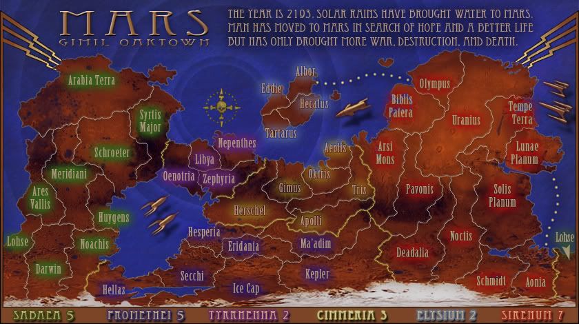
Hey all, gimil and I are playing alternating versions right now, as there are somethings I like to do and things he likes to do. Sorry for not noticing the recent comments as my focus has been on what gimil and I last talked about. In this version I've...
• added a border, which also incorporates the region bonuses. I think moving the bonuses down there makes the top of the map cleaner, and I like separating the gameplay info from the fictional backstory.
• overall I tried to improve some of the muddier elements of the map. Folks have been complaining that the map is "dark" when really I think the problem is that there is a lack of contrast. Dark is fine as long as you keep everything visible. For instance, the text was in my opinion the hardest thing to read, and while it really isn't any lighter now it does have greater contrast against the background.
• brought in a uniquely "classic" element that gimil and I had spoken of... hope you like.
There's still plenty to do... I think we'll need to somehow provide a better key to the regions (region names on the map itself might be necessary) and there's the question of what to do with army counts/contrast circles. I'll mull that one over and see if I can't find a solution in keeping with the 1930s/Flash Gordon/Metropolis style.
And I'm cool with losing the date, and/or any other parts of the text that isn't crucial to the backstory. If we work on it I'm sure we can say more with fewer words.
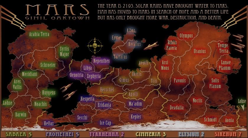
Just for fun: as an example of how the map really isn't too "dark" check out how friggin' cool gimil'dland looks with a black background... I think the land isn't the problem, we just need to get everything else right.
- Click image to enlarge.


