ROME: CIVIL WAR v31
Moderator: Cartographers
Re: Caesar Mortuus Est [3/8/2011] V 24 pg 15
![]() by Minister X on Mon Dec 05, 2011 2:01 pm
by Minister X on Mon Dec 05, 2011 2:01 pm
This is my first effort to make a CC map; I used existing ones as guides and as examples of the accepted characteristics of maps. You're holding me to a standard it hadn't occurred to me might be applied. If that's the standard, that's the standard, and my map doesn't meet it. It's no better than existing ones; the graphics are only so-so and it brings no new gameplay elements to bear. My goal as a newbie cartographer was to make a map as good as those that exist here. It didn't really occur to me that achieving that would constitute failure. That said, I can't blame you for wanting all new maps to exceed all previous standards - it's an ambitious but worthy goal. I'm truly sorry that I've not met this very high standard for new maps, but I gave it my best shot and learned some good Photoshop stuff in the process.
-

 Minister X
- Posts: 424
- Joined: Tue Nov 11, 2008 4:45 pm


Re: Caesar Mortuus Est [3/8/2011] V 24 pg 15
![]() by AndyDufresne on Mon Dec 05, 2011 2:02 pm
by AndyDufresne on Mon Dec 05, 2011 2:02 pm
Keep it up minister x. I think your map does offer unique graphics and theme.
--Andy
--Andy
-

AndyDufresne
- Posts: 24919
- Joined: Fri Mar 03, 2006 8:22 pm
- Location: A Banana Palm in Zihuatanejo


Re: Caesar Mortuus Est [3/8/2011] V 24 pg 15
![]() by lostatlimbo on Tue Dec 06, 2011 1:51 am
by lostatlimbo on Tue Dec 06, 2011 1:51 am
There's a lot of different people on conquer club from all over the world and with it comes a lot of different tastes and preferences. I've seen a lot better maps come out of the foundry and a lot worse.
While I do agree with DiM that your map is fairly basic, I don't think there's anything wrong with that. As long as there are some different, creative maps coming out of the foundry, its okay to do some in a classic style too. Some people will love it, others will hate it, many won't care one way or the other.
You will never please everyone and, in the end, you're doing all the work and you are doing it for free, so as long as you are having fun with the process and are proud of what you are submitting, then stick with it. For the record, I think the gameplay is unique and I'm intrigued as to how it will play out.
HOWEVER, I feel its worth noting that I've been in your shoes fairly recently. With my first map, I felt I'd put together something pretty decent in relation to other maps on CC and thought it was 'good enough'. I tweaked it and tweaked it, but the feedback was similar to this - "Something's missing..." "I'm not feeling it..." and like you, I was reticent to start from scratch. Instead, I took some time off from it and considered giving up on it.
But after some time away, I came back and started seeing what others were seeing. I didn't start from scratch, persay, but I gave it a significant face lift. And I'm glad I did. Its still not great, but it fits now and it was worth that extra effort, despite my reservations.
So maybe thats where you are? Maybe you need to look at it with some fresh eyes. If you still love it and think it suits the theme, then carry on. Or maybe you'll see another angle - a way to take this map to the next level. If you do, I guarantee it will be worth your trouble. But either way, don't be discouraged. We can't all be DiM, but that doesn't mean we can't bring our own level of skill and creativity to the table and still have fun with it.
-

lostatlimbo
- Posts: 1386
- Joined: Wed Mar 28, 2007 3:56 pm
- Location: Portland, OR


Re: ROME [3/8/2011] V 23 pg 14
![]() by lostatlimbo on Tue Dec 06, 2011 2:19 am
by lostatlimbo on Tue Dec 06, 2011 2:19 am
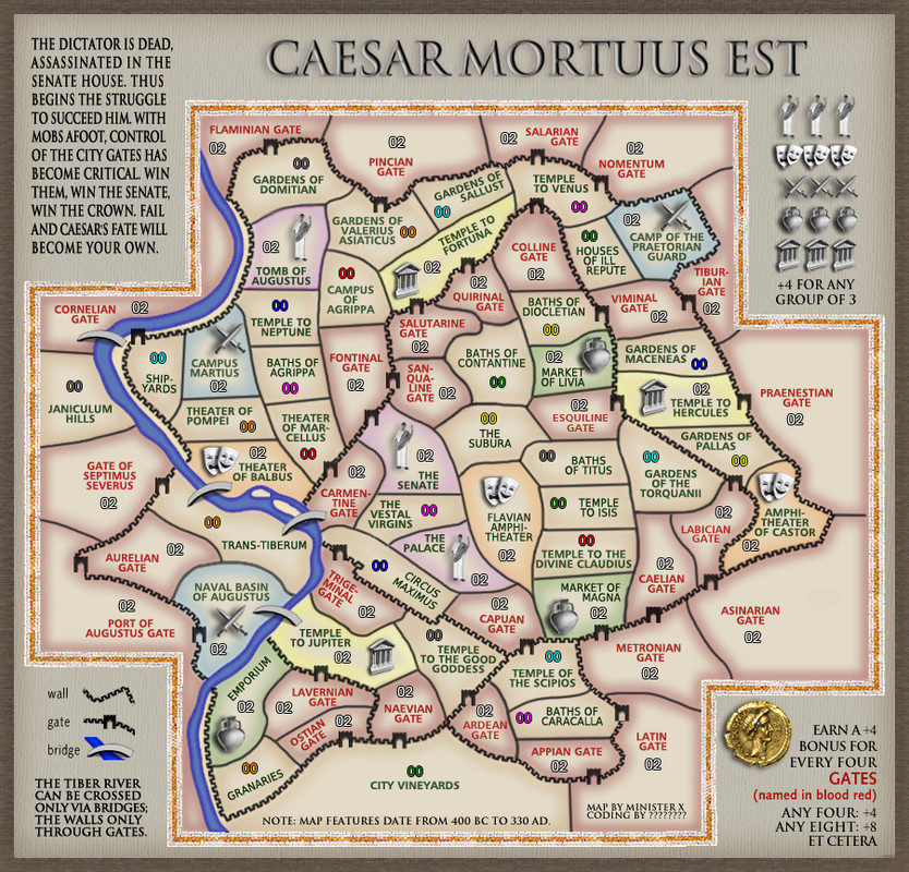
Minister X wrote:Regarding the jaggies you see on the reduced fonts: I see some degradation of quality moving from the full to the small map, but nothing I'd call jaggies. But I wear glasses and have to squint - so I'll trust your eyes. I've adjusted the fonts on the small map from 8.68 points to an even 9, as you suggested. You'll have to tell me if you see an improvement. I know a little bit about font technology and I don't believe using even point sizes should make any difference at all, but I could well be wrong. In any case, the increase in size is easily managed.
It seems a little better, but still choppy. You might need to adjust the kerning a little and try some different anti-alias settings. Try "Strong" or "Smooth". If you tell me what font you are using, I can play with the settings and suggest some options for you.
Whole numbers do make a difference, btw, but I won't get into why.
Minister X wrote:Regarding the drop shadow on the Gladius and title: I see your point. The problem is that the title, using the incised font, is intended to simulate the letters carved in stone, and such things can't have drop shadows. Nevertheless, I applied a drop shadow just to see what it would look like. It's awful. Solution: remove the drop shadow from behind the gladius. In some ways this looks worse than before, in some ways better. I kind of like it; it's stark but the gladius stands out more. We can easily overdo it with drop shadows.
Regarding using Latin for the title: according to Google Translate, it would be "Caesar Mortuus Est". I'm more concerned by the question of whether the increase in "Roman flavor" would outweigh the fact 1) that only one in forty CC players would know what it means (though more than that could make a good guess), and 2) it would be harder to remember. "Mortuus" is a very awkward word. Because there are more letters than in "Caesar Is Dead" the font must be reduced, which isn't fatal but isn't great. I've placed the gladius where I think it makes the most sense, but it is somewhat distracting there (though still pretty cool). I just don't know. I've made the changes but I consider them temporary and I'd like to hear from as many voices as possible: is this better or worse?
I think it is better without the drop shadow. The title has no need to establish a foreground/background (which is essentially what a drop shadow does. I think its fine this way.
I like the Latin version (though I'm not sure I'd trust Google Translate). I don't think you need to worry about its comprehension, as it is clear in context. The first line of your story goes "The dictator is dead..." and Caesar is Caesar in any language. Mort- is the common root of "death" all Latin-based languages, but that is irrelevant. Your map will be the only one (so far) that has Caesar in the title. People will say "the Caesar map" whether it is in English or Latin.
Minister X wrote:Regarding the color-coded bonuses: you may have forgotten or you may have missed it, but there was a somewhat protracted discussion of how much color should be in the map. Some wanted more; some less. The compromise solution was to have some color in the terts but not under the legend. What you're in essence asking is that we reopen that debate. I'd really rather just live with the result of the previous one, which until your post above seemed to be acceptable as a compromise to everyone.
I recall the debate and I was always firmly against them. I think this is one element behind the requests for you to "Romanize" this map. Those colors simply do not fit the time and place and theme. There's no way around that. No one thinks about Rome and has highlighter colors come to mind. Does the map look a little flat and colorless without them? Yes, but that doesn't mean this is the solution to that problem. Maybe you don't need to change the entire perspective and layout in the way DiM suggests, but you could go a long way towards capturing the theme just by taking some inspiration from the colors in his examples.
Or just do a search on Google, you'll see a ton of reds, golds, taupes, olives, but very few cyans, magentas and yellows.
http://www.google.com/search?hl=en&nord=1&q=romans&gs_sm=&gs_upl=&bav=on.2,or.r_gc.r_pw.r_cp.,cf.osb&ion=1&biw=1909&bih=1251&um=1&ie=UTF-8&tbm=isch&source=og&sa=N&tab=wi&ei=MsDdToLJBYjhiALGrqjSCA
I've already spent a bit of time typing this up, but tomorrow I will dig up my Latin books and double check that your title is accurate.
-
lostatlimbo
- Posts: 1386
- Joined: Wed Mar 28, 2007 3:56 pm
- Location: Portland, OR
Re: Caesar Mortuus Est [3/8/2011] V 24 pg 15
![]() by AndyDufresne on Tue Dec 06, 2011 2:20 pm
by AndyDufresne on Tue Dec 06, 2011 2:20 pm
Well written up post, Lostalimbo.
--Andy
--Andy
-
AndyDufresne
- Posts: 24919
- Joined: Fri Mar 03, 2006 8:22 pm
- Location: A Banana Palm in Zihuatanejo
Re: Caesar Mortuus Est [3/8/2011] V 24 pg 15
![]() by thenobodies80 on Sun Jan 08, 2012 1:38 pm
by thenobodies80 on Sun Jan 08, 2012 1:38 pm
I don't think that the title is a problem. OMG It's just a title. It's written in the right way, it's a common latin phrase...so what's wrong with it?
I echo lost@limbo about the few adjustments he suggested. The font can be refined easily adjusting the anti-alias and the colors can be replaced easily.
there're other 4 things i think you should try to fix/chnage/modify on the map:
1. Both bridges in Trans-Tiberium should have a different perspective. It can be done easily.
2. Have more color blind friendly colors, you can do this when you search for different colors, as lost@limbo suggested.
3. Remove the semicolon in your bottom left legend, the phrase "the tiber river can be crossed..." is ok also without it imo.
4. More important find something else instead of the image of the dead caesar you have next to the title. This for two reason, the blood looks ugly, second the image is not free. That is a artwork made by Jean-Léon Gérôme and it's copyrighted, so it must be changed.
Except for those things I don't think that the map is so ugly or bad to not be added to the current map list on this site. Yeah, maybe it hasn't the best graphics of this world, but i think they fit with the theme.
I know that previously I suggested you to go in a different directions, but you have decided to follow a different development and the current result it's not bad and i think it works for this map.
Still think that this map could be a good addition to organize some fun tournaments.
Keep it up!
Nobodies
-

thenobodies80
- Posts: 5400
- Joined: Wed Sep 05, 2007 4:30 am
- Location: Milan


Re: Caesar Mortuus Est [3/8/2011] V 24 pg 15
![]() by DiM on Sun Jan 08, 2012 1:40 pm
by DiM on Sun Jan 08, 2012 1:40 pm
shouldn't this be in the bin seeing that it's been over a month since the last update?
it's been over a month since the map maker even posted here.
it's been over a month since the map maker even posted here.
“In the beginning God said, the four-dimensional divergence of an antisymmetric, second rank tensor equals zero, and there was light, and it was good. And on the seventh day he rested.”- Michio Kaku
-

DiM
- Posts: 10415
- Joined: Wed Feb 14, 2007 6:20 pm
- Location: making maps for scooby snacks


Re: Caesar Mortuus Est [3/8/2011] V 24 pg 15
![]() by thenobodies80 on Sun Jan 08, 2012 2:30 pm
by thenobodies80 on Sun Jan 08, 2012 2:30 pm
Consider what I wrote like a sort of last call
-
thenobodies80
- Posts: 5400
- Joined: Wed Sep 05, 2007 4:30 am
- Location: Milan
Re: Caesar Mortuus Est [3/8/2011] V 24 pg 15
![]() by Minister X on Sun Jan 08, 2012 8:37 pm
by Minister X on Sun Jan 08, 2012 8:37 pm
Bin it. I've tried but am unable to advance things enough from where the last substantive criticism was made. If I ever get a flash of creativity and am able to do so we can always un-bin the thing.
-
Minister X
- Posts: 424
- Joined: Tue Nov 11, 2008 4:45 pm
Re: Caesar Mortuus Est [3/8/2011] V 24 pg 15
![]() by thenobodies80 on Sun Jan 08, 2012 8:47 pm
by thenobodies80 on Sun Jan 08, 2012 8:47 pm
It's a shame. 
Anyway if this is what you want I'm going to move this one into the bin. When and if you want to continue this project please post an update and send a pm to one of the foundry moderators.
[Moved]
Anyway if this is what you want I'm going to move this one into the bin. When and if you want to continue this project please post an update and send a pm to one of the foundry moderators.
[Moved]
-
thenobodies80
- Posts: 5400
- Joined: Wed Sep 05, 2007 4:30 am
- Location: Milan
Re: [Abandoned] - Caesar Mortuus Est
![]() by nolefan5311 on Tue Aug 07, 2012 9:52 pm
by nolefan5311 on Tue Aug 07, 2012 9:52 pm
The six months of vacation has expired, for this reason this topic is now labeled as [Abandoned]. If the original mapmaker wants to continue this map project that's fine but an update must provided. From this moment anyone else is free to take this project without the original mapmaker permission, but it has to be started from the scratch. I really hope you decide to pick this one back up Minister.
-

nolefan5311
- Posts: 1768
- Joined: Mon Nov 22, 2010 11:51 am
- Location: Florida


Re: [Abandoned] - Caesar Mortuus Est
![]() by HitRed on Sat Jul 18, 2020 7:57 pm
by HitRed on Sat Jul 18, 2020 7:57 pm
I call on this map to be returned to life! The mapmaker is back. The art is very advanced. We can be in Beta quickly.

-

HitRed
- Posts: 4498
- Joined: Fri Jun 26, 2015 12:16 pm


Re: [Abandoned] - Caesar Mortuus Est
![]() by Minister X on Tue Jul 21, 2020 9:29 am
by Minister X on Tue Jul 21, 2020 9:29 am
I still have the Photoshop files for this and would be willing to work on it again if there's interest. In fact, after typing that I opened the file and made several changes. It's funny but after all this time my attitude toward things has changed. I remember there being a problem with the dead Caesar - I deleted him. Ditto with the gladius and then resized and re-positioned the title. I tilted some bridges so they'd cross the Tiber more directly. I got rid of my "logo" and instead went with plain text for the attribution, adding a line for the coder because he/she would deserve it. And instead of each of the five thematic symbols getting their own bonus announcement I changed to one common instruction below the graphic. Slightly resized the "The dictator is dead..." text to allow for a bit more white space. I think the net effect is a bit cleaner, simpler, less cluttered.
I'd be pleased if this topic could be reopened. Thanks.
I'd be pleased if this topic could be reopened. Thanks.
-
Minister X
- Posts: 424
- Joined: Tue Nov 11, 2008 4:45 pm
Re: [Abandoned] - Caesar Mortuus Est
![]() by HitRed on Tue Jul 21, 2020 9:55 am
by HitRed on Tue Jul 21, 2020 9:55 am
I'm glad you are restarting this map. 
-
HitRed
- Posts: 4498
- Joined: Fri Jun 26, 2015 12:16 pm
Re: [Abandoned] - Caesar Mortuus Est
![]() by Minister X on Fri Aug 21, 2020 9:41 am
by Minister X on Fri Aug 21, 2020 9:41 am
Well Hitred, it's been a month since the last post with zero additional interest shown, so I suppose it's back into the dustbin of CC cartographic history for Caesar Mortuus Est. RIP, my child.
-
Minister X
- Posts: 424
- Joined: Tue Nov 11, 2008 4:45 pm
Re: [Abandoned] - Caesar Mortuus Est
![]() by HitRed on Fri Aug 21, 2020 9:54 am
by HitRed on Fri Aug 21, 2020 9:54 am
Understood. Quality is not always appreciated.
-
HitRed
- Posts: 4498
- Joined: Fri Jun 26, 2015 12:16 pm
Re: [Abandoned] - Caesar Mortuus Est
![]() by ZaBeast on Fri Aug 21, 2020 12:48 pm
by ZaBeast on Fri Aug 21, 2020 12:48 pm
I missed this one
Looks good. Were any bonus from non-starting neutrals regions planned?
Looks good. Were any bonus from non-starting neutrals regions planned?

-
ZaBeast
- Posts: 362
- Joined: Sat May 06, 2017 5:26 pm


 4
4 5
5
 2
2
 3
3
Re: [Abandoned] - Caesar Mortuus Est
![]() by Minister X on Fri Aug 21, 2020 3:42 pm
by Minister X on Fri Aug 21, 2020 3:42 pm
To the best of my recollection neutrals were never discussed. I searched the thread for "neutral" and found nothing. Off hand I'd imagine that at least one each of the military/market/gov't/theater/temple terts should start neutral to prevent lucky drops, and most (or many) of the gates as well. I don't know it that answers your question. I don't really understand what you meant by "bonus from non-starting neutrals regions". Sorry.
-
Minister X
- Posts: 424
- Joined: Tue Nov 11, 2008 4:45 pm
Re: [Abandoned] - Caesar Mortuus Est
![]() by ZaBeast on Fri Aug 21, 2020 8:49 pm
by ZaBeast on Fri Aug 21, 2020 8:49 pm
From the color codes it looked like any gate/symbol tert were starting neutral, with any non-bonus tert being the only possible starting positions
-
ZaBeast
- Posts: 362
- Joined: Sat May 06, 2017 5:26 pm
4523
Re: [Abandoned] - Caesar Mortuus Est
![]() by Minister X on Fri Aug 21, 2020 9:19 pm
by Minister X on Fri Aug 21, 2020 9:19 pm
No, I just color-coded the gate terts so they'd be more obviously different than the others. That said, it would probably make sense for lots (all?) of the bonus-related terts to start neutral. We just never got that far in the development discussions. Most of it had to do with appearance and colors and the like.
Ah - and now I think I see what you meant by bonuses from non-starting neutrals. Do you get the usual bonus for every three terts even if there's nothing special about them? Again, we never got that far in the discussions as far as I can recall. I probably assumed you would.
LOL. I just took another look at the map and I see that in fact there are neutral army numbers shown in ALL the special bonus terts, so either that was my original intent or a result of discussion. Gimme a break. It's been eight years since I worked on this except for the few cosmetic changes I made a month ago.
-
Minister X
- Posts: 424
- Joined: Tue Nov 11, 2008 4:45 pm
Re: [Abandoned] - Caesar Mortuus Est
![]() by HitRed on Fri Aug 21, 2020 11:20 pm
by HitRed on Fri Aug 21, 2020 11:20 pm
Minister X wrote:I still have the Photoshop files for this and would be willing to work on it again if there's interest. In fact, after typing that I opened the file and made several changes. It's funny but after all this time my attitude toward things has changed. I remember there being a problem with the dead Caesar - I deleted him. Ditto with the gladius and then resized and re-positioned the title. I tilted some bridges so they'd cross the Tiber more directly. I got rid of my "logo" and instead went with plain text for the attribution, adding a line for the coder because he/she would deserve it. And instead of each of the five thematic symbols getting their own bonus announcement I changed to one common instruction below the graphic. Slightly resized the "The dictator is dead..." text to allow for a bit more white space. I think the net effect is a bit cleaner, simpler, less cluttered.
I'd be pleased if this topic could be reopened. Thanks.
-
HitRed
- Posts: 4498
- Joined: Fri Jun 26, 2015 12:16 pm
Re: [Abandoned] - Caesar Mortuus Est
![]() by ZaBeast on Sat Aug 22, 2020 10:13 am
by ZaBeast on Sat Aug 22, 2020 10:13 am
I was talking about more conventional "continent" bonuses (that if possible wouldn't require taking a lot of neutrals)
-
ZaBeast
- Posts: 362
- Joined: Sat May 06, 2017 5:26 pm
4523
Re: [Abandoned] - Caesar Mortuus Est
![]() by Minister X on Sat Aug 22, 2020 10:32 am
by Minister X on Sat Aug 22, 2020 10:32 am
ZaBeast wrote:I was talking about more conventional "continent" bonuses (that if possible wouldn't require taking a lot of neutrals)
I doubt that would add much or be terribly workable. There are already three types of bonuses: 1) the five thematic groups of three each, 2) the gates, 3) hold 3, 6, 9, etc. of anything else. And those "anything else" terts are spread around in no special way so trying to define territorial neighborhoods (or whatever) wouldn't make too much sense. There are several clumps of multiple "anything else" terts but except for the three "Gardens of..." terts just inside the northern wall these terts don't form any sort of natural grouping by type. Furthermore, graphically defining them and finding some place to list them and their bonuses would require a complete redesign, which I'd not attempt unless a whole lot of CCer's said it was necessary and promised me a bunch of those gold coins you see in the lower right corner.
-
Minister X
- Posts: 424
- Joined: Tue Nov 11, 2008 4:45 pm
Re: [Abandoned] - Caesar Mortuus Est
![]() by HitRed on Sat Aug 22, 2020 10:56 am
by HitRed on Sat Aug 22, 2020 10:56 am
Team play.
In a team game I would have a hard time if a team member said, "Attack the temple" without being specific. There are 9 terr. with Temple in the name. Only 3 are part of the Temple bonus though. Maybe the word temple should only be used it an actual temple bonus? Maybe the others could changes to "statue to the good goddess" or "fountain to the good goddess", "pool to the good goddess."
The othe bonus names are good.
Idea only.
-
HitRed
- Posts: 4498
- Joined: Fri Jun 26, 2015 12:16 pm
Re: [Abandoned] - Caesar Mortuus Est
![]() by Minister X on Sat Aug 22, 2020 11:31 am
by Minister X on Sat Aug 22, 2020 11:31 am
"Shrine" would probably be the most reasonable synonym but I've never seen anything but "temple" used in any Roman history or map. And how likely is it, really, that a player would not realize there was more than one temple on the map? There are also five "baths", a bunch of "gardens", and extra theaters outside the theater bonus. We can't eliminate the possibility of someone saying, "Attack the baths (or gardens or theater)."
-
Minister X
- Posts: 424
- Joined: Tue Nov 11, 2008 4:45 pm
Who is online
Users browsing this forum: No registered users
|
|||||||
| Conquer Club is not associated with RISK online in any way. Copyright © 2006-2024 by Big Wham LLC | |||||||