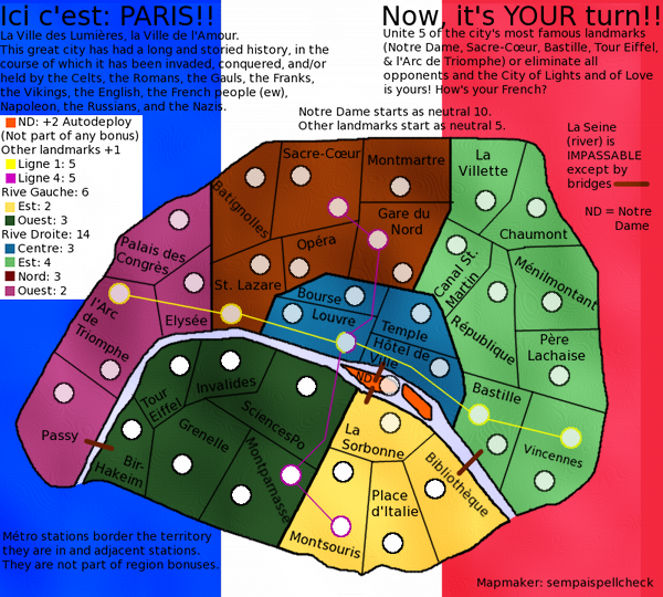
sempaispellcheck wrote:
I'm using GIMP, and I think what I'm going to do is redraw the map following natty's GIMP tutorial
It was just what I had in mind
Moderator: Cartographers
![]() by Flapcake on Fri Apr 13, 2012 8:29 am
by Flapcake on Fri Apr 13, 2012 8:29 am
sempaispellcheck wrote:
I'm using GIMP, and I think what I'm going to do is redraw the map following natty's GIMP tutorial


![]() by sempaispellcheck on Tue Apr 17, 2012 8:23 pm
by sempaispellcheck on Tue Apr 17, 2012 8:23 pm


![]() by Flapcake on Thu Apr 19, 2012 2:51 am
by Flapcake on Thu Apr 19, 2012 2:51 am
![]() by DoomYoshi on Thu Apr 19, 2012 9:23 am
by DoomYoshi on Thu Apr 19, 2012 9:23 am


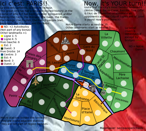
sacre-couer paris icon


![]() by sempaispellcheck on Thu Apr 19, 2012 10:01 am
by sempaispellcheck on Thu Apr 19, 2012 10:01 am
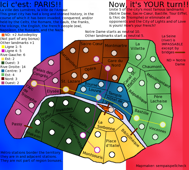
Flapcake wrote:whats easy for every one is that you post the images on the last page aswell as the first
Flapcake wrote:Now your new updateabout the blurness, much better, its just about gone (hurray
) You got all seperate colors for bonuses now, thats good.
I certainly see an improvement in you map
Flapcake wrote:but you have some things you need to sort out.
Flapcake wrote:The outer border, its very rough and pixilated, did you use a pencil tool ? use a brush ( 3 pix for outerborders) I have my brush for borderlines set with 90% transparency, it gives a softer look. ofcourse it depend on how the image appears (soft vs. hard)
Flapcake wrote:The armycirkles, same rough and pixilated, I think you can skip the cirkles in the territories and keep the ones for Ligne, but they are also rough and pixilated.
Flapcake wrote:Innerborder from Montmartre/Gare du nord to La villette, delete the littel piece that crosses over
Flapcake wrote:The flag for bagground is much better, the "red" side just seems kind of "pink" to me
Flapcake wrote:I like your improvements and you are on track for a very nice map, keep it up
Flap
![]() by sempaispellcheck on Thu Apr 19, 2012 10:02 am
by sempaispellcheck on Thu Apr 19, 2012 10:02 am
![]() by sempaispellcheck on Mon Apr 23, 2012 10:45 pm
by sempaispellcheck on Mon Apr 23, 2012 10:45 pm
![]() by nolefan5311 on Tue Apr 24, 2012 2:54 pm
by nolefan5311 on Tue Apr 24, 2012 2:54 pm


![]() by sempaispellcheck on Tue Apr 24, 2012 4:08 pm
by sempaispellcheck on Tue Apr 24, 2012 4:08 pm
![]() by sempaispellcheck on Tue Apr 24, 2012 4:54 pm
by sempaispellcheck on Tue Apr 24, 2012 4:54 pm
![]() by sempaispellcheck on Tue Apr 24, 2012 6:53 pm
by sempaispellcheck on Tue Apr 24, 2012 6:53 pm
![]() by sempaispellcheck on Tue Apr 24, 2012 7:31 pm
by sempaispellcheck on Tue Apr 24, 2012 7:31 pm
![]() by koontz1973 on Wed Apr 25, 2012 11:56 am
by koontz1973 on Wed Apr 25, 2012 11:56 am


![]() by sempaispellcheck on Wed Apr 25, 2012 1:01 pm
by sempaispellcheck on Wed Apr 25, 2012 1:01 pm
![]() by isaiah40 on Wed Apr 25, 2012 3:02 pm
by isaiah40 on Wed Apr 25, 2012 3:02 pm
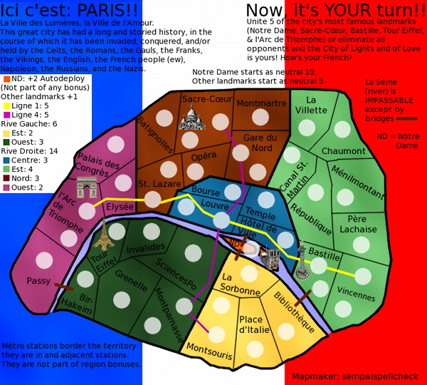
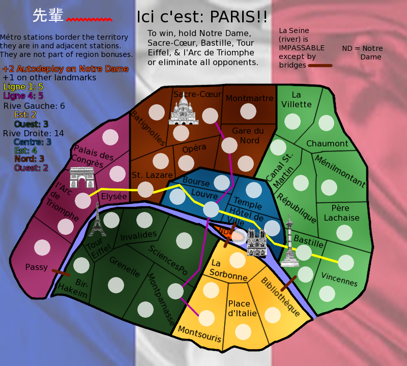
koontz1973 wrote:isaiah40 idea of using the same thing as Flapcake on Denmark should really bring the map to life.Not with the water or on a small scale, but covering the whole of the maps background. (Look at the style)


![]() by koontz1973 on Wed Apr 25, 2012 3:38 pm
by koontz1973 on Wed Apr 25, 2012 3:38 pm
sempaispellcheck wrote:Oh! My apologies, isaiah, I misunderstood you. I'll find a better flag.
The images were the best I could find. I'll look some more and find better ones.
I'm assuming you mean the text at the top? Aw, I liked it. I thought it was funny.Oh well. I can cut it.
isaiah40 wrote:koontz1973 wrote:isaiah40 idea of using the same thing as Flapcake on Denmark should really bring the map to life.Not with the water or on a small scale, but covering the whole of the maps background. (Look at the style)
No, I meant on the small scale like on Denmark. If you do have it covering the whole background, then you will need to subdue it so that it is barely visible. Just enough that you can see it, and just enough that it doesn't detract from the playable area.
![]() by sempaispellcheck on Wed Apr 25, 2012 5:20 pm
by sempaispellcheck on Wed Apr 25, 2012 5:20 pm
koontz1973 wrote:Why not draw them yourself. That way you do not have copyright to deal with.
isaiah40 wrote:If you do have it covering the whole background, then you will need to subdue it so that it is barely visible. Just enough that you can see it, and just enough that it doesn't detract from the playable area.
![]() by sempaispellcheck on Wed Apr 25, 2012 9:06 pm
by sempaispellcheck on Wed Apr 25, 2012 9:06 pm
koontz1973 wrote:Why not something like nattys London with an image as well?
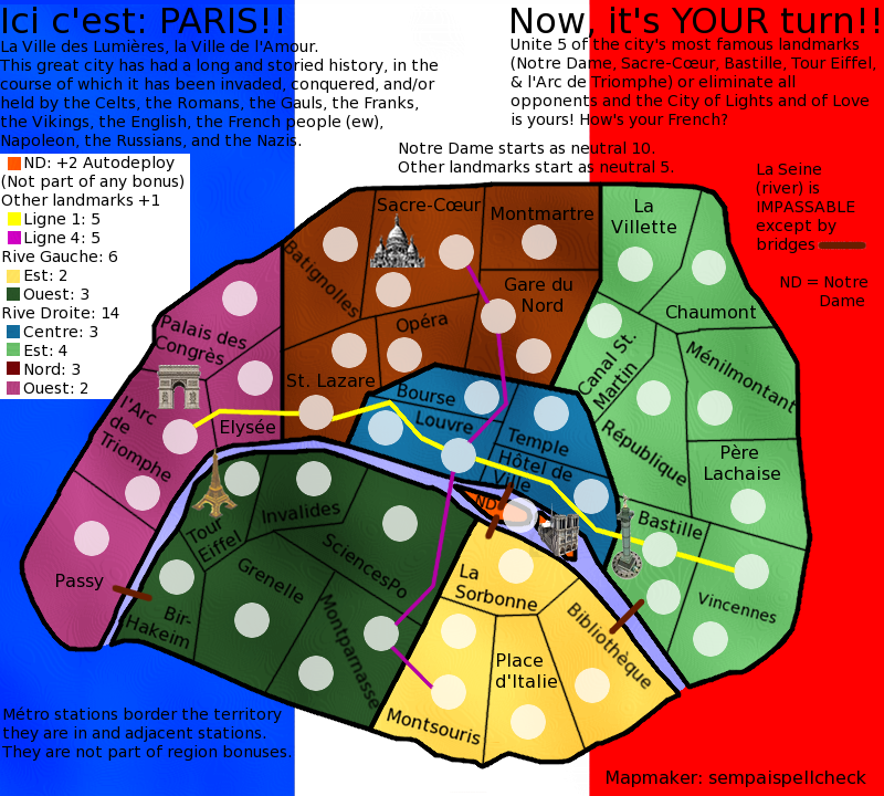
![]() by happy2seeyou on Wed Apr 25, 2012 9:15 pm
by happy2seeyou on Wed Apr 25, 2012 9:15 pm


![]() by sempaispellcheck on Wed Apr 25, 2012 9:21 pm
by sempaispellcheck on Wed Apr 25, 2012 9:21 pm
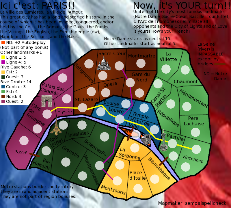
happy2seeyou wrote:the wording on the top is hard to pay attention to.
happy2seeyou wrote:Maybe the flag could be lighter, like the state flags in the "Great Lakes" map (flags are more muted but still seen).
happy2seeyou wrote:Also, maybe fix the legend on the side a lil.
happy2seeyou wrote:Great job so far though
![]() by happy2seeyou on Thu Apr 26, 2012 1:00 pm
by happy2seeyou on Thu Apr 26, 2012 1:00 pm
sempaispellcheck wrote:happy2seeyou wrote:Also, maybe fix the legend on the side a lil.
How? Can you be a bit more specific?
![]() by sempaispellcheck on Thu Apr 26, 2012 1:35 pm
by sempaispellcheck on Thu Apr 26, 2012 1:35 pm
happy2seeyou wrote:ND with the auto bonus doesn't need to be explained that it is not apart of any other bonus.
happy2seeyou wrote:Do you really have to state what places start as a neutral?
![]() by happy2seeyou on Thu Apr 26, 2012 1:47 pm
by happy2seeyou on Thu Apr 26, 2012 1:47 pm
sempaispellcheck wrote:happy2seeyou wrote:ND with the auto bonus doesn't need to be explained that it is not apart of any other bonus.happy2seeyou wrote:Do you really have to state what places start as a neutral?
I did that so that people in the foundry would know, but I guess I can just put that stuff in the first post.
Good suggestions, man. Thank you for those - I should have some fun working on them.
![]() by sempaispellcheck on Sat Apr 28, 2012 10:49 am
by sempaispellcheck on Sat Apr 28, 2012 10:49 am

Return to Melting Pot: Map Ideas
Users browsing this forum: No registered users
|
|||||||
| Conquer Club is not associated with RISK online in any way. Copyright © 2006-2024 by Big Wham LLC | |||||||