Moderator: Cartographers
edbeard wrote:very nice. I love the use of the delta. That really makes the map for me.
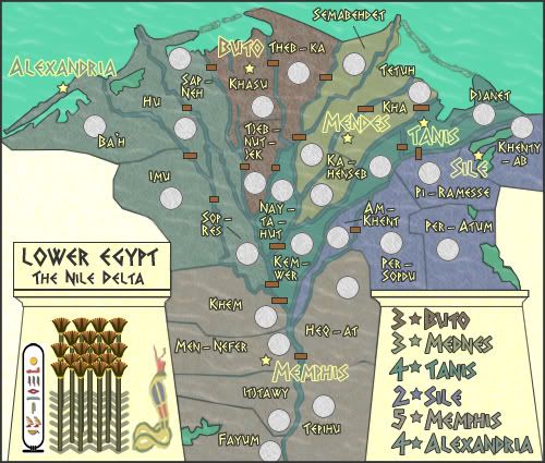
at the moment it is a bit difficult to see where connections are. Well that's not really what I mean. What I mean is that there is so much going on it's a bit difficult to take it all in. Those bridges really jump out at you whilst the rivers are blended to the map. If those bridges could blend a bit more (maybe have the 'cairsnwk style' bridges where the colours of each side spread onto the bridge like on your CCC map)
I'm sure you'll fix this as you go on but a few of the labels and circles could be placed better. Sometimes they're too close together or too close to a river .
I'm guessing you'll put your sig in the blank space above the title? That blank space is too much at the moment. I'm sure you'd fill it but I'll mention it anyway.
The colours are a bit close to each other since they're muted. This makes differentiating them in the legend somewhat difficult.
I think this map will be quite good!
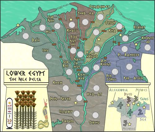
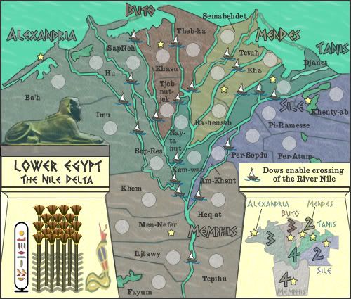
edbeard wrote:well I didn't know there was an update, but the only difference I can see is that you have labeled each of the continents.
honestly I don't like the way you've done it. I really like the colours you have and the dull look that they give. Maybe try doing a mini-map?
Or just doing the text (for continent labels) in a different way. Or, perhaps blend them in somehow.
WidowMakers wrote:If the rivers are borders, they need to be closer to the color of the sea. Currently they are a little hard to see.
Lightening then up would make the bridges stand out more as well.
WM
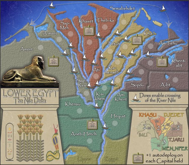
TaCktiX wrote:I think its chief weakness right now is its plainness. There's not even a bonus for holding capitals of multiple regions. It's plain Risk with pastel colors. Perhaps spice it up with a few unique features?
TaCktiX wrote:Another thing is the heavy amount of hyphens higher up the delta. It looks like you've got plenty of space to mess with, so de-hyphenate places that aren't normally hyphenate. The hyphenation makes it look more crowded than the map actually is.
Quite agree.edbeard wrote:I think the font does help
:oops: Oops...blundered there, didn't I?Do you mean for the yellow continent to be separated from itself somewhat? What I mean is that Semabehdet isn't connected to any other Mednes territory.
Bonuses...
Memphis is WAY too high. 5 for two defending territories and only three territories can attack it? Seems like a +3 to me.
Maybe I'm wrong, but I think the only difference between Buto and Tanis is that Tanis has one more continent that can attack it? It has the same number of defensive territories, the same number of territories overall, and the same number of territories that can attack it. I'm not sure if the +3 vs +4 difference makes sense here.
Maybe someone else has a different opinion on that.
You could argue that all the continents are +3 worthy except Sile
Users browsing this forum: No registered users