- Click image to enlarge.
http://www.yachigusaryu.com/blog/pics/p ... adies2.jpg
http://www.cafepress.com/emwfinearts
--Andy
Moderator: Cartographers


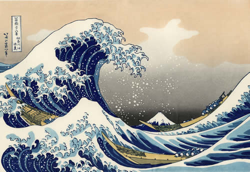
Fantastic idea, and some great art on that site referenced. Red, a lot of those old works of art are domain free. I would certainly suggest that you look into it.AndyDufresne wrote:I think you are onto something. Keep in mind some classical Japanese Art (especially woodblocks---perhaps this map can have the feel/theme?)---the colors, the form, the style---etc.
http://cdn1.ioffer.com/img/item/892/822 ... -Fight.jpg
- Click image to enlarge.
http://www.yachigusaryu.com/blog/pics/p ... adies2.jpg
http://www.cafepress.com/emwfinearts
--Andy


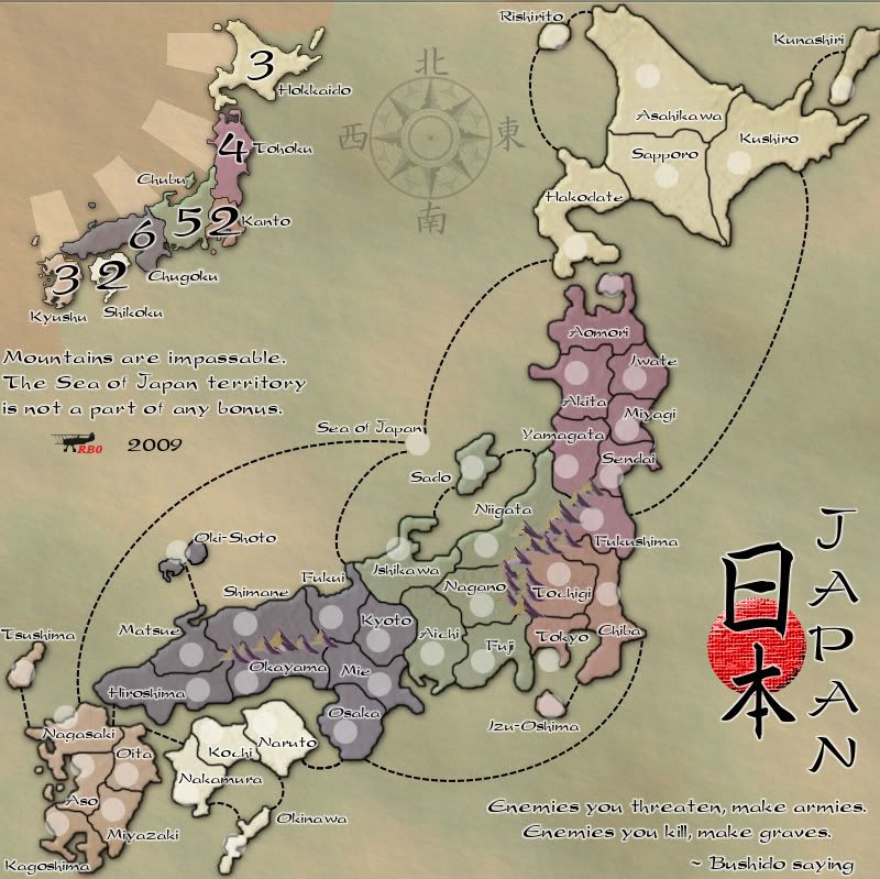
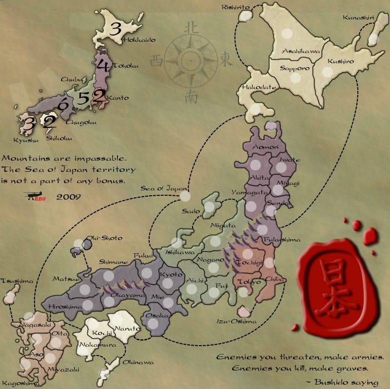
I like it. The mountains need to overlay each other a bit more so there are not gaps in between them, but other than that, it is a very nice style for the map.RedBaron0 wrote:Here's what I've got so far. I know I'm missing a few things still. In particular some sort of color code for the bonuses. I figure I could color the inner edges of the territories, but that might be too much. I could also color along the edge of the the army circles. It is also an option to recolor the land very subtlety. At this point as I think about I've probably drained too much color out of the map and will have to add it back in some way.
- Click image to enlarge.


I think that the colors are beautiful. I would suggest leaving the land as is, and just color the text.natty_dread wrote:You're going to need some more color to distinguish the bonus areas better. Kanto and Chubu are almost indistinguishable, for example.
Allow me to quote the latest image here on the new page:porkenbeans wrote:I think that the colors are beautiful. I would suggest leaving the land as is, and just color the text.natty_dread wrote:You're going to need some more color to distinguish the bonus areas better. Kanto and Chubu are almost indistinguishable, for example.
I tend to agree with natty_dread here, and would further point out that Tohoku and Kanto are quite similar as well, at least when I look at the Fukushima-Chiba border. On the other hand, porkenbeans has a point, in that the nearly monochrome scheme is a nice change from many other maps. But I'm not sure that using coloured text could provide enough distinction without making the text jump off the page. Even if the colours are only a glow behind black text, there are seven zones, and that will pretty much eat up the rainbow, including indigo, which can be a bit of a stretch. Will these colours be clearly different only as a glow? I suppose one could use some white text and some black text, to further distinguish neighbouring regions.RedBaron0 wrote:Here's what I've got so far. I know I'm missing a few things still. In particular some sort of color code for the bonuses. I figure I could color the inner edges of the territories, but that might be too much. I could also color along the edge of the the army circles. It is also an option to recolor the land very subtlety. At this point as I think about I've probably drained too much color out of the map and will have to add it back in some way.
- Click image to enlarge.


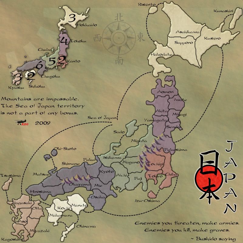
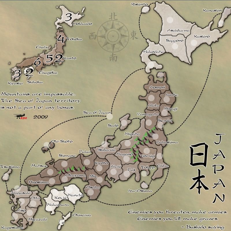
I applaud you for reworking the color scheme of the map; I ensure you it's a huge improvement and will be much better expected.the.killing.44 wrote:You're right, it's definitely oversaturated. You should get rid of the bevel and just have an outer glow. Also, for the text, the white stroke isn't necessary. Much better though.
Nah, there's a precedent of signatures just being uniform across all maps made by a maker. See oaktown: his Marcella script sig is on all his maps, from 1800's India to 1914 Europe to 1961 Berlin, etc. I love it, and think he should keep it.natty_dread wrote:This is a real nitpick... but now that the map looks old, your signature with that biplane really doesn't fit in at all... Could you possibly consider using just your name as a signature?
Well, I guess it's fine then... It's a matter of personal preference, but I like the maps where even the signature is consistent with the theme of the map.the.killing.44 wrote:Nah, there's a precedent of signatures just being uniform across all maps made by a maker. See oaktown: his Marcella script sig is on all his maps, from 1800's India to 1914 Europe to 1961 Berlin, etc. I love it, and think he should keep it.natty_dread wrote:This is a real nitpick... but now that the map looks old, your signature with that biplane really doesn't fit in at all... Could you possibly consider using just your name as a signature?
Yeah I know, I couldn't find a silhouette of a triplane I liked, so I just went with this. Manfred von Richthofen is best known for flying the Fokker Dr1, but did fly other planes during his career.natty_dread wrote:On another note... didn't the Red Baron fly a triplane (namely, Fokker Dr.I)?
I tried that, it looked horrid. That's why there's still a some extending past the mini-map, I wasn't sure where to erase the extensions too.Industrial Helix wrote:Going on Killing's suggestions about the extended sun rays... you could possibly extend them to the opposite corners and make a border out of it.
Hmm. Maybe you could fade it into the main canvas color then... I kind of think you can do it by progressively desaturating it as it passes the mini map.RedBaron0 wrote:[
I tried that, it looked horrid. That's why there's still a some extending past the mini-map, I wasn't sure where to erase the extensions too.Industrial Helix wrote:Going on Killing's suggestions about the extended sun rays... you could possibly extend them to the opposite corners and make a border out of it.
Gradient mask on the layer. Go for it.Industrial Helix wrote:Hmm. Maybe you could fade it into the main canvas color then... I kind of think you can do it by progressively desaturating it as it passes the mini map.RedBaron0 wrote:[
I tried that, it looked horrid. That's why there's still a some extending past the mini-map, I wasn't sure where to erase the extensions too.Industrial Helix wrote:Going on Killing's suggestions about the extended sun rays... you could possibly extend them to the opposite corners and make a border out of it.


