Dukasaur wrote:I like the bright colours. The borders between territories look kind-of primitive, though. I think they could use more complexity, something that suggests the chaotic way borders between neighbourhoods actually evolve.
Glad you like the colors - Paris is (or, at least, can be) a colorful city, and I want the map to reflect that. What you say about the territory borders makes a lot of sense. I'll play with them a bit and see what happens - I'll probably try for something more in line with the "accepted" borders first and see how that comes out.
High score: 2200 - July 20, 2015 Game 13890915 - in which I helped clinch the NC4 title for LHDD
Dukasaur wrote:I like the bright colours. The borders between territories look kind-of primitive, though. I think they could use more complexity, something that suggests the chaotic way borders between neighbourhoods actually evolve.
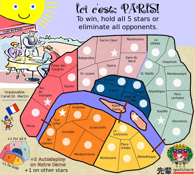
sampai...these are just ideas to muck around with in your head. I have to agree with Dukasaur...i think you've got a theme going there with the colours and the bottom left image being the same colours...bright but yes they work. Yes the borders need work...what is happening on border near Gard du Nord...it's blue and not black...deliberate?
if you're going to use the Paris shield, see of you can get a better version and not so big...its very washed out and pixelly because it's been up-sized.
Perhaps a different softer background for the terts...pencil stroke if OK, but its very all the same way if you get what i mean.
See the bottom fringe around the cafe awning. See if you can create something like that to sit all legend stuff in...it would work in with that picture element.
i think this is the best you've produced so far. and it's heading in a better direction now.
* Pearl Harbour * Waterloo * Forbidden City * Jamaica * Pot Mosbi
cairnswk wrote:I have to agree with Dukasaur...i think you've got a theme going there with the colours and the bottom left image being the same colours...bright but yes they work.
Glad to hear it - that makes my life a little easier.
cairnswk wrote:Yes the borders need work...what is happening on border near Gard du Nord...it's blue and not black...deliberate?
Yes - that's the Canal St. Martin - an impassable.
cairnswk wrote:if you're going to use the Paris shield, see of you can get a better version and not so big...its very washed out and pixelly because it's been up-sized.
OK. I'll see what I can dig up.
cairnswk wrote:Perhaps a different softer background for the terts...pencil stroke if OK, but its very all the same way if you get what i mean.
I'm not sure I do. Can you explain a little more? (I apologize if I seem stupid, but...I guess I kind of am, as far as this sort of thing is concerned).
cairnswk wrote:See the bottom fringe around the cafe awning. See if you can create something like that to sit all legend stuff in...it would work in with that picture element.
You mean for the minimap - as opposed to just having it against the background? OK, I can work with that.
cairnswk wrote:i think this is the best you've produced so far. and it's heading in a better direction now.
Thank you! That's what I thought when I looked at it, and I'm very glad you agree.
High score: 2200 - July 20, 2015 Game 13890915 - in which I helped clinch the NC4 title for LHDD
sempaispellcheck...a suggestion present for you to jog your mind to re-arrange the elements... notice also the treatment i gave the fill on the territories...it just lessens the intensity of the strokes which are still there but not so pronounced
* Pearl Harbour * Waterloo * Forbidden City * Jamaica * Pot Mosbi
Thanks for the suggestions, cairns! Not sure that's exactly what I want, but a lot of good ideas and a lot for me to play with. For example, I do think lessening the texture is good, but I don't think I want to lessen it quite that much. I'll play around with it and see what I see. I'm going away for 2 weeks, and I won't be able to work on it while I'm gone, but I'll get cracking on Version 10 once I get back.
Thanks again! sempai
High score: 2200 - July 20, 2015 Game 13890915 - in which I helped clinch the NC4 title for LHDD
Moved to ideas as an update has not been made in a month. If the map maker wishes to continue with this, he can by making an update and contacting one of the cartographers.
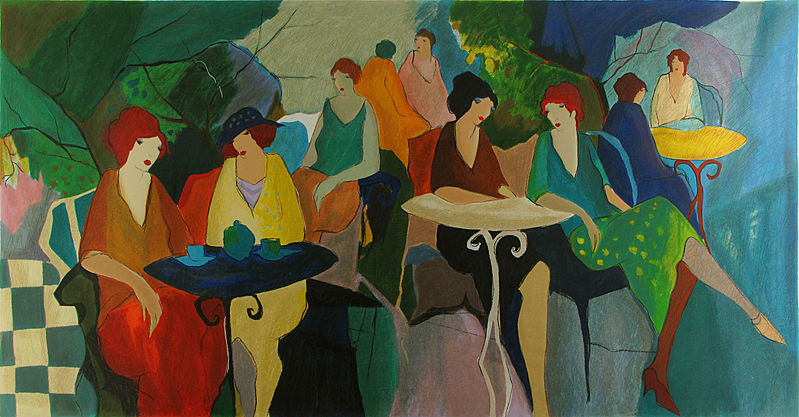
honestly, I agree with generalhead's opinion. Paris is a city with so many monuments, you could do a lot more with it. And I'm not exactly fond of the cartoony look:
I'd prefer if you split the two islands into 2 different territories. In fact I'd prefer if you split a whole lot of the territories, so you can show paris in a lot more detail.
Fix the sun, the way it looks now is a bit oddlooking. Also the fact that it's charp and the pictures infront of it aren't, makes 'm not fit together so well
maybe add some pictures off the several of these monuments, either on the side or place some pictograms of 'm on the map.
redo the bridges, these are just lines. Maybe you can even make 'm a territory. Le pont neuf for example is a marvelous piece of architecture. The same goes for some of the Boulevards. Les champs Élysées are world famous, so it seems like such a pity not to have 'm on a map of Paris.
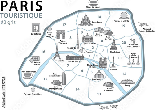
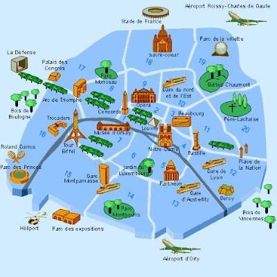
overall, it just seems like so much usage of space, but barely any info or territories in it. I'd prefer if you made the map a bit more like these:
I like the orange map that waauw suggested - I think that is a good starting map... Could have 4 areas, The Top right of the River, The Bottom Left of the River and as a separate area (not included in those other two) could be all the parks and last one is all the sites - From La Defense to Norte Dame to the Zoo..
On the orange map there is I think: 11 parks 19 sites split the bottom section into 6 additional spaces as it's own area and the top into 15 regions ...
For a Total of 52 regions
Just a suggestion - and if you want - I know it's a complete re-work of what you got... But I agree with waauw that the map needs work
Aleena wrote:I agree with waauw that the map needs work
I agree with both of you, but I do not have the time to put in the work. I also don't think I have enough ability to make it work.
As much as it pains me to admit this, I am not the man to bring this map to CC. If anyone is interested in toying with what I was working on, drop my a PM and I will be more than happy to send you my Gimp (.xcf) files.
I would like to thank all of you who have posted in this thread for your feedback and/or encouragement. "Tis better to have tried and failed than never to have tried at all."
sempai
High score: 2200 - July 20, 2015 Game 13890915 - in which I helped clinch the NC4 title for LHDD
don't give up so easily - we have faith in ya ... I'm not any good and map building and in time with support of the other players that have helped me turn my piece of Sh!* into a piece of Junk - but see - it's getting better - it just takes time and continual adjustments...
Which I don't have. That's the main reason I'm "giving up" - I just don't have the time to do the work that needs to be done for this to be a good map.
sempai
High score: 2200 - July 20, 2015 Game 13890915 - in which I helped clinch the NC4 title for LHDD
I see your in about 18 different games right now - finish them off and don't start new ones - then that should free up a lot of your time to work on this idea - I'd love to see you finish this...
Game play, this does look pretty solid and I would not touch it till you get to that stage, but do remove the canal. We can put it back in later.
Graphics. Here is the killer. After a year, have you been practising much? Or did this sit on the back burner over the winter and only spent a few hours on it. Not much has changed since last summer when you had this out and about then.
What really kills this map is the background. Images in the background are all out of focus. When you copy/paste art over, you cannot scale it so much. Either find one that fits or draw it yourself. The title, boring. Black text, no matter how good the font is is just bloody awful. Jazz it up.
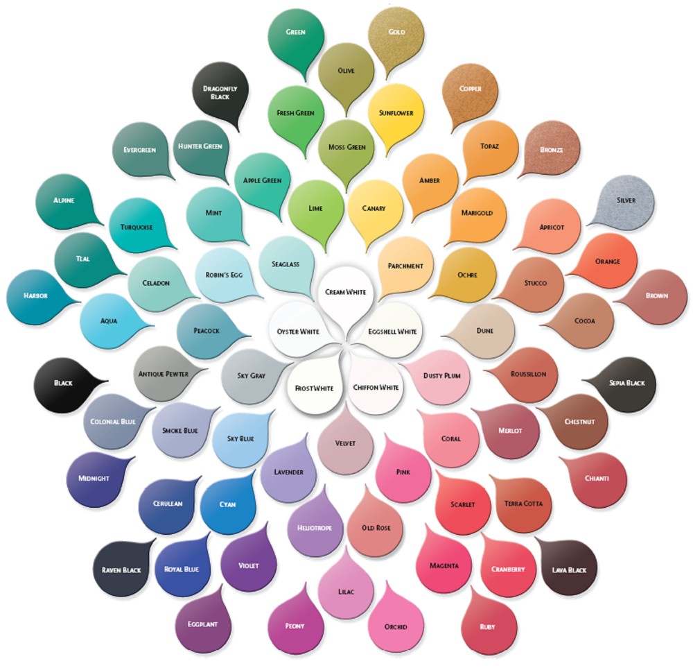
Your legend is squeezed into all available spaces around the map. This forces everyone to go looking for it. Legend items need to go together. Same font, same size. And should not really be larger than the region fonts. Colours, here is a palette chart. This is for the map and background. When you do the colours for the background, find a colour a little darker or lighter so the map stands out.
Aleena wrote:I see your in about 18 different games right now - finish them off and don't start new ones - then that should free up a lot of your time to work on this idea - I'd love to see you finish this...
Sorry, Aleena, but that's not going to happen. First of all, I joined this site to play, and that is still the number 1 reason I'm here. Second of all, that's not why I don't have time - I have just started a full-time job, and I have a 2-hour commute each way. That doesn't leave much time for the kind of learning I will have to do in order to be able to make a map worthy of CC.
koontz1973 wrote:Graphics. Here is the killer. After a year, have you been practising much? Or did this sit on the back burner over the winter and only spent a few hours on it. Not much has changed since last summer when you had this out and about then.
No, I haven't, because I haven't had the time, and I won't have the time, and it's not worth it for me anymore.
I PM'ed everyone who's posted in this thread because I'm hoping that one of you would be willing to take this over and make a decent map of it (or knows someone who would).
sempai
High score: 2200 - July 20, 2015 Game 13890915 - in which I helped clinch the NC4 title for LHDD
sempai, do not give up. Time is the killer with maps. Remember, it took me 9 months, working on average of 2 hours a day to get Rorke's Drift. What I learnt on that one, I took over to the next. It gets easier, but leaving it means you forget some things. Just play with it.
koontz1973 wrote:9 months, working on average of 2 hours a day
Then you should understand why I'm passing this on to someone else. As busy as I am, I'd be lucky to have 2 hours a month to work on this. I'll happily do the XML for the map - that I can do easily, and well. But the graphics are not my forte, and I simply do not have the time to mess around with them.
sempai
High score: 2200 - July 20, 2015 Game 13890915 - in which I helped clinch the NC4 title for LHDD