wcaclimbing wrote:Kaplowitz, to fix the colorblind problem, take a copy of your map and completely desaturate the color.
so the map image is greyscale, no colors.
Then try and tell what continent is what.
Whatever it takes to tell them apart, test it in greyscale mode.
So then even without the colors, you would still know what goes where.
Making the borders between the continents extra bold would help. then you could see that they were different, even without the colors.
Well Ruben said it was okay, but ill take a look anyway. Thx for the advice!
oh, and the minimap colors are wrong again.... switch the grey and purple.....
ugh, yea ill fix that!
[Abandoned] - Switzerland
Moderator: Cartographers
Re: Switzerland v14--May 2--PAGE 1+8
![]() by Kaplowitz on Sat May 03, 2008 9:15 am
by Kaplowitz on Sat May 03, 2008 9:15 am

-

 Kaplowitz
- Posts: 3088
- Joined: Tue May 01, 2007 5:11 pm


Re: Switzerland v14--May 2--PAGE 1+8
![]() by pamoa on Sat May 03, 2008 11:05 am
by pamoa on Sat May 03, 2008 11:05 am
I really like the snowy cap on top of mointains just add more of it. If you want to put more "decoration" mountains you can partially cover all the Graubünden borders (south east "continent") and also the Ticino Graubünden one. Just leave a pass between the territories. And by the way watch out the Glarus Uri border wich start to be a bit short.
Im not really sure what you mean. Add more mts that dont interfere with the gameplay?
I just ment some decoration, if you thought that people who were asking for more mountains were right, it was a way to do it without changing the gameplay, only an hypothetical possibility
De gueules à la tour d'argent ouverte, crénelée de trois pièces, sommée d'un donjon ajouré, crénelé de deux pièces
Gules an open tower silver, crenellated three parts, topped by a apertured turret, crenellated two parts
Gules an open tower silver, crenellated three parts, topped by a apertured turret, crenellated two parts
-

pamoa
- Posts: 1242
- Joined: Sat Sep 01, 2007 3:18 am
- Location: Confederatio Helvetica


Re: Switzerland v14--May 2--PAGE 1+8
![]() by Kaplowitz on Sun May 04, 2008 12:56 pm
by Kaplowitz on Sun May 04, 2008 12:56 pm
v15
-New Text
-New text glow
-Smudge on mts for blending
-Fixed minimap
-Removed impassable box
-Thicker border around continents
Are these good?
what did i miss?
what's new?
- Click image to enlarge.

-New Text
-New text glow
-Smudge on mts for blending
-Fixed minimap
-Removed impassable box
-Thicker border around continents
Are these good?
what did i miss?
what's new?
-
Kaplowitz
- Posts: 3088
- Joined: Tue May 01, 2007 5:11 pm
Re: Switzerland v15--May 4--PAGE 1+9
![]() by ZeakCytho on Sun May 04, 2008 1:39 pm
by ZeakCytho on Sun May 04, 2008 1:39 pm
I don't like the thicker continent border very much, but if others need it to distinguish continents from each other, I could live with it.
The mountain fade looks better, but they still need snowcaps.
The new font is awesome! So much more legible. You could make certain things more legible by moving a few words around. For example, I'd move Neuchatel entirely onto the territory (I think you can fit it), and move Lausanne entirely onto the background. I'd also flip the placements of the Solo-Thurn text and its army circle. The borders of that territory are kind of hard to make out.
-

ZeakCytho
- Posts: 1251
- Joined: Wed Sep 12, 2007 4:36 pm


Re: Switzerland v15--May 4--PAGE 1+9
![]() by wcaclimbing on Sun May 04, 2008 1:45 pm
by wcaclimbing on Sun May 04, 2008 1:45 pm
ZeakCytho wrote:I don't like the thicker continent border very much, but if others need it to distinguish continents from each other, I could live with it.
The mountain fade looks better, but they still need snowcaps.
The new font is awesome! So much more legible. You could make certain things more legible by moving a few words around. For example, I'd move Neuchatel entirely onto the territory (I think you can fit it), and move Lausanne entirely onto the background. I'd also flip the placements of the Solo-Thurn text and its army circle. The borders of that territory are kind of hard to make out.
^ i agree with all of that ^
The continent divisions are TOO thick now. could you try something between that size and the regular size? just a bit thinner.

-

wcaclimbing
- Posts: 5598
- Joined: Fri May 12, 2006 10:09 pm
- Location: In your quantum box....Maybe.


New fonts
![]() by pamoa on Sun May 04, 2008 2:40 pm
by pamoa on Sun May 04, 2008 2:40 pm
I'm not found of your new texts, maybe more legible but plain and boring from my point of view. 
And as wcaclimbing said I think you go too far in the legible way loosing all sensitive matter.
And as wcaclimbing said I think you go too far in the legible way loosing all sensitive matter.
De gueules à la tour d'argent ouverte, crénelée de trois pièces, sommée d'un donjon ajouré, crénelé de deux pièces
Gules an open tower silver, crenellated three parts, topped by a apertured turret, crenellated two parts
Gules an open tower silver, crenellated three parts, topped by a apertured turret, crenellated two parts
-
pamoa
- Posts: 1242
- Joined: Sat Sep 01, 2007 3:18 am
- Location: Confederatio Helvetica
Re: Switzerland v15--May 4--PAGE 1+9
![]() by tubaman on Sun May 04, 2008 3:04 pm
by tubaman on Sun May 04, 2008 3:04 pm
I think you should either add some territories or take some away. It's too small to be an average sized map and it's too big to be a small map. I dunno it kinda bothers me, maybe no one else cares.

-

tubaman
- Posts: 145
- Joined: Sun May 27, 2007 12:13 am
- Location: Philly


Re: Switzerland v15--May 4--PAGE 1+9
![]() by Kaplowitz on Sun May 04, 2008 3:07 pm
by Kaplowitz on Sun May 04, 2008 3:07 pm
tubaman wrote:I think you should either add some territories or take some away. It's too small to be an average sized map and it's too big to be a small map. I dunno it kinda bothers me, maybe no one else cares.
Then it can be a smallish-average sized map
pamoa wrote:I'm not found of your new texts, maybe more legible but plain and boring from my point of view.
And as wcaclimbing said I think you go too far in the legible way loosing all sensitive matter.
I can put up some options. Honestly, this was the easiest to read, but its okay to look at others.
wcaclimbing wrote:ZeakCytho wrote:I don't like the thicker continent border very much, but if others need it to distinguish continents from each other, I could live with it.
The mountain fade looks better, but they still need snowcaps.
The new font is awesome! So much more legible. You could make certain things more legible by moving a few words around. For example, I'd move Neuchatel entirely onto the territory (I think you can fit it), and move Lausanne entirely onto the background. I'd also flip the placements of the Solo-Thurn text and its army circle. The borders of that territory are kind of hard to make out.
^ i agree with all of that ^
The continent divisions are TOO thick now. could you try something between that size and the regular size? just a bit thinner.
Ill make them thinner. All i did was add a stroke to it. ACtually im also going to see if lowering the opacity of the stroke looks nice also.
ZeakCytho wrote:I don't like the thicker continent border very much, but if others need it to distinguish continents from each other, I could live with it.
The mountain fade looks better, but they still need snowcaps.
The new font is awesome! So much more legible. You could make certain things more legible by moving a few words around. For example, I'd move Neuchatel entirely onto the territory (I think you can fit it), and move Lausanne entirely onto the background. I'd also flip the placements of the Solo-Thurn text and its army circle. The borders of that territory are kind of hard to make out.
Snow caps will be added. Text will be moved.
-
Kaplowitz
- Posts: 3088
- Joined: Tue May 01, 2007 5:11 pm
Re: Switzerland v15--May 4--PAGE 1+9
![]() by edbeard on Sun May 04, 2008 4:21 pm
by edbeard on Sun May 04, 2008 4:21 pm
I question the decision to put rivers where there are not rivers.
It makes me wonder about your other decisions with regards to where you put mountains and where you came up with your continent boundaries (and maybe territory boundaries too but I always feel that is where alterations can be made more freely).
I didn't see any of this explained in the thread so maybe you can tell us.
there is no river where you've put it. there's actually a major road there
-

edbeard
- Posts: 2501
- Joined: Thu Mar 29, 2007 12:41 am


Re: Switzerland v15--May 4--PAGE 1+9
![]() by Kaplowitz on Sun May 04, 2008 5:23 pm
by Kaplowitz on Sun May 04, 2008 5:23 pm
edbeard wrote:I question the decision to put rivers where there are not rivers.
It makes me wonder about your other decisions with regards to where you put mountains and where you came up with your continent boundaries (and maybe territory boundaries too but I always feel that is where alterations can be made more freely).
I didn't see any of this explained in the thread so maybe you can tell us.
there is no river where you've put it. there's actually a major road there
edbeard, couldnt you yell at me about this earlier?!
RIVERS:
- Click image to enlarge.

Its hard to tell, but the blue lines are Rivers, the black are territories.
MOUNTAINS:
I couldnt really find any good maps, but pamoa (who lives in Switzerland) said to put them there
- Click image to enlarge.

Thats the best image i can find.
CONTINENTS:
The blue one is the only one that is realistic. Other than that i just went with Central, Northeast, ect. Any suggestions?
-
Kaplowitz
- Posts: 3088
- Joined: Tue May 01, 2007 5:11 pm
Re: Switzerland v15--May 4--PAGE 1+9
![]() by edbeard on Sun May 04, 2008 6:02 pm
by edbeard on Sun May 04, 2008 6:02 pm
I'm not sure what makes you think I'm yelling. It's just feedback. No need to take it personal.
Why didn't I mention it earlier? Well I assumed you were putting things in places based on reality. When I saw that you changed from mountains to a river that made me wonder what was happening.
I think with geographical maps, you should attempt to make things how they are in reality.
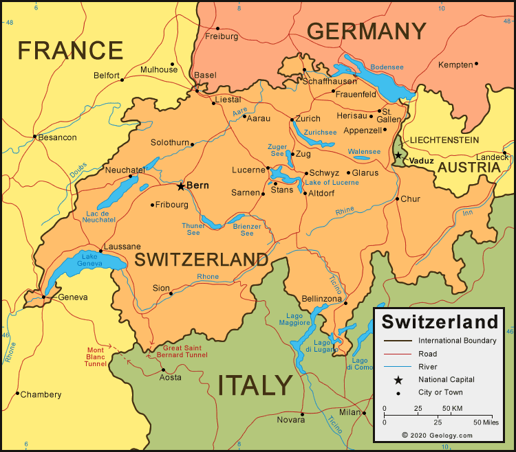
here's a map showing the 26 cantons of switzerland
obviously the way it's split up is not conducive to making a CC map, but you can use that for a starting point. Some of the areas are too small and some are too big. I don't think that combining areas and splitting up others (calling them north/south/east/west of that canton) is that much of a stretch when you're making a map. Especially if you're using the actual borders.
One interesting way you could split up continents is by language
The german area is obviously too huge so maybe split that up into north west east or something. Note that to do it you'd probably need some territories to be part of two continents. Just an idea though.
here's a geographical map I found

that tells you generally where the mountain ranges are. you can probably use google earth to see more specifics.
http://www.embassyworld.com/maps/Maps_Of_Switzerland.html is what I've used to find most of these maps.
Just read through the wikipedia entry on switzerland (or any encyclopedia) and read about the geography, history, and political divisions.
If you don't base your map on reality then you're going to get people complaining about how your map doesn't represent their country properly. It's better to at least look through the options now and talk about it while you're in the early stages rather than ignore it and have a map that swiss people will complain about.
Why didn't I mention it earlier? Well I assumed you were putting things in places based on reality. When I saw that you changed from mountains to a river that made me wonder what was happening.
I think with geographical maps, you should attempt to make things how they are in reality.
here's a map showing the 26 cantons of switzerland
- Click image to enlarge.

obviously the way it's split up is not conducive to making a CC map, but you can use that for a starting point. Some of the areas are too small and some are too big. I don't think that combining areas and splitting up others (calling them north/south/east/west of that canton) is that much of a stretch when you're making a map. Especially if you're using the actual borders.
One interesting way you could split up continents is by language
- Click image to enlarge.

The german area is obviously too huge so maybe split that up into north west east or something. Note that to do it you'd probably need some territories to be part of two continents. Just an idea though.
here's a geographical map I found
that tells you generally where the mountain ranges are. you can probably use google earth to see more specifics.
http://www.embassyworld.com/maps/Maps_Of_Switzerland.html is what I've used to find most of these maps.
Just read through the wikipedia entry on switzerland (or any encyclopedia) and read about the geography, history, and political divisions.
If you don't base your map on reality then you're going to get people complaining about how your map doesn't represent their country properly. It's better to at least look through the options now and talk about it while you're in the early stages rather than ignore it and have a map that swiss people will complain about.
Last edited by edbeard on Sun May 04, 2008 6:22 pm, edited 1 time in total.
-
edbeard
- Posts: 2501
- Joined: Thu Mar 29, 2007 12:41 am
Re: Switzerland v15--May 4--PAGE 1+9
![]() by Kaplowitz on Sun May 04, 2008 6:21 pm
by Kaplowitz on Sun May 04, 2008 6:21 pm
I didnt take it personally at all, it was just an expression i guess
Yes, the current territories are the 26 cantons, with cities to split it up.
Honestly, the above post seems to support the map at its current stage, the bottom map shows that the rivers and mts are basically right, and
Is exactly what i have right now.
I understand that, and i want this map to be as factual as possible, but all of your suggestions besides the Language Continents, are already in the map.
Yes, the current territories are the 26 cantons, with cities to split it up.
Honestly, the above post seems to support the map at its current stage, the bottom map shows that the rivers and mts are basically right, and
obviously the way it's split up is not conducive to making a CC map, but you can use that for a starting point. Some of the areas are too small and some are too big. I don't think that combining areas and splitting up others (calling them north/south/east/west of that canton) is that much of a stretch when you're making a map. Especially if you're using the actual borders.
Is exactly what i have right now.
If you don't base your map on reality then you're going to get people complaining about how your map doesn't represent their country properly. It's better to at least look through the options now and talk about it while you're in the early stages rather than ignore it and have a map that swiss people will complain about.
I understand that, and i want this map to be as factual as possible, but all of your suggestions besides the Language Continents, are already in the map.
-
Kaplowitz
- Posts: 3088
- Joined: Tue May 01, 2007 5:11 pm
Re: Switzerland v15--May 4--PAGE 1+9
![]() by edbeard on Sun May 04, 2008 6:23 pm
by edbeard on Sun May 04, 2008 6:23 pm
I disagree. do as you please
-
edbeard
- Posts: 2501
- Joined: Thu Mar 29, 2007 12:41 am
Re: Switzerland v15--May 4--PAGE 1+9
![]() by pamoa on Sun May 04, 2008 7:02 pm
by pamoa on Sun May 04, 2008 7:02 pm
edbeard wrote:If you don't base your map on reality then you're going to get people complaining about how your map doesn't represent their country properly. It's better to at least look through the options now and talk about it while you're in the early stages rather than ignore it and have a map that swiss people will complain about.
Well as a swiss I checked this map and helped Kaplowitz to improve it. What I can tell you is that it is pretty accurate for a CC map counting on the playability of the game. The rivers are existing and are quite important and not so easily crossable! Except that part between Bern and Fribourg which don't really exist.
Kaplowitz, you should remove it and put it between Bienne and Fribourg and you may extend it between Neuchâtel and Fribourg as their is a lake there!
Go on, continue like this
De gueules à la tour d'argent ouverte, crénelée de trois pièces, sommée d'un donjon ajouré, crénelé de deux pièces
Gules an open tower silver, crenellated three parts, topped by a apertured turret, crenellated two parts
Gules an open tower silver, crenellated three parts, topped by a apertured turret, crenellated two parts
-
pamoa
- Posts: 1242
- Joined: Sat Sep 01, 2007 3:18 am
- Location: Confederatio Helvetica
Re: Switzerland v15--May 4--PAGE 1+9
![]() by Kaplowitz on Tue May 06, 2008 6:28 pm
by Kaplowitz on Tue May 06, 2008 6:28 pm
Current Large map:
Possible Small map:

-Changed river
-Added lake
-snow caps (good?)
-made slighter smaller borders around continents
-Moved some text + army circles
Pamoa didnt like the new font, so here is another.
Its not as legible, but it looks pretty cool. Im not sure if it will be good on a small map.
What did i miss?
What's next?
What can i do to make this more realistic?
Are the updates good?
Which font do you like better?
- Click image to enlarge.

Possible Small map:
-Changed river
-Added lake
-snow caps (good?)
-made slighter smaller borders around continents
-Moved some text + army circles
Pamoa didnt like the new font, so here is another.
Its not as legible, but it looks pretty cool. Im not sure if it will be good on a small map.
- Click image to enlarge.

What did i miss?
What's next?
What can i do to make this more realistic?
Are the updates good?
Which font do you like better?
-
Kaplowitz
- Posts: 3088
- Joined: Tue May 01, 2007 5:11 pm
Re: Switzerland v16--May 6--PAGE 1+10
![]() by ZeakCytho on Tue May 06, 2008 6:39 pm
by ZeakCytho on Tue May 06, 2008 6:39 pm
I don't like the font in the last map you posted.
The snowcaps are good, though I feel they could be made larger. Right now they're just a thin line across the top ridge; you could make them come down the slopes a tiny bit.
The thinner continent borders are better, but they're rather pixely.
Fribourg can't attack any of the other territories in its continent, so I'd either add a bridge or make it a different continent. I hate non-contiguous continents!

I still think the border around the entirety of Switzerland looks a bit funny, especially with the changing colors as it passes through each continent.
I'd move the army circle on Thurgau away from the border a bit. Same with Appenzell, if you can. Move the Schaffhausen circle either entirely onto the territory or entirely off. This half-on, half-off thing that it has right now looks weird.
I'd move the text of the territory Sankt Gallen further northwest, so there's no confusion as to which territory the Appenzell circle belongs to.
The snowcaps are good, though I feel they could be made larger. Right now they're just a thin line across the top ridge; you could make them come down the slopes a tiny bit.
The thinner continent borders are better, but they're rather pixely.
Fribourg can't attack any of the other territories in its continent, so I'd either add a bridge or make it a different continent. I hate non-contiguous continents!
I still think the border around the entirety of Switzerland looks a bit funny, especially with the changing colors as it passes through each continent.
I'd move the army circle on Thurgau away from the border a bit. Same with Appenzell, if you can. Move the Schaffhausen circle either entirely onto the territory or entirely off. This half-on, half-off thing that it has right now looks weird.
I'd move the text of the territory Sankt Gallen further northwest, so there's no confusion as to which territory the Appenzell circle belongs to.
-
ZeakCytho
- Posts: 1251
- Joined: Wed Sep 12, 2007 4:36 pm
Re: Switzerland v16--May 6--PAGE 1+10
![]() by Kaplowitz on Tue May 06, 2008 6:50 pm
by Kaplowitz on Tue May 06, 2008 6:50 pm
ZeakCytho wrote:I don't like the font in the last map you posted.
The snowcaps are good, though I feel they could be made larger. Right now they're just a thin line across the top ridge; you could make them come down the slopes a tiny bit.
Ill make them bigger
The thinner continent borders are better, but they're rather pixely.
Ill work on that
Fribourg can't attack any of the other territories in its continent, so I'd either add a bridge or make it a different continent. I hate non-contiguous continents!
Woops! ill add a bridge
I still think the border around the entirety of Switzerland looks a bit funny, especially with the changing colors as it passes through each continent.
If anyone else doesnt like it, ill change it. Or ill post both next update.
I'd move the army circle on Thurgau away from the border a bit. Same with Appenzell, if you can. Move the Schaffhausen circle either entirely onto the territory or entirely off. This half-on, half-off thing that it has right now looks weird.
Sure.
I'd move the text of the territory Sankt Gallen further northwest, so there's no confusion as to which territory the Appenzell circle belongs to.
Okay
-
Kaplowitz
- Posts: 3088
- Joined: Tue May 01, 2007 5:11 pm
Graphics
![]() by pamoa on Wed May 07, 2008 2:33 am
by pamoa on Wed May 07, 2008 2:33 am
I do prefer the last font you showed. Ithink it's part of the map feeling having special font. Some can say just put an Helvetica wich also could be very appropriate as invented by a swiss. But all your graphic theme is more like 1900 and the straight sans serif font is a bit odd for me. But I repeat it's only my point of view.
For the snow caps i thought you would repeat the "symbol" you made to make something like a dotted line of white point along the top of the mountains... rather than drawing a white border!
Genève text should be moved outside the border.
Your small map miss the Zug army circle.
For the snow caps i thought you would repeat the "symbol" you made to make something like a dotted line of white point along the top of the mountains... rather than drawing a white border!
Genève text should be moved outside the border.
Your small map miss the Zug army circle.
De gueules à la tour d'argent ouverte, crénelée de trois pièces, sommée d'un donjon ajouré, crénelé de deux pièces
Gules an open tower silver, crenellated three parts, topped by a apertured turret, crenellated two parts
Gules an open tower silver, crenellated three parts, topped by a apertured turret, crenellated two parts
-
pamoa
- Posts: 1242
- Joined: Sat Sep 01, 2007 3:18 am
- Location: Confederatio Helvetica
Re: Switzerland v16--May 6--PAGE 1+10
![]() by Ruben Cassar on Wed May 07, 2008 9:07 am
by Ruben Cassar on Wed May 07, 2008 9:07 am
The previous font was more legible than the one used in the last map. I prefer the previous one.
I don't like canton Ticino being part of a French speaking region. Why don't you split Ticino in parts and create a separate 3 territory region for that canton. Places like Bellinzona, Lugano, Locarno or Chiasso could be used to divide canton Ticino. Check a map of the canton Ticino to guide you.
I don't like canton Ticino being part of a French speaking region. Why don't you split Ticino in parts and create a separate 3 territory region for that canton. Places like Bellinzona, Lugano, Locarno or Chiasso could be used to divide canton Ticino. Check a map of the canton Ticino to guide you.


-

Ruben Cassar
- Posts: 2160
- Joined: Thu Nov 16, 2006 6:04 am
- Location: Civitas Invicta, Melita, Evropa


Re: Switzerland v16--May 6--PAGE 1+10
![]() by bryguy on Wed May 07, 2008 2:38 pm
by bryguy on Wed May 07, 2008 2:38 pm
I like the new colors, they look nice 
1) Like other people have mentioned, i dont care for the new font
2) The think that annoys me most in a map is when they leave the territory lines in the smaller area for bonuses, plz remove them from that
3) The snow cap is a nice touch on the ticino mountain
All i can see right now, keep up the good work
-
bryguy
- Posts: 4381
- Joined: Tue Aug 07, 2007 8:50 am
- Location: Lost in a Jigsaw


Re: Graphics
![]() by Kaplowitz on Wed May 07, 2008 5:04 pm
by Kaplowitz on Wed May 07, 2008 5:04 pm
pamoa wrote:I do prefer the last font you showed. Ithink it's part of the map feeling having special font. Some can say just put an Helvetica wich also could be very appropriate as invented by a swiss. But all your graphic theme is more like 1900 and the straight sans serif font is a bit odd for me. But I repeat it's only my point of view.
Im going to put up a poll
For the snow caps i thought you would repeat the "symbol" you made to make something like a dotted line of white point along the top of the mountains... rather than drawing a white border!
Sure
Genève text should be moved outside the border.
Okay
Your small map miss the Zug army circle.
woops!
-
Kaplowitz
- Posts: 3088
- Joined: Tue May 01, 2007 5:11 pm
Re: Switzerland v16--May 6--PAGE 1+10
![]() by Kaplowitz on Wed May 07, 2008 5:04 pm
by Kaplowitz on Wed May 07, 2008 5:04 pm
Ruben Cassar wrote:The previous font was more legible than the one used in the last map. I prefer the previous one.
Im going to make a poll
I don't like canton Ticino being part of a French speaking region. Why don't you split Ticino in parts and create a separate 3 territory region for that canton. Places like Bellinzona, Lugano, Locarno or Chiasso could be used to divide canton Ticino. Check a map of the canton Ticino to guide you.
And make it a continent?
-
Kaplowitz
- Posts: 3088
- Joined: Tue May 01, 2007 5:11 pm
Re: Switzerland v16--May 6--PAGE 1+10
![]() by Kaplowitz on Wed May 07, 2008 5:06 pm
by Kaplowitz on Wed May 07, 2008 5:06 pm
bryguy wrote:I like the new colors, they look nice
1) Like other people have mentioned, i dont care for the new font Read above ^^^
2) The think that annoys me most in a map is when they leave the territory lines in the smaller area for bonuses, plz remove them from that That was to help the colorblind people, Ruben was having a little trouble distinguishing continents. Unless multiple people really want it changed, i really think they should stay.
3) The snow cap is a nice touch on the ticino mountain Thank you
All i can see right now, keep up the good work
-
Kaplowitz
- Posts: 3088
- Joined: Tue May 01, 2007 5:11 pm
Re: Switzerland v16--May 6--PAGE 1+10
![]() by Ruben Cassar on Wed May 07, 2008 5:13 pm
by Ruben Cassar on Wed May 07, 2008 5:13 pm
Kaplowitz wrote:Ruben Cassar wrote:The previous font was more legible than the one used in the last map. I prefer the previous one.
Im going to make a poll
I don't like canton Ticino being part of a French speaking region. Why don't you split Ticino in parts and create a separate 3 territory region for that canton. Places like Bellinzona, Lugano, Locarno or Chiasso could be used to divide canton Ticino. Check a map of the canton Ticino to guide you.
And make it a continent?
Yes make it a "continent". It's the Italian speaking part of Switzerland - Canton Ticino. You have enough space to make at least a 3 territory region (continent).
-
Ruben Cassar
- Posts: 2160
- Joined: Thu Nov 16, 2006 6:04 am
- Location: Civitas Invicta, Melita, Evropa
Re: Switzerland v16--May 6--PAGE 1+10
![]() by ZeakCytho on Wed May 07, 2008 5:16 pm
by ZeakCytho on Wed May 07, 2008 5:16 pm
Minor thing: the minimap doesn't have the white border around continents. Maybe it should be added in? Then again, if people (Ruben) can see the borders on the minimap fine, maybe it would look better without it?
-
ZeakCytho
- Posts: 1251
- Joined: Wed Sep 12, 2007 4:36 pm
Who is online
Users browsing this forum: No registered users
|
|||||||
| Conquer Club is not associated with RISK online in any way. Copyright © 2006-2025 by Big Wham LLC | |||||||