too shiny at the top, too dark at the bottum.
try using the same shade on the whole map please
also we need stuff to make continents, some unpassable stuff
[Abandoned] - Singapore map
Moderator: Cartographers


![]() by samuelanonymous on Wed Mar 28, 2007 6:50 am
by samuelanonymous on Wed Mar 28, 2007 6:50 am
Personally, I like the idea of a Singapore map. However, there are many things to be improved about this map.
Firstly, the graphics need to be better. The map is very low resolution and if zoomed into just a bit, it becomes highly pixellated. The colour scheme is not that good either. Also, the impassable borders look very unprofessional.
Secondly, the bonus. The bonuses are rather uneven at the moment, so do improve it and make them more balanced.
Thirdly, you need to work harder on the general gameplay of this map. Try to place impassable borders at places with real-life significance to make it more realistic. Also, try to add special features to this map, or it will end up being the classic map only with different territories.
Hoped that feedback helped!
-

 samuelanonymous
- Posts: 23
- Joined: Tue Feb 27, 2007 7:30 am
![]() by mibi on Wed Apr 18, 2007 10:42 am
by mibi on Wed Apr 18, 2007 10:42 am
i think you should put Singapore in context. meaning, within Malaysia. it doesn't have to be playable, but at least it would make Singapore look like some distant island. the canada map is a good example of this.
-

mibi
- Posts: 3350
- Joined: Thu Mar 01, 2007 8:19 pm
- Location: The Great State of Vermont


![]() by DiM on Thu Apr 19, 2007 9:36 am
by DiM on Thu Apr 19, 2007 9:36 am
first of all don't put the image only in the first post. it's kinda hard to follow.
keep the first post updated with the latest version but put the different versions also in the update posts.
now to suggestions about the map:
*colours need to be toned down. use pastel colours that complement eachother. at the moment thei hurt the eyes.
*textures. you have no textures whatsoever
*font. it's very hard to read, make it bigger and make it the same colour everywhere.
*title is barely visible because of the background
*background is really disturbing, use a texture and tone it down a bit
*the borders are all jagged and pixely. either redraw them or use some blur
*sea connections. simple black lines don't do the trick, use something more visualy pleasing.
*some terits are really tiny. like mac-phearson. that's gonna be troublesome.
*some terits are really big. while this is not such a big problem it tends to disrupt the harmony
*get rid of the 4-way borders.
*add some specific things from singapore, a background image or something. at the moment it does not symbolize singapore at all
“In the beginning God said, the four-dimensional divergence of an antisymmetric, second rank tensor equals zero, and there was light, and it was good. And on the seventh day he rested.”- Michio Kaku
-

DiM
- Posts: 10415
- Joined: Wed Feb 14, 2007 6:20 pm
- Location: making maps for scooby snacks


![]() by cairnswk on Fri Apr 20, 2007 6:38 am
by cairnswk on Fri Apr 20, 2007 6:38 am
hoala....i would give you encouragement to continue this map for your own development and learning, as these personal aspects will grow considerably during the process you undertake.
There are several types of operation that this map could be used for:
* Fall of Singapore in WWII
* Oriental Crossroad (with oriental flavour, colours etc, and port areas and airport to attack
* the city skyline
* conquer lee kwon yew in the presidental palace
are just a couple i can think of in 2 minutes, and I am sure you could come up with many variations.
I would however, agree with Andy, Keyogi and others...if you don't have the artistic skills to produce this to a high standard map, then:
1. put it into map ideas and hope that someone skilled might do it for U
2. spend the time (lots of time) learning a program such as photoshop or fireworks to get yourself up to speed.
There are people who will help you along the way with your graphic programs, but you have to do the basic footwork first and get a better program than Paint. This seems to be the consenus of the forum from what I have read.
Don't worry about the gameplay as this will come out as you develop the map, it's theme and its intricacies. But have a basic idea where you are going with map first. Sometimes simply putting up territories/suburbs doesn't always work if there is no theme behind it or loads of barriers and physical attributes that can create interest or contribute to the gameplay to start with.
Good luck!

* Pearl Harbour * Waterloo * Forbidden City * Jamaica * Pot Mosbi
-

cairnswk
- Posts: 11510
- Joined: Sat Feb 03, 2007 8:32 pm
- Location: Australia


![]() by Guiscard on Sun Apr 22, 2007 8:58 am
by Guiscard on Sun Apr 22, 2007 8:58 am
I think you need to spend some time working with whatever graphics program you use and develop your skills before you carry on with this map. It has potential in itself, but your graphical ability is lacking at the moment. You also need to consider colours a bit more carefully. Take a look at some of the current maps in development or being played to get an idea of how colours work together properly. The Lord of the Rings map is probably the best example.
Your colours are very bright and clashy, and the sea is very overbearing. Also you need to look at fonts. Try and work with some effects like drop shadow to help your labels stand out more. Also, hang back on the texture and bevel. it seems pretty overbearing.
Your colours are very bright and clashy, and the sea is very overbearing. Also you need to look at fonts. Try and work with some effects like drop shadow to help your labels stand out more. Also, hang back on the texture and bevel. it seems pretty overbearing.
qwert wrote:Can i ask you something?What is porpose for you to open these Political topic in ConquerClub? Why you mix politic with Risk? Why you not open topic like HOT AND SEXY,or something like that.
-

Guiscard
- Posts: 4103
- Joined: Fri Dec 08, 2006 7:27 pm
- Location: In the bar... With my head on the bar


Singapore map v6
![]() by haoala on Fri Apr 27, 2007 6:03 am
by haoala on Fri Apr 27, 2007 6:03 am
Here's the next update
27/4 update

What's new:
*added malaysia
*changed the font for the names and the bonus area
*reduced texture
*removed pulau serangoon and pulau brani cos they were too small
*removed original shadow and added nicer one
*removed old links and added new ones
*added merlion in background
*refined title
*added signature
*added compass
*showed s'pore flag
*changed north east's bonus
Still have to
*make background nicer
*change colours (i need advice on this)
*anything else
Please give feedback. It would be much appreciated.
27/4 update
What's new:
*added malaysia
*changed the font for the names and the bonus area
*reduced texture
*removed pulau serangoon and pulau brani cos they were too small
*removed original shadow and added nicer one
*removed old links and added new ones
*added merlion in background
*refined title
*added signature
*added compass
*showed s'pore flag
*changed north east's bonus
Still have to
*make background nicer
*change colours (i need advice on this)
*anything else
Please give feedback. It would be much appreciated.
Gain the upper hand
-

haoala
- Posts: 295
- Joined: Tue Feb 27, 2007 7:58 am
- Location: Directly opposite the South of Napo


![]() by Skittles! on Fri Apr 27, 2007 6:15 am
by Skittles! on Fri Apr 27, 2007 6:15 am
Okay.
Malaysia - Make it more dead looking.
Colours -
Change the yellow colour to a different shade
Change the Red colour to a different shade
Change green to a different shade
Change blue to a different shade.
It all looks a little squashed.
Make Malaysia north more, then increase the size of Singapura, so it's not so cluttered.
And I'm glad someone is doing this map, I absolutly love Singapura.
KraphtOne wrote:when you sign up a new account one of the check boxes should be "do you want to foe colton24 (it is highly recommended) "
-

Skittles!
- Posts: 14574
- Joined: Wed Jan 03, 2007 2:18 am

![]() by samuelanonymous on Fri Apr 27, 2007 6:58 am
by samuelanonymous on Fri Apr 27, 2007 6:58 am
the graphics are much better now, and the words can be seen. However, I feel that the territories are too uneven in terms of size. some of them, like nee soon east and nee soon central are so small it is difficult to distinguish between them. on the other hand, bukit timah is so huge. I think you should split the large territories up and combine some small territories. Also, you need to make sure that people can tell that west coast stretches the whole way. the island group should be split away from the blue continent, and it may be possible to make all the islands a separate continent (including the northern islands) so that it becomes harder to get and defend. however, giving it a large bonus will create an incentive for people to get it.
also, i agree with cairnswk in that there should be a theme for the map to make it more original. the port and airport idea is quite a good one. try and make the map something that people will play, and not just an adaptation of classic.
also, i agree with cairnswk in that there should be a theme for the map to make it more original. the port and airport idea is quite a good one. try and make the map something that people will play, and not just an adaptation of classic.
-
samuelanonymous
- Posts: 23
- Joined: Tue Feb 27, 2007 7:30 am
![]() by Skittles! on Fri Apr 27, 2007 7:41 am
by Skittles! on Fri Apr 27, 2007 7:41 am
Eh, also.
Texture for the sea needs to be... A texture. Not just some plain dark blue background.
The lion needs to be seen more clearly.
I count 38 territories, create some more. Break big territories into smaller ones, but also make the really small ones into the big ones.
The legend for the bonus's, with the fonts, hurt my eyes. Maybe something without white borders on the words, but make it black so it doesn't hurt as much.
KraphtOne wrote:when you sign up a new account one of the check boxes should be "do you want to foe colton24 (it is highly recommended) "
-
Skittles!
- Posts: 14574
- Joined: Wed Jan 03, 2007 2:18 am
Re: more area
![]() by haoala on Sun Apr 29, 2007 8:48 am
by haoala on Sun Apr 29, 2007 8:48 am
oliver wrote:split the west and east into more bonus parts?
what do you mean
Gain the upper hand
-
haoala
- Posts: 295
- Joined: Tue Feb 27, 2007 7:58 am
- Location: Directly opposite the South of Napo
![]() by samuelanonymous on Mon Apr 30, 2007 11:03 pm
by samuelanonymous on Mon Apr 30, 2007 11:03 pm
ok some more suggestions
1) make the sea lighter colour with a texture
2) move malaysia upwards (i dun think its so close in real life anyway)
3) split big territories and combine smaller territories
4) i noticed that hougang is totally enclosed. perhaps you could create 2 territories like that in the south like the cbd and give bonuses or negative bonuses if u hold them. a bit like downtown in the montreal map.
5) do something nice with the sea links. white lines just aren't nice. also, improve the playability with regards to the sea links, maybe make 2 loops which go in different directions which are one-way borders?
6) make all the islands connected, or make then a new continent, including tekong and ubin. give it some high bonus or some other incentive to get it.
7) could you make malaysia playable? but no bonus? its a bit like antarctica in world 2.1.
just some thoughts.
-
samuelanonymous
- Posts: 23
- Joined: Tue Feb 27, 2007 7:30 am
![]() by luckywar on Mon Apr 30, 2007 11:12 pm
by luckywar on Mon Apr 30, 2007 11:12 pm
The colors hurt my eyes after 2 seconds. Granted, i've been playing for the past 4 hours, but the maps that are out there don't. So I wouldn't play it until you fixed that. Plus, the texture isn't that great either.
Top Score:2896 5.13.08
Highest Place: 48
Title: Top Terminator (Won LB’s Terminator Tourney)

Highest Place: 48
Title: Top Terminator (Won LB’s Terminator Tourney)
-
luckywar
- Posts: 299
- Joined: Wed Mar 07, 2007 9:06 pm


![]() by Keefie on Tue May 01, 2007 3:39 am
by Keefie on Tue May 01, 2007 3:39 am
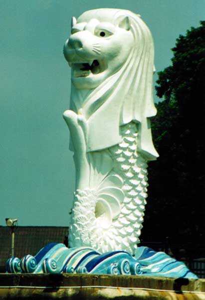
I think the flag colours should be a little stronger. Also how about a little more decoration, something like a Merlion, which is a national symbol of Singapore.
Last edited by Keefie on Tue May 01, 2007 3:43 am, edited 2 times in total.
-

Keefie
- Posts: 6461
- Joined: Sun Dec 03, 2006 1:05 pm
- Location: Sleepy Hollow


 3
3

Who is online
Users browsing this forum: No registered users
|
|||||||
| Conquer Club is not associated with RISK online in any way. Copyright © 2006-2024 by Big Wham LLC | |||||||