Draft Stamped 6.12.13
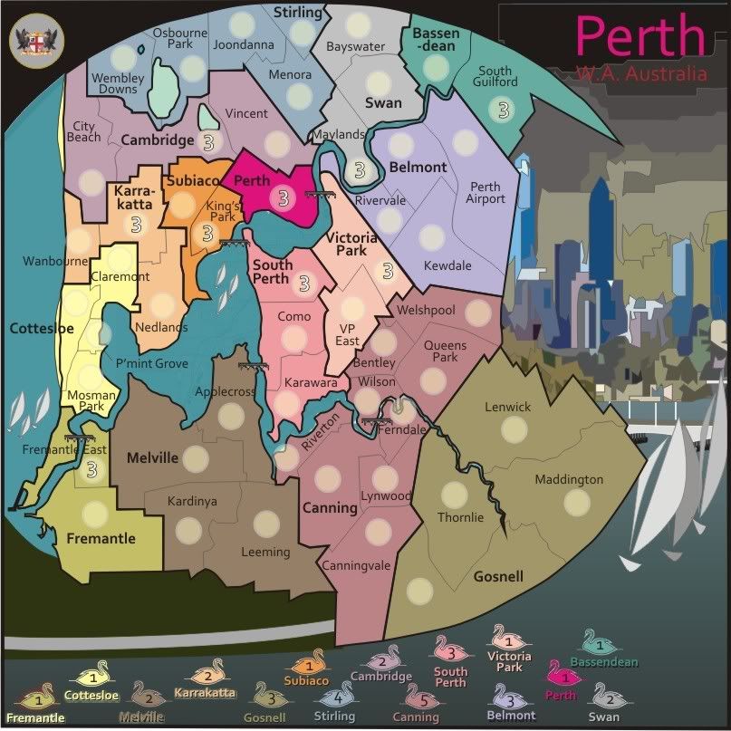
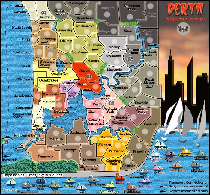
Map Name:Classic Cities: Perth
Mapmaker(s):cairnswk
Number of Territories:20 continents, 73 terrtorites - 7 neutrals = 66 (golden number)
Special Features:Easy classic gameplay, medium size map
What Makes This Map Worthy of Being Made:
[*]one of the Classic cities' map
[*]another Australian city represented
[*]lots of small bonuses for easy taking
Graphics FeaturesI hope the map will feature the skyline of Perth at night reflected in the Swan River below.
Swans feature on the City Emblem, hence these are used in the legend.
Saling and cycling are two big pasttimes in both Perth and Fremantle, it is a very outdoors place - indeed you might recall the 1987 America's Cup was held in Fremantle. I was in NZ at the time cheeering in a social room with a Fosters beer in my hand.
Sizes:Small - 700 x 650; Large - 770 x 715
Current Version 9 - Small
Previous versions:
XML: (to come)