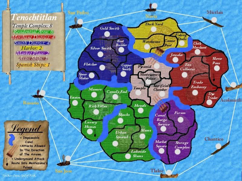
Right, well, I want to comment on a few things to do with the graphics...
Something I don't like is the graphics for the canals, they're terrible! You've just used a textured paintbrush, they need touching up big time.
I don't like the legend, it looks too futuristic for the Aztecs, those boxes don't do anything for the aesthetics of the legend, but the scroll looks ok.
I've also noticed that san jose is just an image pasted over the sea. It looks a bit off in my opinion as where the holes in the picture are you've retained the previous background, and I think it looks horrible.
The water still doesn't fit, I don't think, try looking up water textures and using them instead of the current one, it still looks like the city is floating.
The borders need a little touching up, they look quite jagged and rough at the moment.
Just a minor point - The arrows leading from the Canoe Port to the Pyramid of the God's overlaps the text and it makes it slightly harder to read...
[Abandoned] - Tenochtitlan
Moderator: Cartographers
62 posts
• Page 2 of 3 • 1, 2, 3
![]() by TuckerCase on Thu Jun 08, 2006 11:02 am
by TuckerCase on Thu Jun 08, 2006 11:02 am
Personally I like the canals how they are. I didn't use a textured paint brush, not that it's relevant. If mass opinion is against them I'll allow myself to be persuaded.
The arrows do overlap the "Pyramids of the gods" text, but there's no room for them to not. I don't want to make the arrows smaller, I'll consider coming up with a shorter name.
As for the scroll, I'd prefer simple white text. It needs to be color coded though, and with such a range of values it seems to be the best option so all the text shows up against a background.
I'll touch up a few of the other things in the next version.
-

 TuckerCase
- Posts: 72
- Joined: Fri Feb 03, 2006 8:55 pm


![]() by rocksolid on Thu Jun 08, 2006 12:18 pm
by rocksolid on Thu Jun 08, 2006 12:18 pm
There's still an offending apostrophe in Pyramid of the gods.
Bottom legend looks cool. Top legend...I see your problem - maybe use a different shape other than rectangles.
Aztec art was pretty distinctive, and you might want to find some ways to incorporate elements of it in your design, perhaps in the legend or in the water somewhere. The eagle and snake in the middle of the Mexican flag could also be a good legend piece of art, as it has to do with the founding of Tenochtitlan.

Not sure if you're working off some model of Tenochtitlan, but there are elements of the actual city that could help shape your map, give you inspiration for new names, etc.
http://en.wikipedia.org/wiki/Tenochtitlan
I'm afraid I have to concur with the dissatisfaction with the canals. Usually water flows in canals in a fairly orderly fashion, so some other texture reflecting that could be better.
As for the general water (and I think it's a good idea to somehow make the transition from canal water to lake water seamless), the problem with this version, as with the last one, is that the texture is too large, which is what makes it look like clouds. I think lake water will be fairly even from one area to the next, so some kind of pattern that repeats itself every 20 x 20 pixels, perhaps varied with a colour gradient from one end of the lake to the other (towards an imagined sunrise or sunset) would probably look more lakelike.
While it's clear to me how the secret passages connect to the palace (though I don't know if it's a two-way connection), I don't think it will be clear to most people. I think people often don't read legends (I know, it's dumb) unless they're looking for an explanation of something in the image - like say a winding dotted line from the shovels to the palace.
And lastly, I reiterate my concern over the one-way attack icons - they look like they could be arrows or trireme oars, which doesn't make clear which way the one-way works.
Bottom legend looks cool. Top legend...I see your problem - maybe use a different shape other than rectangles.
Aztec art was pretty distinctive, and you might want to find some ways to incorporate elements of it in your design, perhaps in the legend or in the water somewhere. The eagle and snake in the middle of the Mexican flag could also be a good legend piece of art, as it has to do with the founding of Tenochtitlan.
Not sure if you're working off some model of Tenochtitlan, but there are elements of the actual city that could help shape your map, give you inspiration for new names, etc.
http://en.wikipedia.org/wiki/Tenochtitlan
I'm afraid I have to concur with the dissatisfaction with the canals. Usually water flows in canals in a fairly orderly fashion, so some other texture reflecting that could be better.
As for the general water (and I think it's a good idea to somehow make the transition from canal water to lake water seamless), the problem with this version, as with the last one, is that the texture is too large, which is what makes it look like clouds. I think lake water will be fairly even from one area to the next, so some kind of pattern that repeats itself every 20 x 20 pixels, perhaps varied with a colour gradient from one end of the lake to the other (towards an imagined sunrise or sunset) would probably look more lakelike.
While it's clear to me how the secret passages connect to the palace (though I don't know if it's a two-way connection), I don't think it will be clear to most people. I think people often don't read legends (I know, it's dumb) unless they're looking for an explanation of something in the image - like say a winding dotted line from the shovels to the palace.
And lastly, I reiterate my concern over the one-way attack icons - they look like they could be arrows or trireme oars, which doesn't make clear which way the one-way works.

-

rocksolid
- Posts: 625
- Joined: Sat Mar 18, 2006 10:00 pm
- Location: Mowwwnt Reeeal


![]() by AndyDufresne on Thu Jun 08, 2006 2:24 pm
by AndyDufresne on Thu Jun 08, 2006 2:24 pm
Well lets see...
~~Visual Appeal~~
---First, the bonus legend definitely needs some reworking. As noted, it doesn't have and Aztec feel. It rather looks like a stained glass window rather than a scroll. Perhaps if you looked into getting rid of the grid and putting the font on the scroll, with some sort of splashes of color behind the text. Also I think you should look into a few different scroll ideas, don't get settled this early on many things.
---As for the other legend I rather like the way it looks. But that said...
---I like the arrow idea but that particular choice of arrows isn't such a good one. Look into clearer images, and perhaps smaller. Maybe even consider using some spears or something.
---The shovel for the representation of the underground passages is an interesting. But I still stress looking into a few different images.
---The boats are still horrendous. As noted by others...they still don't fit. More images, more, more, more. And with the boats, look into perhaps something other than the using the white spider's web of lines.
---As for the water same tried and true messages. More and more images. There are a lot of textures that can be used for water, and the cloud poofs aren't quite working.
---And that said, have you used the same image for the background texture on the map's continents? Look for more individuality.
---The borders seem to be dug out chasms. They really don't have to appear to be deep crevices to get the job done. Also softening up all the edges would be beneficial. The names are more readable now, but the font is plain. Have you considered others?
---And lastly...the rivers. You may be satisfied, but they don't feel like rivers. They remind me of drawing with blue crayon on wax paper. Look into textures for the water, and when you get a nice ocean established make sure the water from the river and the ocean mesh at the emptying point on the edge of the battlefield.
================================
~~~Nitty Gritty~~~
---As for game play, I think the temple complex should stay at max 8. Anything more seems way too much. 8 Still accomplishes your goal.
---Border issues need to be resolved, perhaps the underground routes will help this out.
================================
---Overall...more, more, more.
--Andy
~~Visual Appeal~~
---First, the bonus legend definitely needs some reworking. As noted, it doesn't have and Aztec feel. It rather looks like a stained glass window rather than a scroll. Perhaps if you looked into getting rid of the grid and putting the font on the scroll, with some sort of splashes of color behind the text. Also I think you should look into a few different scroll ideas, don't get settled this early on many things.
---As for the other legend I rather like the way it looks. But that said...
---I like the arrow idea but that particular choice of arrows isn't such a good one. Look into clearer images, and perhaps smaller. Maybe even consider using some spears or something.
---The shovel for the representation of the underground passages is an interesting. But I still stress looking into a few different images.
---The boats are still horrendous. As noted by others...they still don't fit. More images, more, more, more.
---As for the water same tried and true messages. More and more images. There are a lot of textures that can be used for water, and the cloud poofs aren't quite working.
---And that said, have you used the same image for the background texture on the map's continents? Look for more individuality.
---The borders seem to be dug out chasms. They really don't have to appear to be deep crevices to get the job done. Also softening up all the edges would be beneficial. The names are more readable now, but the font is plain. Have you considered others?
---And lastly...the rivers. You may be satisfied, but they don't feel like rivers. They remind me of drawing with blue crayon on wax paper. Look into textures for the water, and when you get a nice ocean established make sure the water from the river and the ocean mesh at the emptying point on the edge of the battlefield.
================================
~~~Nitty Gritty~~~
---As for game play, I think the temple complex should stay at max 8. Anything more seems way too much. 8 Still accomplishes your goal.
---Border issues need to be resolved, perhaps the underground routes will help this out.
================================
---Overall...more, more, more.
--Andy
-

AndyDufresne
- Posts: 24919
- Joined: Fri Mar 03, 2006 8:22 pm
- Location: A Banana Palm in Zihuatanejo


![]() by TuckerCase on Sat Jun 17, 2006 7:22 pm
by TuckerCase on Sat Jun 17, 2006 7:22 pm
Update. I decided to up the Smith and Merchant Districts to 4 in order to make it so going for the smaller two continents isn't necessarily better than going for those.
-
TuckerCase
- Posts: 72
- Joined: Fri Feb 03, 2006 8:55 pm
![]() by Marvaddin on Sat Jun 17, 2006 10:11 pm
by Marvaddin on Sat Jun 17, 2006 10:11 pm
I like it, but some little suggestions:
- the larger spanish ships were better, these look smaller than those little aztec ships.
- yellow names arent good too... Maybe you could add some coloured signals, instead of put the names in that colour.
- the shovels could be more visible.
- I believe that residentail area could have one less border, possibly Urban Sprawl.
- you could change some names... tax collector for example. That big country for the tax collector? Exchange with the cloth merchant, or another one.
- Palace names have some minor problems, as in letters "y" and "z".
- some borders are visible under the canals, like between spear maker and states. You also could do the canals more connected to the lake.
Good job.

-

Marvaddin
- Posts: 2545
- Joined: Thu Feb 09, 2006 5:06 pm
- Location: Belo Horizonte, Brazil


![]() by minihaymanz on Sun Jun 18, 2006 12:51 am
by minihaymanz on Sun Jun 18, 2006 12:51 am
nice pics in the back of the contients...
as stated before, canals need improvement...
I found it hard to read the spanish ship names...especially navia
and can you attack from montezuma's palace into the places with underground attack or is it just 1 way?
as stated before, canals need improvement...
I found it hard to read the spanish ship names...especially navia
and can you attack from montezuma's palace into the places with underground attack or is it just 1 way?
-

minihaymanz
- Posts: 267
- Joined: Wed May 24, 2006 4:45 pm
- Location: Hamilton, Ontario


![]() by TuckerCase on Sun Jun 18, 2006 4:15 am
by TuckerCase on Sun Jun 18, 2006 4:15 am
reverend_kyle wrote:The rivers KILL me
Canals. The Canals kill you.
-
TuckerCase
- Posts: 72
- Joined: Fri Feb 03, 2006 8:55 pm
![]() by reverend_kyle on Sun Jun 18, 2006 4:26 am
by reverend_kyle on Sun Jun 18, 2006 4:26 am
I reccommend you make the canals just blue versions of the black borders. It would look good and it would still be obvious enough.TuckerCase wrote:reverend_kyle wrote:The rivers KILL me
Canals. The Canals kill you.
-

reverend_kyle
- Posts: 9250
- Joined: Tue Mar 21, 2006 4:08 pm
- Location: 1000 post club


![]() by reverend_kyle on Sun Jun 18, 2006 4:27 am
by reverend_kyle on Sun Jun 18, 2006 4:27 am
What are the odds of someone getting dealt the temple and with the 8 armies smashing everyone else in?
Let it be known i like the temple idea.
Let it be known i like the temple idea.
-
reverend_kyle
- Posts: 9250
- Joined: Tue Mar 21, 2006 4:08 pm
- Location: 1000 post club
![]() by Haydena on Sun Jun 18, 2006 4:55 am
by Haydena on Sun Jun 18, 2006 4:55 am
Yuck! Those white circles are terrible!!! Darkish grey will work better, just set the colour to black and play with the transparency in a new layer. Oh, and tell us when you're updating it, because I swear those circles weren't there before.
Those canals HAVE to have something done to them, they are simply awful, they look as though they have been done in MS Paint or something with a large paintbrush. Think of the possibilities you could have for the canals...
And rev, if someone gets dealt the temple someone is going to attack them, and I think the odd's are astronomical.
-

Haydena
- Posts: 634
- Joined: Sun Mar 19, 2006 2:43 pm
- Location: Sussex, England
![]() by AndyDufresne on Sun Jun 18, 2006 2:31 pm
by AndyDufresne on Sun Jun 18, 2006 2:31 pm
Well lets see...
It's starting to come along, and with some more work and effort it could be a fun map!
--Andy
- ---Everyone's given some pretty good suggestions. For the canals I'd look into changing them so they are not just a paintbrush stroke. And make them look like they are flowing into the surrounding ocean. And is it just me, or does anyone eles notice a little line through the Urban Sprawl to Chantico in the ocean...looks like you just pasted the same image of the ocean, without blending it so much, some waves don't seem to match up. But maybe I am just seeing this.
---Some of the names on the ocean are hard to see, as are some of the ships. These ships still don't fit with the style of the map. Perhaps stay away from real life representations and look at more clip art stylized images.
---The pictures located behind the continents work pretty well I think, though purple's is hard to see.
---And as Haydena noted, white circles are horrendous. It looks like a child has took your map and paper hole punched and is shining a high beam through it.
---The arrow bridges should be looked into, the image is blurry. I think you should experiment with a few other styles of arrows. As for the shovels, as Marv noted they should probably be more striking and larger.
---Your borders on the map still feel like they are simply drawn there. Perhaps you can see if you can give them some depth, or maybe polishing and softening the borders so they don't look like they are simply drawn in.
It's starting to come along, and with some more work and effort it could be a fun map!
--Andy
-
AndyDufresne
- Posts: 24919
- Joined: Fri Mar 03, 2006 8:22 pm
- Location: A Banana Palm in Zihuatanejo
![]() by DublinDoogey on Sun Jun 18, 2006 2:56 pm
by DublinDoogey on Sun Jun 18, 2006 2:56 pm
I just have time to give you a suggestiong for the canals.
On my map (north america) I created the ocean as a layer, and then the land as a seperate layer on top of that. Then, to make the rivers I simply erased the land layer where I wanted the water to be. I then added a one stroke border effect to the land layer, to add a difference between to the water and the land in the rivers.
Just a thought, use it if you want.
-

DublinDoogey
- Posts: 329
- Joined: Tue Feb 28, 2006 7:03 pm
- Location: Wisconsin

![]() by TuckerCase on Mon Jun 19, 2006 10:06 am
by TuckerCase on Mon Jun 19, 2006 10:06 am
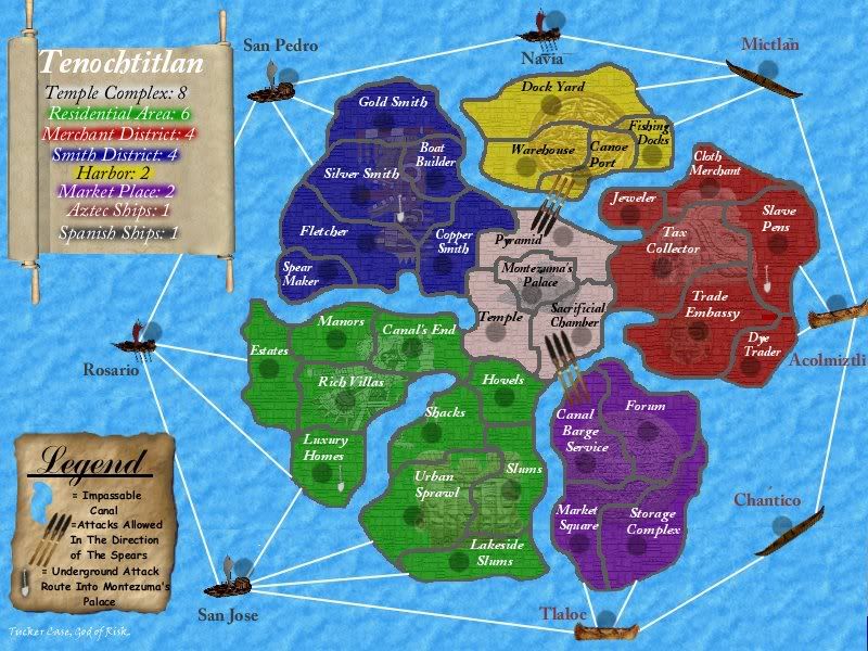
I updated the canals. I went with Dublin's suggestion, which I think might look ok. . .
I lightened up the border lines in an attempt to make it look like they're not "simply drawn there."
I darkened the circles, and I think they look pretty good now, but they might be too dark for dark blue armies now.
The arrows are replaced with spears, which are easier to see.
The font for the Spanish ships is a darker color.
The shovels I just lightened up, but kept the same pictures. I think they're visible enough. I'm not sure if I need something more striking, or not.
-
TuckerCase
- Posts: 72
- Joined: Fri Feb 03, 2006 8:55 pm

![]() by fluffybunnykins on Mon Jun 19, 2006 2:00 pm
by fluffybunnykins on Mon Jun 19, 2006 2:00 pm
maybe, if the canals weren't so wide, it would look less like a group of islands? I think it might be all the textures that make thin stuff (like shovels, spears/arrows and names) hard to see
Superman wears 'Fluffybunnykins' pyjamas
-

fluffybunnykins
- Posts: 385
- Joined: Tue May 02, 2006 6:43 am
- Location: Liverpool, UK
![]() by reverend_kyle on Mon Jun 19, 2006 2:41 pm
by reverend_kyle on Mon Jun 19, 2006 2:41 pm
I'd thin the canals out. Even with them thin they are still obvious.
-
reverend_kyle
- Posts: 9250
- Joined: Tue Mar 21, 2006 4:08 pm
- Location: 1000 post club
![]() by TuckerCase on Mon Jun 19, 2006 9:05 pm
by TuckerCase on Mon Jun 19, 2006 9:05 pm
My reasoning with making the canals so wide was to kind of give it the feel of a city, where you were really seeing canals, and not just lines on a map representing rivers. I was trying to make it look like the map was on a smaller scale then other maps. Although, I do think reverend kyle is right that they would still be obvious if I made them half as wide or whatever I chose. So if it would look better that way, I might try it.
-
TuckerCase
- Posts: 72
- Joined: Fri Feb 03, 2006 8:55 pm
![]() by Marvaddin on Tue Jun 20, 2006 12:27 am
by Marvaddin on Tue Jun 20, 2006 12:27 am
Does residential area really need 6 borders? At least one less, please.
Try get back the old spanish ships, please... these are, hmm, small!
And I would like to suggest you use white letters in all continents, I believe it would be better, and we would not have those problems in "y" and etc.
A tip: I believe the circles are small for the numbers. And, in fact, blue numbers dislike dark circles, you will see it. Dont make them too dark, you will regret it...
-
Marvaddin
- Posts: 2545
- Joined: Thu Feb 09, 2006 5:06 pm
- Location: Belo Horizonte, Brazil
62 posts
• Page 2 of 3 • 1, 2, 3
Who is online
Users browsing this forum: No registered users
|
|||||||
| Conquer Club is not associated with RISK online in any way. Copyright © 2006-2024 by Big Wham LLC | |||||||