[Abandoned] - Official Feudal War Revamp
Moderator: Cartographers
![]() by CoolC on Sun Feb 10, 2008 1:42 pm
by CoolC on Sun Feb 10, 2008 1:42 pm
The map itself is really nice but you should definitely improve the title area (left part of header). I think it's mostly the glow effect of the top and bottom text that bothers me, the middle informational text is pretty ok. Maybe have the top and bottom text in different color, like yellowish?
I don't need a 500px image in my signature because I don't have anything to compensate for.
-

 CoolC
CoolC
- Posts: 105
- Joined: Tue May 01, 2007 10:10 am


![]() by snapdoodle on Sun Feb 10, 2008 3:22 pm
by snapdoodle on Sun Feb 10, 2008 3:22 pm
Can you put a monster in the Lake?
That's not a real suggestion but I think it would be funny to have a monster eating some villagers by the lake.
That's not a real suggestion but I think it would be funny to have a monster eating some villagers by the lake.
-

snapdoodle
- Posts: 190
- Joined: Tue Jul 10, 2007 1:40 pm


-

Sir. Ricco
- Posts: 4555
- Joined: Tue Oct 02, 2007 2:33 pm
- Location: Making kingdoms burn and bloodshed start.


![]() by InkL0sed on Sun Feb 10, 2008 9:19 pm
by InkL0sed on Sun Feb 10, 2008 9:19 pm
1)The borders are way too unclear. I can barely see them at all!
2) I don't like that river you added by Rebel Territory. I don't think giving Rebel Territory 7 one less border really affects gameplay. It also removes the connection between Lake Minstello 4 and 5, which I don't like either, as it forces the player with Barbarians to take Rebel 7 before going to Realm of Might.
3) I don't understand why you widened the river. The length of the bridge between Great Kingdom and Realm of Might just makes me nervous now...
Sorry if I'm repeating anybody, as I haven't read the entire thread.
-

InkL0sed
- Posts: 2370
- Joined: Sat Jun 23, 2007 4:06 pm
- Location: underwater


![]() by FreeMan10 on Sun Feb 10, 2008 11:06 pm
by FreeMan10 on Sun Feb 10, 2008 11:06 pm
fireedud wrote:I don't like the roads travelling through the kingdoms, they look awkward. I'm not sure how you can change it, maybe you can just get rid of it altogether?
Roads? What roads?
-

FreeMan10
- Posts: 152
- Joined: Wed Jan 23, 2008 12:48 pm
- Location: On The Road
![]() by gimil on Thu Feb 14, 2008 7:05 pm
by gimil on Thu Feb 14, 2008 7:05 pm
Kaplowitz wrote:i dont like the left bridge and the bottom two walls.
Klap, there is absolutly nothing I can do with a comment like this. I dont like peanut butter, but that doesnt mean someone should change it
As for all other concerns, I think ive addressed them all in the next update which will be here any minute
What do you know about map making, bitch?
Top Score:2403
natty_dread wrote:I was wrong
Top Score:2403
-

gimil
- Posts: 8599
- Joined: Sat Mar 03, 2007 12:42 pm
- Location: United Kingdom (Scotland)


![]() by Kaplowitz on Thu Feb 14, 2008 7:47 pm
by Kaplowitz on Thu Feb 14, 2008 7:47 pm
gimil wrote:Kaplowitz wrote:i dont like the left bridge and the bottom two walls.
Klap, there is absolutly nothing I can do with a comment like this. I dont like peanut butter, but that doesnt mean someone should change it
As for all other concerns, I think ive addressed them all in the next update which will be here any minute
I dont like them because (:P) they look more flat, pixely, and i guess fake than the other ones. Maybe its because they are missing a shadow or something, idk.
And i dont like peanut butter either. Lets start a cult.

-

Kaplowitz
- Posts: 3088
- Joined: Tue May 01, 2007 5:11 pm
![]() by wcaclimbing on Thu Feb 14, 2008 7:52 pm
by wcaclimbing on Thu Feb 14, 2008 7:52 pm
The text on the water about XML is impossible to read. It matches too closely to the water.
for those of you that can't find the text (this is the first time i've seen it, also. dont feel bad.) It is in the water directly above Lake Minstello 14 and 15.
edit: ah... i figured out what (part) of it says. I can see "XML_____Lanyards". Can't figure out what the middle word is, though....
edit2: much better borders in the update. I like them a lot more now.
Last edited by wcaclimbing on Thu Feb 14, 2008 7:54 pm, edited 1 time in total.

-

wcaclimbing
- Posts: 5598
- Joined: Fri May 12, 2006 10:09 pm
- Location: In your quantum box....Maybe.


![]() by gimil on Thu Feb 14, 2008 7:53 pm
by gimil on Thu Feb 14, 2008 7:53 pm
wcaclimbing wrote:The text on the water about XML is impossible to read. It matches too closely to the water.
for those of you that can't find the text (this is the first time i've seen it, also. dont feel bad.) It is in the water directly above Lake Minstello 14 and 15.
edit: ah... i figured out what (part) of it says. I can see "XML_____Lanyards". Can't figure out what the middle word is, though....
okey doeky
What do you know about map making, bitch?
Top Score:2403
natty_dread wrote:I was wrong
Top Score:2403
-
gimil
- Posts: 8599
- Joined: Sat Mar 03, 2007 12:42 pm
- Location: United Kingdom (Scotland)
![]() by wcaclimbing on Thu Feb 14, 2008 7:56 pm
by wcaclimbing on Thu Feb 14, 2008 7:56 pm
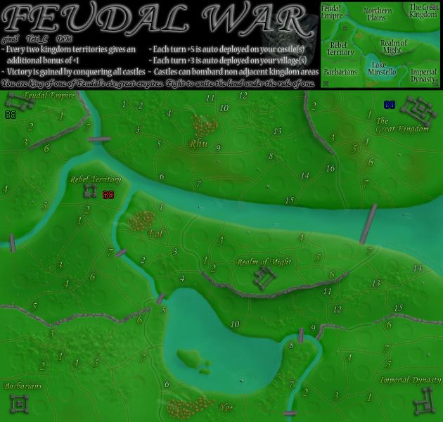
The border between Imperial Dynasty 7 and Lake Minstello 12 looks kinda strange. It doesn't look connected to the grey walls. The left side looks connected, but the right side seems to just end, not connecting to the walls. Extending that border a bit farther to the right so it touches the grey would fix it.
-
wcaclimbing
- Posts: 5598
- Joined: Fri May 12, 2006 10:09 pm
- Location: In your quantum box....Maybe.


-
Sir. Ricco
- Posts: 4555
- Joined: Tue Oct 02, 2007 2:33 pm
- Location: Making kingdoms burn and bloodshed start.
![]() by Psy Oct on Fri Feb 15, 2008 5:40 am
by Psy Oct on Fri Feb 15, 2008 5:40 am
Personally, I like fuedal as it is - this upgrade looks like a step backwards to me.
If you're going to change anything, change the font - it's horrible to read, I've misdeployed countless times because of it; it mars an otherwise excellent map.
If you're going to change anything, change the font - it's horrible to read, I've misdeployed countless times because of it; it mars an otherwise excellent map.
-
Psy Oct
- Posts: 11
- Joined: Tue Aug 07, 2007 12:13 pm
![]() by whitestazn88 on Fri Feb 15, 2008 2:08 pm
by whitestazn88 on Fri Feb 15, 2008 2:08 pm
honestly, i have not yet played on feudal wars. because the majority of my games are 1v1, i'm still scared about the pretty big bonuses that come from the +5 autodeploy.
still, i'd have to agree with Psy Oct, because the original map still looks good to me
still, i'd have to agree with Psy Oct, because the original map still looks good to me
-
whitestazn88
- Posts: 3128
- Joined: Mon Feb 05, 2007 2:59 pm
- Location: behind you


![]() by gimil on Fri Feb 15, 2008 3:20 pm
by gimil on Fri Feb 15, 2008 3:20 pm
bryguy wrote:Sir. Ricco wrote:I like it darker. The castles are also looking cooler.
yea but i can see the pixels on the castles, which i dont care for. And i agree that it looks better darker
Those pixels are castle battlements.
What do you know about map making, bitch?
Top Score:2403
natty_dread wrote:I was wrong
Top Score:2403
-
gimil
- Posts: 8599
- Joined: Sat Mar 03, 2007 12:42 pm
- Location: United Kingdom (Scotland)


![]() by gimil on Tue Feb 19, 2008 11:17 pm
by gimil on Tue Feb 19, 2008 11:17 pm
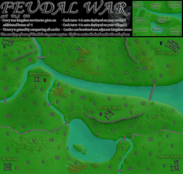
NOTE: Except for the minor border changes ive made, I veto any other major gameplay games other than the changing of neutrals to balance the map out.
Heres all the changes I made:
-Increase rhu neutral from 3 to 5, this is to reduce the chance of an early village grab which ive witnessed many times.
-reworked hte layout for lake 1,2,3,4 and 5 + Rebel 7 to try and give better expansion options in that area.
-Tweeks lake 8,9,11 for graphic purposes.
-reduced the neutral by one on fol and surrounding terrs, this was to help with hte disadvantage on the middle castles
-Reworked realm of might to have a single terr that can defend both kingdom enterences.
What do you know about map making, bitch?
Top Score:2403
natty_dread wrote:I was wrong
Top Score:2403
-
gimil
- Posts: 8599
- Joined: Sat Mar 03, 2007 12:42 pm
- Location: United Kingdom (Scotland)
](./images/smilies/eusa_wall.gif "Brick wall")


![]() by Mr_Adams on Tue Feb 19, 2008 11:22 pm
by Mr_Adams on Tue Feb 19, 2008 11:22 pm
I say again, do what you like to your map AS LONG AS IT DOESN'T CHANGE GAME PLAY!
Edit: ^^^ Wicked is the one who got me hooked on this map... An rt that I won.
Edit:
Last edited by Mr_Adams on Tue Feb 19, 2008 11:24 pm, edited 1 time in total.

-

Mr_Adams
- Posts: 1987
- Joined: Fri Jul 13, 2007 8:33 pm


![]() by edbeard on Tue Feb 19, 2008 11:22 pm
by edbeard on Tue Feb 19, 2008 11:22 pm
I've said this before, but I don't think there was a response from you to it so I'll say it again.
On the previous version, the borders between Kingdoms were easily distinguishable from other borders. Now, they are essentially the same so figuring out where a kingdom ends and the other one starts is a bit difficult. It's not terribly bad, but before I could just look and know right away that the kingdom ended at that border. Now, I have to think about it and possibly look towards the mini-map and territory numbers for help.
On the previous version, the borders between Kingdoms were easily distinguishable from other borders. Now, they are essentially the same so figuring out where a kingdom ends and the other one starts is a bit difficult. It's not terribly bad, but before I could just look and know right away that the kingdom ended at that border. Now, I have to think about it and possibly look towards the mini-map and territory numbers for help.
-

edbeard
- Posts: 2501
- Joined: Thu Mar 29, 2007 12:41 am


Who is online
Users browsing this forum: No registered users
|
|||||||
| Conquer Club is not associated with RISK online in any way. Copyright © 2006-2024 by Big Wham LLC | |||||||