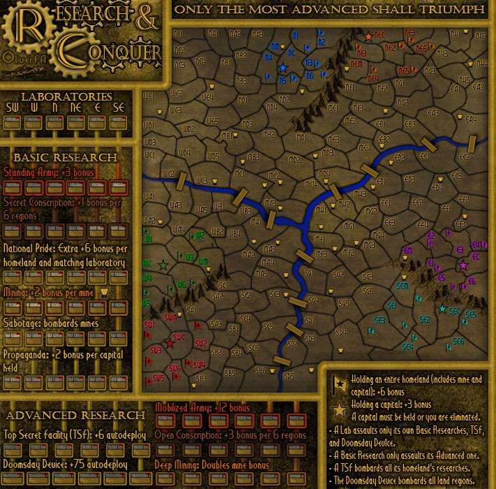
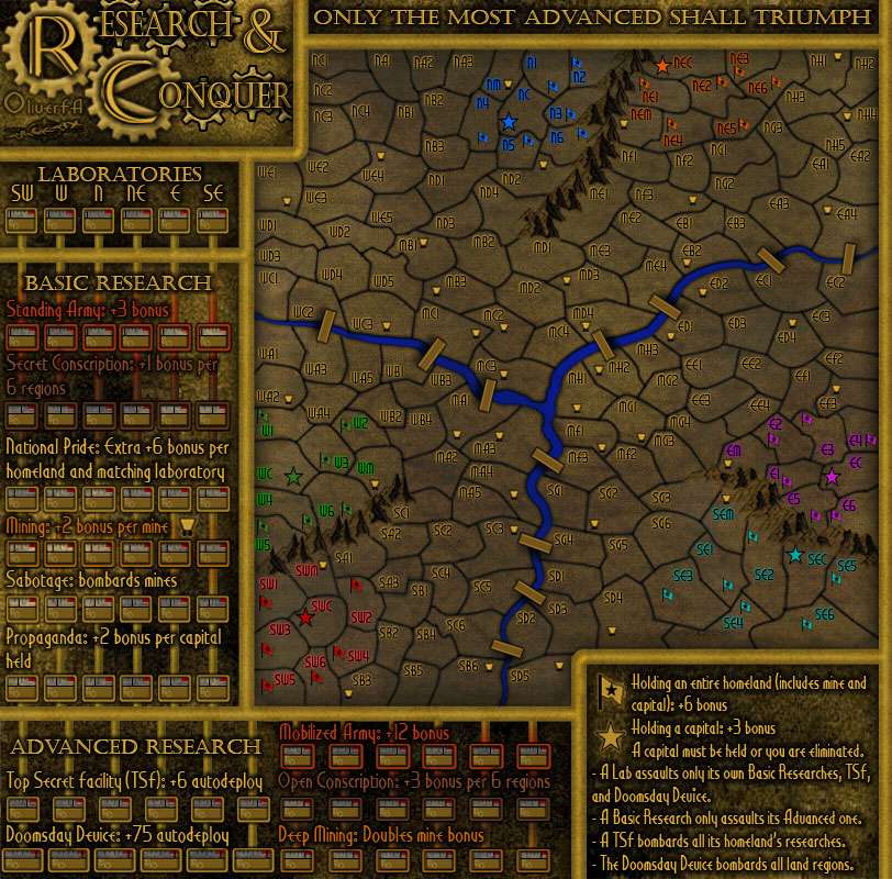
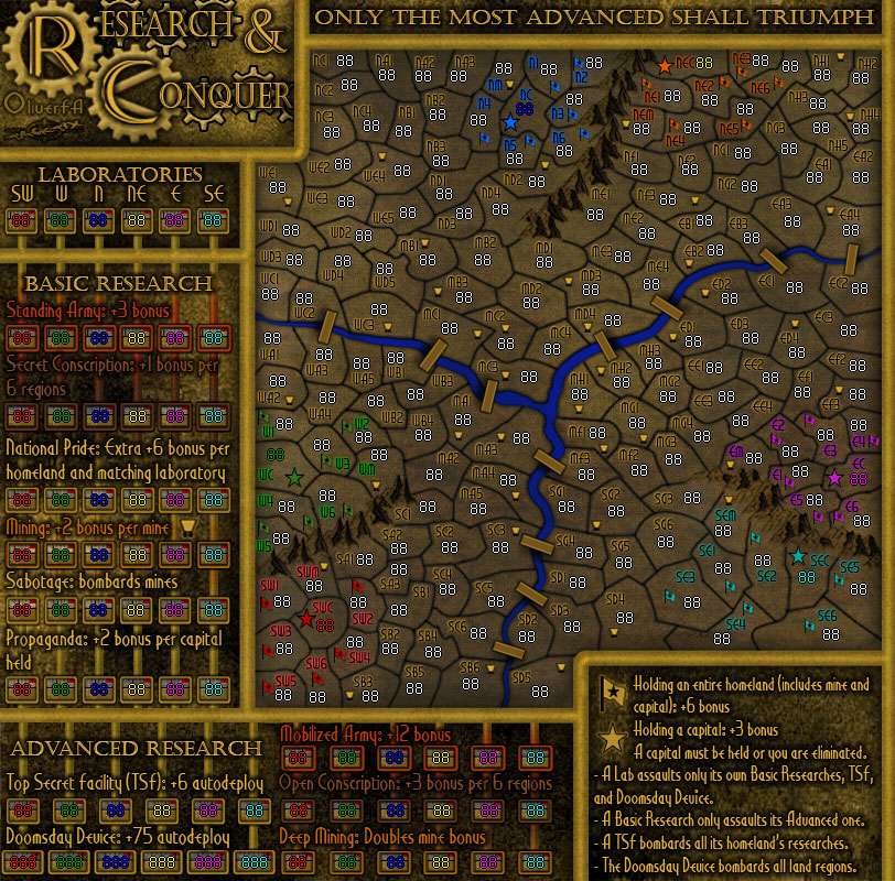
-=- Tanarri -=- wrote:- Secret Conscription is looking a little dark. I can still read it, but I could see how some may have difficulty. I wonder if it would look different enough if it were just a shade or two lighter?
It's actually the same shade as its counterpart in the south. The local background there is darker than the one in the south, but I'll see about applying a lighter shade to it.
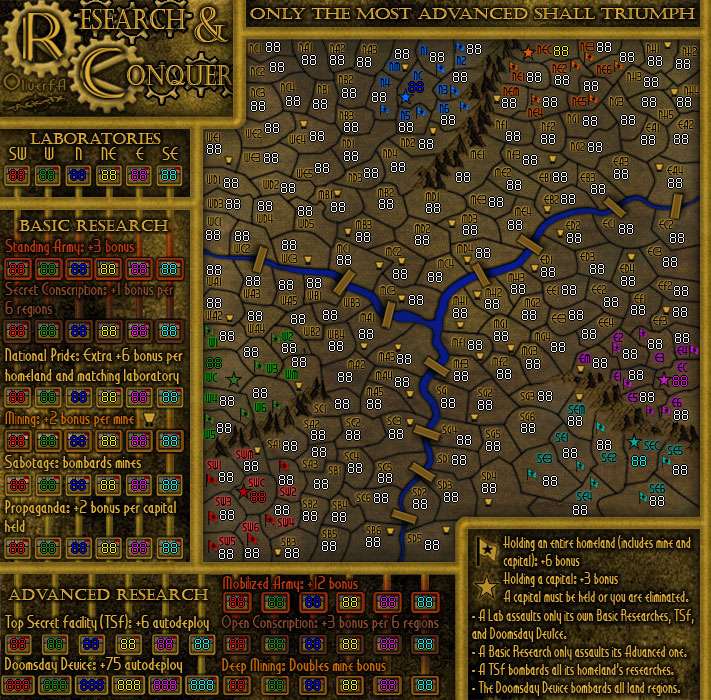
- I like the burn effect on the Conquer map, particularly around Nar. I wonder if using that effect around other parts of the map, perhaps in varying degrees would work to add further texture to the Conquer map?
Already did that. It's three layers all at 25% opacity and Subtract blending. I had them at 30%, but it made the map too dark. I did do some evening so the effect looked well-rounded across the map. As such, I don't think "more is better" in this case.
- I don't know if it's a necessary (or even doable) suggestion, but what do you think of moving TSF and Doomsday's boxes closer together so that the vertical lines from the basic research section just keep going straight down. I think that may make it even clearer that the Labs attack the TSFs and Doomsday. Not sure if that would mean things getting too squished though.
It isn't do-able. I put Doomsday boxes as close together as I felt comfortable while still keeping them separate. TSF was just moved over so that the pipes could go down evenly. It's a nifty idea, but with the requisite 3-digit number on Doomsday, their size becomes impossible to avoid.
- 'B' in bombards after Sabotage still needs to be capitalized based on how National Pride and Deep Mining's descriptions are capitalized.
Will do.
- On the map, the MF section looks like it has a lowercase f. If this is the case it should be uppercase to match the other territories. Same with EF and NF, though I'm suspecting that it's just the font style and they are capitals already
It's the font style, and since it's still viewable as an "F" regardless of which case I won't be looking for another font. The "i"s on the map I changed out for another Art Deco font (the main is Libeled Lady, the backup is Maharlika), but I don't think the F will follow as well.
- If you wanted to get really nitpicky, the shadow direction for the mountains doesn't match up with the bridges. Mountains look like the light is coming from left and the bridges look like it's coming from the centre of the map
Yeah, small problem with it though: the mountains are drawn that way. I think I'll just change the bridge shadow so light is coming from the WSW, allowing all bridges to show a shadow and the mountains to still make sense.
The vertical lines do help, but where they are the same colour as the thicker margins of the boxes around the Laboratories, the Basic Research and the Advanced Research, there is still the possibility of misinterpreting those boxes as cross-connections. I'm just not sure which should change colour. Perhaps a texture or filigree on the boxes so that the verticals appear to be made of something different and less contiguous.
I'm going to have to disagree on the necessity. It CAN be considered as a cross-connection, but only if people aren't reading the legend. If I did change the filigree to something different, it would break the graphical theming I've got going, and the change would stick out like a sore thumb. For the sake of catering to ignorance, I think that's too great a sacrifice.