hey thenobs, I'm finally dropping by as promised! I've got a bunch of maps to respond to, so I'll just tell you the things that I like and why.
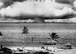
I like what you've done in 3.1 around the islands. The apocalyptic glow in 3.0 (and especially in the image you PM'd me) are distracting, and do not fit the Polynesian theme... Micronesia in particular is punishingly bright on my eyes. If you were to tone the glow down so that it looks like shallow water/reef that'd be really nice, but when you couple the glow with the radioactive colors you've got a bikini atoll map rather than an oceania map.


I can see you're facing some some background dilemmas... to which I say let that be the last thing you worry about. Personally I like the direction that the 3.4 background is going -- it's far more abstract than the other images, which is perfect because you aren't trying to achieve realism with the graphics on this map. The fact that the 3.4 background recedes into the background I do NOT like - you shouldn't have a vanishing point for the background if you don't have one for the rest of the map - and as it is the heavy lines are too distracting, but I personally think more abstract water is better than realistic water.
Looks like the gameplay is about the same as last week, so my earlier comments stand - I see no particular problems, just things to consider as you move ahead.


