- Click image to enlarge.
Blitz and griff...i assume this is your latest version.
I haven't read through the thread, so please forgive if stuff has already been mentioned.
Firstly. in your front page where you edit the first entry, could you put up in the "master" title what number the latest version is and on which page it can be found..for instance...
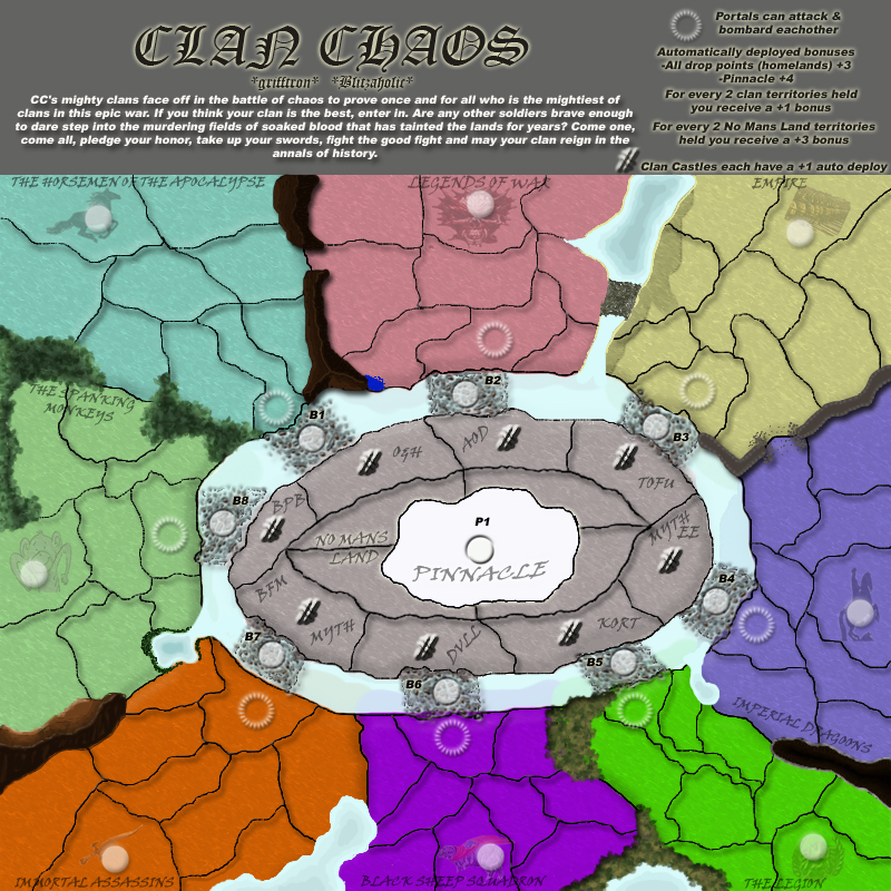
Clan Choas Map V5 (P8)If i didn't know different this layout and part of gameplay is almost modelled on Valley of the Kings.
I'd ditch the yellow glow around the legend text. Yellow on gray doesn't go so good and is hard to read.
Your main map font is also hard to read first off.
You have some four way corners on blue... a no-no, unless you plan on placing an impassable mountain or other such feature there.
The trees/bushes between blue and green are starting to look good, but some of the other impassables obviously you're still working on their formation.
Try to shorten the lead story,,,player don't like having to read too much, hence they constantly get in trouble when they don't read instructions on maps, so tryu to keep it short and sweet.
The castles are all the same design, is this intentional?
Why not make each castle out of the logos basic shape?
If the connections B1-8 are meant to be bridges, then give them more solid graphic.
I'm not entirely sure what they are....swamp perhaps.
i don't think the borders between each territory need a drop shadow.....and while i'm on that....why not make the land look like land....you know like i did in Waterloo or mibi did in D-Day. It's only a brush paint skill you've got to learn and it would be very worthwhile.
ONly some suggestions, guys. Good luck. Keep going though, you'll get there!